Last week, I had the pleasure of using Sketch 3 to redesign the UI of an app we’re building inside the Objective C App course (No longer offered. New course here).
I hadn’t planned to redesign it, but after reading Meng To’s book, Design+Code, I became inspired to do better.
Additionally, I was quite a beginner with Sketch and wanted to take this opportunity to get familiar with it. By the way, Meng is an excellent designer/developer and is a prominent figure in the Sketch community. I’d recommend his book if you’re keen on learning principles of app design!
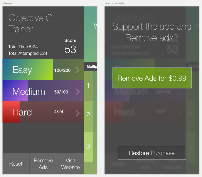
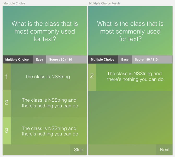
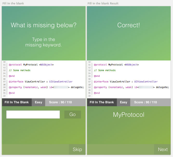
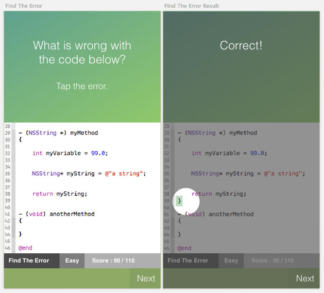
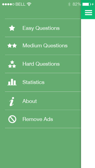
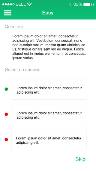
The book gave me a jump start with using Sketch, especially the shortcuts and iOS specific workflows. I came up with this over an evening and an afternoon:
New Objective C Trainer App Design
Original Objective C Trainer App Design
And now, compare it to the original app design that I had made with Photoshop. (Not to say that using Photoshop or Sketch made the difference but rather, it was in the design principles and iteration that made the new designs better)
Sketch iOS Design Process Video
Quite a difference between the original design and the new design right?
I recorded a process video of how I created the new app design in Sketch 3 and released it in my course.
I also took that same course lesson and adapted it for YouTube which you can see here:
Hope this is helpful for you guys and inspires non-designers to learn some app design principles!

