


Overview
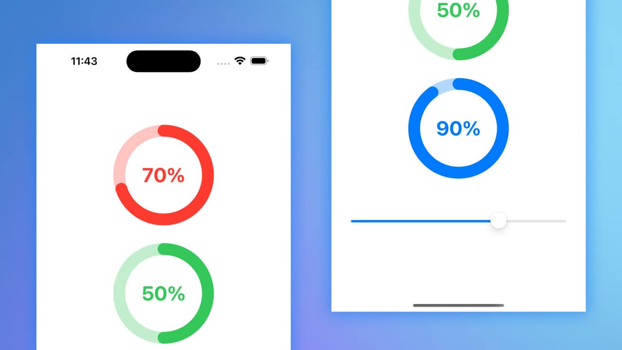
Activity rings are a visually appealing way to represent progress or activity data, often seen in health and fitness applications. In SwiftUI, we can create custom activity rings to showcase various metrics. This article will guide you through creating a simple set of activity rings using SwiftUI’s drawing and animation capabilities.
Code Snippet
Swift
struct ActivityRing: View {
    var progress: Double
    var ringColor: Color

    var body: some View {
        ZStack {
            Circle()
                .stroke(lineWidth: 20)
                .opacity(0.3)
                .foregroundStyle(ringColor)

            Circle()
                .trim(from: 0.0, to: CGFloat(min(progress, 1.0)))
                .stroke(style: StrokeStyle(lineWidth: 20, lineCap: .round, lineJoin: .round))
                .foregroundStyle(ringColor)
                .rotationEffect(.degrees(270.0))
                .animation(.linear(duration: 0.5), value: progress)

            Text(String(format: "%.0f%%", min(progress, 1.0) * 100.0))
                .font(.largeTitle)
                .bold()
                .foregroundStyle(ringColor)
        }
    }
}
Swift
import SwiftUI

struct ActivityRingView: View {
    @State private var progress1 = 0.7
    @State private var progress2 = 0.5
    @State private var progress3 = 0.9

    var body: some View {
        VStack(spacing: 50) {
            ActivityRing(progress: progress1, ringColor: .red)
                .frame(width: 150, height: 150)

            ActivityRing(progress: progress2, ringColor: .green)
                .frame(width: 150, height: 150)

            ActivityRing(progress: progress3, ringColor: .blue)
                .frame(width: 150, height: 150)

            Slider(value: $progress1, in: 0...1)
                .padding()
        }
        .padding()
    }
}
Code Explanation
ActivityRing: This struct defines the activity ring view, which takesprogressandringColoras parameters. Theprogressparameter represents the completion percentage, whileringColordefines the color of the ring.Circle(): The firstCirclecreates the background ring with a lower opacity.Circle().trim(from: 0.0, to: CGFloat(min(progress, 1.0))): This circle is trimmed to show the progress, using a stroke style to create rounded edges and animating its drawing.Text: Displays the progress percentage in the center of the ring.
ActivityRingView: This struct defines a view containing threeActivityRingviews with different progress values and colors, along with aSliderto adjust the first ring’s progress.@State private var progress1, progress2, progress3: These state variables hold the progress values for the three rings.VStack(spacing: 50): Arranges the activity rings vertically with spacing between them, each with a fixed frame size.Slider: Allows the user to interactively adjust the progress of the first activity ring.
Creating activity rings in SwiftUI is a straightforward process that leverages the framework’s powerful drawing and animation features. By customizing the ring’s color and progress, you can create visually appealing representations of activity data that enhance the user experience. Whether for health apps or other purposes, activity rings are an effective way to visualize progress and motivate users.