Overview
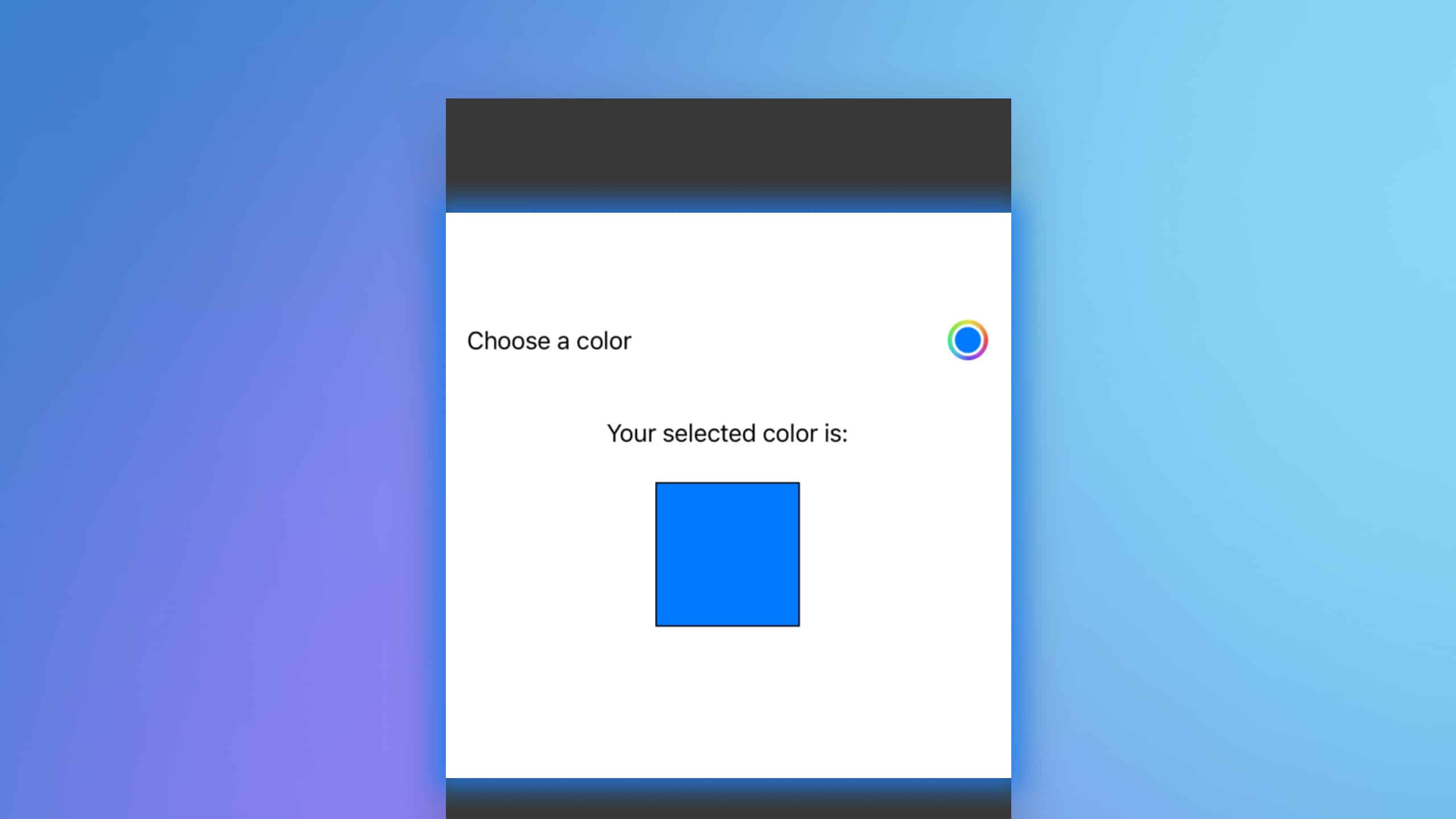
In SwiftUI, the ColorPicker provides a user-friendly interface for color selection, which can be integrated into various applications where users need to choose colors, such as drawing apps or customization settings. This article will explore how to implement ColorPicker and manage its state effectively within a SwiftUI view.

Code Snippet
import SwiftUI

struct ContentView: View {
    @State private var selectedColor = Color.blue

    var body: some View {
        VStack {
            ColorPicker("Choose a color", selection: $selectedColor)
                .padding()

            Text("Your selected color is:")
                .padding()

            Rectangle()
                .fill(selectedColor)
                .frame(width: 100, height: 100)
                .border(Color.black, width: 1)
        }
    }
}
Code Explanation
@State private var selectedColor = Color.blue: This line initializes a state variable to store the selected color, with a default value of blue.ColorPicker("Choose a color", selection: $selectedColor): TheColorPickeris initialized with a label and a binding to theselectedColor. Changes in the picker update this state variable.Rectangle().fill(selectedColor): A rectangle is displayed using the chosen color, demonstrating how the selected color can be used within other views.
The ColorPicker in SwiftUI is a powerful and easy-to-implement tool for color selection, enhancing user interaction by allowing dynamic color customization within apps. By integrating ColorPicker, developers can provide a more engaging and personalized user experience. The example above illustrates the simplicity with which this component can be added to a SwiftUI view, demonstrating real-time updates of UI components based on user selections.


