Overview
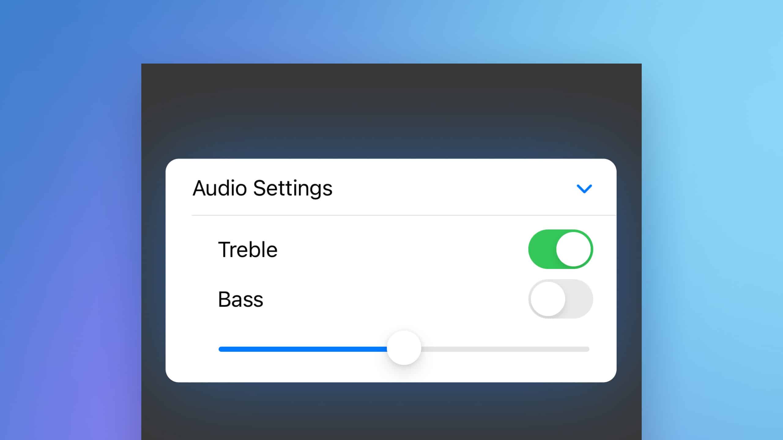
SwiftUI’s DisclosureGroup is a versatile UI component that allows developers to create collapsible content containers. This is especially useful in forms or lists where you want to keep the interface clean while still offering users the ability to access more detailed information as needed. This article will cover how to implement DisclosureGroup in SwiftUI, illustrating with an example where audio settings are managed within a form.

Code Snippet
import SwiftUI

struct ContentView: View {
    @State private var isExpanded = true
    @State private var trebleOn = true
    @State private var bassOn = false
    @State private var levels = 0.5

    var body: some View {
        NavigationStack {
            Form {
                DisclosureGroup("Audio Settings", isExpanded: $isExpanded) {
                    VStack {
                        Toggle("Treble", isOn: $trebleOn)
                        Toggle("Bass", isOn: $bassOn)
                        Slider(value: $levels, in: 0...1, step: 0.1)
                    }
                }
            }
        }
    }
}
Code Explanation
@Statevariables are used to track the state of each control within theDisclosureGroup.- The
DisclosureGroupis initialized with a title and an expansion state. Inside, it contains aVStackwith aTogglefor treble and bass, and aSliderfor adjusting levels. .isExpandedbinding allows the group to be programmatically expanded or collapsed, which is useful for responding to certain user inputs or other app logic.- The form automatically adapts to the content of the
DisclosureGroup, showing or hiding the toggles and slider based on the group’s expansion state.
DisclosureGroup in SwiftUI is an effective way to organize content in a user-friendly way, making your app’s interface cleaner and more intuitive. This example demonstrates how easily you can integrate dynamic components within forms, improving the overall user experience by exposing settings only when needed.


