Overview
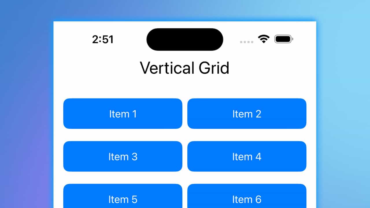
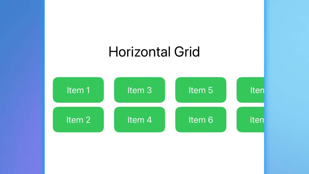
SwiftUI introduces two powerful grid layout options: LazyVGrid for vertical grids and LazyHGrid for horizontal grids. Both grids are designed to handle large data sets efficiently by only rendering the views currently visible on the screen. This “lazy” behavior ensures performance is maintained even with extensive content. Whether you want to create a vertically scrolling list of items or a horizontally scrolling gallery, these grids provide a clean, flexible way to arrange views.
In this article, we’ll walk through a simple implementation of both grid types and explain how they work.


Code Snippet
import SwiftUI

struct GridExample: View {
    // Define the data to be displayed in the grid
    let items = ["Item 1", "Item 2", "Item 3", "Item 4", "Item 5", "Item 6", "Item 7", "Item 8"]

    // Define grid columns for LazyVGrid
    let columns = [GridItem(.flexible()), GridItem(.flexible())]

    // Define grid rows for LazyHGrid
    let rows = [GridItem(.fixed(50)), GridItem(.fixed(50))]

    var body: some View {
        ScrollView {
            VStack {
                // Vertical Grid (LazyVGrid)
                Text("Vertical Grid")
                    .font(.title)

                LazyVGrid(columns: columns, spacing: 20) {
                    ForEach(items, id: \.self) { item in
                        Text(item)
                            .frame(maxWidth: .infinity, minHeight: 50)
                            .background(.blue)
                            .foregroundStyle(.white)
                            .clipShape(RoundedRectangle(cornerRadius: 10))

                    }
                }
                .padding()

                // Horizontal Grid (LazyHGrid)
                Text("Horizontal Grid")
                    .font(.title)
                ScrollView(.horizontal) {
                    LazyHGrid(rows: rows, spacing: 20) {
                        ForEach(items, id: \.self) { item in
                            Text(item)
                                .frame(width: 100, height: 50)
                                .background(.green)
                                .foregroundStyle(.white)
                                .clipShape(RoundedRectangle(cornerRadius: 10))
                        }
                    }
                    .padding()
                }
            }
        }
    }
}
Grid Code Explanation
-
Lazy Grids Overview:
- The “lazy” in
LazyVGridandLazyHGridrefers to how the views are loaded. These grids don’t create all the views at once but instead load views as they come into the screen’s visible area. This is particularly useful when working with large datasets because it conserves memory and boosts performance.
- The “lazy” in
-
Data Array (
items):- We define a simple array of strings,
items, representing the data that will populate each cell in the grid. This is straightforward and easy to follow for beginners, with each item simply being a label like “Item 1” or “Item 2”.
- We define a simple array of strings,
-
GridItem Definitions:
GridItem(.flexible()): In the vertical grid (LazyVGrid), we use flexible columns, meaning that the grid cells will adjust to fill the available space. In this example, we have two flexible columns, so the items will be arranged in two even columns.GridItem(.fixed(50)): In the horizontal grid (LazyHGrid), we use fixed-size rows with a height of 50 points. This ensures that the items are laid out in two rows with a uniform height.
-
LazyVGrid:
LazyVGrid(columns: columns, spacing: 20): This creates a vertical grid layout with the columns we defined. The spacing between items is set to 20 points. TheForEachloop populates the grid by iterating over theitemsarray and placing each item inside the grid cells.- Each grid cell is styled with a blue background, white text, and rounded corners using
clipShape(RoundedRectangle(cornerRadius: 10)).
-
LazyHGrid:
LazyHGrid(rows: rows, spacing: 20): This creates a horizontal grid layout with the fixed-size rows we defined. AScrollView(.horizontal)wraps the grid to make it scrollable horizontally when the content exceeds the width of the screen. Each item is styled with a green background, white text, and rounded corners for a uniform appearance.
-
ScrollView:
- The entire layout is wrapped inside a
ScrollView, which makes theLazyVGridscroll vertically and theLazyHGridscroll horizontally. This makes both grids suitable for displaying a lot of data without overwhelming the user interface.
- The entire layout is wrapped inside a
-
Text Styling:
- The
Textviews for each item are displayed with a flexible width (maxWidth: .infinityforLazyVGrid) to ensure they fill the grid cells properly, and their background and corner radius are applied for a polished UI.
- The
How Lazy Grids Work
The key advantage of using “lazy” grids is their ability to only load the views currently visible on the screen. This significantly improves the performance when dealing with large data sets or complex views, as only the necessary parts of the interface are loaded into memory. As the user scrolls, new views are created on demand, and old views that move out of the screen are discarded. This reduces memory usage and ensures smooth scrolling performance, especially in scenarios where many items need to be displayed.
SwiftUI’s LazyHGrid and LazyVGrid are incredibly efficient and flexible tools for creating grid layouts. By understanding how these grids work, you can build scalable, dynamic user interfaces that handle large amounts of data without sacrificing performance. Start experimenting with different grid configurations, and use these tools to build better, more responsive apps!


