


Overview
This article explores the GroupBox in SwiftUI, a versatile container view that allows developers to group content visually. GroupBoxes can contain multiple child views and provide a clean, organized layout for user interfaces. They are often used to categorize sections of controls or information visually, making UIs easier to navigate and understand.
Code Snippet
import SwiftUI
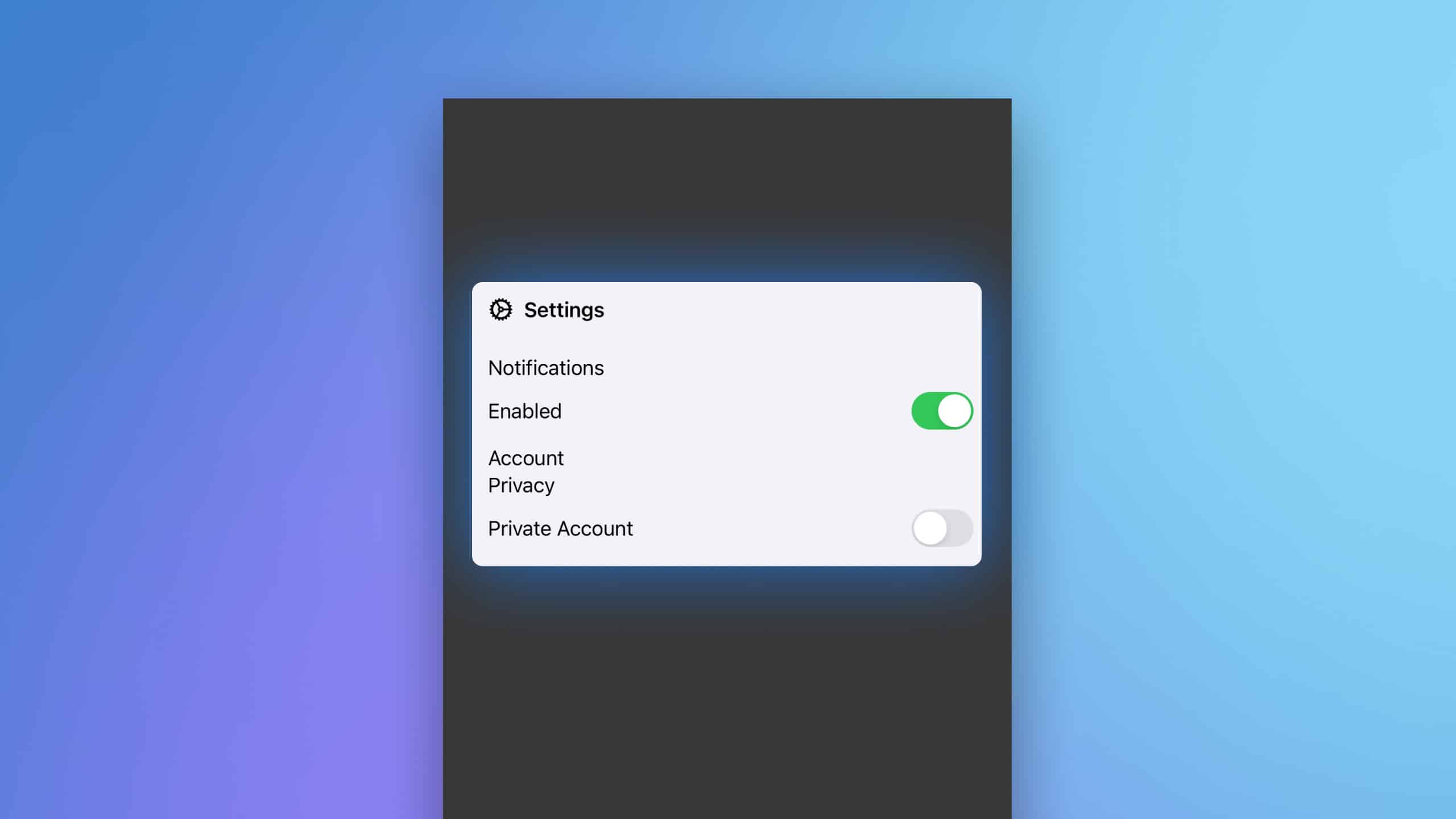
struct GroupBoxExample: View {
var body: some View {
GroupBox {
VStack(alignment: .leading) {
Text("Notifications").padding(.bottom, 2)
Toggle("Enabled", isOn: .constant(true))
Text("Account").padding(.top, 5)
Text("Privacy").padding(.bottom, 2)
Toggle("Private Account", isOn: .constant(false))
}
.padding(.top)
} label: {
Label("Settings", systemImage: "gear")
}
}
}Code Explanation
GroupBox { ... } label: { ... }: Defines a GroupBox with its content and an associated label. The label is created using aLabelview which combines text and an icon.VStack(alignment: .leading): Arranges the contained views vertically with left alignment.Text("Notifications"): Displays a label.Toggle("Enabled", isOn: .constant(true)): Represents a toggle switch bound to a constant value, shown as always enabled for demonstration..padding(.bottom, 2),.padding(.top, 5): Applies padding below or above certain views to create visual spacing.Label("Settings", systemImage: "gear"): Creates a label with text “Settings” and a gear icon, used as the header for the GroupBox.
GroupBox in SwiftUI is an excellent tool for organizing related UI elements, making interfaces easier to navigate and understand. By combining text, icons, and interactive elements within a GroupBox, developers can create engaging and highly functional user interfaces tailored to enhance user experience. This component is particularly useful in forms and settings where clear section demarcations are necessary.