


Overview
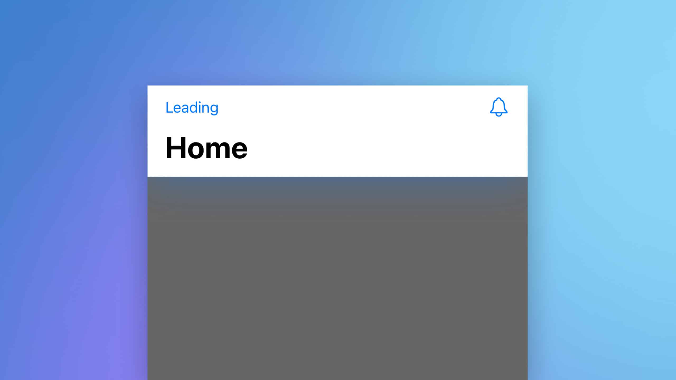
This article explains how to add buttons to a navigation bar in SwiftUI using the .toolbar modifier, including placing them on the leading or trailing side, and using text or images for buttons.
Code Snippet
Swift
import SwiftUI

struct ContentView: View {
    var body: some View {
        NavigationStack{
            Text("Main Content")
                .toolbar {
                    // Leading button
                    ToolbarItem(placement: .topBarLeading) {
                        Button("Leading") {
                            // Button Action
                        }
                    }

                    // Trailing button with
                    // view modifiers
                    ToolbarItem(placement: .topBarTrailing) {
                        Button(action: {
                            // Button Action
                        }) {
                            Image(systemName: "bell")
                        }
                    }
                }
        }
    }
}
Code Explanation
NavigationStack: This is used to handle the navigation of views within the app.Text("Main Content"): Represents the main content of the screen..toolbar: This modifier is used to define the toolbar content for the navigation area.ToolbarItem(placement: .topBarLeading): Specifies a toolbar item on the leading side of the navigation bar.Button("Leading"): Creates a button labeled “Leading”. The action to be performed when tapped is defined within the braces. You can add your own action inside of this braces.ToolbarItem(placement: .topBarTrailing): Places a toolbar item on the trailing side.Button(action: {}) { Image(systemName: "bell") }: Defines a button with an icon. The action for the button and the use of a system image as the button’s content.
This code demonstrates the flexibility of SwiftUI’s .toolbar modifier in adding and positioning buttons within the navigation bar, either with text or icons.