


Overview
If you want to create a SwiftUI Page control or Page view to display a series of views or images that users can swipe through, you can do it with the “Page” TabView style. This article will guide you through implementing a simple page control using SwiftUI’s TabView with a PageTabViewStyle.
Code Snippet
import SwiftUI
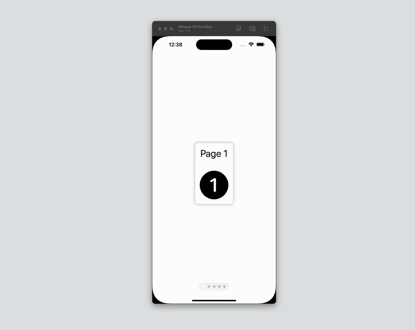
struct ContentView: View {
var body: some View {
TabView {
ForEach(0..<5) { index in
VStack {
Text("Page \(index + 1)")
.font(.largeTitle)
.padding()
Image(systemName: "\(index + 1).circle.fill")
.resizable()
.scaledToFit()
.frame(width: 100, height: 100)
.padding()
}
.background(Color(.systemBackground))
.clipShape(RoundedRectangle(cornerRadius: 10))
.shadow(radius: 5)
.padding()
}
}
.tabViewStyle(.page)
.indexViewStyle(.page(backgroundDisplayMode: .always))
}
}Code Explanation
TabView {}: This is the container that allows for swiping between views. It operates similarly to aUITabBarControllerin UIKit but is highly customizable in SwiftUI.ForEach(0..<5) { index in }: This loop creates five pages, each containing aTextview and anImageview. Theindexvariable is used to differentiate the content of each page.VStack {}: Each page’s content is organized vertically using aVStack. This stack includes aTextview and anImageview.Text("Page \(index + 1)"): Displays the page number as a large title.Image(systemName: "\(index + 1).circle.fill"): Uses SF Symbols to show an image corresponding to the page number.
.background(Color(.systemBackground)): Sets the background color of each page to match the system background..clipShape(RoundedRectangle(cornerRadius: 10)): Clips the content to a rounded rectangle shape with a corner radius of 10..shadow(radius: 5): Adds a shadow to each page for a subtle 3D effect..padding(): Adds padding around the content within each page..tabViewStyle(.page): Applies the page style to theTabView, enabling horizontal swiping..indexViewStyle(.page(backgroundDisplayMode: .always)): Adds a page indicator at the bottom of the view, with a background that is always visible.
SwiftUI’s TabView with PageTabViewStyle provides a straightforward and elegant way to implement page controls in your app. With minimal code, you can create a visually appealing and functional paginated interface. Whether you’re displaying a tutorial, a photo gallery, or any other sequential content, SwiftUI’s page controls are a powerful tool to enhance user experience. Experiment with different views and styles to make the most out of this feature in your projects.