


A Picker is a control that allows selecting a single value from a set of values, similar to what a dropdown does for a webpage. This tutorial will explore how to use a Picker, add it to a SwiftUI view, and make a selection.
Prerequisites
To follow this tutorial, you’ll need to have a Mac with Xcode installed. Don’t have a Mac computer? Check out your options using Windows.
We’ll also cover the use of Swift enums to declare the data we’ll use for the Picker. If you’re new and haven’t used Swift enums before, you may want to check the Swift enums four-part series first: Part 1, Part 2, Part 3, and Part 4.

Basic Code Example
import SwiftUI

struct PickerSample: View {
    @State private var selectedColour = 0

    let colours = ["red", "blue", "yellow"]

    var body: some View {
        Picker(selection: $selectedColour, label: Text("Select Colour")) {
            ForEach(0..<colours.count, id: \.self) {
            Text(colours[$0])
          }
        }
    }
}
The example above is a Picker that takes its selector options from an array of ‘colours’, defined in line 6. The picker itself in line 4 takes in a selection binding ‘$selectedColour’, which provides the current value for display. In this case, the state variable selectedColour is initially set to 0 in line 4, so the picker will initially be selected onto ‘red’, the element at index 0. The label parameter takes in a view (ex. Text), which is typically used to describe the purpose of the picker, and doesn’t appear in the view.
The content of the picker in this case are Text views iterated using a ForEach line in line 9, which will display each element of the ‘colours’ array as an option in the picker.
Picker Using Enum

import SwiftUI

enum Animal: String, CaseIterable, Identifiable {
    case dog
    case cat
    case bird
    var id: Self { self }
}

struct PickerwithEnumSample: View {
    @State private var selectedAnimal = Animal.dog

    var body: some View {
        Picker("Animal", selection: $selectedAnimal) {
          ForEach(Animal.allCases) { animal in
            Text(animal.rawValue)
          }
        }
    }
}
Instead of passing an array, enum cases can be used. The enum of ‘Animal’ includes dog, cat, and bird, and so the Picker in this case takes in “Animal”, a LocalizedStringKey, and another selection binding ‘$selectedAnimal’, which is defined in line 11 to initially pick ‘dog’.
The content of the picker is defined using a ForEach to iterate through each animal, and to display the animal.rawValue (the string itself) as text.
Styling the Picker
The Picker, by default, would show an inline view with the selected value, and tapping it would show a popover menu for all possible options.
Selecting a value from the popover menu will change the selected value of the inline picker. When pickerStyle isn’t set to the Picker, the default value would be .automatic.
Using PickerStyle, we can specify how the Picker should look like.
Inline Picker Style
import SwiftUI
enum Planet: String, CaseIterable, Identifiable {
case mercury, venus, earth, mars, jupiter, saturn, uranus, neptune
var id: Self { self }
}
struct ContentView: View {
@State private var selectedPlanet: Planet = .earth
var body: some View {
List {
Picker("Planet", selection: $selectedPlanet) {
ForEach(Planet.allCases) { planet in
Text(planet.rawValue.capitalized)
}
}
}
.pickerStyle(.inline)
}
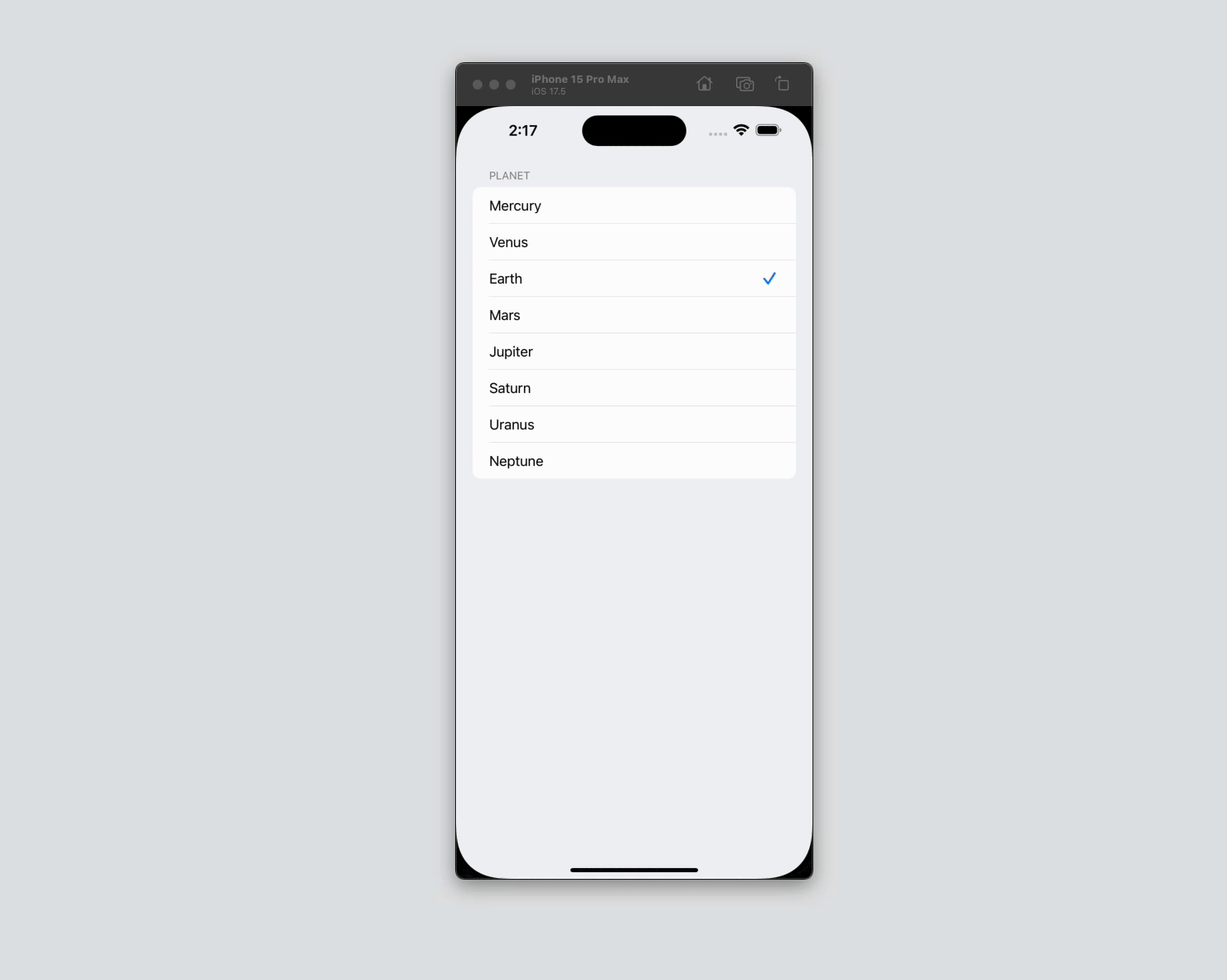
}Selecting a new value from the Picker will assign a new value for selectedPlanet. Initially, the selectedPlanet binding will determine the value of the picker, but when the value changes due to a new selection, the Picker will drive the value back to the selectedPlanet state property.
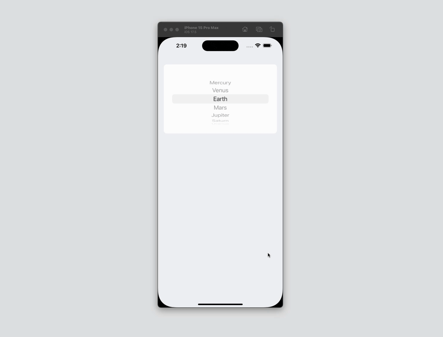
Wheel Picker Style
This is a style similar to the UIPickerView.
struct ContentView: View {
...
var body: some View {
List {
Picker("Planet", selection: $selectedPlanet) {
ForEach(Planet.allCases) { planet in
Text(planet.rawValue.capitalized)
}
}
}
.pickerStyle(.wheel)
}
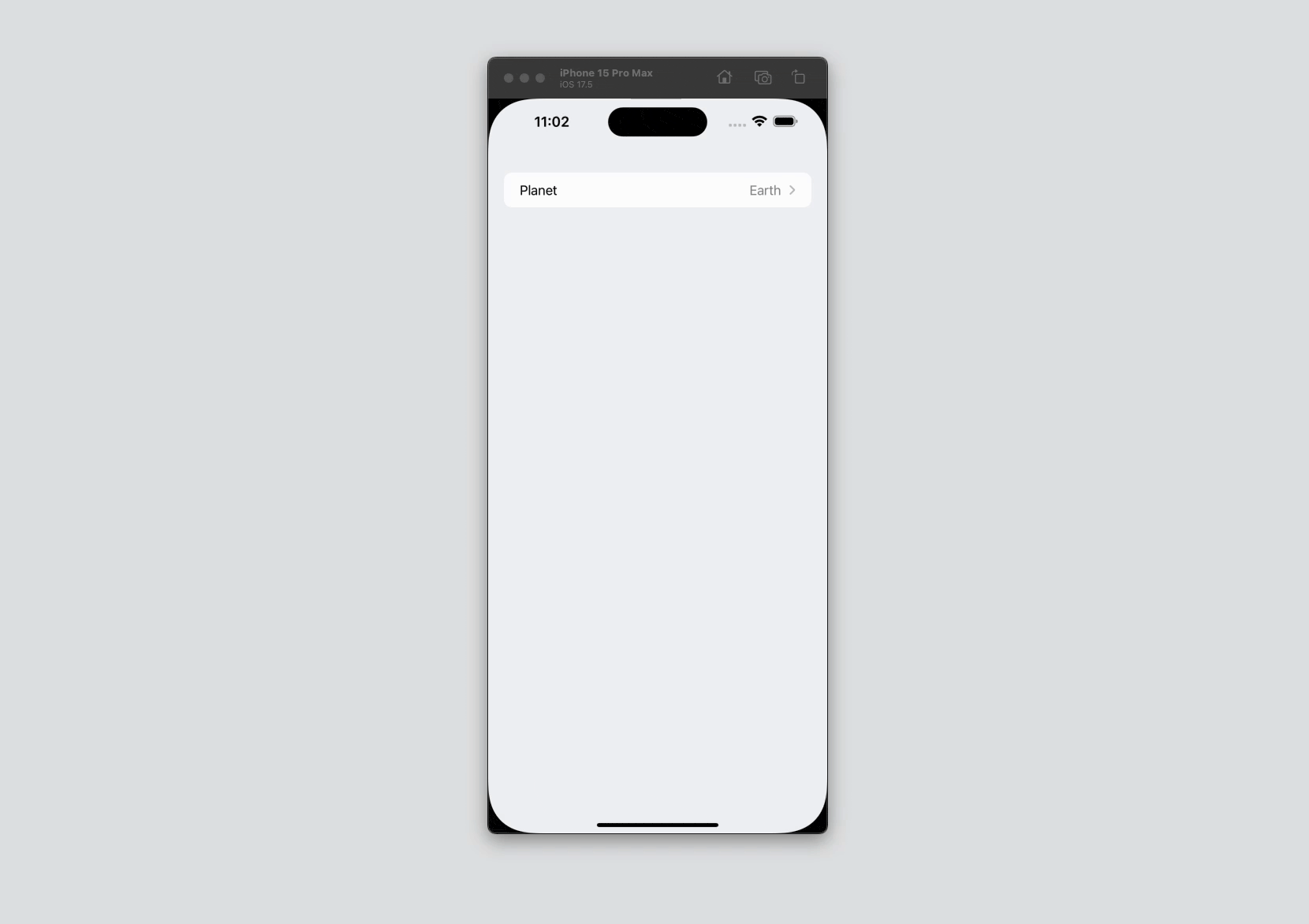
}Navigation Link Picker Style
The navigation link picker style is ideal when you want to present a new screen for selection. This picker style requires a NavigationStack as the root view of the body otherwise, it wouldn’t work.
struct ContentView: View {
    ...
    var body: some View {
        NavigationStack {
            List {
                Picker("Planet", selection: $selectedPlanet) {
                    ForEach(Planet.allCases) { planet in
                        Text(planet.rawValue.capitalized)
                    }
                }
            }
        }
        .pickerStyle(.navigationLink)
    }
}
Segmented Picker Style
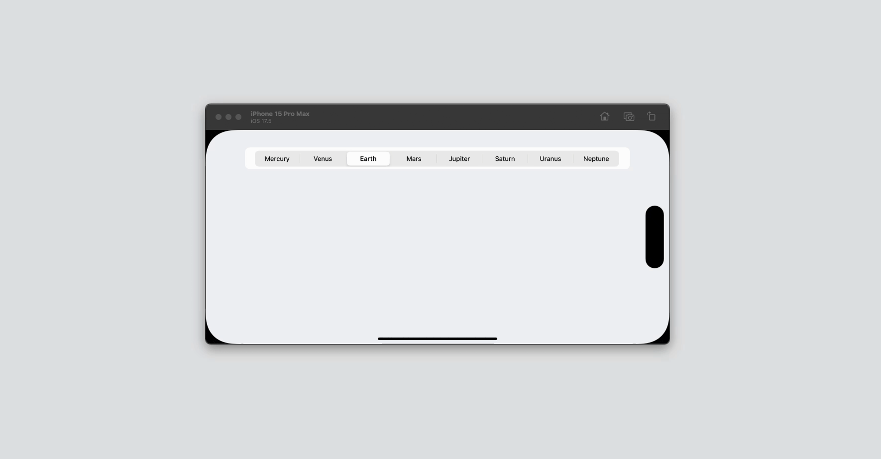
A segmented picker style is like a Tab selection. This is not an ideal picker style when you have more than three options as mobile devices tend to have limited width especially in portrait orientation.
struct ContentView: View {
    ...
    var body: some View {
        List {
            Picker("Planet", selection: $selectedPlanet) {
                ForEach(Planet.allCases) { planet in
                    Text(planet.rawValue.capitalized)
                }
            }
        }
        .pickerStyle(.segmented)
    }
}
Notice that when I attempt to show all options, the label for each option becomes truncated and is no longer visually pleasing.
So only use this picker style when you have 3 options or fewer.
Conclusion
The Picker control follows the design standards Apple made for the Human Interface Guidelines for Input and Selection.
Creating a Picker is easier in SwiftUI. It involves less code and setup compared to doing it in UIKit. I hope that by following this tutorial, you get to understand how to use a Picker on your projects!
That’s all for now. Happy learning!