


Overview
This article explains how to implement and customize progress indicators in SwiftUI. Progress indicators are essential UI components to inform users about the status of ongoing operations, such as data loading or file downloads. We will explore ProgressView, which is the primary component for showing progress in SwiftUI, and how to customize it to fit your application’s design.
Code Snippet
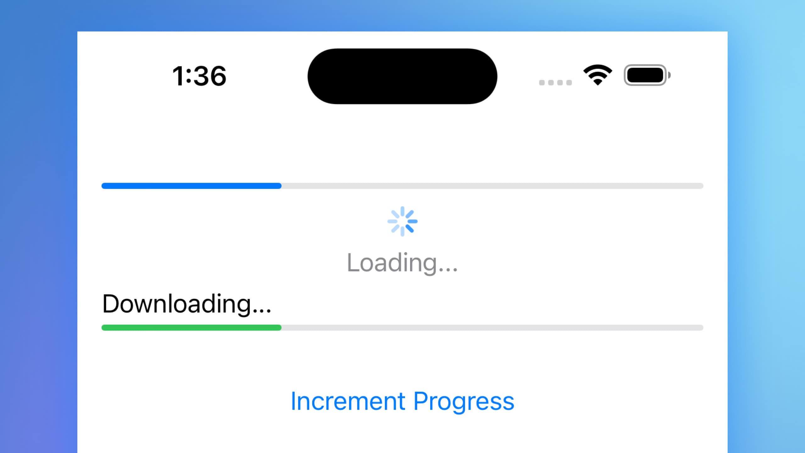
import SwiftUI

struct ContentView: View {
    @State private var progress = 0.3

    var body: some View {
        VStack(spacing: 20) {
            // Default progress view
            ProgressView(value: progress)

            // Customized circular progress view
            ProgressView("Loading...", value: progress)
                .progressViewStyle(.circular)
                .tint(.blue)
                .padding()

            // Customized linear progress view with label
            ProgressView("Downloading...", value: progress, total: 1.0)
                .progressViewStyle(.linear)
                .tint(.green)

            // Button to simulate progress increment
            Button {
                if progress < 1.0 {
                    progress += 0.1
                }
            } label: {
                Text("Increment Progress")
            }
            .padding()
        }
        .padding()
    }
}
Code Explanation
@State private var progress: A state variable to keep track of the current progress value.VStack(spacing: 20): A vertical stack to arrange the progress views and button with spacing.ProgressView(value: progress): A default progress view that displays the current progress.ProgressView("Loading...", value: progress): A circular progress view with a custom label..progressViewStyle(.circular): Applies the circular progress view style..tint(.blue): Customizes the tint color of the circular progress view to blue.ProgressView("Downloading...", value: progress, total: 1.0): A linear progress view with a label and a total progress value..progressViewStyle(.linear): Applies the linear progress view style..tint(.green): Customizes the tint color of the linear progress view to green.Button { ... } label: { Text("Increment Progress") }: A button that increments the progress value by 0.1 each time it is pressed. The button is styled with padding for better visual appeal.
This code demonstrates how to use and customize the ProgressView component in SwiftUI. You can adjust the progress state variable to reflect the actual progress of your tasks and style the progress view to match your application’s design.
Progress indicators are vital for providing feedback to users during long-running tasks. SwiftUI’s ProgressView offers a straightforward way to implement both linear and circular progress indicators with various customization options. By understanding how to use and style these components, you can enhance the user experience in your SwiftUI applications.