


Overview
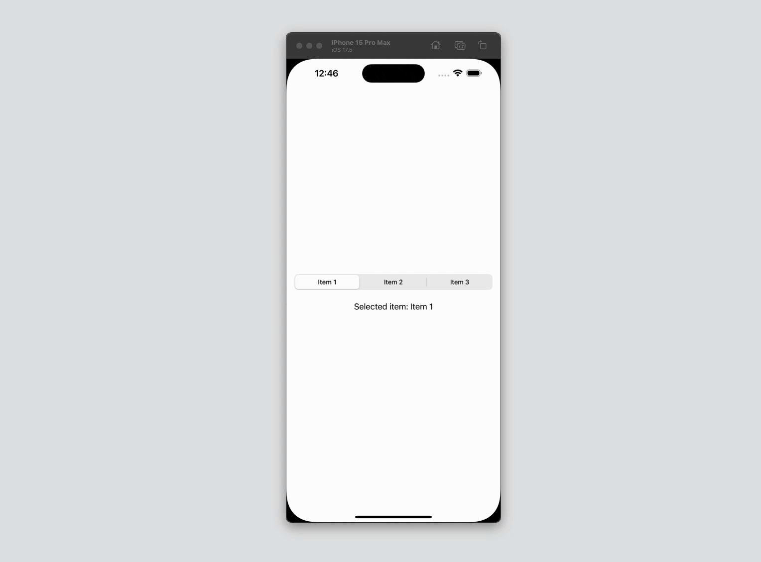
SwiftUI provides a versatile and easy-to-implement segmented control using the Picker view with the .segmented style. This allows developers to offer users a choice between multiple options in a compact, visually appealing manner. This article will demonstrate how to create a segmented control in SwiftUI using Picker with .segmented style.
Code Snippet
import SwiftUI

struct ContentView: View {
    @State private var selectedItem = "Item 1"
    let items = ["Item 1", "Item 2", "Item 3"]

    var body: some View {
        VStack {
            Picker("Select an item", selection: $selectedItem) {
                ForEach(items, id: \.self) { item in
                    Text(item).tag(item)
                }
            }
            .pickerStyle(.segmented)

            Text("Selected item: \(selectedItem)")
                .padding()
        }
        .padding()
    }
}
Code Explanation
@State private var selectedItem = "Item 1": This state variable keeps track of the currently selected item.let items = ["Item 1", "Item 2", "Item 3"]: An array holding the titles of the items.Picker("Select an item", selection: $selectedItem): The Picker view is initialized with a label (“Select an item”) and binds to theselectedItemstate variable.ForEach(items, id: \.self) { item in Text(item).tag(item) }: This loop creates a Text view for each item and tags each item with itself. Thetagis essential for identifying the selected item..pickerStyle(.segmented): This modifier applies the segmented control style to the Picker. Other styles, like.wheel,.menu,.inline, or.palette, can be used for different appearances.Text("Selected item: \(selectedItem)"): This Text view displays the title of the currently selected item, demonstrating how the selected item can be used to update the UI.
Using the Picker view with the .segmented style in SwiftUI is a straightforward way to create segmented controls. This method is not only easy to implement but also integrates seamlessly with the rest of your SwiftUI views. By leveraging the power of state variables and SwiftUI’s declarative syntax, you can create dynamic and interactive UI components that enhance user experience. Whether for toggling between views or filtering content, segmented controls are a valuable tool in your SwiftUI arsenal.