


Overview
Toggles in SwiftUI are a straightforward way to incorporate switch-like functionality into your app’s user interface. They are used to represent and control a Boolean state, such as turning a feature on or off. Toggles are simple to implement and highly customizable, fitting seamlessly into various SwiftUI views. This article will guide you through creating and using a basic Toggle in SwiftUI.
Code Snippet
import SwiftUI
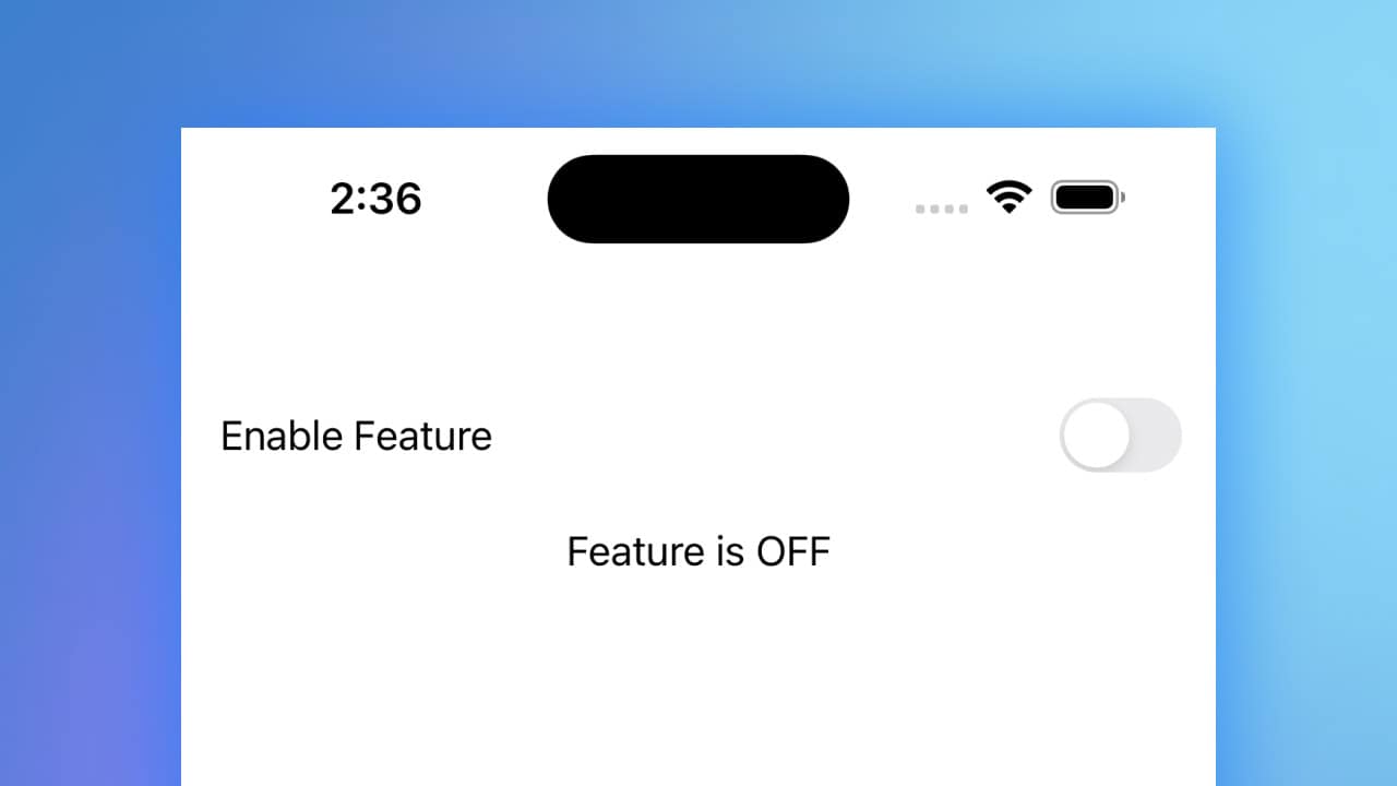
struct ToggleView: View {
@State private var isOn = false
var body: some View {
VStack {
Toggle(isOn: $isOn) {
Text("Enable Feature")
}
.padding()
Text(isOn ? "Feature is ON" : "Feature is OFF")
}
}
}Code Explanation
@State private var isOn = false: This line declares a state variable to keep track of the toggle’s state. The@Stateproperty wrapper is used here because the state will change over time.Toggle(isOn: $isOn): The Toggle view is created with a binding to theisOnstate variable. The$prefix creates a two-way binding, allowing the Toggle to update the state and the state to update the Toggle.Text("Enable Feature"): This Text view serves as the label for the Toggle, providing a description of what the Toggle controls..padding(): This modifier adds padding around the Toggle for better spacing and appearance.Text(isOn ? "Feature is ON" : "Feature is OFF"): This Text view displays the current state of the feature controlled by the Toggle, updating dynamically as the Toggle’s state changes.
Toggles in SwiftUI offer a clean and intuitive way to manage Boolean states within your app’s interface. By leveraging SwiftUI’s state management and binding capabilities, Toggles can be easily integrated and customized to fit various design needs. Whether you’re enabling a setting or toggling a feature, SwiftUI’s Toggle component provides a robust solution for user interaction.