


A Button is a type of control that performs an action when it is triggered. In SwiftUI, a Button typically requires a title text which is the text description of your button, and an action function that will handle an event action when triggered by the user.
Basic Text Button Example
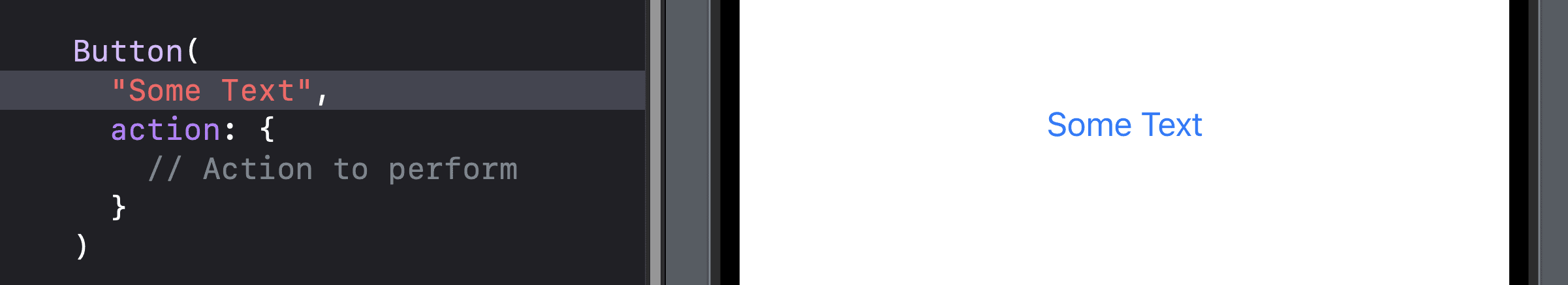
When making a basic Button via autocomplete the format is as shown:
Button(
  "Some Text",
  action: {
    // Action to perform
  }
)
The code within the action will be run whenever the button is clicked. Another way this can be formatted is shown below, which is useful if your ‘action’ code is lengthy:
Button(“Some Text”) {
  // Action to perform
}Download this free kit and save hours of time by referencing or copy-pasting the code for your own project.
Basic Button Styles
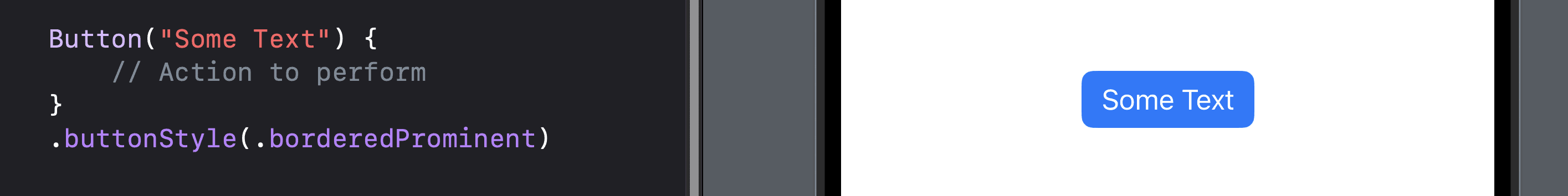
You can use the buttonStyle modifier to change the appearance of your button in several ways:
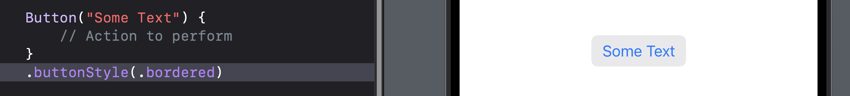
Button ("Some Text") {
  // Action to perform
 }
 .buttonStyle(.bordered)
Bordered
.buttonStyle(.bordered): This will put a rounded grey background behind your button.
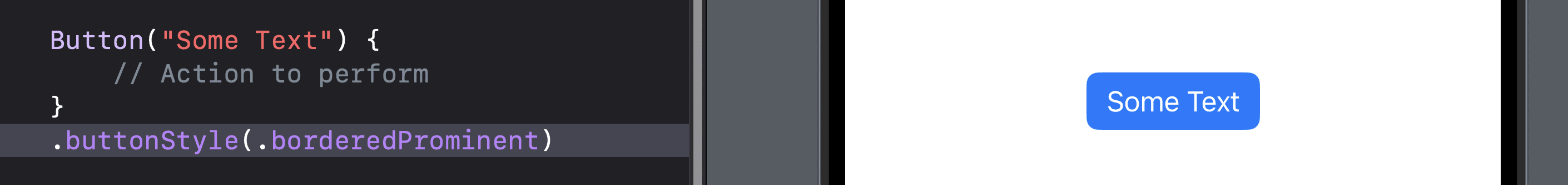
Bordered Prominent
.buttonStyle(.borderedProminent): This will put a rounded colored background behind your button.
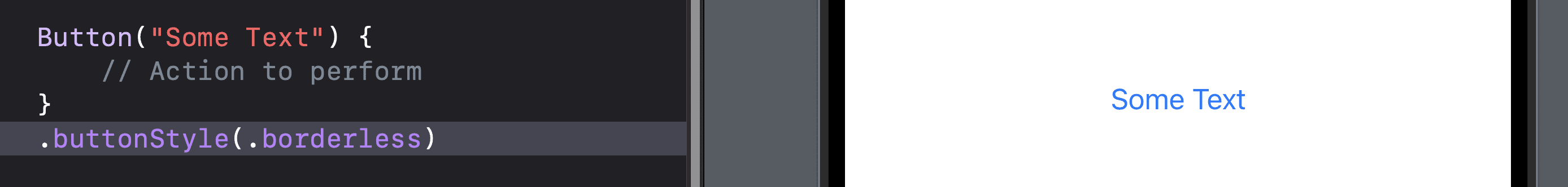
Borderless
.buttonStyle(.borderless): As the name implies, there’ll be no border or background.
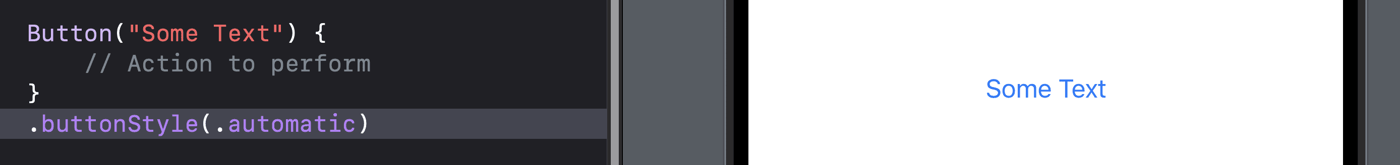
Automatic
.buttonStyle(.automatic): This is platform dependent and the system will decide. On iOS, automatic defaults to borderless.
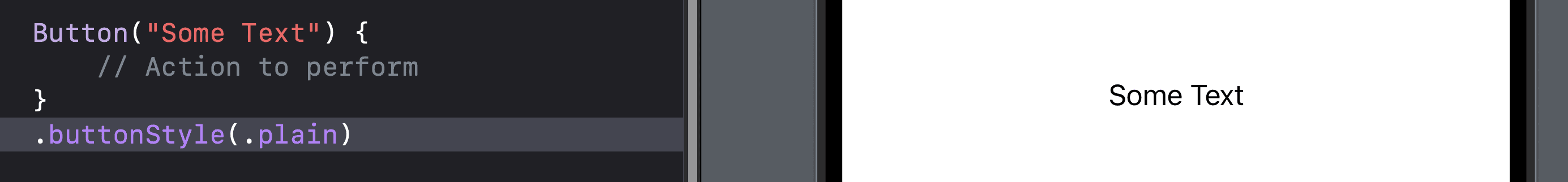
Plain
.buttonStyle(.plain): This will remove all treatment from the button including color and visual states.
Custom Buttons
If the basic text button is too plain, you can actually use whatever view you want to represent your button! That code looks like this:
Button(action: {
    // Action to perform
}) {
    // Custom view for the button
}
For the custom view, you can put an image, an SF Symbol or any combination of views:
SwiftUI Button Examples
Image Button
Use an image as a tappable button.
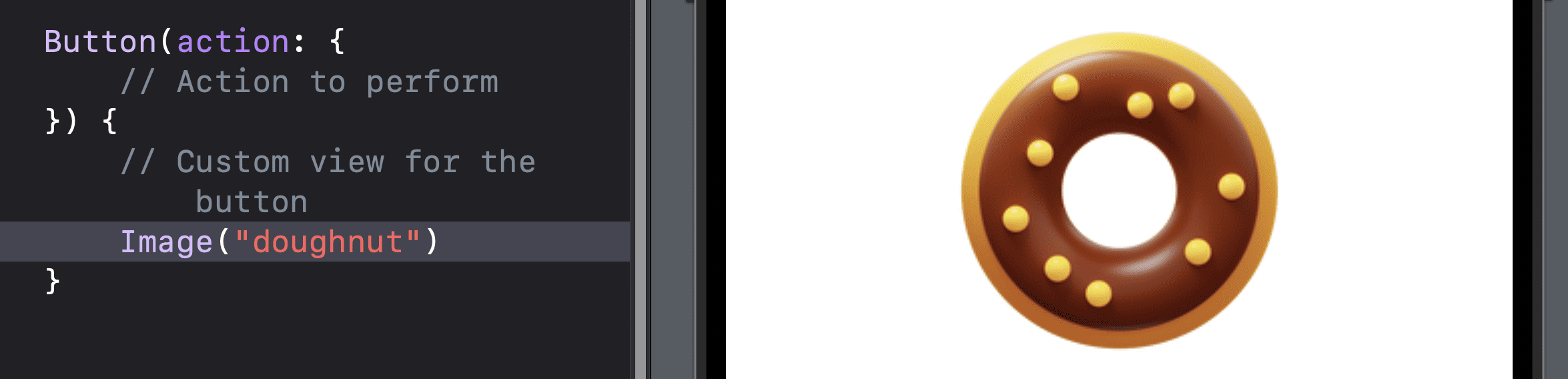
Button(action: {
  // Action to perform
 }) {
   // Image view for the button
  Image("doughnut")
}
Icon and Text Button
Combine an SF Symbol icon and text as a button.
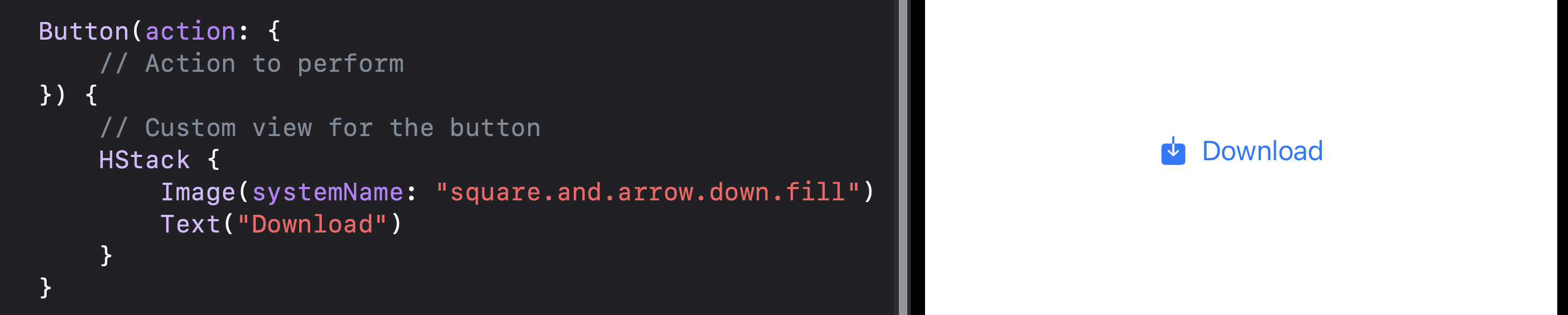
Button(action: {
  // Action to perform
}) {
  // Custom view for the button
  HStack {
    Image(systemName: "square.and.arrow.down.fill")
    Text("Download")
  }
}
Icon Button
Use a lone SF Symbol icon as a button.
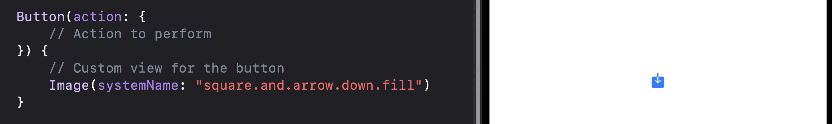
Button(action: {
  // Action to perform
}) {
  // Custom view for the button
  Image(systemName: "square.and.arrow.down.fill")
}
Animated Button
You can combine a button with transform modifiers to create an effect such as scaling the button in this example.
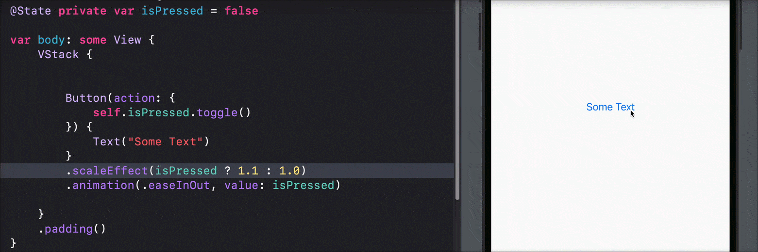
@State private var isPressed = false

Button(action: {
    self.isPressed.toggle()
}) {
    Text("Some Text")
}
.scaleEffect(isPressed ? 1.1 : 1.0)
.animation(.easeInOut, value: isPressed)
Button Styling Modifiers
In addition to the buttonStyle modifier which we covered earlier, you can apply other modifiers to change things like font, colors and size.
Button(“Some Text”) {
  // some code
}
.frame(width: 100, height: 100)
.font(.title)
.foregroundColor(.white)
.background(.blue)
.cornerRadius(10)
Button Accessibility
By using the accessibility modifier, you can make sure your buttons are accessibility friendly.
Button("Some Text") {
  // Action to perform
}
.accessibility(label: Text("Some Text"))
Practical Button Code Sample
@State var counter = 0

VStack {
  Text("\(counter)")

  Button("Increase Count"){ counter += 1 }
  Button(action: { counter = counter - 1 }) {
    Image(systemName: "arrow.down")
  }
  .buttonStyle(.plain)
}
The code above uses two buttons. The first button with the label “Increase Count” will add one to our counter every time it is pressed. The second button, which is a downwards arrow image, will subtract one from our counter when pressed.
Download this free kit and save hours of time by referencing or copy-pasting the code for your own project.