


The ability to visually present data allows developers to create more intuitive and engaging applications. Swift Charts, a powerful and easy-to-use library, takes data visualization in iOS development to a new level.
Today, we’ll focus on creating a bar chart representing the iPhone’s market share across various regions using SwiftUI and Swift Charts. Here’s a step-by-step guide:
Step 1: Data Definition
In Swift, a struct is a custom data type that allows us to compose several pieces of data together. In this case, the iPhone struct combines the region and shares of the iPhone’s market share in each region.
struct iPhone: Identifiable, Equatable {

    let region: String
    let shares: Double

    var id: String { region }

    ...

}
Dummy data for testing
Finally, dummyData is a static array of iPhone instances representing our dataset. ‘Static’ here means that this property belongs to the type itself rather than any one instance of the type. We’re using this array to populate our chart.
struct iPhone: Identifiable, Equatable {

   ...

    static var dummyData: [iPhone] = [
        .init(region: "Worldwide", shares: 27.6),
        .init(region: "North America", shares: 54.76),
        .init(region: "South America", shares: 14.33),
        .init(region: "Asia", shares: 15.94),
        .init(region: "Europe", shares: 35.84),
        .init(region: "Oceania", shares: 55.55),
        .init(region: "Africa", shares: 14.18),
    ]

}
Each iPhone instance in sampleData represents the market share in a specific region. This sample data is utilized in BarMarkChart view to generate a bar for each region, thus creating our bar chart.
Step 2: Add Our Data Source
In this step, We need to introduce two elements: our data source and a method to identify the leading market.
The line let data = iPhone.sampleData is how we initialize our data source for the chart. The next line is leadingMarket a computed property that identify the leading market. Using this we’ll be able to highlight the leading market in our chart later on.
struct BarMarkChart: View {

    let data = iPhone.dummyData

    var leadingMarket: iPhone? {
        data.max { $0.shares < $1.shares }
    }
    // ...
}
Step 3: Chart Composition
At the top of the view, import the Charts framework:
import Charts
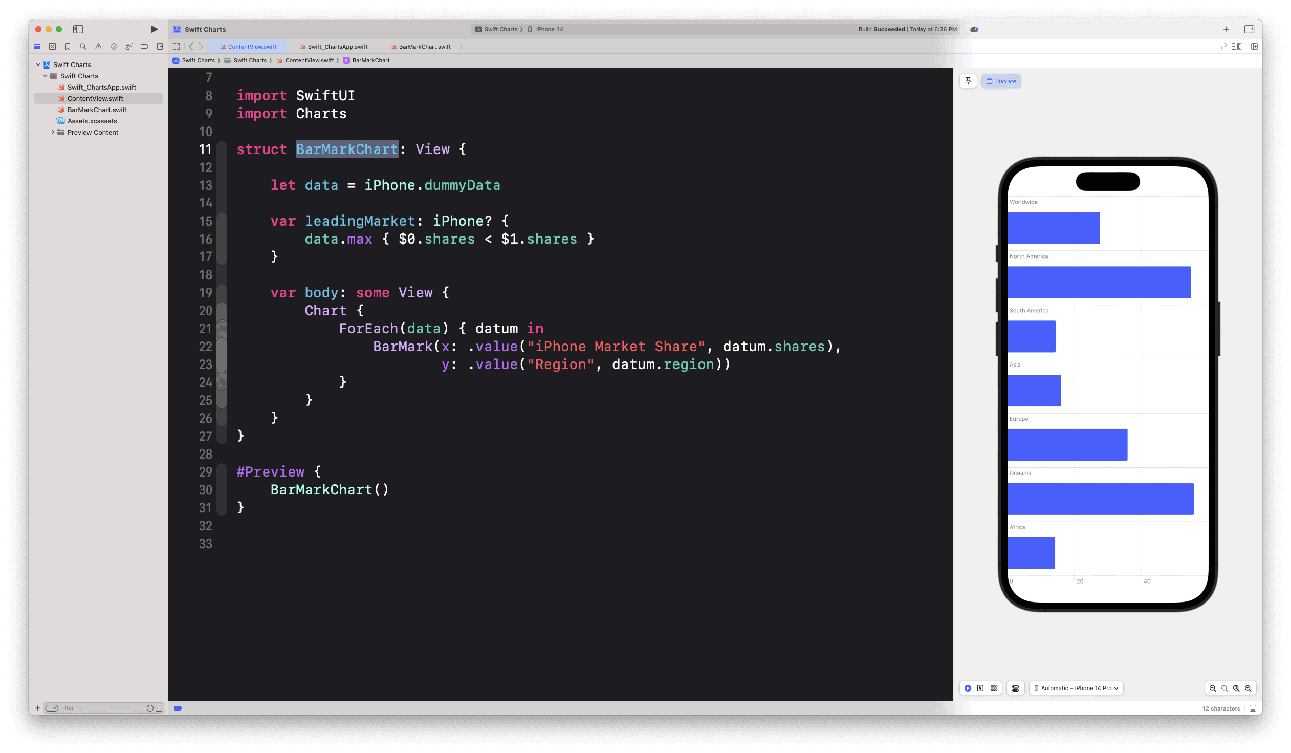
In the body of our BarMarkChart view, we create the chart and iterate through our data array to form each bar:
struct BarMarkChart: View {

    ...

    var body: some View {
        Chart {
                ForEach(data) { datum in
                    BarMark(x: .value("iPhone Market Share", datum.shares),
                            y: .value("Region", datum.region))
                    // ...
                }
            }

            // ...
    }
}
Each BarMark is a representation of the market share (datum.shares) of the iPhone in a specific region (datum.region).
if you try to run your project at this point, you will see similar view to the image below
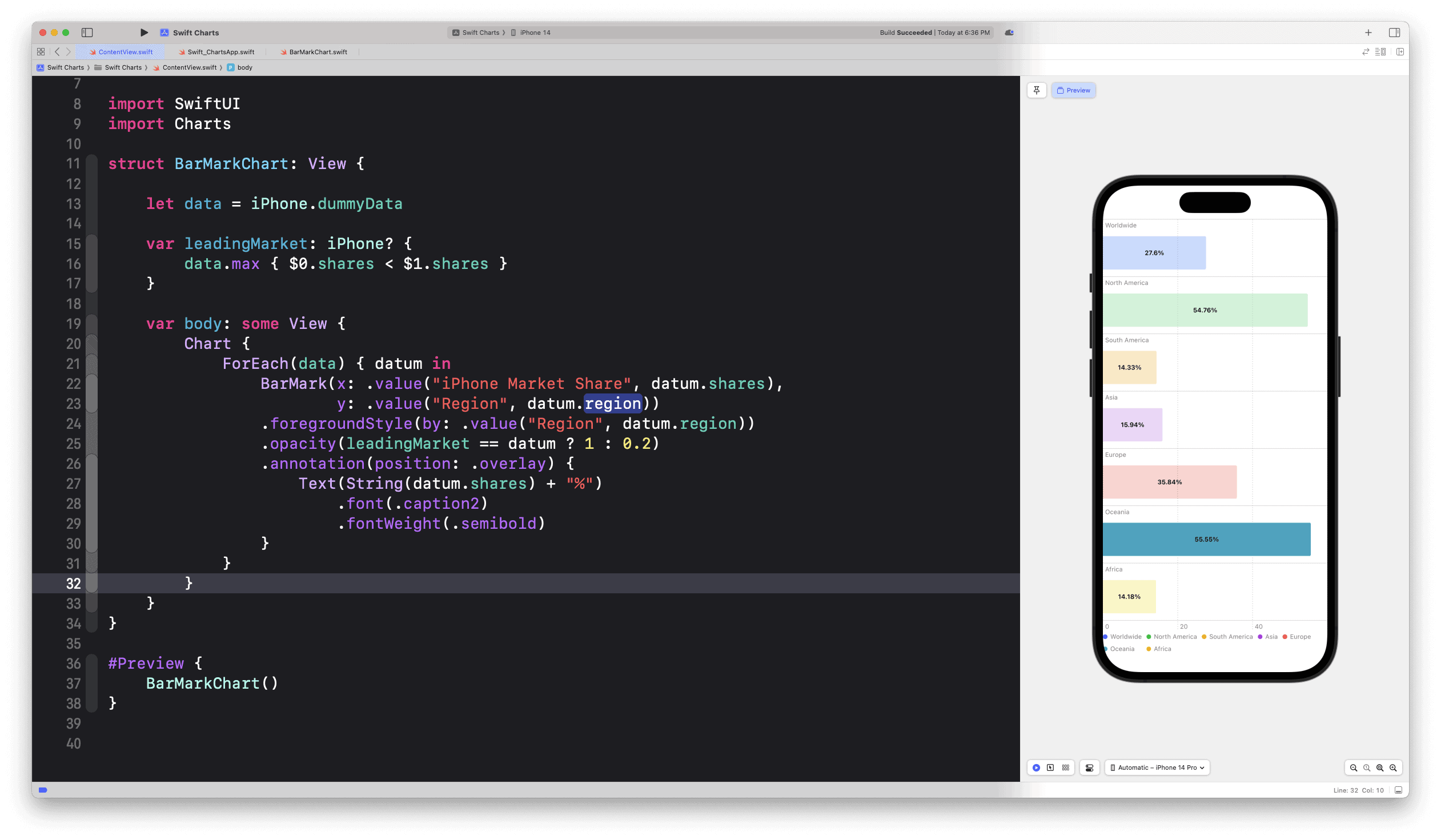
Step 4: Styling and Annotations
Then, we use a conditional statement to adjust the opacity of each bar depending on whether it represents the leading market or not. Furthermore, we annotate each bar with the corresponding market share percentage:
struct BarMarkChart: View {

    // ...

    var body: some View {
        Chart {
            ForEach(data) { datum in
                  BarMark(x: .value("iPhone Market Share", datum.shares),
                          y: .value("Region", datum.region))
                  .foregroundStyle(by: .value("Region", datum.region))
                  .opacity(leadingMarket == datum ? 1 : 0.2)
                  .annotation(position: .overlay) {
                      Text(String(datum.shares) + "%")
                          .font(.caption2)
                          .fontWeight(.semibold)
                  }
              }
          }
      }
}
Run the app, or check your canvas preview. Your view now look similar to this image below
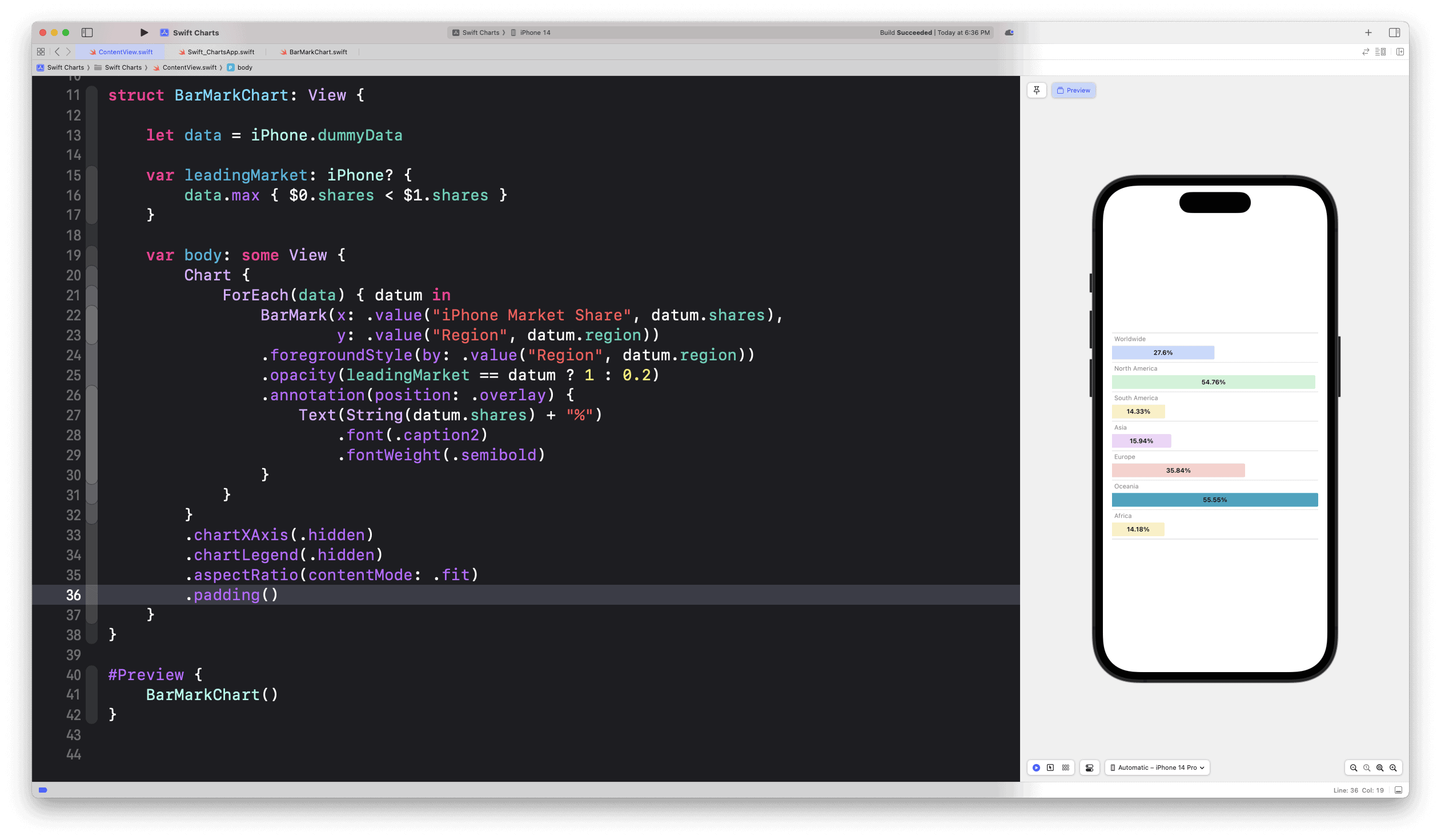
Step 5: Final Chart Adjustments
Finally, we hide the x-axis and legend, set the aspect ratio, and add some padding to our chart for a cleaner, more focused visualization:
var body: some View {
    Chart {
       ForEach(data) { datum in
            // ...
        }
    }
    .chartXAxis(.hidden)
    .chartLegend(.hidden)
    .aspectRatio(contentMode: .fit)
    .padding()

}
Run the app, or check your canvas preview. Your view now look similar to this image below
Good to know
Back in Step 1: Data Definition you may notice The Identifiable and Equatable protocols add on our iPhone model. Here’s why:
Identifiable
The Identifiable protocol is used to uniquely identify each instance of a type. This is particularly crucial when working with SwiftUI, as it needs to understand how to differentiate each item in a collection (like an array) when iterating over it in a ForEach loop. Here, we have var id: String { region } to return the region as the unique ID, as each region is unique in our context.
Equatable
The Equatable protocol allows the Swift compiler to compare instances of a type for equality, using the == and != operators. This is helpful for us to highlight the leading market in the chart (by comparing shares of the instances).
var leadingMarket: iPhone? { data.max { $0.shares < $1.shares } }
And thats it! We have successfully created an interactive and visually appealing bar chart using SwiftUI and Swift Charts. These libraries offer immense flexibility and control over data visualization, making the process of crafting unique, informative graphics a breeze.