Color in SwiftUI can be used in various ways to enhance the appearance of your app. Color can be used in modifiers to change the background or foreground colors of views, or color can be used as a view itself.
Basic Code Sample
Text(“Hello”)
  .foregroundColor(Color.red)
In this example, the text “Hello” will be in red. Note that there are various predefined colors you can use, such as Color.yellow, Color.green, etc.
Color in Modifiers
Text(“Hello World!”)
  .foregroundColor(Color.red)
  .background(Color.blue.opacity(0.5))
We can use Color in various modifiers, such as .background. Note that we can change the color by adding the modifier .opacity, which changes the color’s transparency.
Color as a View
ZStack {
  Color.green
    .edgesIgnoringSafeArea(.all)
  Color.blue.frame(width: 100, height: 100)
}
Here, Color is used as a view. The resulting view will be a blue square of 100px by 100px, on top of a green background. Note that modifiers such as .frame and .edgesIgnoringSafeArea can be used on the Color, just like any other view.
System Colors
Color(.systemRed)
Note that Color can take in system colors, which have two versions that display depending on if the device is in light mode or dark mode. A list of all these system colors and their versions can be found in this link: https://developer.apple.com/design/human-interface-guidelines/ios/visual-design/color/
Custom Colors
Color(red: 0.0, green: 1.0, blue: 1.0)
Color can also take in RGB values to display the color associated with the values. The example above would be a cyan colour.
However, if you choose to define your colors this way, it may be preferable to add Color sets to your project, which is shown below.
Color Sets
Color(“Custom Color”)
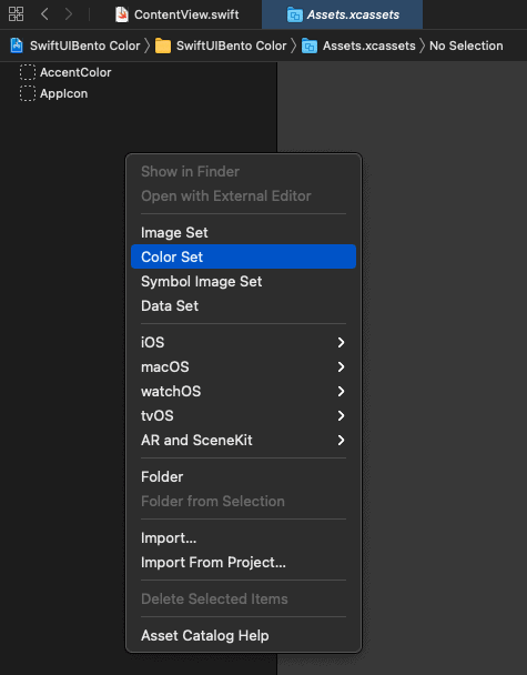
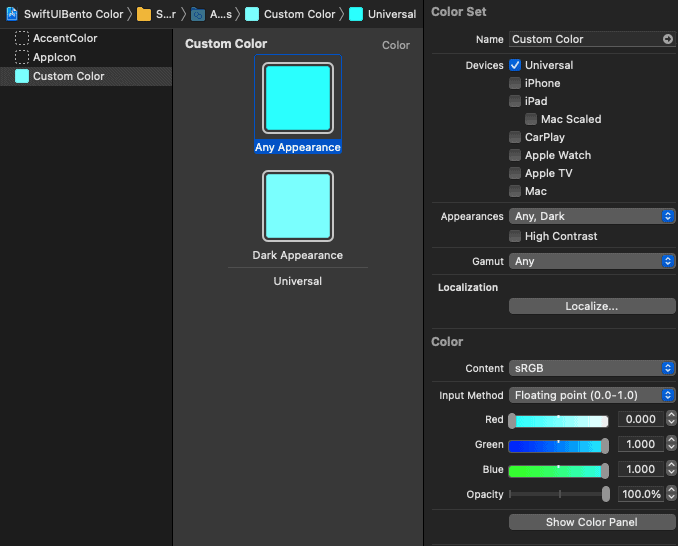
Color sets can be added in the Assets.xcassets of your project, which you can use throughout your views. In this example, we added a Color set named “Custom Color”, and we’re able to define its light mode and dark mode versions using RGB values, hex codes, or system colors. The steps are included in the screenshots below.


