


Overview
This article explores how to use TabView in SwiftUI to create a tab-based navigation interface. We will demonstrate how to add multiple tabs, each with its own content, including text and images, and customize the tab items using the .tabItem modifier.
Code Snippet
import SwiftUI
struct ContentView: View {
var body: some View {
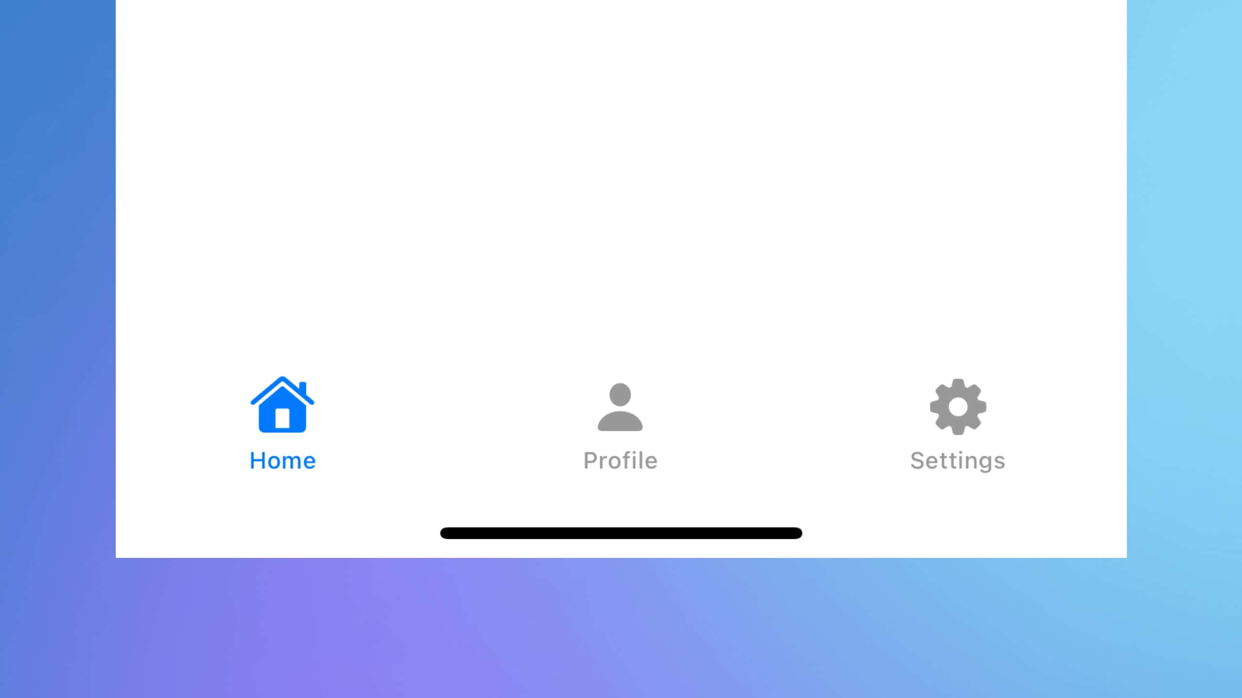
TabView {
FirstTabView()
.tabItem {
Label("Home", systemImage: "house")
}
SecondTabView()
.tabItem {
Label("Profile", systemImage: "person")
}
ThirdTabView()
.tabItem {
Label("Settings", systemImage: "gearshape")
}
}
}
}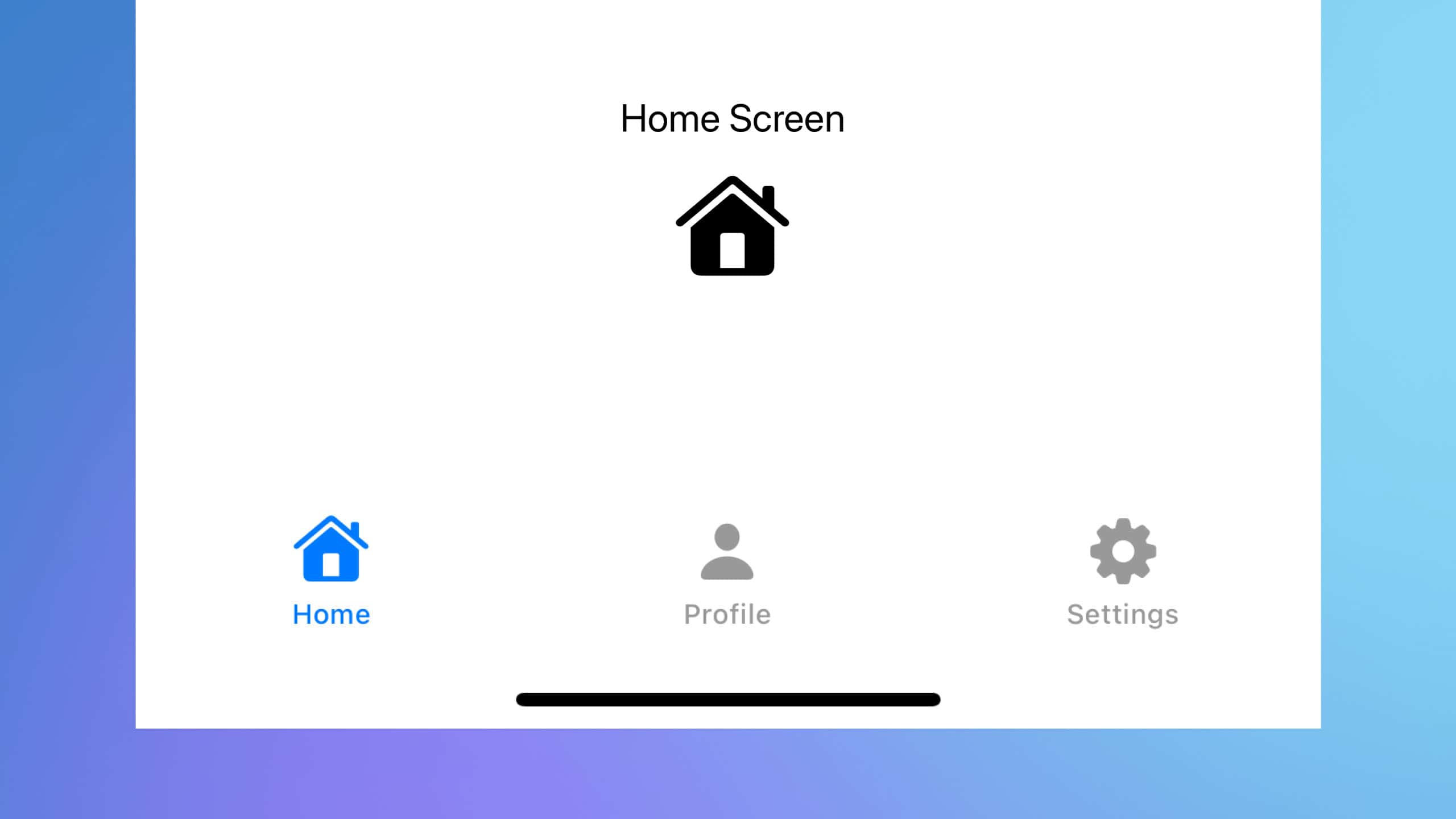
struct FirstTabView: View {
    var body: some View {
        VStack {
            Text("Home Screen")
                .font(.largeTitle)
                .padding()
            Image(systemName: "house.fill")
                .resizable()
                .scaledToFit()
                .frame(width: 100, height: 100)
        }
    }
}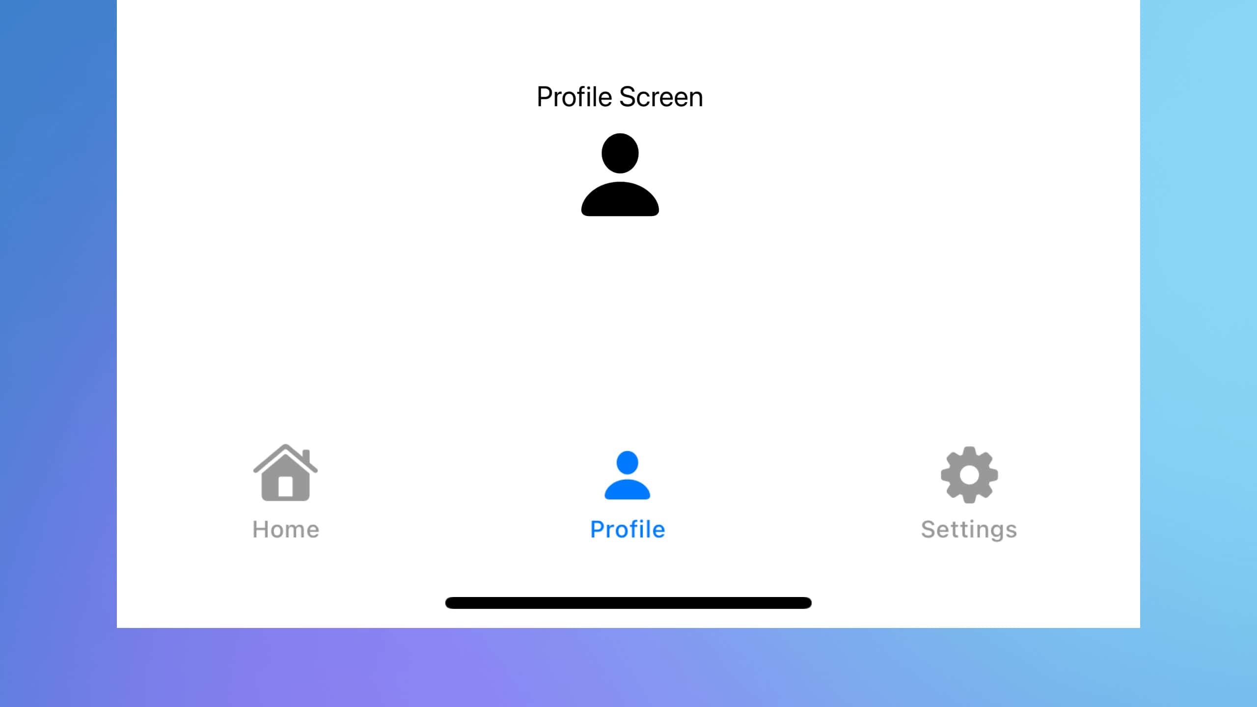
struct SecondTabView: View {
    var body: some View {
        VStack {
            Text("Profile Screen")
                .font(.largeTitle)
                .padding()
            Image(systemName: "person.fill")
                .resizable()
                .scaledToFit()
                .frame(width: 100, height: 100)
        }
    }
}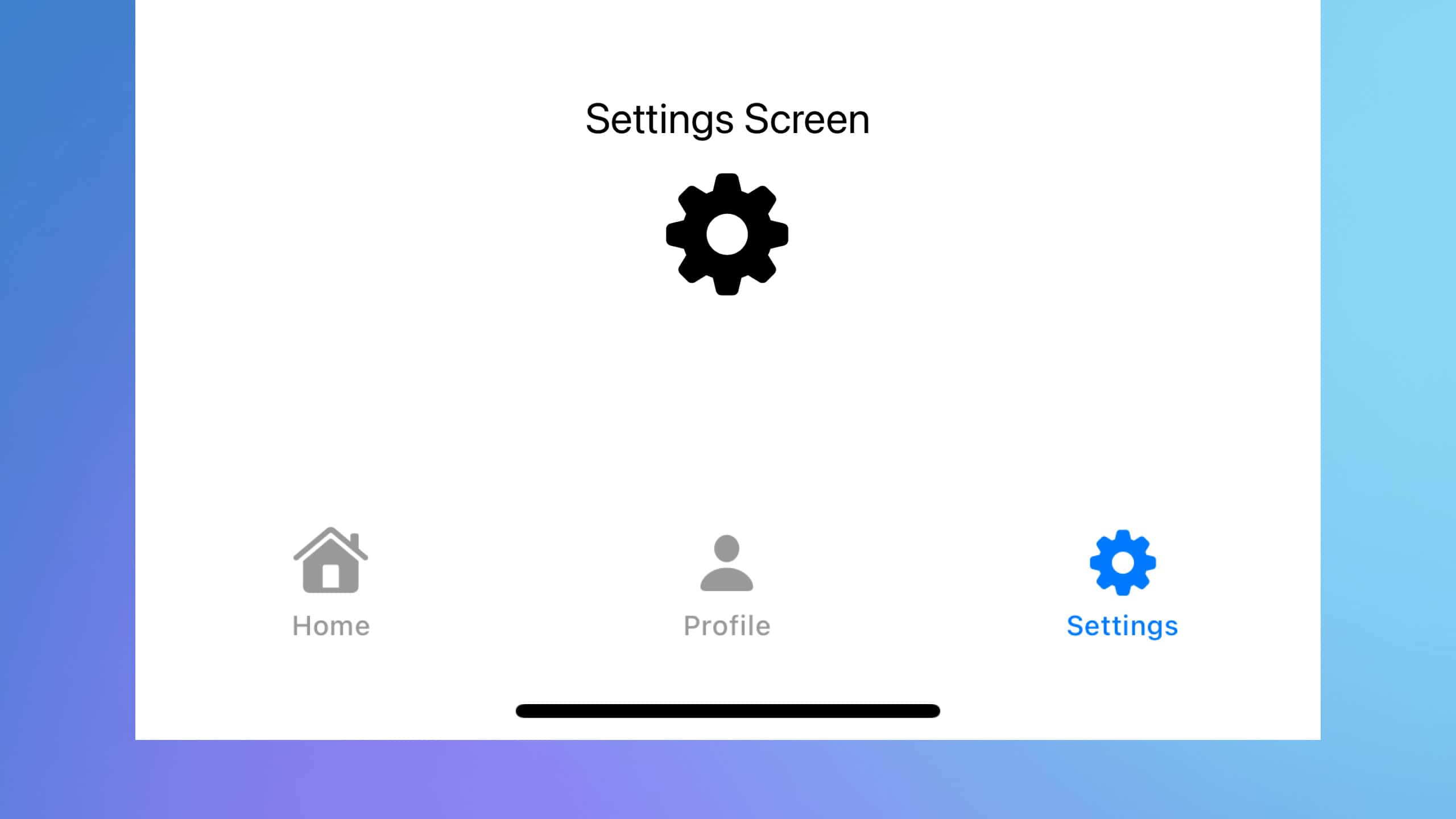
struct ThirdTabView: View {
    var body: some View {
        VStack {
            Text("Settings Screen")
                .font(.largeTitle)
                .padding()
            Image(systemName: "gearshape.fill")
                .resizable()
                .scaledToFit()
                .frame(width: 100, height: 100)
        }
    }
}
Code Explanation
ContentView: The main view struct containing the
TabView.- TabView: The container that holds the tabs.
- FirstTabView, SecondTabView, ThirdTabView: These are the content views for each tab.
- .tabItem: This modifier specifies the label and icon for each tab using the
Labelview.Label("Home", systemImage: "house"): Creates a label with the text “Home” and a house icon for the Home tab.Label("Profile", systemImage: "person"): Creates a label with the text “Profile” and a person icon for the Profile tab.Label("Settings", systemImage: "gearshape"): Creates a label with the text “Settings” and a gear icon for the Settings tab.
FirstTabView, SecondTabView, ThirdTabView: Structs representing the content of each tab.
- VStack: A vertical stack to arrange the text and image vertically.
- Text(“…”): Displays the title of the screen.
- Image(systemName: “…”): Displays an image. The
systemNameparameter specifies a built-in SF Symbols icon. - .resizable(): Makes the image resizable.
- .scaledToFit(): Scales the image to fit within the specified frame.
- .frame(width: 100, height: 100): Sets the frame of the image to 100×100 points.
Bonus: Labelling Tabs and Changing the Default Tab
struct ContentView: View {
    @State private var selection = 2

    var body: some View {
        TabView(selection:$selection) {
            FirstTabView()
            .tabItem {
                Label("Home", systemImage: "house")
            }
            .tag(1)

            SecondTabView()
            .tabItem {
                Label("Profile", systemImage: "person")
            }
            .tag(2)

            ThirdTabView()
            .tabItem {
                Label("Settings", systemImage: "gearshape")
            }
            .tag(3)
        }
    }
}
TabView can take in a selection binding, which we can declare using @State such as in line 2. This will determine which tab to initially display. The tag modifiers to each tab/child view are labels for selection. The code above will initially display the tab with tag(2), which is found on line 16. The tag and selection can be anything from numbers 1, 2, 3 to strings "First", "Second", "third".
Creating a TabView in SwiftUI is a straightforward process that can greatly enhance the navigation and user experience of your app. By organizing content into tabs, you provide a clean and intuitive interface for users to switch between different sections of your app. This example demonstrates the basics, but TabView can be customized and extended in many ways to fit the specific needs of your app. Experiment with different tab items, content views, and styles to create a unique and user-friendly interface.