
Each stage builds on the previous one. Work through them in order and you’ll go from zero to shipping a real SwiftUI app.
Learn SwiftUI Stage 1: Your First SwiftUI View
You’ve been writing Swift logic — variables, functions, loops, structs. Now something exciting happens: you’re about to make something you can actually see.
This stage runs across 6 lessons and each one takes roughly 20 to 35 minutes. You’ll need Xcode installed and the canvas preview open as you work through the code examples. If you don’t see the canvas, go to Editor > Canvas in the menu bar, or press Option + Command + Return. If the preview is paused, click Resume or press Option + Command + P to bring it back to life.
Don’t skip the challenge at the end of each lesson. They’re short and they’re how you convert watching into doing. By the time you finish Stage 1, you’ll be able to explain how declarative UI works, place Text, Image, and Button views on screen, style them with modifiers, arrange them using VStack, HStack, and ZStack, and build a complete, polished profile card layout entirely from scratch.
Before you write a single line of SwiftUI code, there’s a mental shift you need to make. It’s not a big one, but skipping it causes a lot of confusion later. This lesson is about that shift — and it’s entirely conceptual. No code yet.
You’ve been writing Swift in a style called imperative programming. You tell the computer exactly what to do, step by step. “Create a variable. Loop through this array. Call this function.” The computer follows your instructions in sequence. That’s the approach you’ve been using and it works great for logic, data, and algorithms.
SwiftUI uses a completely different approach called declarative programming. Instead of telling the computer how to build your interface step by step, you describe what you want it to look like — and SwiftUI figures out how to make it happen. By the end of this lesson, you’ll have a clear mental model of what that actually means, and why it changes everything about the way you build screens.
The Restaurant Analogy
Here’s the clearest way I know to explain the difference. Imagine you’re hungry.
Imperative approach: You walk into the kitchen, find a pan, turn on the stove, add oil, crack two eggs, wait until the edges set, flip once, plate it, add salt. You are doing every step yourself, in order.
Declarative approach: You sit down at a restaurant and say “I’d like two eggs over easy, please.” You describe the result you want. The kitchen figures out how to make it happen.
SwiftUI is the restaurant. You describe your interface — “I want a blue button, centered on screen, with the text ‘Get Started'” — and SwiftUI handles everything needed to actually draw it. You don’t manage pixels, layout passes, or drawing calls. You just describe the outcome.
What “You Describe, SwiftUI Renders” Actually Means
In SwiftUI, your job is to write code that describes the current state of your interface. SwiftUI watches that description and keeps the screen in sync with it automatically.
Think about a light switch. Imperatively, you’d say: “When someone taps the switch, reach into the screen, find the light bulb image, change its color from gray to yellow, then update the label underneath.” Declaratively, you’d say: “When isOn is true, show a yellow bulb. When it’s false, show a gray bulb.” SwiftUI watches isOn and updates the screen whenever it changes. You describe the two possible states — SwiftUI handles the transitions.
This is one of the biggest reasons SwiftUI code tends to be shorter and easier to read than the older UIKit approach. You’re not writing instructions for every possible change. You’re writing a description of how things should look given any possible state.
Why This Matters for You Right Now
If you try to approach SwiftUI the same way you’d write imperative code, you’ll fight it constantly. You’ll want to “reach in and change” things manually, and you’ll be confused when that doesn’t work the way you expect. The moment you stop thinking about commands and start thinking about descriptions, SwiftUI clicks.
Don’t worry if this still feels a bit abstract. It will become concrete the moment you start writing actual views in Lesson 1.2. This lesson is just making sure the mental model is in place before the code arrives.
One More Thing: Views Are Structs
In SwiftUI, everything you see on screen is a view. A piece of text is a view. A button is a view. An image is a view. Even the invisible containers that arrange other views are views.
Here’s the Swift connection: every SwiftUI view is a struct that conforms to the View protocol. You already know what structs are. A SwiftUI view is just a struct with one required property — body — that returns a description of what should be on screen.
When you open a new SwiftUI project in Xcode, you’ll see a struct called ContentView with a body property already in place. That’s the pattern. Every view you ever build will follow it.
Using AI to Test Your Mental Model
AI tools are great for testing whether you actually understand a concept — not just whether you’ve read about it. Try these prompts to pressure-test what you just learned before moving on to Lesson 1.2.
Before moving to Lesson 1.2, write a two or three sentence explanation of the difference between declarative and imperative UI — in your own words, as if you’re explaining it to a friend who has never coded. Don’t use the restaurant analogy. Come up with your own. If you can do this, the mental model is in place.
This is the lesson where things get real. You’re going to place your first views on screen and see them appear in the canvas preview. That moment — when you type a line of code and a button or a piece of text appears instantly on the right side of your screen — is one of those small milestones worth appreciating. It never gets old.
In SwiftUI, every visual element is a view. Text is a view. Images are views. Buttons are views. They’re all structs that conform to the View protocol, and they all live inside the body property of your ContentView. You already know what structs and protocols are — here you’re seeing them used in a very practical, visual context.
By the end of this lesson, you’ll know how to place Text, Image, and Button views in your interface, and you’ll understand the basic structure that every SwiftUI view file shares.
The ContentView Template
When you create a new SwiftUI project in Xcode, it generates a file called ContentView.swift that looks like this:
// Import the SwiftUI framework — this gives you access to all SwiftUI views and tools
import SwiftUI
// Define a struct called ContentView that conforms to the View protocol
struct ContentView: View {
// body is a computed property that returns what this view looks like
var body: some View {
// This is where you place your views — SwiftUI renders whatever you put here
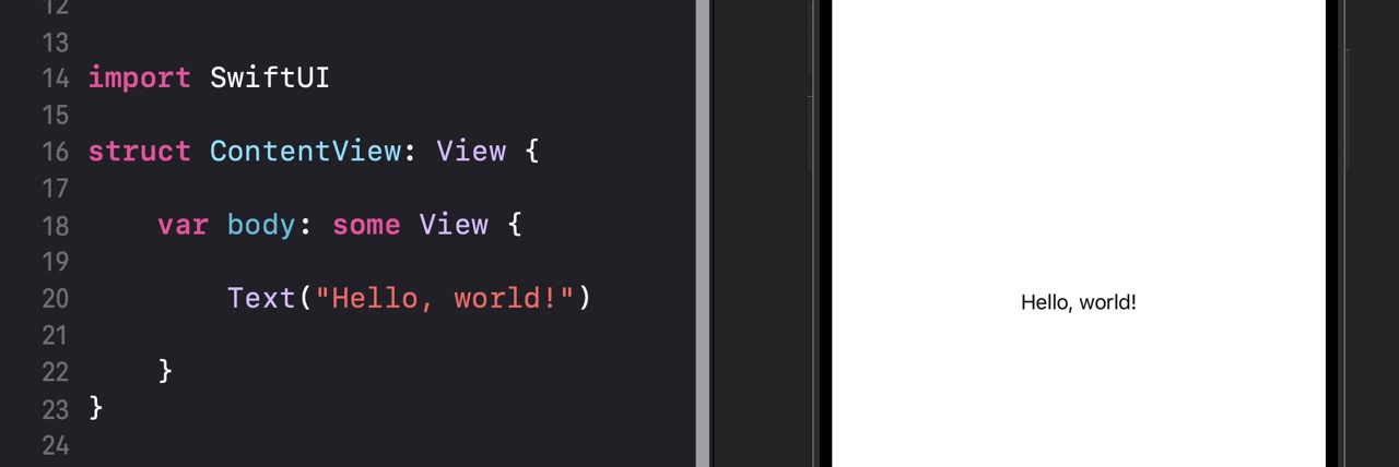
Text("Hello, world!")
}
}
| Line | What it does |
|---|---|
import SwiftUI |
Loads the SwiftUI framework so you can use all of its views, modifiers, and tools. You’ll have this at the top of every SwiftUI file. |
struct ContentView: View |
Defines a new struct called ContentView and says it conforms to the View protocol. Any type that conforms to View must have a body property. |
var body: some View |
The required property that every View must have. It returns “some View” — meaning it returns some kind of view, but SwiftUI handles the specifics. You describe what goes here. |
Text("Hello, world!") |
Creates a Text view displaying the string you pass in. This is the simplest possible view — one line, and it shows up on screen immediately. |
some View? The keyword some means “an opaque type.” You’re telling Swift “this returns some concrete type that conforms to View, but I’m not going to specify exactly which one.” It lets you return complex combinations of views without worrying about naming every type involved. For now, just treat some View as the return type for every view’s body.
The Three Foundation Views
// Text displays any string you pass to it
Text("Welcome to SwiftUI")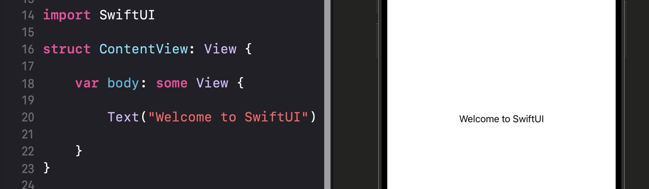
Text is the most basic building block in SwiftUI. Pass any String and it renders it on screen in the system font. You’ll chain modifiers onto it to control font size, color, weight, and more — that comes in Lesson 1.3.// Use systemName: to load an icon from SF Symbols (Apple's free icon library)
Image(systemName: "star.fill")
// Or load an image you've added to your Assets.xcassets folder
Image("profile-photo")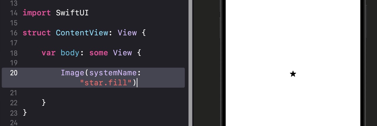
Image has two common forms. systemName: loads icons from SF Symbols — Apple’s built-in library of thousands of free icons that you can use in any app. The other form loads images you’ve added to your project’s asset catalog. You’ll use SF Symbols constantly throughout your SwiftUI career.// Button takes two arguments: an action closure and a label closure
Button(action: {
// This code runs when the user taps the button
print("Button tapped!")
}) {
// This is what the button looks like
Text("Get Started")
}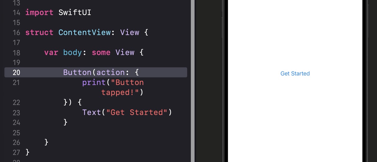
Button takes two things: an action (what happens when it’s tapped) and a label (what it looks like). The action is a closure — a block of code that runs when the user taps. The label can be any view, not just text. You’ll see Image icons, combinations of text and icons, and more as you go further.Button("Get Started") { print("tapped") }. This is shorthand for the same thing — the label is inferred from the string, and the trailing closure is the action. Both forms work the same way.
Quick Reference
| Syntax | What It Does |
|---|---|
| Text(“Hello”) | Displays a string on screen in the default system font |
| Image(systemName: “star.fill”) | Displays an SF Symbol icon by name |
| Image(“photo-name”) | Displays an image from your asset catalog |
| Button(action: { }) { } | Creates a tappable button with an action and a label view |
| Button(“Label”) { } | Shorthand button with a string label and trailing action closure |
| var body: some View | Required property in every SwiftUI view — returns what to display |
Using AI to Go Further
In your ContentView, place three things on screen: a person icon using Image(systemName: "person.circle.fill"), a Text view with your name (or any name), and a Button with the label “Follow”. They’ll stack on top of each other for now — that’s fine, layout comes in Lesson 1.4. The goal is just to have all three visible in the canvas preview at the same time.
body. If you try to put three views there without a container, you’ll get an error. Try wrapping them in a VStack { } — we’ll cover that properly in Lesson 1.4.
Right now, your views exist — but they look pretty plain. The text is a default size, the button is unstyled, and the image is tiny. That’s where modifiers come in. Modifiers are how you style and configure views in SwiftUI, and they’re one of the most powerful ideas in the whole framework.
If you’ve used CSS for web development, modifiers will feel familiar. If you haven’t, here’s the analogy: think of a modifier like an adjective. A plain noun is “a button.” Add modifiers and it becomes “a large, bold, blue, rounded button with padding.” Each modifier adds one quality to the view, and you can chain as many as you need.
By the end of this lesson, you’ll know how to chain modifiers confidently, understand why the order of modifiers matters, and use the most common ones: .font(), .foregroundStyle(), .padding(), .background(), .cornerRadius(), and .frame().
How Modifiers Work
A modifier is a method you call on a view by typing a dot after it. It returns a new, modified view. Chain multiple modifiers by adding another dot. Here’s a simple example:
// Start with a Text view
Text("Hello, SwiftUI!")
    // Make the font large and bold
    .font(.largeTitle)
    .fontWeight(.bold)
    // Change the text color to blue
    .foregroundStyle(.blue)
    // Add breathing room around the text
    .padding()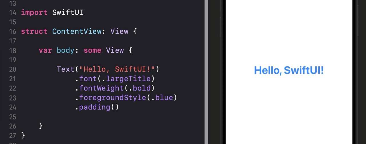
| Line | What it does |
|---|---|
Text("Hello, SwiftUI!") |
Creates the base text view with default styling. |
.font(.largeTitle) |
Sets the font to Apple’s built-in “largeTitle” style — a large, prominent size used for main headings. |
.fontWeight(.bold) |
Makes the font bold. You can also use .semibold, .medium, .light, and others. |
.foregroundStyle(.blue) |
Sets the text color to blue. This is the modern SwiftUI way to set color (replaces the older .foregroundColor). |
.padding() |
Adds equal spacing on all four sides of the view using the system default padding amount. |
.padding() applied before .background(.yellow) gives you a yellow background that includes the padding. Reverse the order and the yellow background only covers the text — the padding sits outside it. This trips up a lot of beginners. When something looks wrong, try reordering your modifiers.
The Essential Modifiers
// Built-in font styles scale automatically with the user's accessibility settings
Text("Large Title").font(.largeTitle)
Text("Title").font(.title)
Text("Headline").font(.headline)
Text("Body").font(.body)
Text("Caption").font(.caption)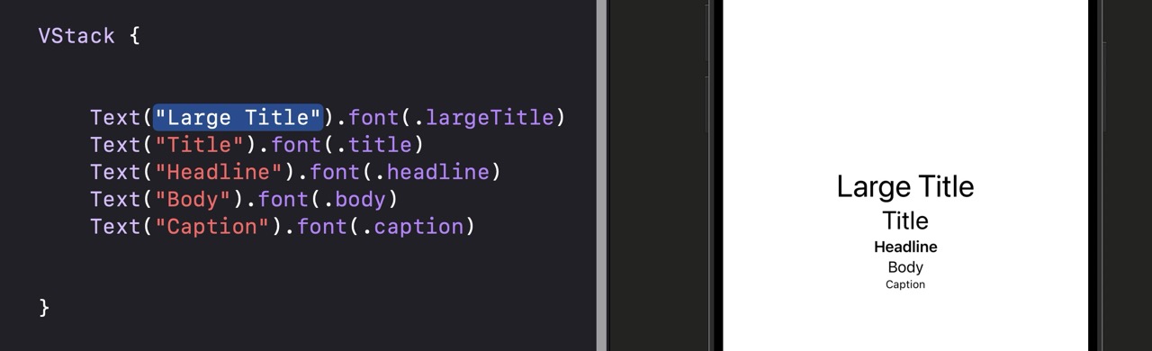
.largeTitle, .title, .headline, .body, and .caption instead of hardcoded point sizes. These respect the user’s Dynamic Type settings so your app stays accessible.// Set text color using built-in Color values
Text("Ocean").foregroundStyle(.blue)
Text("Fire").foregroundStyle(.orange)
Text("Muted").foregroundStyle(.secondary).foregroundStyle() is the modern way to set text color in SwiftUI. .secondary is especially useful — it gives you an automatically appropriate muted color that adapts to light and dark mode.// Default padding on all sides
Text("All sides").padding()
// Specific amount on all sides
Text("Custom amount").padding(20)
// Padding on specific edges only
Text("Top only").padding(.top, 16).padding() with no arguments adds a system-default amount on all sides — usually 16 points. Pass a number to specify the exact amount. Pass an edge like .top, .bottom, .leading, or .trailing to target specific sides.// Yellow background fills only the text area
Text("Highlighted")
.background(.yellow)
// Adding padding BEFORE background extends the colored area
Text("With padding")
.padding()
.background(.yellow).background() fills the area of whatever view it’s applied to — which changes depending on what modifiers came before it. Padding before background = larger background. Background before padding = tighter background.// A rounded button appearance using padding, background, and cornerRadius together
Text("Get Started")
.padding()
.background(.blue)
.foregroundStyle(.white)
.cornerRadius(12)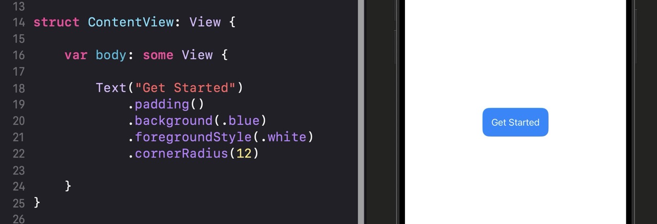
.padding(), .background(), and .cornerRadius() and you have a professional-looking button without any custom drawing. A radius of 8 to 16 is common for buttons; higher values create more pill-like shapes.// Fixed size
Color.blue
.frame(width: 100, height: 100)
// Full width, fixed height
Color.green
.frame(maxWidth: .infinity, height: 50).frame() sets explicit dimensions. Use width: and height: for fixed sizes. Use maxWidth: .infinity to make a view expand to fill all available horizontal space — this is very common for full-width buttons and backgrounds.Quick Reference
| Modifier | What It Does |
|---|---|
| .font(.largeTitle) | Sets text to a semantic font size that respects Dynamic Type |
| .fontWeight(.bold) | Sets the weight of the text — bold, semibold, medium, light, etc. |
| .foregroundStyle(.blue) | Sets the text or icon color |
| .padding() | Adds default spacing on all sides |
| .padding(.top, 16) | Adds 16pt padding on a specific edge |
| .background(.yellow) | Sets a background color behind the view |
| .cornerRadius(12) | Rounds the corners by the given number of points |
| .frame(width: 100, height: 100) | Sets a fixed size for the view |
| .frame(maxWidth: .infinity) | Expands the view to fill all available width |
Using AI to Go Further
Using only Text and modifiers (no actual Button yet), create something in your canvas that looks like a tappable button. It should have a background color, rounded corners, white text, and visible padding. Aim for something you’d actually want in a real app — not just a blue rectangle with “button” on it. Check your canvas preview to verify the result looks right.
Text("...").font(.headline).foregroundStyle(.white).padding().background(.blue).cornerRadius(12) as a starting point, then customize it from there.
So far your views have been sitting alone on screen. That works for a single element, but real app interfaces combine dozens of views — some stacked vertically, some side by side, some layered on top of each other. This lesson is about the three containers that make all of that possible.
Think about how you’d describe a physical layout: “the label is above the button,” “the icon is to the left of the title,” “the badge is on top of the image.” SwiftUI has a container for each of those relationships. VStack for vertical, HStack for horizontal, and ZStack for layered. You nest views inside them like items in a box.
By the end of this lesson, you’ll know how each stack works, how to combine them, and how to control alignment and spacing. These three containers are the backbone of virtually every SwiftUI layout you’ll ever build.
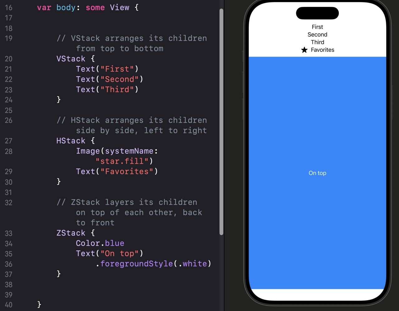
How Stacks Work
// VStack arranges its children from top to bottom
VStack {
    Text("First")
    Text("Second")
    Text("Third")
}

// HStack arranges its children side by side, left to right
HStack {
    Image(systemName: "star.fill")
    Text("Favorites")
}

// ZStack layers its children on top of each other, back to front
ZStack {
    // Background layer — renders first, appears furthest back
    Color.blue
    // Foreground layer — renders last, appears on top
    Text("On top")
        .foregroundStyle(.white)
}
| Container | How it arranges children |
|---|---|
VStack { } |
Stacks views vertically — first child at the top, last child at the bottom. |
HStack { } |
Arranges views horizontally — first child on the left, last child on the right. |
ZStack { } |
Layers views on top of each other — first child furthest back, last child on top. |
The Three Stack Containers
// VStack with leading alignment and custom spacing between items
VStack(alignment: .leading, spacing: 12) {
    Text("Chris Ching")
        .font(.title)
        .fontWeight(.bold)
    Text("iOS Developer")
        .font(.subheadline)
        .foregroundStyle(.secondary)
}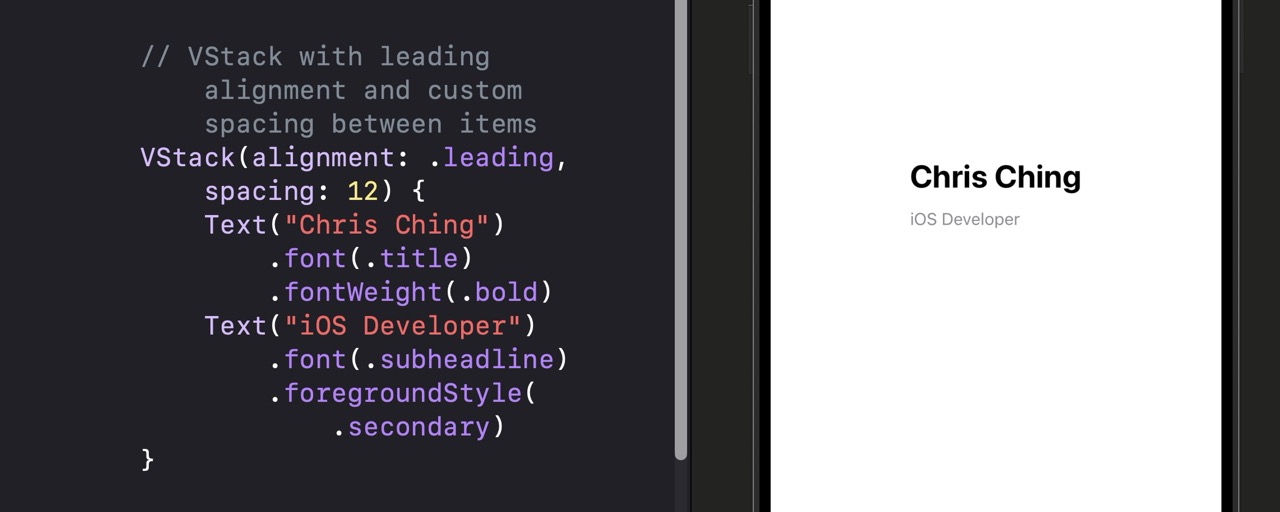
alignment: controls how children line up horizontally within the stack — .leading (left), .center (default), or .trailing (right). spacing: controls the gap between each child view in points.// HStack with a Spacer to push views to opposite ends
HStack {
Text("Username")
.font(.headline)
// Spacer expands to fill all available space between the two views
Spacer()
Image(systemName: "chevron.right")
.foregroundStyle(.secondary)
}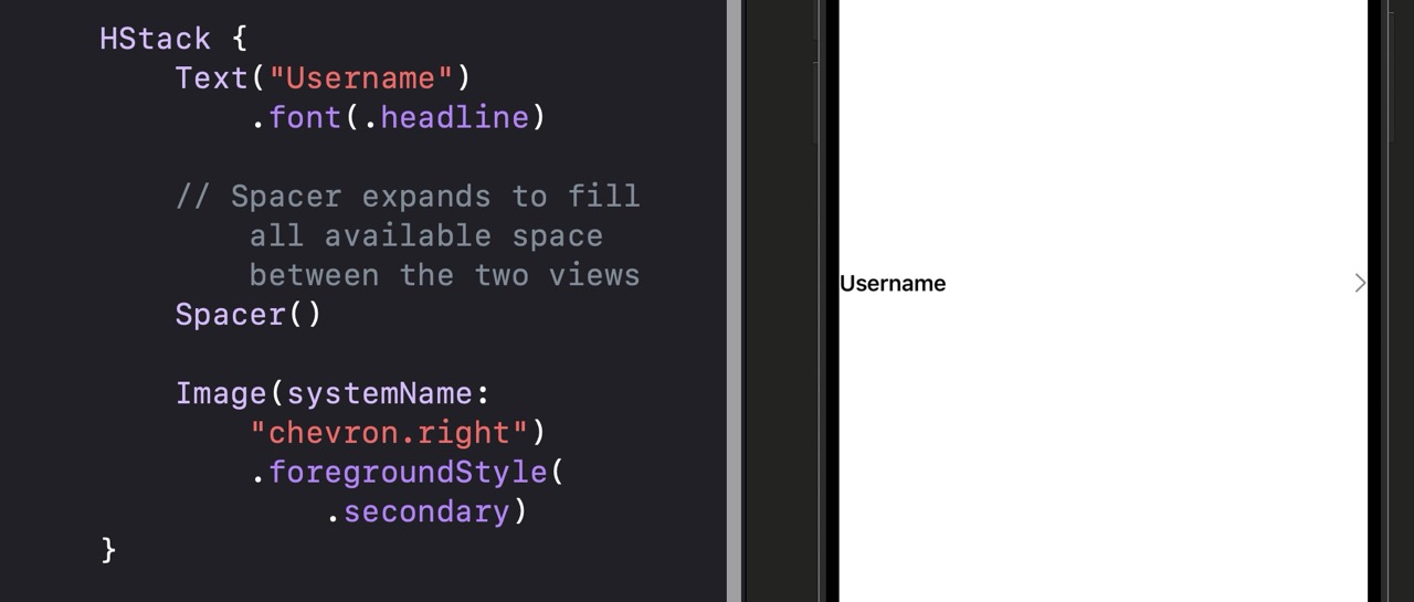
Spacer() is one of the most useful tools in SwiftUI layouts. It expands to fill all available space in the direction of the stack — which pushes neighboring views apart. An HStack with a Spacer in the middle pushes the left view to the left edge and the right view to the right edge.// ZStack for a card with an image and a text overlay
ZStack(alignment: .bottomLeading) {
// The background image fills the frame
Color.blue
.frame(width: 300, height: 200)
.cornerRadius(16)
// Text sits on top, aligned to the bottom left
Text("Mountain View")
.font(.title2)
.fontWeight(.bold)
.foregroundStyle(.white)
.padding()
}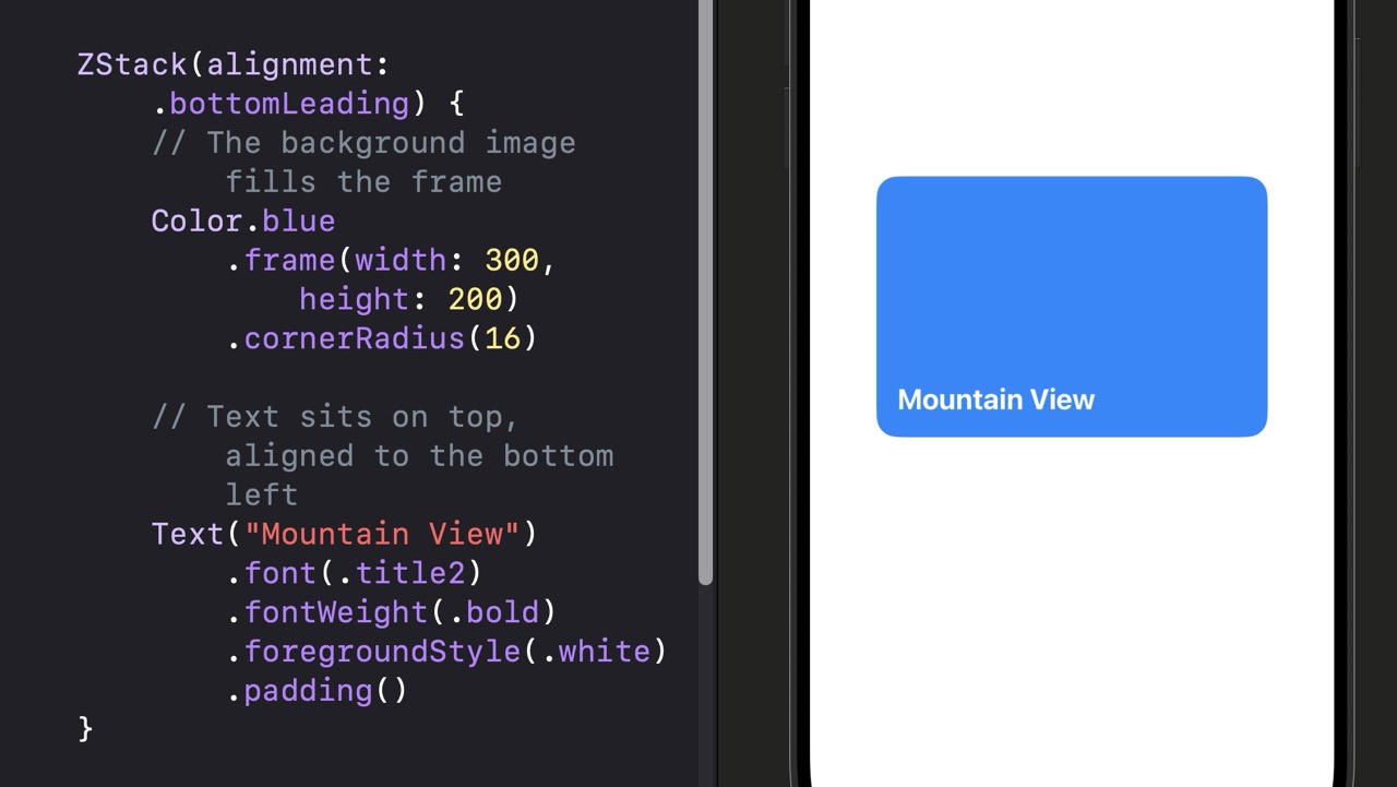
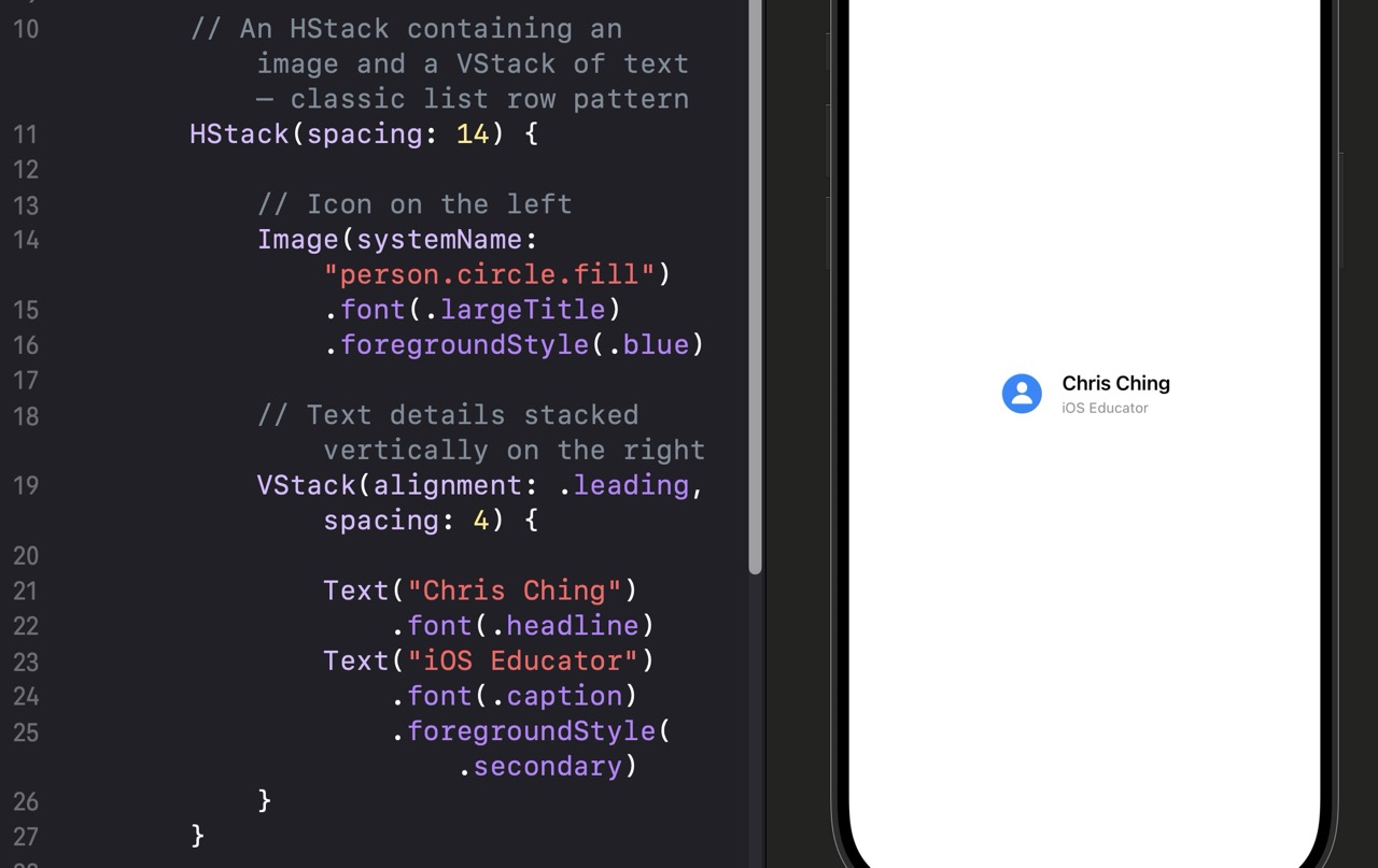
ZStack‘s alignment: parameter controls where layered views appear within the stack’s bounds. Use it to position overlaid text at the top, bottom, corners, or center of the background view beneath it.// An HStack containing an image and a VStack of text — classic list row pattern
HStack(spacing: 14) {
// Icon on the left
Image(systemName: "person.circle.fill")
.font(.largeTitle)
.foregroundStyle(.blue)
// Text details stacked vertically on the right
VStack(alignment: .leading, spacing: 4) {
Text("Chris Ching")
.font(.headline)
Text("iOS Educator")
.font(.caption)
.foregroundStyle(.secondary)
}
}
Group { }. You’ll rarely hit this limit in practice, but it’s worth knowing before it surprises you.
Quick Reference
| Syntax | What It Does |
|---|---|
| VStack { } | Stacks views top to bottom, centered by default |
| VStack(alignment: .leading) { } | Stacks views top to bottom, left-aligned |
| VStack(spacing: 12) { } | Stacks views top to bottom with 12pt gaps |
| HStack { } | Arranges views side by side, vertically centered |
| ZStack { } | Layers views on top of each other, centered |
| ZStack(alignment: .bottomLeading) { } | Layers views, aligning to the bottom left |
| Spacer() | Fills available space in the direction of the containing stack |
Using AI to Go Further
Build a horizontal row of three stats — like you’d see on a social media profile. Each stat has a bold number on top and a muted label underneath (e.g. “248” with “Posts” below it, “12K” with “Followers”, “540” with “Following”). The three stats should be evenly spaced across the full width of the screen. Check your canvas — the result should look like something you’d actually see in an app.
Spacer() between each VStack to distribute the spacing evenly. Give the number text .font(.title2).fontWeight(.bold) and the label .font(.caption).foregroundStyle(.secondary).
You’ve been using the canvas preview to check your views as you build them. But there’s a lot more to it than just glancing at the right side of Xcode. This lesson covers how to use both the canvas preview and the simulator effectively — and how to deal with the moments when they decide to stop cooperating.
The canvas preview and the simulator solve the same basic problem — “what does this look like?” — but in different contexts. The preview is fast, lightweight, and perfect for iterating on layout and styling. The simulator is slower to launch but runs real app code and is better for testing actual behavior like taps, navigation, and animations.
By the end of this lesson, you’ll know how to preview your views across multiple device sizes and color schemes, how to run your app in the simulator, and what to do when the preview crashes — which it will, eventually.
Working with the Canvas Preview
// Your ContentView code
struct ContentView: View {
    var body: some View {
        Text("Hello, Preview!")
    }
}

// This macro enables the live canvas preview at the bottom of the file
// It's automatically generated by Xcode — you normally don't need to edit it
#Preview {
    ContentView()
}
| Element | What it does |
|---|---|
#Preview { } |
A Swift macro that tells Xcode to render the view inside it in the canvas panel. Added automatically to new SwiftUI files. |
| Resume button | Appears when the preview is paused. Click it (or press Option + Command + P) to update the preview with your latest changes. |
| Live Preview mode | Runs an interactive version of your view — you can tap buttons, scroll lists, and trigger animations without launching the simulator. |
| Static preview | Default mode — renders a snapshot of your view. Faster to build and ideal for layout checks. |
// Preview in both light and dark mode simultaneously
#Preview("Light Mode") {
    ContentView()
        .preferredColorScheme(.light)
}

#Preview("Dark Mode") {
    ContentView()
        .preferredColorScheme(.dark)
}#Preview blocks in the same file. Each one renders as its own preview in the canvas. This is great for checking light and dark mode at the same time, or previewing how your layout looks on different device sizes.// No code changes needed — just press the Run button (▶) in Xcode
// or use the keyboard shortcut: Command + R
// Xcode builds and launches your app in the selected simulator device// You can preview any view — not just ContentView
struct ProfileCard: View {
var body: some View {
Text("Profile content here")
}
}
// Preview this specific component directly
#Preview {
ProfileCard()
}#Preview block. This is one of SwiftUI’s best development features — you can iterate on a small component without building and running the entire app. Faster feedback means faster learning.Quick Reference
| Action | How to do it |
|---|---|
| Open the canvas | Editor > Canvas, or Option + Command + Return |
| Resume a paused preview | Click Resume or press Option + Command + P |
| Run in the simulator | Click ▶ or press Command + R |
| Preview in dark mode | .preferredColorScheme(.dark) on the view inside #Preview { } |
| Preview a specific component | Add #Preview { YourView() } at the bottom of any SwiftUI file |
| Switch simulator device | Use the device dropdown at the top of Xcode |
Using AI to Go Further
Take any view you built in a previous lesson and add three #Preview blocks below it: one default, one with .preferredColorScheme(.dark), and one with a different device size (set it in the Preview device picker). Open all three previews and check that your layout looks reasonable in all three. If dark mode breaks something, note what and why.
#Preview("Dark Mode") { ... } — this makes the previews easier to identify in the canvas when multiple are open.
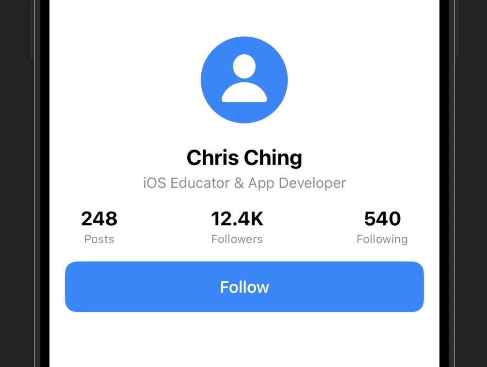
This is the mini-project that brings everything from Stage 1 together. You’re going to build a polished profile card — a circular avatar, a name, a title, a stats row, and a follow button — entirely from scratch using only what you’ve learned so far.
No new concepts in this lesson. Everything here is Text, Image, VStack, HStack, ZStack, and modifiers. What’s new is putting them together intentionally, thinking about the layout before writing the code, and ending up with something that looks like it belongs in a real app.
Work through each step in order. After each one, check your canvas preview before moving to the next. The goal isn’t to finish fast — it’s to understand what each piece is doing and why.
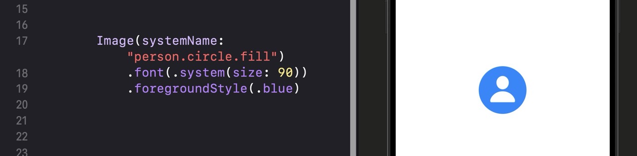
Step 1: The Avatar
Start with a fresh ContentView and build the avatar first. A circular SF Symbol icon styled to look like a profile picture.
// Step 1: Start with just the avatar
struct ContentView: View {
    var body: some View {

        // Use a person icon scaled up to act as an avatar placeholder
        Image(systemName: "person.circle.fill")
            // Scale the SF Symbol to a large display size
            .font(.system(size: 90))
            // Color it blue to give a profile-picture feel
            .foregroundStyle(.blue)
    }
}
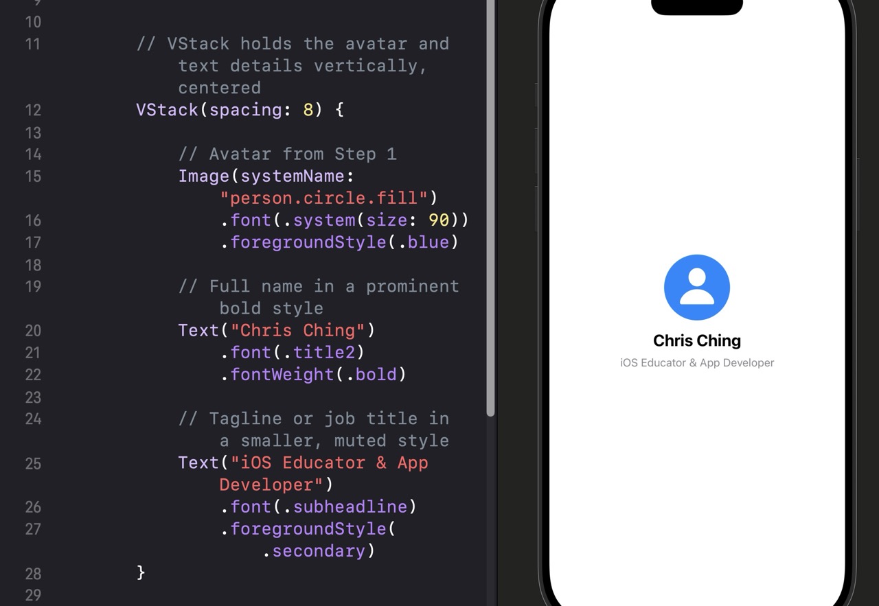
Step 2: Add the Name and Title
Wrap the avatar in a VStack and add the name and tagline beneath it.
var body: some View {

    // VStack holds the avatar and text details vertically, centered
    VStack(spacing: 8) {

        // Avatar from Step 1
        Image(systemName: "person.circle.fill")
            .font(.system(size: 90))
            .foregroundStyle(.blue)

        // Full name in a prominent bold style
        Text("Chris Ching")
            .font(.title2)
            .fontWeight(.bold)

        // Tagline or job title in a smaller, muted style
        Text("iOS Educator & App Developer")
            .font(.subheadline)
            .foregroundStyle(.secondary)
    }
}
Step 3: Add the Stats Row
Add a horizontal stats row below the name. Three stats — Posts, Followers, Following — evenly distributed using Spacer.
// Add this below the tagline Text, still inside the outer VStack
HStack {
    // Each stat is a VStack with a number and a label
    VStack {
        Text("248").font(.title3).fontWeight(.bold)
        Text("Posts").font(.caption).foregroundStyle(.secondary)
    }

    // Spacer pushes the stats apart to fill the full width
    Spacer()

    VStack {
        Text("12.4K").font(.title3).fontWeight(.bold)
        Text("Followers").font(.caption).foregroundStyle(.secondary)
    }

    Spacer()

    VStack {
        Text("540").font(.title3).fontWeight(.bold)
        Text("Following").font(.caption).foregroundStyle(.secondary)
    }
}
.padding(.horizontal)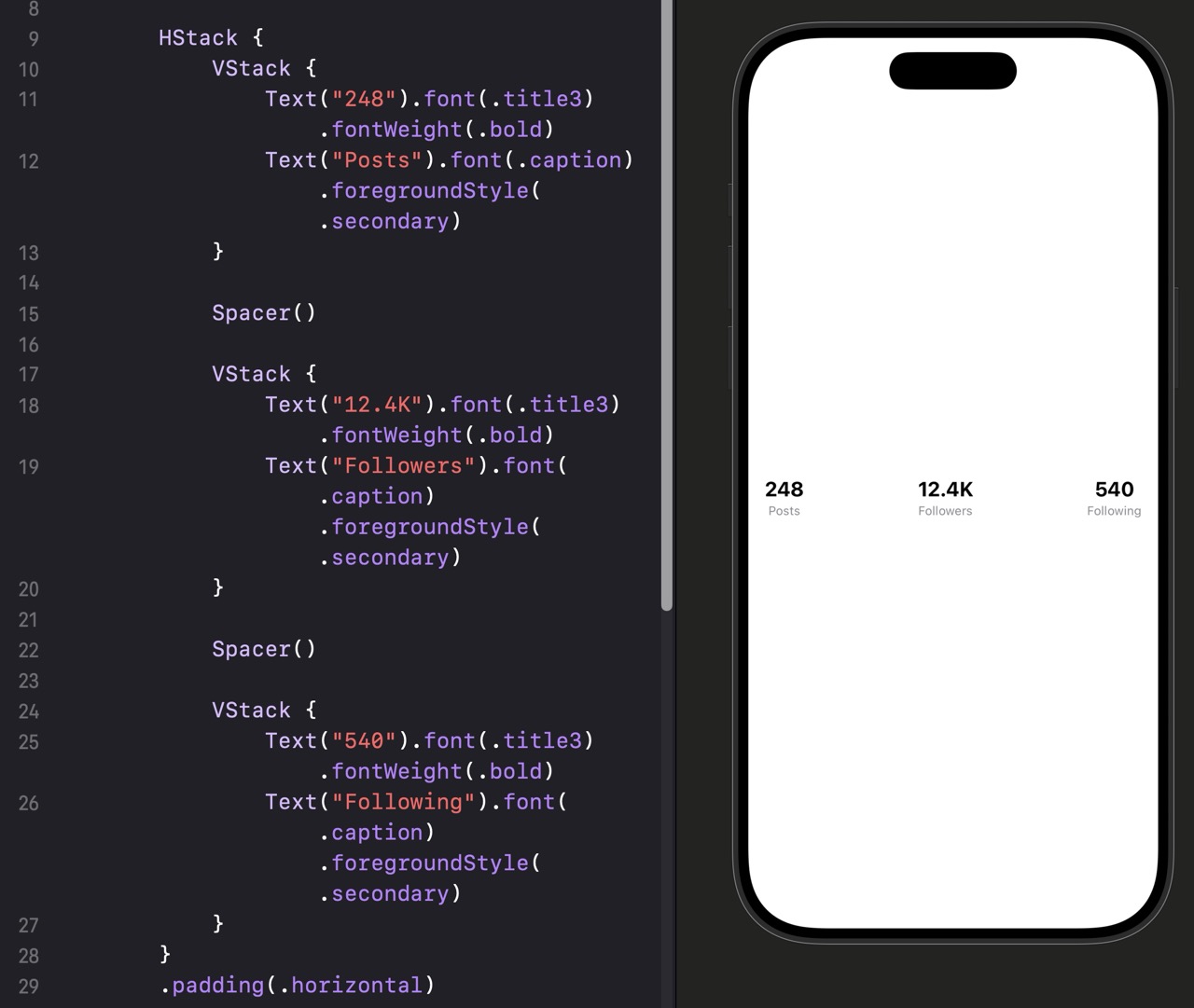
Step 4: Add the Follow Button and Final Padding
The last piece is a full-width Follow button and some overall padding to give the card breathing room.
// Add this below the HStack stats row, still inside the outer VStack
Button(action: {
    // Action will go here once we learn about state in Stage 2
}) {
    // Button label styled to look like a solid primary button
    Text("Follow")
        .font(.headline)
        .foregroundStyle(.white)
        .frame(maxWidth: .infinity)
        .padding()
        .background(.blue)
        .cornerRadius(12)
}

// Apply overall padding and top spacing to the outer VStack using modifiers
// The modifier goes on the closing brace of the outer VStack
.padding()
.padding(.top, 20)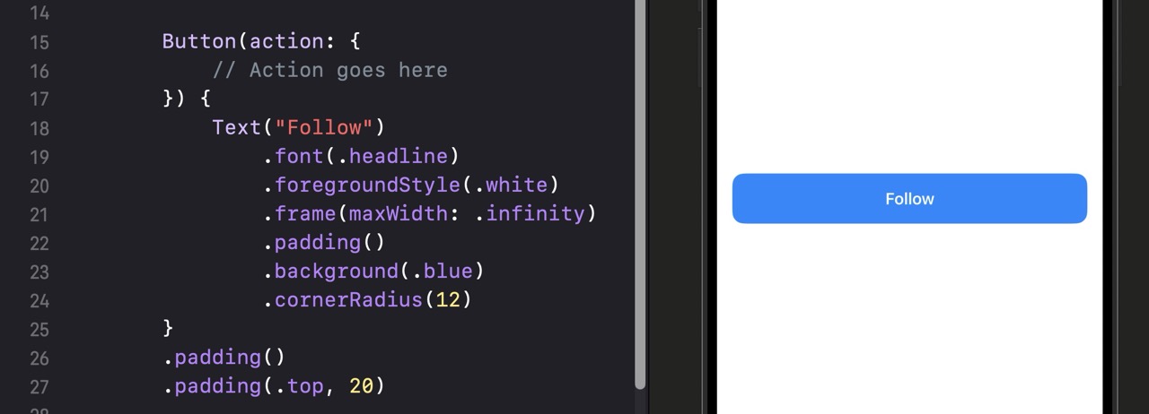
@State — which is Stage 2. Right now, the goal was to get comfortable building layouts. The behavior comes next.
The Complete Profile Card
import SwiftUI

struct ContentView: View {
    var body: some View {

        // Outer container — everything stacks vertically with 16pt gaps
        VStack(spacing: 16) {

            // Avatar
            Image(systemName: "person.circle.fill")
                .font(.system(size: 90))
                .foregroundStyle(.blue)

            // Name and tagline grouped with tighter spacing
            VStack(spacing: 4) {
                Text("Chris Ching")
                    .font(.title2)
                    .fontWeight(.bold)
                Text("iOS Educator & App Developer")
                    .font(.subheadline)
                    .foregroundStyle(.secondary)
            }

            // Stats row
            HStack {
                VStack {
                    Text("248").font(.title3).fontWeight(.bold)
                    Text("Posts").font(.caption).foregroundStyle(.secondary)
                }
                Spacer()
                VStack {
                    Text("12.4K").font(.title3).fontWeight(.bold)
                    Text("Followers").font(.caption).foregroundStyle(.secondary)
                }
                Spacer()
                VStack {
                    Text("540").font(.title3).fontWeight(.bold)
                    Text("Following").font(.caption).foregroundStyle(.secondary)
                }
            }
            .padding(.horizontal)

            // Follow button — full width, blue, rounded
            Button(action: {}) {
                Text("Follow")
                    .font(.headline)
                    .foregroundStyle(.white)
                    .frame(maxWidth: .infinity)
                    .padding()
                    .background(.blue)
                    .cornerRadius(12)
            }
        }
        .padding()
        .padding(.top, 20)
    }
}

#Preview {
    ContentView()
}
Using AI to Go Further
Modify the profile card you just built in three ways. First, change the accent color from blue to a different color that still looks professional (try green, indigo, or teal — avoid red, as it implies a warning). Second, add a fourth line below the tagline: a location line using Image(systemName: "location.fill") placed in an HStack next to a Text view. Third, change the Follow button to say “Following” and update its background to gray to represent a toggled state. You’ll make this interactive in Stage 2 — for now, just make it look right statically. Verify all three changes in the canvas before moving on.
.background(.blue) to .background(.gray.opacity(0.2)) and change .foregroundStyle(.white) to .foregroundStyle(.primary).
Stage 1 Recap: Your First SwiftUI View
Six lessons in, and you’ve made the leap from Swift logic to real, visible UI. Here’s what you covered:
- Lesson 1.1 — What SwiftUI Is and How It Thinks: The declarative mental model — you describe what the interface should look like and SwiftUI handles the rendering. Every SwiftUI view is a struct with a body property.
- Lesson 1.2 — Your First View: Text, Image, Button: The three foundation views that every SwiftUI interface is built from, plus the structure of ContentView that every SwiftUI file shares.
- Lesson 1.3 — Modifiers: How to style and configure views by chaining modifiers, why order matters, and the most important modifiers: font, foregroundStyle, padding, background, cornerRadius, and frame.
- Lesson 1.4 — VStack, HStack, ZStack: The three layout containers that arrange views vertically, horizontally, and in layers — plus how to nest them and use Spacer to control distribution.
- Lesson 1.5 — The Canvas Preview and the Simulator: How to use the canvas preview effectively, preview across device sizes and color schemes, run your app in the simulator, and recover when the preview crashes.
- Lesson 1.6 — Building a Profile Card: A complete mini-project combining everything from Lessons 1.1 to 1.5 — a polished, real-world layout built step by step using Text, Image, VStack, HStack, and modifiers.
If you skipped any challenges along the way, go back and do them. The profile card in particular is worth building twice — once following the steps, and once from scratch on your own without looking at the code. That second attempt is where the real learning happens.
Stage 2 is where your views come alive. You’ll learn about State and Data Flow — how to make views respond to taps, track user input, and update automatically when data changes. Static layouts are just the beginning. Once your views can react to data, you’ll start building things that actually feel like apps.
Learn SwiftUI Stage 2: State and Data Flow
In Stage 1 you built views that looked great but didn’t move — this stage is where they come alive and start responding to the user.
Stage 2 has six lessons and runs about three hours total, though some lessons are shorter conceptual ones and others have more code to work through. You’ll need Xcode open with the canvas preview active so you can see your views update in real time as you work. Make sure you complete the challenge at the end of each lesson before moving on — these aren’t optional extras, they’re the part where the concepts actually stick.
By the end of this stage you’ll understand why plain variables don’t trigger UI updates and why SwiftUI needs state to know when to re-render, how to use @State to store and update values local to a view, how to pass state to child views using @Binding so they can both read and write the same value, how to move state into a separate class using the @Observable macro for more complex data, how to read built-in app-wide values from the environment, and how to apply the single source of truth principle to keep your data clean and your bugs rare.
Imagine a scoreboard at a basketball game. Every time a team scores, someone updates the number on the board. But what if the scoreboard wasn’t connected to anything — what if changing the score behind the scenes had no way to tell the board to refresh? The number on the board would just sit there, frozen, no matter what was really happening. That’s exactly the problem SwiftUI’s state system solves.
In Stage 1 you built views using properties, modifiers, and layout containers. Those views worked great — but everything about them was fixed at the moment the view was created. If you wanted the UI to change in response to something the user did, you’d quickly hit a wall.
By the end of this lesson you’ll understand exactly why a plain variable inside a SwiftUI view doesn’t cause the UI to update when it changes, and you’ll have the mental model for what state actually is and why SwiftUI needs it. There’s no code in this lesson — just the concept that makes everything else in Stage 2 make sense.
What happens when you use a plain variable
Here’s the problem in concrete terms. Suppose you want to show a counter that goes up when the user taps a button. Your first instinct might be to write something like this:
struct CounterView: View {
    // A plain variable — NOT wrapped in @State
    var count = 0

    var body: some View {
        VStack {
            Text("Count: \(count)")
            Button("Tap me") {
                // This line will cause a compile error — structs are immutable
                count += 1
            }
        }
    }
}
This won’t even compile. SwiftUI views are structs, and structs are value types — their properties are immutable by default inside methods. But even if you got around that, there’s a deeper problem: SwiftUI has no way of knowing that count changed. It can’t see you mutate a plain variable. So even if the mutation happened, SwiftUI would never re-render the view to show the new number.
What “source of truth” means
You’ll hear the phrase “source of truth” a lot in SwiftUI. It just means: one authoritative place where a piece of data lives. When that data changes, everything that depends on it updates automatically. The view is a reflection of the data — not the other way around.
Think of it like a thermostat and every room in your house. The thermostat holds the actual temperature reading (the source of truth). Every display in every room just shows what the thermostat says. You don’t update each room display individually — you update the thermostat and everything else follows.
In SwiftUI, state is your thermostat. Your views are the room displays. When state changes, SwiftUI figures out which views depend on it and re-renders only those parts. This is the system that makes reactive UIs possible.
The mental model to carry forward
Before diving into the code in the next lesson, here’s the model to keep in mind: a SwiftUI view is a function of its state. Given the same state, you always get the same view. Change the state, and SwiftUI calls that function again and produces a new view. You describe what the UI should look like for any given state, and SwiftUI handles the rest.
Quick Reference
| Concept | What It Means |
|---|---|
| Plain var in a view | Immutable in a struct — and even if mutated, SwiftUI won’t know to re-render |
| State | Data that SwiftUI watches — when it changes, affected views automatically re-render |
| Source of truth | One authoritative location where a piece of data lives and is owned |
| View as a function | Same state always produces the same view — change state to change the UI |
| Reactive UI | The UI reacts to data changes automatically, rather than you updating it manually |
Before moving on, try this in Xcode. Create a new SwiftUI view called ScoreboardView. Add a var score = 0 property and a Button that tries to do score += 1. Read the compiler error you get. Then try adding the mutating keyword to the button’s closure (you can’t — the closure isn’t a function on the struct). The goal is to see exactly why plain variables don’t work, so the solution in 2.2 makes complete sense.
Think of @State as a special storage locker that SwiftUI manages for your view. When you put a value in the locker, SwiftUI watches it. The moment something changes that value, SwiftUI automatically redraws every part of the view that uses it. You don’t have to do anything extra — the connection is automatic.
In lesson 2.1 you saw exactly why a plain variable doesn’t work: SwiftUI can’t see the change, and structs are immutable anyway. @State solves both problems at once. It stores the value outside the struct (so mutating it is valid), and it tells SwiftUI to watch for changes (so re-rendering happens automatically).
By the end of this lesson you’ll know how to declare and use @State properties, understand why they’re always marked private, and build interactive views with counters, toggles, and text fields that respond to user input in real time.
Your first @State property
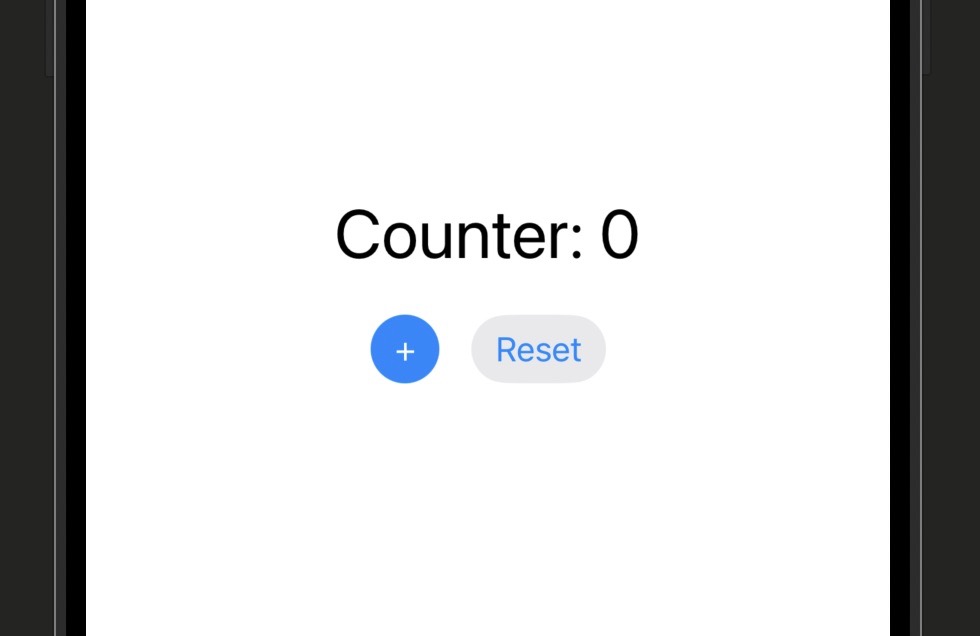
Here’s the counter from lesson 2.1 — now fixed with @State:
import SwiftUI

struct CounterView: View {
    // @State tells SwiftUI to own and watch this value
    @State private var count = 0

    var body: some View {
        VStack(spacing: 20) {
            // SwiftUI reads count here — when count changes, this Text re-renders
            Text("Count: \(count)")
                .font(.largeTitle)

            // The button's action mutates count — this triggers a re-render
            Button("Tap to Increment") {
                count += 1
            }
            .buttonStyle(.borderedProminent)
        }
    }
}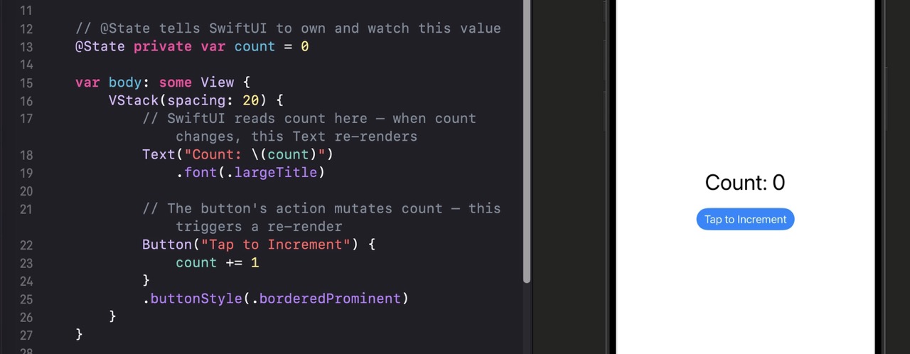
| Line | What it does |
|---|---|
@State private var count = 0 |
The @State wrapper tells SwiftUI to store this value in its own managed storage and watch it for changes. private means only this view should own or modify it directly. |
Text("Count: \(count)") |
This view reads count. SwiftUI knows this view depends on that state, so whenever count changes, this Text will re-render with the new value. |
count += 1 |
This mutates the state value from inside the button’s action closure. Because @State is involved, SwiftUI detects the change and re-renders the view. |
.buttonStyle(.borderedProminent) |
A modifier that gives the button Apple’s filled blue style. Not required — just makes it look nicer. |
@State properties should always be marked private. State is meant to be owned by one view. If another view needs to read or write it, you’ll use @Binding instead — that’s exactly what lesson 2.3 covers.
@State with different value types
@State private var isOn = false

VStack {
    // Toggle reads and writes isOn automatically
    Toggle("Enable notifications", isOn: $isOn)
        .padding()

    // Ternary operator shows different text based on isOn's value
    Text(isOn ? "Notifications: On" : "Notifications: Off")
        .foregroundStyle(isOn ? .green : .red)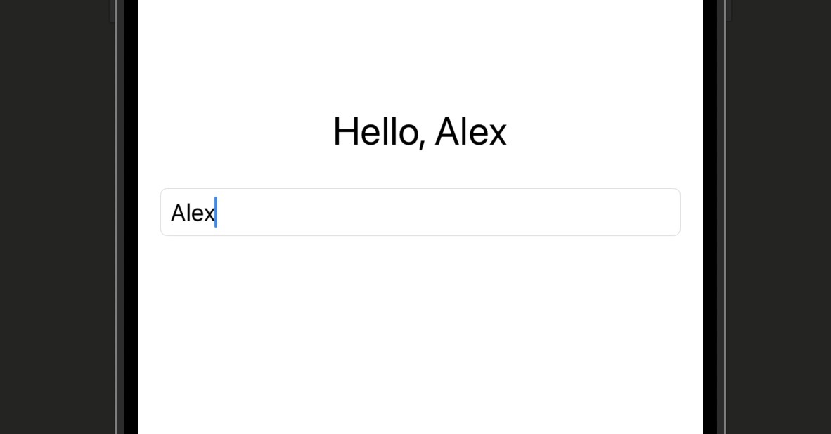
}$isOn syntax creates a binding to the state — the Toggle needs to both read and write the value, so it needs a binding rather than the value directly. You’ll fully understand bindings in lesson 2.3.@State private var name = ""
VStack(spacing: 12) {
// TextField needs a binding because it writes back to name as the user types
TextField("Enter your name", text: $name)
.textFieldStyle(.roundedBorder)
.padding()
// This Text re-renders every keystroke as name changes
Text("Hello, \(name.isEmpty ? "stranger" : name)!")
.font(.title2)
}name state value, which triggers the Text to re-render. You can see this live in the simulator — the greeting updates with every keystroke.@State private var showDetails = false
VStack(spacing: 16) {
Button(showDetails ? "Hide Details" : "Show Details") {
// Toggle the Bool — SwiftUI re-renders the conditional block below
showDetails.toggle()
}
// This entire block only renders when showDetails is true
if showDetails {
Text("Here are the details you asked for.")
.padding()
.background(.blue.opacity(0.1))
.cornerRadius(8)
}
}if block as part of the view hierarchy. When showDetails changes, SwiftUI adds or removes that block from the rendered output. This is a very common pattern for disclosure sections, alerts, and expanded content.@State private var isExpanded = false
VStack {
Button("Toggle Size") {
// withAnimation wraps the state change — SwiftUI animates the diff
withAnimation(.spring()) {
isExpanded.toggle()
}
}
// The frame size is driven by state — the animation happens between the two sizes
RoundedRectangle(cornerRadius: 12)
.fill(.blue)
.frame(width: isExpanded ? 200 : 80, height: isExpanded ? 200 : 80)
}withAnimation tells SwiftUI to animate between the old and new rendered states rather than snapping instantly. The animation system figures out what changed — you just tell it how to animate.Quick Reference
| Syntax | What It Does |
|---|---|
| @State private var x = value | Declares a state property — SwiftUI owns and watches it |
| x = newValue | Mutates state from inside the view — triggers re-render |
| x.toggle() | Flips a Bool state value to its opposite |
| $x | Creates a binding to the state — required when passing to a child view or control that needs to write back |
| withAnimation { x = y } | Animates the UI transition caused by the state change |
Build a view called LikeButtonView that has two pieces of state: a Bool for whether the post is liked, and an Int for the like count (start it at 42). When the button is tapped, toggle the liked state and either add or subtract 1 from the count. Show a filled red heart (heart.fill) when liked and an outline heart (heart) when not. Display the current count next to the heart. Wrap the state mutation in withAnimation(.spring()) for a satisfying tap feel.
Image(systemName: isLiked ? "heart.fill" : "heart") inside an HStack with a Text for the count. Use .foregroundStyle(.red) when liked.
Using AI to Go Further
Think of a TV remote. The remote doesn’t store what channel the TV is on — the TV stores that. But the remote can change the channel. When you press a button, the remote sends the instruction to the TV, and the TV updates. The remote is a binding: it can read and write a value that lives somewhere else.
In lesson 2.2 you learned that @State is always marked private because the owning view should be the only one to hold it. But what happens when you split your UI into multiple views — a common thing to do to keep code clean — and a child view needs to change a parent’s state? That’s exactly where @Binding comes in.
By the end of this lesson you’ll understand the difference between a state owner and a binding consumer, how the $ prefix passes a binding down to a child view, and why this pattern keeps data flowing in one direction rather than creating confusion about where data lives.
The problem: split views need shared state
import SwiftUI

// The PARENT owns the state — it's the single source of truth
struct ParentView: View {
    @State private var isOn = false

    var body: some View {
        VStack(spacing: 20) {
            // Parent reads the state directly
            Text(isOn ? "The switch is ON" : "The switch is OFF")
                .font(.title2)

            // Pass a BINDING to the child — use $ to create it from the @State
            ToggleRow(isOn: $isOn)
        }
    }
}

// The CHILD receives a binding — it can read and write, but doesn't own the value
struct ToggleRow: View {
    // @Binding, not @State — this view doesn't own the value
    @Binding var isOn: Bool

    var body: some View {
        HStack {
            Text("Enable feature")
            Spacer()
            // Toggle mutates isOn via the binding — the parent's @State is what actually changes
            Toggle("", isOn: $isOn)
                .labelsHidden()
        }
        .padding()
        .background(.gray.opacity(0.1))
        .cornerRadius(10)
    }
}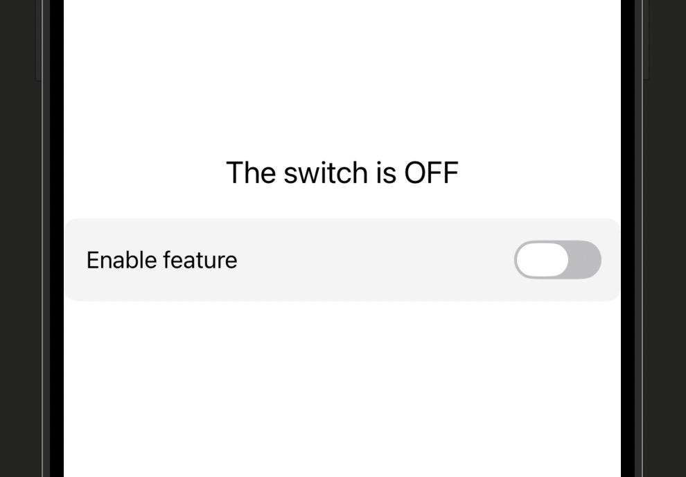
| Line | What it does |
|---|---|
@State private var isOn = false |
The parent owns this value. It’s the source of truth. Only this view stores the actual Bool. |
ToggleRow(isOn: $isOn) |
The $ prefix converts the state property into a binding and passes it to the child. The child gets a reference to the parent’s storage, not a copy. |
@Binding var isOn: Bool |
The child declares it receives a binding. No private, no initial value — the value lives in the parent, not here. |
$isOn in the child |
When the child passes the binding further (to a Toggle), it uses $ again — the binding wraps itself into another binding, passing the reference along the chain. |
@State in the child when you actually need @Binding. If the child uses @State, it gets its own separate copy of the data — changes in the child won’t be visible in the parent, and you now have two conflicting sources of truth.
@Binding patterns
// In the parent — $ creates a Binding from a @State property
ChildView(value: $myStateProperty)

// In the child — declare with @Binding, no default value, no private
@Binding var value: String$ prefix is the syntax for “give me a binding to this state property.” The child gets a two-way connection: reading value returns the current value, and writing to value updates the parent’s @State.// Use .constant() in Previews when you need to pass a binding but don't have a parent
struct ToggleRow_Previews: PreviewProvider {
static var previews: some View {
// .constant wraps a value in a non-mutating binding — read-only, for previewing
ToggleRow(isOn: Binding.constant(true))
}
}Binding.constant() is used in previews when you need to satisfy a @Binding parameter but you don’t have a parent with @State. It creates a read-only binding that can’t actually be mutated.// Grandparent owns the state
@State private var text = ""
// Grandparent passes a binding to Parent
ParentView(text: $text)
// Parent holds a binding and passes it down to Child
struct ParentView: View {
@Binding var text: String
var body: some View {
// Use $ again to pass the binding to the next child
ChildView(text: $text)
}
}$, and the actual @State at the root is the only place the value is stored. No matter how many views deep you are, a change at any level flows back to the single source of truth.@State private var volume: Double = 0.5
@State private var quantity = 1
VStack(spacing: 16) {
// Slider reads and writes volume via binding
Slider(value: $volume, in: 0...1)
// Stepper reads and writes quantity via binding
Stepper("Quantity: \(quantity)", value: $quantity, in: 1...10)
}TextField, Toggle, Slider, Stepper, Picker, DatePicker — all accept bindings for their data parameter. This is why you always use $ when passing data to these controls.Quick Reference
| Syntax | What It Does |
|---|---|
| @Binding var x: Type | Declares a binding — this view can read and write x, but doesn’t own it |
| ChildView(x: $myState) | Passes a binding from a @State property to a child view |
| Binding.constant(value) | A read-only binding for use in previews or testing |
| $binding in child | Pass an existing @Binding further down to the next child |
| x = newValue in child | Writing to a @Binding updates the parent’s @State — triggers re-render at parent level |
Build a ColorSwatch view that has three @State Double properties: red, green, and blue, each starting at 0.5. Display a large RoundedRectangle filled with Color(red: red, green: green, blue: blue). Below it, create a separate ColorSlider view that takes a label String and a @Binding var value: Double, and displays that label next to a Slider. Use three ColorSlider views in the parent, passing $red, $green, and $blue. The rectangle should update its color live as you drag any slider.
Slider(value: $value, in: 0...1) is the slider you need. The in: 0...1 range constrains it to valid color component values.
Using AI to Go Further
So far, the state you’ve been managing has been small and simple — a counter, a toggle, a text field. But real apps have real data: a list of tasks, a user’s profile, a shopping cart with dozens of items. Cramming all of that into @State properties inside a view gets messy fast. The solution is to move your data into a separate class and have SwiftUI watch that instead.
In lessons 2.2 and 2.3 you owned state directly inside the view. That’s perfect for local UI state — whether a sheet is open, what the user has typed in a field. But anything that represents your app’s actual data model belongs outside the view, in its own class, with clear responsibilities. This is a big step toward building real apps.
By the end of this lesson you’ll know how to use the @Observable macro (iOS 17+) to create an observable data model, how to use @State to hold an instance of that model inside a view, and how to recognize the older @ObservableObject and @StateObject pattern when you find it in existing code.
Lifting state into a model class
import SwiftUI
import Observation

// @Observable is a macro (iOS 17+) that makes this class trackable by SwiftUI
@Observable
class CounterModel {
    // These stored properties are automatically tracked — no property wrappers needed
    var count = 0
    var label = "Counter"

    // A method on the model that mutates its own state
    func increment() {
        count += 1
    }

    func reset() {
        count = 0
    }
}

struct CounterView: View {
    // @State holds the model instance — SwiftUI will re-render when any tracked property changes
    @State private var model = CounterModel()

    var body: some View {
        VStack(spacing: 20) {
            // Reading model.count — SwiftUI re-renders this when count changes
            Text("\(model.label): \(model.count)")
                .font(.largeTitle)

            HStack(spacing: 16) {
                Button("+") { model.increment() }
                    .buttonStyle(.borderedProminent)

                Button("Reset") { model.reset() }
                    .buttonStyle(.bordered)
            }
        }
    }
}
| Line | What it does |
|---|---|
@Observable class CounterModel |
The @Observable macro instruments the class so SwiftUI can track which properties are read and re-render only views that depend on properties that actually changed. |
var count = 0 (inside @Observable) |
No property wrapper needed here — @Observable handles tracking automatically for all stored properties. This is what makes it cleaner than the older approach. |
@State private var model = CounterModel() |
The view uses @State to hold the model instance. SwiftUI knows this is an observable object and sets up tracking automatically. |
model.increment() |
Calling a method on the model mutates count. SwiftUI detects the change (because of @Observable) and re-renders the parts of the view that read count. |
@Observable requires iOS 17+. If you need to support older iOS versions, you’ll use the older pattern: @ObservableObject on the class, @Published on each tracked property, and @StateObject instead of @State in the view. The concept is identical — the syntax is just more verbose.
@Observable patterns
@Observable
class UserProfile {
    var name = "Chris"
    var isPremium = false
}

struct ProfileView: View {
    @State private var profile = UserProfile()

    var body: some View {
        Text("Hello, \(profile.name)")
    }
}@Observable, every stored property is tracked automatically. SwiftUI only re-renders views that actually read a property that changed — this is more efficient than the older approach.// Older approach — class conforms to ObservableObject protocol
class UserProfile: ObservableObject {
// @Published marks each property that should trigger re-renders when changed
@Published var name = "Chris"
@Published var isPremium = false
}
struct ProfileView: View {
// @StateObject instead of @State — owns and creates the object
@StateObject private var profile = UserProfile()
var body: some View {
Text("Hello, \(profile.name)")
}
}@Published does what @Observable does automatically, and @StateObject is the older equivalent of @State for reference types.@Observable
class CartModel {
var items: [String] = []
func addItem(_ item: String) {
items.append(item)
}
}
struct ShopView: View {
@State private var cart = CartModel()
var body: some View {
VStack {
// Pass the same cart model to both children — they share the same instance
ProductListView(cart: cart)
CartSummaryView(cart: cart)
}
}
}
struct ProductListView: View {
// No property wrapper needed in child for @Observable — just a regular property
var cart: CartModel
var body: some View {
Button("Add Item") { cart.addItem("Widget") }
}
}ProductListView and CartSummaryView receive a reference to the same CartModel instance. When one child adds an item, the other child sees the change automatically. No bindings needed — they share one object.Quick Reference
| Syntax / Pattern | What It Does |
|---|---|
| @Observable class MyModel | Makes all stored properties trackable — SwiftUI re-renders views that read properties when they change |
| @State var model = MyModel() | Holds an observable object in a view — SwiftUI creates and owns the instance |
| @ObservableObject (older) | Protocol-based alternative to @Observable — requires @Published on each tracked property |
| @Published var x (older) | Marks a property as triggering re-renders when changed — used with @ObservableObject |
| @StateObject (older) | Older equivalent of @State for reference types conforming to ObservableObject |
Create a TaskModel class marked @Observable with a var tasks: [String] = [] property and an addTask(_ task: String) method. In a TaskListView, hold the model as @State. Use a TextField with @State private var newTask = "" so the user can type a task name. Add a button that calls model.addTask(newTask) and then clears newTask. Display the tasks in a List. The list should update live every time a task is added.
List(model.tasks, id: \.self) { task in Text(task) } is the pattern for rendering the array.
Using AI to Go Further
Some information in your app needs to be accessible everywhere, not just passed down through bindings. Think about the system’s current color scheme — light or dark mode. Every view in your entire app might want to know this, and it would be exhausting to pass it as a parameter through every view. The environment is the solution: a shared bag of values that any view in the hierarchy can reach into and read.
In lessons 2.3 and 2.4 you passed data explicitly — either through bindings or by passing a model instance as a property. The environment is different: it flows down the entire view hierarchy automatically, without you having to thread it through every intermediate view. Views can also inject values into the environment, making them available to all of their descendants.
By the end of this lesson you’ll know how to read common built-in environment values like colorScheme, dismiss, and locale, and you’ll understand the environment’s role in the broader SwiftUI data flow picture.
Reading built-in environment values
import SwiftUI

struct AppearanceAwareView: View {
    // @Environment reads a value from the SwiftUI environment — no parent needed
    @Environment(\.colorScheme) var colorScheme

    var body: some View {
        VStack(spacing: 16) {
            // colorScheme is either .light or .dark — the system sets this automatically
            Text(colorScheme == .dark ? "Dark mode is active" : "Light mode is active")
                .font(.title2)

            Image(systemName: colorScheme == .dark ? "moon.fill" : "sun.max.fill")
                .font(.largeTitle)
                .foregroundStyle(colorScheme == .dark ? .white : .orange)
        }
        .padding()
    }
}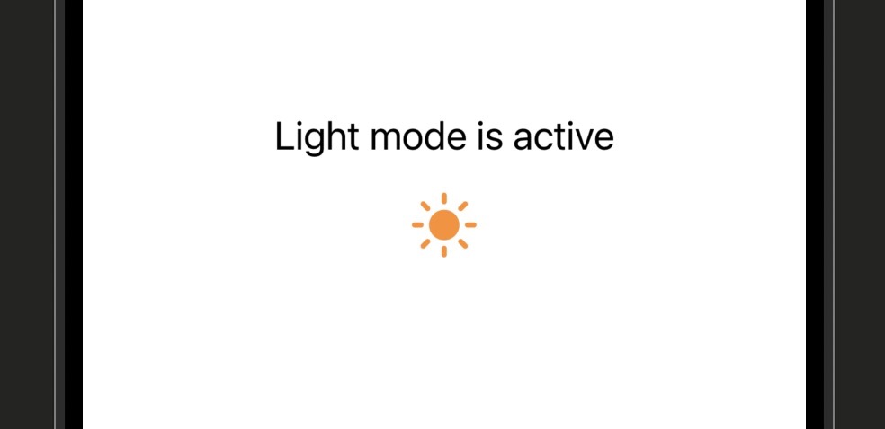
| Line | What it does |
|---|---|
@Environment(\.colorScheme) var colorScheme |
Reads the colorScheme value from the SwiftUI environment. The backslash syntax (\.colorScheme) is a key path — it identifies which environment value you want. |
colorScheme == .dark |
Compares the environment value to the .dark case of the ColorScheme enum. When the user switches between light and dark mode, this view will automatically re-render. |
Commonly used environment values
struct SettingsSheet: View {
    // dismiss is an action — calling it dismisses this view
    @Environment(\.dismiss) var dismiss

    var body: some View {
        Button("Done") {
            // Calling dismiss() closes this sheet — no binding needed
            dismiss()
        }
    }
}
dismiss is an action, not a value — you call it like a function. It tells SwiftUI to dismiss whatever container this view is inside, whether that’s a sheet, fullscreen cover, or navigation destination. Much cleaner than passing a dismiss binding down.struct LocaleView: View {
@Environment(\.locale) var locale
var body: some View {
// locale.identifier shows something like "en_CA" or "fr_FR"
Text("Your locale: \(locale.identifier)")
}
}struct AdaptiveView: View {
@Environment(\.dynamicTypeSize) var typeSize
var body: some View {
// Switch layout based on type size — large type users may need a different layout
if typeSize >= .accessibility1 {
VStack { /* stacked layout for big text */ }
} else {
HStack { /* side-by-side layout for normal text */ }
}
}
}dynamicTypeSize lets you adapt your layout for users with accessibility text size settings enabled. This is an important accessibility consideration for any app you intend to ship.struct LinkView: View {
// openURL is an action — call it with a URL to open Safari
@Environment(\.openURL) var openURL
var body: some View {
Button("Visit CodeWithChris") {
openURL(URL(string: "https://codewithchris.com")!)
}
}
}dismiss, openURL is an action in the environment. Calling it opens the URL in the appropriate system handler — usually Safari for web URLs.Quick Reference
| Environment Key | What It Provides |
|---|---|
| \.colorScheme | Current light/dark mode setting (.light or .dark) |
| \.dismiss | An action to dismiss the current sheet or navigation push |
| \.locale | The user’s current locale (language, region) |
| \.dynamicTypeSize | The user’s preferred text size from Accessibility settings |
| \.openURL | An action to open a URL in the appropriate system app |
| \.isPresented | A Bool binding indicating whether this view is currently presented |
Build a ThemeCard view that reads \.colorScheme from the environment. Display a RoundedRectangle with a background color and border that changes depending on whether the scheme is light or dark — use a light gray background with a dark border in light mode, and a dark gray background with a light border in dark mode. Inside the rectangle, show text that names the current mode. In Xcode’s canvas, use the “Color Scheme” variant option (in the editor at the bottom) to preview both light and dark mode simultaneously and verify your card adapts correctly.
.environment(\.colorScheme, .dark) can be used as a modifier in the Preview to force dark mode if you’re not using the canvas variant option.
Using AI to Go Further
Imagine two whiteboards in different rooms, both showing the same meeting schedule. If someone updates one but not the other, they get out of sync. Now nobody is sure which one is correct. This is what happens in code when the same piece of data lives in two different places — both are “true” but they disagree, and your app behaves unpredictably as a result.
Everything you’ve learned in this stage — @State, @Binding, @Observable, @Environment — is in service of one principle: each piece of data should have exactly one owner, one place where it lives and is authoritative. Every other view that needs it gets a binding or a reference to that single source, never its own copy.
By the end of this lesson you’ll be able to look at a SwiftUI view hierarchy and identify whether state is owned correctly, recognize the common patterns that break single source of truth, and refactor a broken example into one that works reliably.
What good data ownership looks like
import SwiftUI

// The model is the single source of truth — one place, one owner
@Observable
class ProfileModel {
    var name = "Alex"
    var isVerified = false
}

// Root view owns the model — it flows downward from here
struct RootView: View {
    @State private var profile = ProfileModel()

    var body: some View {
        VStack(spacing: 24) {
            // HeaderView reads from the model — same instance
            HeaderView(profile: profile)

            // EditView also uses the same instance — a change here shows up in HeaderView
            EditView(profile: profile)
        }
    }
}

struct HeaderView: View {
    var profile: ProfileModel

    var body: some View {
        Text("Hello, \(profile.name)")
            .font(.title)
    }
}

struct EditView: View {
    @Bindable var profile: ProfileModel

    var body: some View {
        TextField("Name", text: $profile.name)
            .textFieldStyle(.roundedBorder)
            .padding(.horizontal)
    }
}
| Design decision | Why it’s the right choice |
|---|---|
Model lives in RootView |
RootView is the highest view that needs access to the profile. Owning it here means all children can share the same instance. |
var profile in HeaderView |
Because ProfileModel is an @Observable class (a reference type), passing it as a plain property gives HeaderView a reference to the same object — not a copy. It reads properties but never writes them, so no special wrapper is needed. |
@Bindable var profile in EditView |
@Bindable tells SwiftUI that you want to create bindings to properties of this @Observable object. Without it, the $profile.name syntax used by TextField would not compile — Swift doesn’t know how to derive a Binding from a plain property. |
$profile.name in EditView |
Once profile is marked @Bindable, the $ prefix creates a two-way Binding to that specific property. The TextField reads from it and writes back to it — the change propagates to the underlying model, which updates HeaderView automatically. |
EditView declared its own @State private var localName = profile.name, it would make a copy at init time. Editing it would never update HeaderView. The two views would be showing different data. This is a very common bug — and it always comes back to violating single source of truth.
The data flow summary for Stage 2
// Use when: local UI state that only this view cares about
@State private var isExpanded = false@State. Don’t over-engineer — not every value needs a model class.// Use when: a child view needs to mutate a parent's @State
@Binding var isSelected: Bool@Binding. This keeps the source of truth in one place while giving the child view access to update it.// Use when: state is complex, shared between multiple views, or belongs outside the view
@Observable
class MyModel { var data = "" }// Use when: system values (colorScheme, locale) or app-wide actions (dismiss)
@Environment(\.colorScheme) var colorSchemeQuick Reference
| Tool | When to use it |
|---|---|
| @State | Local UI state owned by this view and not needed elsewhere |
| @Binding | Child view needs to read/write a parent’s @State |
| @Observable class + @State | Complex data, multiple views sharing the same model instance |
| @Environment | System-provided values or app-wide actions accessible anywhere |
| Plain property (var) | Read-only data passed from parent — no write-back needed |
| @Bindable | Child view needs to create bindings ($property) into an @Observable object it received as a property |
Here’s a broken data flow to fix. You have a ParentView with @State private var score = 0. It creates a ScoreDisplayView and a ScoreControlView. The broken version has ScoreControlView declaring its own @State private var score = 0 and incrementing it — so ScoreDisplayView always shows 0 no matter how many times you tap the button. Refactor ScoreControlView to use @Binding var score: Int instead, update the parent to pass $score, and verify that both views now show the same number. This exercise is the whole stage in one bug fix.
Using AI to Go Further
Stage 2 Recap: State and Data Flow
You’ve just completed the most important stage in the entire Learn SwiftUI curriculum. The concepts here — state ownership, reactive rendering, single source of truth — are the foundation everything else is built on. Here’s what you covered:
- Lesson 2.1 — Why Views Need State: Plain variables in SwiftUI structs can’t be mutated and don’t trigger re-renders — you need a state system for the UI to react to change.
- Lesson 2.2 — @State:
@Stateis the fundamental tool for local view state — SwiftUI owns the storage and re-renders any view that reads a state value whenever it changes. - Lesson 2.3 — @Binding:
@Bindinglets a child view read and write a parent’s@State— the child gets a reference, not a copy, preserving single source of truth across the hierarchy. - Lesson 2.4 — @Observable: Complex data belongs in a separate
@Observableclass — the view holds an instance with@State, and SwiftUI tracks changes to the model’s properties automatically. - Lesson 2.5 — @Environment: Built-in environment values like
colorScheme,dismiss, andlocaleare readable anywhere in the view hierarchy without passing them manually — perfect for system-wide and app-wide information. - Lesson 2.6 — Single Source of Truth: Every piece of data should have exactly one owner — everything else reads from or binds to that owner, never duplicating the value into a separate
@State.
This stage is a milestone. Developers who genuinely understand data flow write apps that are easier to debug, easier to extend, and far less likely to have confusing UI bugs. If any lesson felt shaky, go back and redo the challenge before moving on — it’s worth it.
Stage 3 takes on Layout in Depth — you’ll go deep on stacks, grids, GeometryReader, and building layouts that hold up across screen sizes and orientations.
Learn SwiftUI Stage 3: Layout in Depth
VStack and HStack got your views on screen — now it’s time to make them go exactly where you want.
This stage is all about precision. You’ll work in Xcode with the canvas preview open so you can see the results of every change in real time. There are 7 lessons totalling about 3 hours of content. Each lesson ends with a challenge — build it, check the preview, and don’t move on until it looks right.
By the end of Stage 3 you’ll know how to push views apart with Spacer, constrain and size views with frame() and padding(), read actual screen dimensions with GeometryReader, build grid layouts, respect and override the safe area, and let SwiftUI choose the right layout automatically with ViewThatFits.
By default, SwiftUI stacks views as tightly as their content allows. That’s fine for simple layouts, but most real apps need breathing room — a title pushed to the top, a button pinned to the bottom, or a line separating two sections. That’s exactly what Spacer and Divider are for.
Spacer is an invisible view that expands to fill all available space in the direction it’s placed. Think of it like a spring: drop one between two views and it pushes them apart as far as the container allows. Divider is a thin horizontal (or vertical) line that visually separates content — the same kind of separator you see in Settings or menus.
Neither Spacer nor Divider display any visible content on their own. Spacer is pure layout; Divider is a single line. Together they give you two of the most commonly needed layout tools in any SwiftUI app.
import SwiftUI

struct ContentView: View {
    var body: some View {
        VStack {
            // Title pinned to the top
            Text("My App")
                .font(.largeTitle)

            // Spacer pushes everything below it to the bottom
            Spacer()

            // Divider draws a horizontal line
            Divider()

            // Button sits at the bottom
            Button("Get Started") { }
                .buttonStyle(.borderedProminent)
        }
        .padding()
    }
}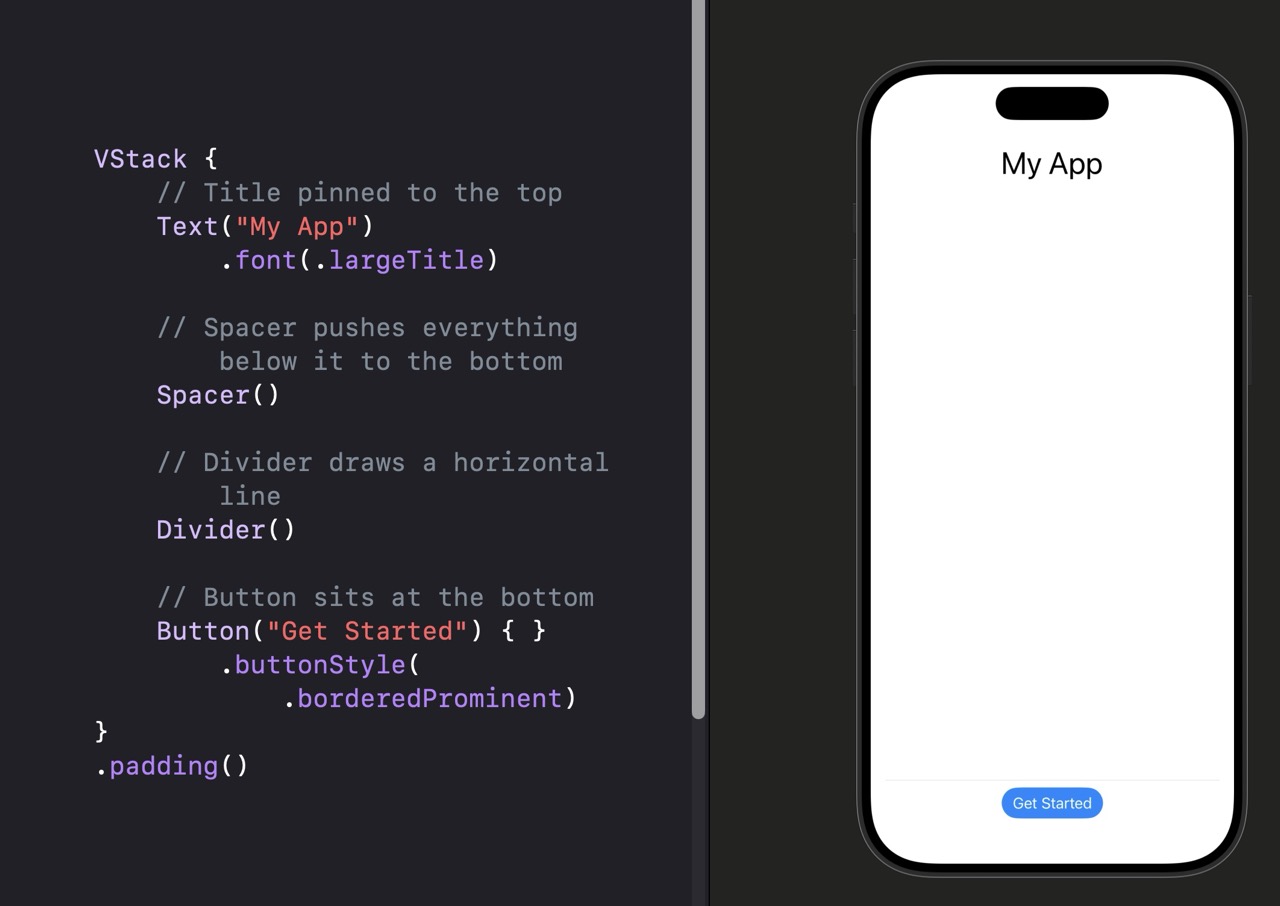
| Line | What it does |
|---|---|
VStack { } | A vertical container. Spacer inside a VStack expands vertically. |
Spacer() | Fills all remaining space in the stack direction. With one Spacer, the title goes up and the button goes down. |
Divider() | Draws a 1pt horizontal line. Inside a VStack it stretches to the full width of the container. |
.padding() | Adds default padding on all four sides of the VStack so content doesn’t touch the screen edges. |
Spacer and Divider Variations
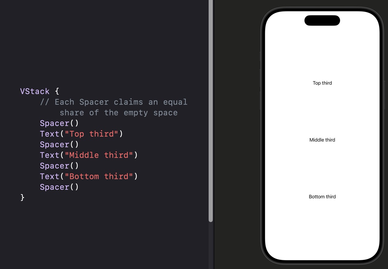
VStack {
    // Each Spacer claims an equal share of the empty space
    Spacer()
    Text("Top third")
    Spacer()
    Text("Middle third")
    Spacer()
    Text("Bottom third")
    Spacer()
}
VStack {
    Text("Section Title").font(.headline)
    // This Spacer will always be at least 32 points tall
    Spacer(minLength: 32)
    Text("Body content below")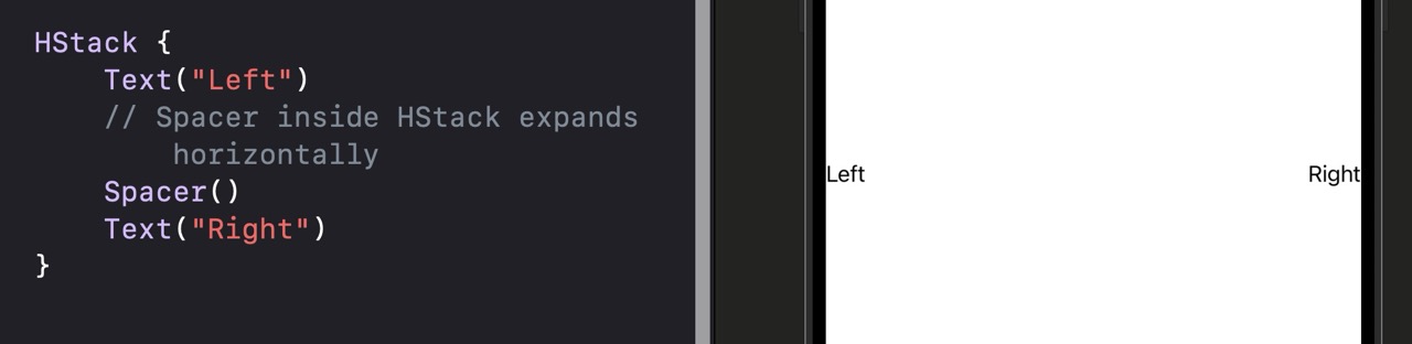
}minLength: guarantees a floor. Useful when you want breathing room that never collapses even on smaller devices.HStack {
Text("Left")
// Spacer inside HStack expands horizontally
Spacer()
Text("Right")
}
HStack {
    Text("Option A")
    // Divider inside HStack draws a vertical line
    Divider()
    Text("Option B")
}
.fixedSize(horizontal: false, vertical: true).fixedSize modifier gives the HStack a defined height so the Divider has something to fill. Without it, Divider may not appear.| View / Modifier | What It Does |
|---|---|
| Spacer() | Fills all available space in the stack direction |
| Spacer(minLength: n) | Same as above but never smaller than n points |
| Divider() | Draws a horizontal line (vertical when inside HStack) |
| Spacer in VStack | Expands vertically, pushes adjacent views toward edges |
| Spacer in HStack | Expands horizontally, pushes adjacent views to sides |
Build a view that looks like a profile row in a settings screen. From left to right: a circle (use Circle().fill(.blue).frame(width: 44, height: 44)), then a VStack with a name and subtitle in a smaller font, then a Spacer, then the text “Edit” in blue. The whole row should have padding on all sides. Check your canvas — it should look like a typical iOS settings cell.
Using AI to Go Further
SwiftUI views size themselves to fit their content by default. A Text is exactly as wide as its text. A Button wraps its label. That’s often exactly what you want — but not always. When you need explicit control over how big a view is, where it sits, or how much space surrounds it, frame(), padding(), and offset() are the tools you reach for.
Think of frame() as setting the outer box that a view fits inside. Think of padding() as adding cushioning around a view. Think of offset() as sliding a view away from where it would normally sit — without disrupting the views around it.
These three modifiers cover the vast majority of explicit sizing and positioning work in SwiftUI. You’ll use them in almost every view you build.
import SwiftUI

struct ContentView: View {
    var body: some View {
        VStack(spacing: 20) {

            // Fixed frame: exactly 200 wide, 60 tall
            Text("Fixed Frame")
                .frame(width: 200, height: 60)
                .background(.blue.opacity(0.2))

            // Padding: adds 16pt space on all sides
            Text("With Padding")
                .padding(16)
                .background(.green.opacity(0.2))

            // Offset: slides 30pt right, 10pt down — doesn't affect layout
            Text("Offset Text")
                .offset(x: 30, y: 10)
                .background(.orange.opacity(0.2))
        }
    }
}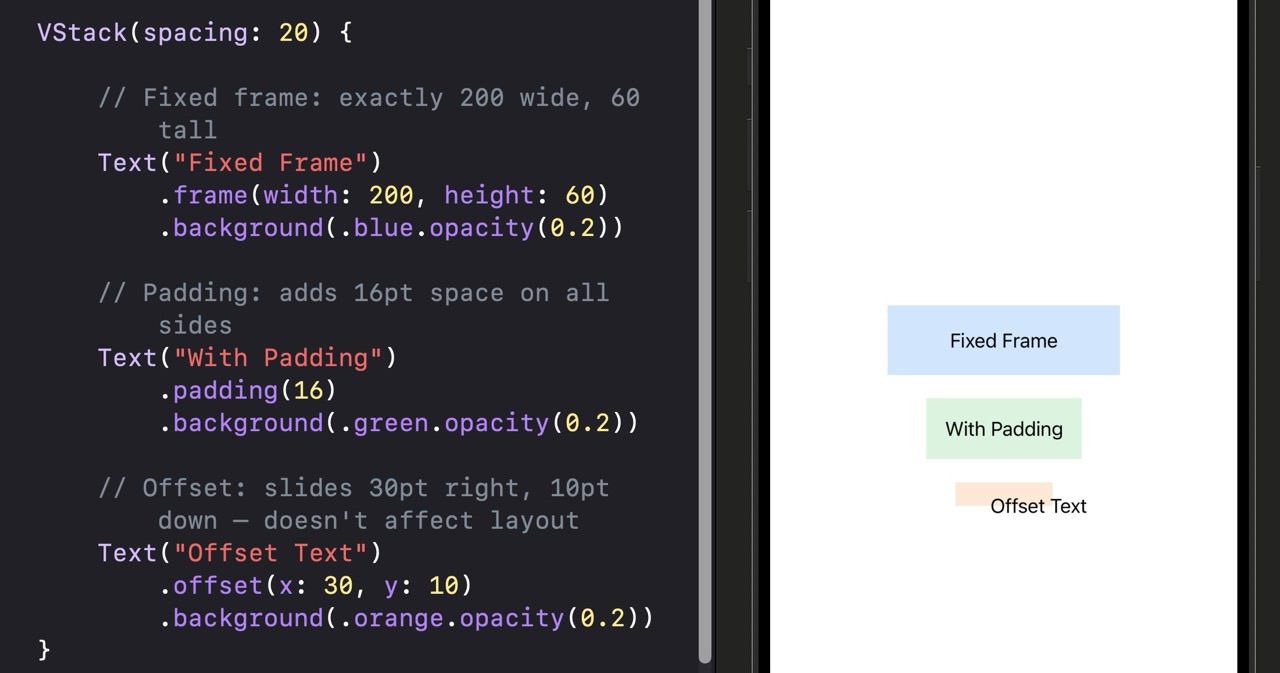
| Modifier | What it does |
|---|---|
.frame(width:height:) | Sets a fixed size. The view’s content is placed inside this box, aligned center by default. |
.padding(16) | Adds 16 points of space between the view’s content and anything outside it on all four sides. |
.offset(x:y:) | Visually shifts the view by x/y points. Other views don’t move — they still think this view is at its original position. |
.background() | Here used to make the frame visible so you can see exactly what area each modifier affects. |
offset() moves a view visually but doesn’t change where the layout system thinks it is. Other views won’t shift to make room. If you need a view to actually move in the layout, use padding() or frame() instead.
frame(), padding(), and offset() Variations
// Fills the full width of its container
Text("Full Width Button")
    .frame(maxWidth: .infinity)
    .padding()
    .background(.blue)
    .foregroundStyle(.white)
.cornerRadius(12)maxWidth: .infinity tells SwiftUI the view wants as much horizontal space as available. This is how you make buttons stretch full-width — a very common pattern for primary CTAs.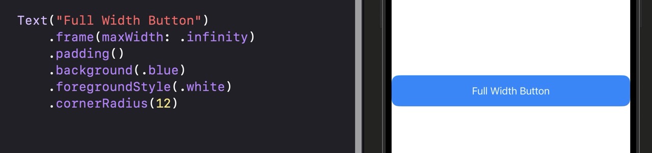
// At least 100 wide, at most 300 wide, grows to fill what's available
Text("Flexible width text")
    .frame(minWidth: 100, maxWidth: 300)
.background(.yellow.opacity(0.4))// Content aligns to the leading (left) edge of the frame
Text("Left aligned")
.frame(maxWidth: .infinity, alignment: .leading)
.padding()alignment: parameter lets you pin the content to any edge. Combined with maxWidth: .infinity, this is the clean way to left-align text in a full-width view.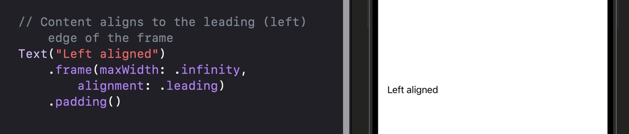
VStack(alignment: .leading) {
    // Only adds padding above the heading
    Text("Section Header")
        .font(.headline)
        .padding(.top, 24)
    Text("Body text with no extra top space")
}.top, .bottom, .leading, .trailing, .horizontal, and .vertical.| Modifier | What It Does |
|---|---|
| .frame(width:height:) | Fixed size box |
| .frame(maxWidth: .infinity) | Stretch to fill available width |
| .frame(minWidth:maxWidth:) | Flexible bounds — grows between min and max |
| .frame(alignment:) | Controls where content sits inside the frame |
| .padding() | Default padding (16pt) on all edges |
| .padding(n) | Custom padding amount on all edges |
| .padding(.edge, n) | Padding on specific edge(s) only |
| .offset(x:y:) | Slide a view visually without affecting layout |
Build a card view: a VStack containing a title and subtitle, both left-aligned using .frame(maxWidth: .infinity, alignment: .leading). The VStack should have 16pt padding on all sides, a white background, 12pt corner radius, and a light shadow. Below the card, add a button that stretches full width. Check your canvas — the card should look like something from a real app.
.background(.white).cornerRadius(12).shadow(radius: 4) to the VStack itself after the padding modifier.
Using AI to Go Further
Most of the time, SwiftUI knows how to size and position your views without any help. But occasionally you need actual numbers — the real width of the screen, or the exact height of a container — so you can do math on them. That’s what GeometryReader is for.
GeometryReader is a container view that tells you the size of the space it occupies. You wrap your content inside it, and you get access to a GeometryProxy — an object with a .size property telling you the available width and height in points.
Here’s the important caveat: GeometryReader should be a last resort, not a first instinct. It has a side effect — it expands to fill all available space, which can throw off your layout unexpectedly. In most cases, .frame(maxWidth: .infinity) or a Spacer will do the job without any of the complications GeometryReader introduces.
GeometryReader, first ask: can I solve this with .frame(maxWidth: .infinity), a Spacer, or a different layout container? If yes, use that instead.
import SwiftUI

struct ContentView: View {
    var body: some View {
        // GeometryReader gives us access to the available size
        GeometryReader { geometry in
            VStack {
                // Use geometry.size.width to make a proportional width
                Rectangle()
                    .fill(.blue)
                    // Always 80% of the available container width
                    .frame(width: geometry.size.width * 0.8, height: 100)

                // Display the actual dimensions so we can see what's happening
                Text("Container is \(Int(geometry.size.width))pt wide")
                    .font(.caption)
            }
        }
    }
}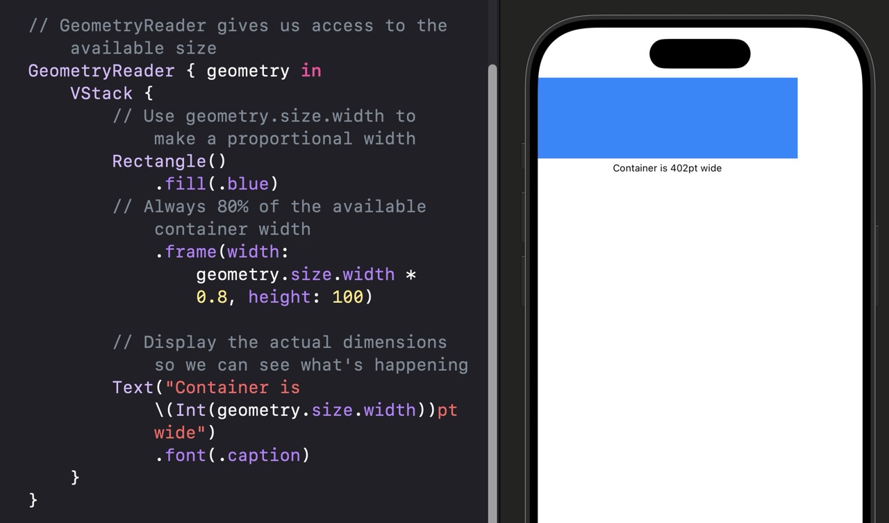
| Line | What it does |
|---|---|
GeometryReader { geometry in } | Creates a container that fills all available space and provides a GeometryProxy named “geometry” inside the closure. |
geometry.size.width | The actual pixel-independent width of the GeometryReader’s container in points. |
geometry.size.width * 0.8 | 80% of the available width — this value automatically adapts to any screen size. |
geometry.size.height | The available height — also accessible the same way. |
GeometryReader Variations
GeometryReader { geometry in
    // Hero image that's always 40% of the screen height
    Rectangle()
        .fill(.indigo)
        .frame(height: geometry.size.height * 0.4)
}VStack {
Text("Header")
// GeometryReader only measures this VStack's remaining space
GeometryReader { geometry in
HStack {
// Sidebar takes up 30% of the remaining horizontal space
Color.blue.frame(width: geometry.size.width * 0.3)
Color.green
}
}
}GeometryReader { geometry in
// minY gives the view's distance from the top of the global screen
let topOffset = geometry.frame(in: .global).minY
Text("I am \(Int(topOffset))pt from the top")
}geometry.frame(in: .global) returns the view’s frame in screen coordinates. This is advanced — most beginners don’t need it. The common use case is scroll-linked animations where you need to know how far a view has scrolled.| Property / Method | What It Does |
|---|---|
| geometry.size.width | Available width in points |
| geometry.size.height | Available height in points |
| geometry.frame(in: .global) | View’s frame in screen coordinates |
| geometry.frame(in: .local) | View’s frame relative to itself |
| geometry.safeAreaInsets | The safe area insets at the time of measurement |
.frame(maxWidth: .infinity)? Can I use a Spacer? Can I use a flexible frame with min/max? In most cases, one of those simpler tools will do the job without GeometryReader’s layout side effects.
Build a simple progress bar using GeometryReader. The bar background should span the full width of the screen. The filled portion should be 65% of that width, using a blue rectangle. The bar should be 16pt tall with 8pt corner radius. Below it, show the text “65% complete”. Check the canvas — the blue fill should end cleanly at 65% of the screen width.
geometry.size.width * 0.65 and align it to the leading edge using .frame(maxWidth: .infinity, alignment: .leading) on the ZStack.
Using AI to Go Further
A regular VStack creates every single child view the moment it loads — even if most of those views are offscreen. That’s fine for a small number of views, but if you have 500 rows in a list, creating all 500 at once wastes memory and slows things down. LazyVStack solves this by only creating views as they scroll into view.
The word “lazy” here means the same thing it does in everyday language: it waits until it has to do the work. A LazyVStack only creates a row when it’s about to become visible on screen. When rows scroll off screen, they can be released from memory. This is how apps with hundreds or thousands of rows stay fast.
The API is identical to VStack and HStack — you just change the name. The key rule: LazyVStack must be placed inside a ScrollView to be useful. Without a ScrollView, there’s no scrolling and no reason to be lazy.
import SwiftUI

struct ContentView: View {
    var body: some View {
        // ScrollView provides the scrollable container
        ScrollView {
            // LazyVStack only creates rows as they scroll into view
            LazyVStack(spacing: 12) {
                // ForEach creates a view for each number 1 through 200
                ForEach(1...200, id: \.self) { number in
                    Text("Row \(number)")
                        .frame(maxWidth: .infinity, alignment: .leading)
                        .padding()
                        .background(.white)
                        .cornerRadius(8)
                }
            }
            .padding()
        }
        .background(Color(.systemGroupedBackground))
    }
}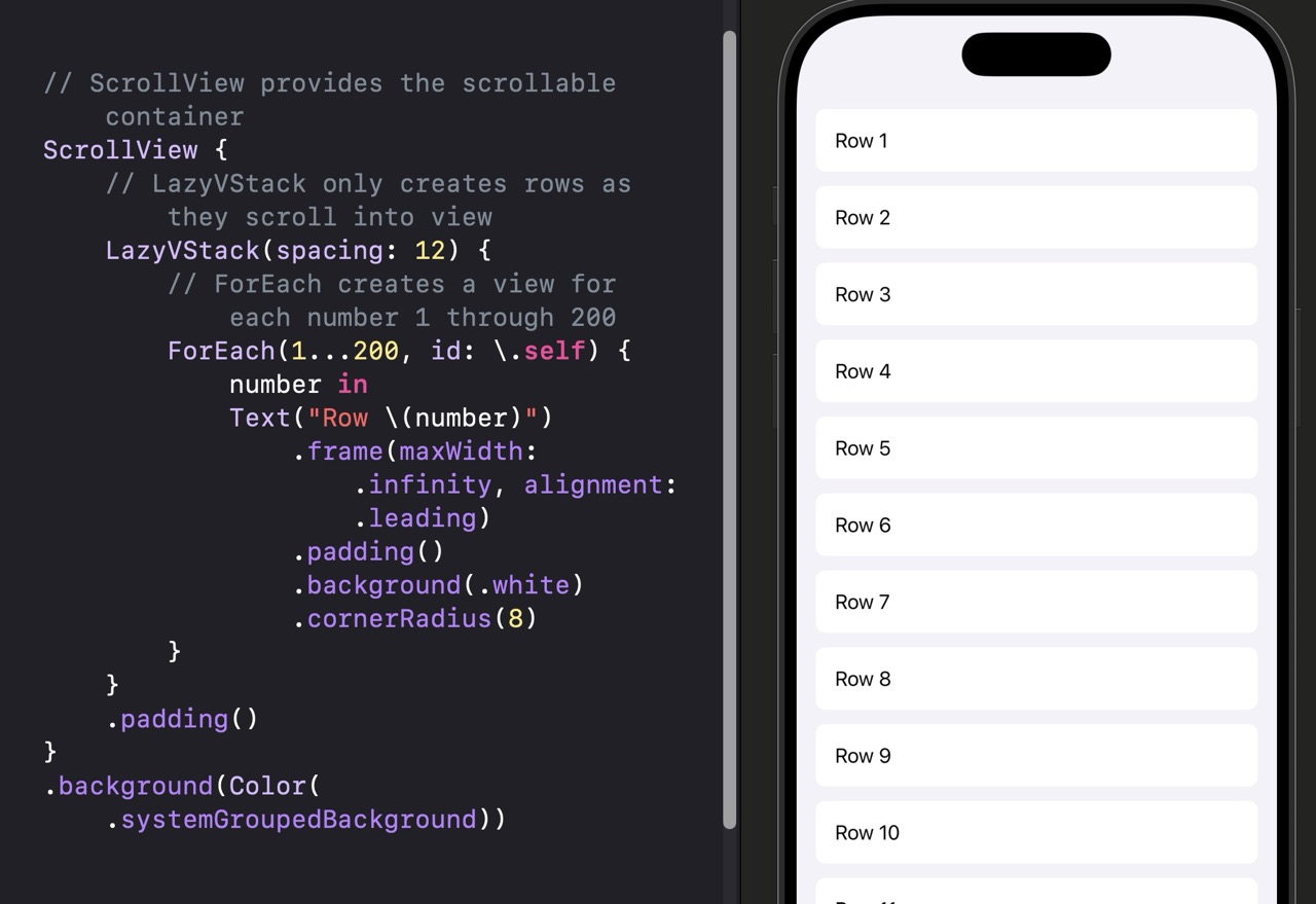
| Line | What it does |
|---|---|
ScrollView { } | Makes its content scrollable. Without this, LazyVStack has no space to scroll and creates all views eagerly. |
LazyVStack(spacing: 12) | A vertical stack that creates child views on demand. The spacing parameter adds 12pt between each row. |
ForEach(1...200, id: \.self) | Creates 200 iterations. id: \.self tells SwiftUI to use each integer as its own unique identifier. |
VStack is simpler and just as fast. Only switch to LazyVStack when the number of views is large or dynamic. For most simple layouts, VStack is the right choice.
Lazy Stack Variations
// Horizontal scroll view with lazy loading
ScrollView(.horizontal, showsIndicators: false) {
    // Creates cards as they scroll into horizontal view
    LazyHStack(spacing: 16) {
        ForEach(1...50, id: \.self) { i in
            // Square card for each item
            RoundedRectangle(cornerRadius: 12)
                .fill(.blue.opacity(0.2))
                .frame(width: 120, height: 120)
                .overlay { Text("\(i)") }
        }
    }
    .padding()
}LazyHStack inside a horizontal ScrollView for horizontally scrolling carousels. This is the pattern behind Netflix-style horizontal content rows.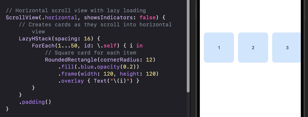
ScrollView {
    LazyVStack(pinnedViews: [.sectionHeaders]) {
        Section {
            ForEach(1...20, id: \.self) { i in
                Text("Item \(i)").padding()
            }
        } header: {
            // This header sticks to the top while its section scrolls
            Text("Section A")
                .font(.headline)
                .frame(maxWidth: .infinity, alignment: .leading)
                .padding()
                .background(.white)
        }
    }
}pinnedViews: parameter on LazyVStack lets section headers stick to the top as content scrolls past them — the same behavior you see in iOS Contacts or Calendar apps.| View / Modifier | What It Does |
|---|---|
| LazyVStack | Vertical stack that creates views on demand as they scroll into view |
| LazyHStack | Same concept, horizontal direction |
| ScrollView(.vertical) | Vertical scroll container — required wrapper for LazyVStack |
| ScrollView(.horizontal) | Horizontal scroll container — required wrapper for LazyHStack |
| pinnedViews: [.sectionHeaders] | Keeps Section headers pinned to the top edge while scrolling |
Build a horizontally scrolling card row. Each card should be 160pt wide and 200pt tall, with a rounded corner of 16pt and a gradient background that changes color per item. Use [.blue, .purple, .pink, .orange, .green] as a colors array and cycle through them using colors[i % colors.count]. Show a number centered on each card. The row should scroll without showing scroll indicators. Check the canvas — you should see colorful cards that scroll horizontally.
LazyHStack inside a ScrollView(.horizontal, showsIndicators: false). Add .padding(.horizontal) to the LazyHStack so the first and last cards aren’t flush with the screen edge.
Using AI to Go Further
VStack and HStack are great for one-dimensional layouts. But when you need rows and columns at the same time — a photo grid, a product catalog, an icon launcher — you need a grid. SwiftUI has two options: Grid for small, fixed layouts where you need precise alignment across rows and columns, and LazyVGrid for large, scrollable grids with dynamic content.
The key to both is GridItem — a value type that defines one column (for LazyVGrid) or acts as a sizing description. You create an array of GridItems, and that array defines how many columns your grid has and how they’re sized.
There are three column types: fixed (always exactly N points wide), flexible (takes a share of available space), and adaptive (fits as many columns as possible given a minimum size). Adaptive is the most powerful — it automatically adjusts the number of columns based on available width.
import SwiftUI

struct ContentView: View {
    // Three flexible columns — each takes one-third of the width
    let columns = [
        GridItem(.flexible()),
        GridItem(.flexible()),
        GridItem(.flexible())
    ]

    var body: some View {
        ScrollView {
            // LazyVGrid lays out items in the defined columns
            LazyVGrid(columns: columns, spacing: 12) {
                ForEach(1...30, id: \.self) { item in
                    // Square cell for each grid item
                    RoundedRectangle(cornerRadius: 10)
                        .fill(.blue.opacity(0.3))
                        .aspectRatio(1, contentMode: .fit)
                        .overlay { Text("\(item)") }
                }
            }
            .padding()
        }
    }
}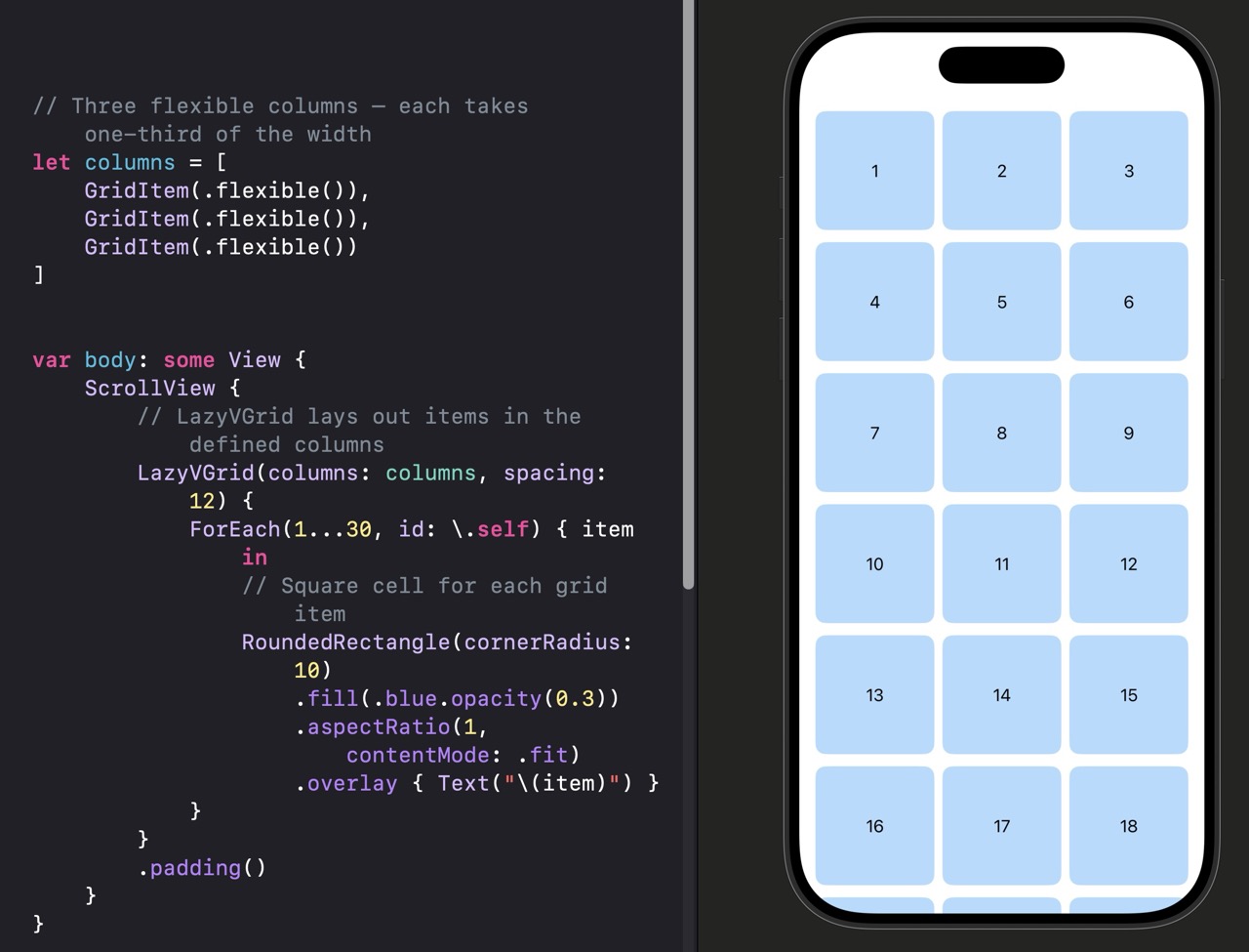
| Line | What it does |
|---|---|
GridItem(.flexible()) | Creates one column that takes an equal share of available space. Three flexible items = three equal columns. |
LazyVGrid(columns:spacing:) | Lays views into columns using the GridItem array. spacing: is the gap between rows. |
.aspectRatio(1, contentMode: .fit) | Makes each cell square — height equals width. The 1 means a 1:1 width-to-height ratio. |
Grid Column Type Variations
// Two fixed columns: one narrow sidebar, one wide main area
let columns = [
    GridItem(.fixed(80)),
    GridItem(.fixed(240))
]// One adaptive column — SwiftUI decides how many fit
let columns = [
GridItem(.adaptive(minimum: 100))
]
// On a 390pt wide screen, this creates 3 columns (390 / 100 ≈ 3-4)
// On a wider iPad, it automatically creates more columns
// Grid is for fixed, known content — not dynamic lists
Grid(alignment: .leading, horizontalSpacing: 20, verticalSpacing: 12) {
    GridRow {
        Text("Name").fontWeight(.bold)
        Text("Chris Ching")
    }
    GridRow {
        Text("Role").fontWeight(.bold)
        Text("iOS Developer")
    }
}Grid view (different from LazyVGrid) uses explicit GridRow containers. It automatically aligns cells across rows — perfect for forms, data tables, or comparison layouts with a fixed number of rows.| View / Type | What It Does |
|---|---|
| LazyVGrid(columns:) | Scrollable grid using a columns array — lazy loading |
| GridItem(.flexible()) | Column that takes an equal share of available width |
| GridItem(.fixed(n)) | Column that is always exactly n points wide |
| GridItem(.adaptive(minimum:)) | Fits as many columns as possible given a minimum width |
| Grid { GridRow { } } | Fixed grid with precise row-level alignment control |
| .aspectRatio(1, contentMode: .fit) | Makes a view square — height equals its width |
Build a grid that looks like iOS Photos using an adaptive layout. Each cell should be a square with a gray background and show an SF Symbol image centered inside it — use Image(systemName: "photo"). The minimum column width should be 100pt. The spacing between cells should be 2pt (tight, like the real Photos app). The whole thing should be scrollable. Check the canvas — cells should tile tightly across the full width.
GridItem(.adaptive(minimum: 100)) as your single column definition. Set both spacing: on the LazyVGrid and the spacing inside your GridItem to 2 for tight cell gutters. No padding needed on the ScrollView.
Using AI to Go Further
Modern iPhones have areas of the screen that are either physically cut into (the Dynamic Island, the notch) or reserved by the system (the home indicator bar at the bottom, the status bar at the top). SwiftUI calls these regions the safe area — and by default, your content stays inside it.
That default is a good one. It prevents your buttons from hiding behind the home indicator and your text from overlapping the status bar clock. But sometimes you want to break out intentionally — to extend a background color or image all the way to the screen edges, for example. The .ignoresSafeArea() modifier lets you do that.
The important mental model here is that .ignoresSafeArea() expands a view’s frame to include safe area regions — but you don’t have to move your content into those regions. You can extend a background behind the status bar while keeping your text inside the safe area.
import SwiftUI

struct ContentView: View {
    var body: some View {
        ZStack {
            // Background extends behind status bar and home indicator
            Color.indigo
                .ignoresSafeArea()

            // Content stays within the safe area by default
            VStack {
                Text("Full bleed background")
                    .foregroundStyle(.white)
                    .font(.title)
                Spacer()
                Text("Content stays safe")
                    .foregroundStyle(.white.opacity(0.7))
            }
            .padding()
        }
    }
}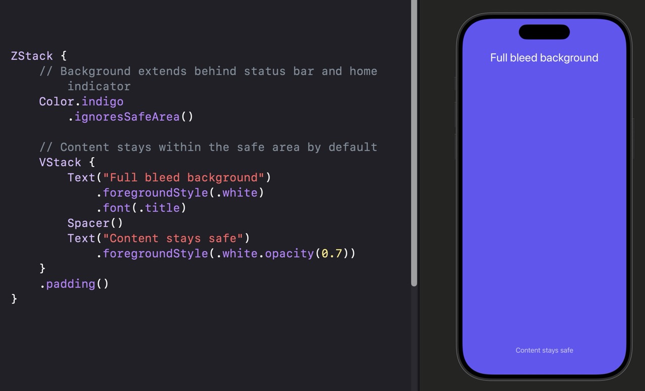
| Line | What it does |
|---|---|
Color.indigo.ignoresSafeArea() | Extends the color fill behind the status bar and home indicator — the full screen edge to edge. |
VStack { } (no ignoresSafeArea) | Without the modifier, the VStack respects the safe area by default. Text stays clear of the Dynamic Island and home indicator. |
ZStack { } | Layers the background and content on top of each other. The background goes full-bleed; the content sits on top inside the safe area. |
.ignoresSafeArea() to background colors and images — not to your interactive content. Buttons and text that land behind the home indicator or under the notch become hard to see and tap.
Safe Area Variations
TextField("Search", text: $searchText)
    .textFieldStyle(.roundedBorder)
    .padding()
    // Prevents the keyboard from shifting this text field's container
.ignoresSafeArea(.keyboard).ignoresSafeArea(.keyboard) to a container disables that behavior — useful when you’re managing keyboard avoidance yourself.Color.blue
// Only extend behind the top (status bar / Dynamic Island)
.ignoresSafeArea(edges: .top)edges: parameter to limit which safe area edges are ignored. Options: .top, .bottom, .leading, .trailing, .horizontal, .vertical, .all.ScrollView {
LazyVStack {
/* list content */
}
}
// Adds a floating button that sits above the bottom safe area
.safeAreaInset(edge: .bottom) {
Button("Compose") { }
.buttonStyle(.borderedProminent)
.padding()
}.safeAreaInset() places a view at the edge of the safe area and automatically adds inset to the main content so nothing is hidden behind the floating overlay. It’s the correct way to add a floating action button or toolbar above a scroll view.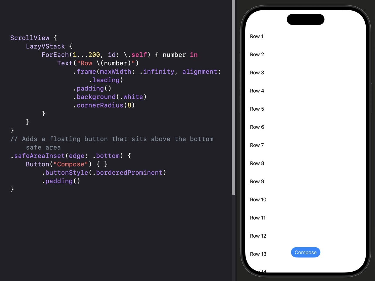
| Modifier | What It Does |
|---|---|
| .ignoresSafeArea() | Extends the view behind all safe area regions |
| .ignoresSafeArea(edges: .top) | Ignores safe area on specific edge(s) only |
| .ignoresSafeArea(.keyboard) | Prevents the keyboard from shifting content |
| .safeAreaInset(edge:) | Adds overlaid content at a safe area edge with automatic content inset |
Build a screen with a full-bleed gradient header at the top. Use a ZStack: a gradient background using LinearGradient from .purple to .indigo that extends behind the status bar using .ignoresSafeArea(edges: .top), and a VStack on top containing a large white title and a subtitle. Below the header area, add a few rows of white content on a gray background. Check the canvas — the gradient should fill all the way to the top of the screen including behind the status bar.
.ignoresSafeArea(edges: .top) to the gradient color itself, not the VStack containing your text.
Using AI to Go Further
Sometimes you want to show a large, full layout on a big screen and a compact version on a small one — without writing complicated conditional logic. ViewThatFits lets SwiftUI make that decision for you.
You give it several alternative views in order of preference. SwiftUI tries to fit the first one in the available space. If it doesn’t fit, it tries the next one. It uses whichever fits first. If none fit, it falls back to the last option regardless. Think of it like giving someone a list of dress code options from most formal to most casual — wear the first one that works.
ViewThatFits is especially useful for button rows that should be horizontal on wide screens and vertical on narrow ones, or for headlines that should show their full text on large devices but a shorter version on small ones.
import SwiftUI

struct ContentView: View {
    var body: some View {
        // ViewThatFits tries each option in order and uses the first that fits
        ViewThatFits {

            // Preferred: horizontal layout for wide containers
            HStack(spacing: 12) {
                Button("Save Draft") { }.buttonStyle(.bordered)
                Button("Preview") { }.buttonStyle(.bordered)
                Button("Publish Post") { }.buttonStyle(.borderedProminent)
            }

            // Fallback: vertical layout for narrow containers
            VStack(spacing: 10) {
                Button("Publish Post") { }
                    .buttonStyle(.borderedProminent)
                    .frame(maxWidth: .infinity)
                Button("Save Draft") { }
                    .buttonStyle(.bordered)
                    .frame(maxWidth: .infinity)
                Button("Preview") { }
                    .buttonStyle(.bordered)
                    .frame(maxWidth: .infinity)
            }
        }
        .padding()
    }
}
| Line | What it does |
|---|---|
ViewThatFits { } | A container that evaluates its children in order and renders the first one that fits in the available space. |
| First child (HStack) | The preferred layout — wide, horizontal. Shown if the container is wide enough for all buttons side by side. |
| Second child (VStack) | The fallback — compact, vertical. Used when the HStack version doesn’t fit. |
ViewThatFits Variations
// Only checks whether views fit horizontally — ignores height
ViewThatFits(in: .horizontal) {
    Text("Get Started with CodeWithChris").font(.title)
    Text("Get Started").font(.title)
    Text("Start").font(.title)
}in: .horizontal makes it only evaluate horizontal fit — useful for text truncation where you want the longest string that doesn’t wrap.// Only checks height fit — useful for tall content in a fixed container
ViewThatFits(in: .vertical) {
// Full detail layout
DetailedInfoView()
// Compact layout used if there isn't enough vertical space
CompactInfoView()
}in: .vertical when your concern is height — for example, inside a sheet or a fixed-height container that might not accommodate your ideal tall layout.| Usage | What It Does |
|---|---|
| ViewThatFits { } | Checks both width and height to find the first fitting view |
| ViewThatFits(in: .horizontal) | Only checks horizontal fit — ignores height |
| ViewThatFits(in: .vertical) | Only checks vertical fit — ignores width |
| First child | Most preferred / largest layout — shown if it fits |
| Last child | Fallback — always used if nothing else fits |
Build a title banner using ViewThatFits(in: .horizontal). The first option should be a long tagline in .title font: “Start building your first iOS app today”. The second should be “Build your first iOS app”. The third should be “Start building”. Check the canvas by wrapping the ViewThatFits in a container of different widths — try constraining it with .frame(width: 200) and .frame(width: 350) to see different options activate.
ViewThatFits in a container view and use .frame(width: 200) on that container in the Xcode canvas preview to simulate a narrow space. Change the width to see different text options kick in.
Using AI to Go Further
Stage 3 Recap: Layout in Depth
You now have precise control over how your views are sized, spaced, and positioned. Here’s what you covered across the seven lessons in this stage:
- Lesson 3.1 — Spacer and Divider: Use Spacer to push views apart and Divider to add a thin separator. Spacer behaves differently inside VStack vs HStack — it always expands in the stack’s direction.
- Lesson 3.2 — frame(), padding(), offset(): frame() sets a view’s size, padding() adds space around it, and offset() slides it visually without affecting the layout of surrounding views. Use
maxWidth: .infinityto stretch a view full-width. - Lesson 3.3 — GeometryReader: GeometryReader gives you the actual dimensions of its container — useful for proportional sizing, but a last resort. Most sizing problems are better solved with frame() or Spacer.
- Lesson 3.4 — LazyVStack and LazyHStack: Lazy stacks create child views only as they scroll into view. Use them inside ScrollView when your content list is large or dynamic. For small, fixed lists, regular VStack is simpler.
- Lesson 3.5 — Grid and LazyVGrid: LazyVGrid creates grid layouts using GridItem columns. Flexible columns share space evenly, fixed columns are exact, and adaptive columns automatically fit as many columns as possible for any screen width.
- Lesson 3.6 — Safe Area: SwiftUI respects the safe area by default to keep content away from the Dynamic Island and home indicator. Use
.ignoresSafeArea()intentionally on backgrounds and images, and.safeAreaInset()for floating overlays that don’t hide content. - Lesson 3.7 — ViewThatFits: Give SwiftUI multiple layout alternatives in order of preference and it will use the first one that fits the available space. Ideal for responsive layouts without conditional logic.
If you skipped any of the challenges, go back and do them. The best way to internalize layout concepts is to build something and check it visually in the canvas — no tutorial can replace that.
In Stage 4 you’ll learn Navigation — how to push views onto a stack, present sheets and alerts, and build the multi-screen flows that every real app needs.
Learn SwiftUI Stage 4: Navigation
Every real app has more than one screen — and this is where you learn to connect them. Navigation is where SwiftUI starts to feel like an actual app.
This stage covers 7 lessons and takes around 3 hours to work through. You’ll need Xcode open and the canvas preview running, but here’s a heads-up: navigation is one of those topics you really have to test in the simulator. Tapping between screens, pushing views, and dismissing sheets all need a running app — the canvas can show you what a single screen looks like, but it can’t simulate the full navigation experience. Get comfortable hitting the Run button early.
By the end of Stage 4, you’ll know how to use NavigationStack and NavigationLink to push views onto a stack, present screens modally with sheets and full-screen covers, show alerts and confirmation dialogs, build tab bar navigation with TabView, and pass data between screens in both directions. These are the building blocks of virtually every multi-screen iOS app.
Think about the Settings app on your iPhone. You tap “General,” a new screen slides in from the right. You tap “About,” another screen slides in. Hit the back button and you go back the way you came. That sliding-in, sliding-back behavior is called push/pop navigation, and in SwiftUI it’s powered by NavigationStack.
NavigationStack is a container view — you wrap it around your content, and it manages a stack of screens. “Stack” is a good mental model here: screens pile up as you navigate deeper, and they come back off the pile as you go back. The screen you’re currently looking at is always on top of the stack.
Before we add any navigation links, let’s start with the simplest possible NavigationStack — a container with a title. This alone gives you the navigation bar at the top, which is where back buttons and titles appear.
import SwiftUI

struct ContentView: View {
    var body: some View {
        // NavigationStack is the container — wrap your content inside it
        NavigationStack {
            // This Text is the content of the root (first) screen
            Text("Welcome to my app")
                // .navigationTitle sets the large title in the nav bar
                .navigationTitle("Home")
        }
    }
}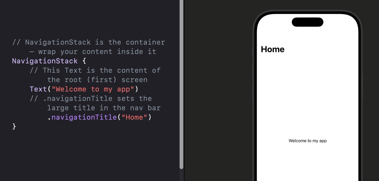
| Line | What it does |
|---|---|
NavigationStack { } |
Creates the navigation container. Everything inside it becomes part of the navigation stack. The first view inside is the root — the starting screen. |
Text("Welcome to my app") |
The content of the root screen. In a real app this would be a full view — a list, a grid, whatever your first screen needs to show. |
.navigationTitle("Home") |
Sets the title shown in the navigation bar at the top of the screen. Apply this to the content inside NavigationStack, not to NavigationStack itself. |
NavigationView instead of NavigationStack. NavigationView still works, but Apple deprecated it in iOS 16. NavigationStack is the modern replacement and handles many edge cases better. Use NavigationStack for any new project.
Customizing the Navigation Bar
NavigationStack {
    Text("Content here")
        // String literal becomes the nav bar title
        .navigationTitle("My App")
}Text("Content")
.navigationTitle("Settings")
// .large = big collapsible title (default), .inline = smaller centered title
.navigationBarTitleDisplayMode(.inline).large for root screens and .inline for detail screens pushed deeper in the stack. This matches the pattern Apple uses in its own apps.Text("Content")
.navigationTitle("Home")
.toolbar {
// ToolbarItem places a button in the nav bar
ToolbarItem(placement: .navigationBarTrailing) {
Button("Add") {
// action goes here
}
}
}.navigationBarTrailing for the right side (common for Add or Edit buttons) and .navigationBarLeading for the left. The system handles layout automatically.Text("Content")
.navigationTitle("Home")
// Set the nav bar background to a custom color
.toolbarBackground(Color.blue, for: .navigationBar)
.toolbarBackground(.visible, for: .navigationBar)| Modifier | What It Does |
|---|---|
| .navigationTitle(“Title”) | Sets the text shown in the nav bar |
| .navigationBarTitleDisplayMode(.large) | Big collapsible title — good for root screens |
| .navigationBarTitleDisplayMode(.inline) | Small centered title — good for detail screens |
| .toolbar { } | Adds buttons or items to the nav bar |
| .toolbarBackground(color, for: .navigationBar) | Sets nav bar background color (iOS 16+) |
.large and .inline. Run in the simulator and scroll to see the large title collapse.
Using AI to Go Further
You have a NavigationStack. Now you need something the user can tap to move to the next screen. That’s NavigationLink. Think of it like a hyperlink on a webpage — you tap it and you go somewhere. The difference is that instead of loading a URL, you’re pushing a new SwiftUI view onto the navigation stack.
NavigationLink works in two parts: the label (what the user sees and taps) and the destination (the view that appears when they tap it). The label can be anything — text, an image, a whole custom row. The destination is any SwiftUI view you want to show next.
Here’s the most common pattern you’ll use as a beginner — a list of items where each row is a NavigationLink that pushes to a detail screen:
import SwiftUI

struct ContentView: View {
    var body: some View {
        NavigationStack {
            // List gives us rows — each row can be a NavigationLink
            List {
                // NavigationLink: label is what you see, destination is where you go
                NavigationLink("Go to Detail") {
                    // This view appears when the user taps the link
                    DetailView()
                }
                NavigationLink("Go to Settings") {
                    SettingsView()
                }
            }
            .navigationTitle("Home")
        }
    }
}

struct DetailView: View {
    var body: some View {
        // The back button appears automatically — no code needed
        Text("You're on the detail screen")
            .navigationTitle("Detail")
            .navigationBarTitleDisplayMode(.inline)
    }
}

struct SettingsView: View {
    var body: some View {
        Text("Settings screen")
            .navigationTitle("Settings")
            .navigationBarTitleDisplayMode(.inline)
    }
}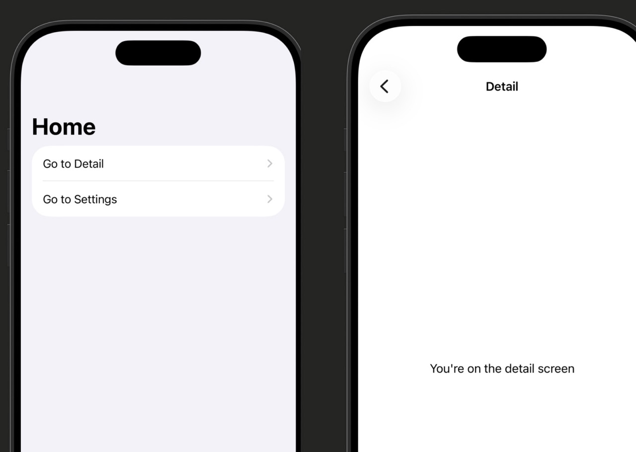
| Line | What it does |
|---|---|
NavigationLink("Go to Detail") { } |
The string is the label — what appears in the row. The closure is the destination — the view that gets pushed when tapped. |
DetailView() |
The destination view. You’re creating an instance of your custom view right here. In a real app you’d often pass data into it as well (more on that below). |
| Back button | SwiftUI adds the back button automatically — you don’t need to write any code for it. It’s labeled with the title of the previous screen. |
.navigationBarTitleDisplayMode(.inline) |
On detail screens pushed from a list, inline mode looks cleaner. It keeps the title small and leaves room for the back button. |
Passing Data to the Destination
Most of the time you’re not just navigating to a blank screen — you’re passing data along with you. Here’s how to send data forward to a detail view:
struct ContentView: View {
    // Simple array of fruit names to display in a list
    let fruits = ["Apple", "Banana", "Cherry"]

    var body: some View {
        NavigationStack {
            List(fruits, id: \.self) { fruit in
                // Pass `fruit` into the destination so it knows which item to show
                NavigationLink(fruit) {
                    FruitDetailView(fruit: fruit)
                }
            }
            .navigationTitle("Fruits")
        }
    }
}

struct FruitDetailView: View {
    // The destination receives the value as a stored property
    let fruit: String

    var body: some View {
        Text("You selected: \(fruit)")
            .navigationTitle(fruit)
            .navigationBarTitleDisplayMode(.inline)
    }
}let since you’re receiving it, not changing it.// Instead of a plain string, use a trailing closure for a custom label
NavigationLink {
DetailView()
} label: {
// Anything here becomes the tappable area
HStack {
Image(systemName: "star.fill")
.foregroundColor(.yellow)
Text("Featured Item")
.font(.headline)
}
}label: closure form when you want a custom-looking row instead of plain text. The entire label view becomes tappable and gets the chevron arrow automatically when inside a List.NavigationStack {
List(fruits, id: \.self) { fruit in
// Just pass the value — no destination closure needed here
NavigationLink(fruit, value: fruit)
}
.navigationTitle("Fruits")
// Declare what view to show for a given type of value
.navigationDestination(for: String.self) { fruit in
FruitDetailView(fruit: fruit)
}
}| Pattern | When to Use It |
|---|---|
| NavigationLink(“Label”) { DestView() } | Simple navigation, small number of links, destination doesn’t need data |
| NavigationLink(fruit) { FruitDetailView(fruit: fruit) } | Passing a value forward, one destination per link |
| NavigationLink(“Label”) { } label: { CustomView } | When you want a custom-designed row instead of plain text |
| NavigationLink(value: item) + .navigationDestination | iOS 16+, many links to the same destination type, or programmatic navigation |
Using AI to Go Further
So far, navigation happens because the user taps something. But what if you need your code to navigate — without a user tap? Imagine an onboarding flow that automatically moves to the next step after something completes, or a deep link that opens the app directly on a specific screen. That’s programmatic navigation.
NavigationPath is a value that represents the current stack of screens. When you hand that path to your NavigationStack, you’re in control: append a value to the path and a new screen gets pushed. Remove the last value and you go back. Empty the whole path and you’re back at the root.
This is an intermediate concept — you don’t need it for most beginner apps. But once you start building real multi-screen flows, you’ll reach for it regularly.
import SwiftUI

struct ContentView: View {
    // @State holds the navigation path — changes to it drive navigation
    @State private var path = NavigationPath()

    var body: some View {
        // Pass a binding to the path so NavigationStack can read and write it
        NavigationStack(path: $path) {
            VStack(spacing: 20) {
                // Tapping this button pushes "Detail" onto the path programmatically
                Button("Go to Detail from code") {
                    path.append("Detail")
                }
                // This navigates two levels deep at once
                Button("Skip to Settings") {
                    path.append("Detail")
                    path.append("Settings")
                }
                // This jumps back to root no matter how deep we are
                Button("Go back to root") {
                    path.removeLast(path.count)
                }
            }
            .navigationTitle("Home")
            // Declare what view to show when a String value is pushed
            .navigationDestination(for: String.self) { screen in
                Text("Screen: \(screen)")
                    .navigationTitle(screen)
            }
        }
    }
}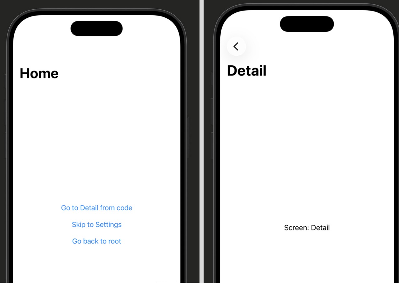
| Line | What it does |
|---|---|
@State private var path = NavigationPath() |
Creates an empty navigation path stored in state. Because it’s @State, any change to it will automatically update the UI — screens get pushed or popped. |
NavigationStack(path: $path) |
The binding ($path) connects the stack to your state. The stack reads the path to know which screens to show, and writes to it when the user hits the back button. |
path.append("Detail") |
Pushes a new screen. SwiftUI looks at the appended value’s type, finds the matching .navigationDestination, and presents that view. |
path.removeLast(path.count) |
Removes all items from the path, which pops all screens and returns to the root. This is the “go home” pattern. |
@State is how SwiftUI stores values that can change over time and drive UI updates. When path changes — a value is appended or removed — SwiftUI automatically re-renders the NavigationStack to reflect the new state. You’ll learn more about @State in Stage 2 of the State and Data series.
NavigationPath Patterns
// Append any Hashable value — the type must match a .navigationDestination
path.append("SettingsScreen")

// You can also append custom types if they conform to Hashable
path.append(selectedUser)Hashable — a Swift protocol that means the value can be used as a unique key. Strings, Ints, and most basic types are already Hashable. Custom structs need to explicitly conform.// Go back one screen (same as user tapping the back button)
path.removeLast()
// Go back two screens at once
path.removeLast(2)
// Go all the way back to root
path.removeLast(path.count)NavigationStack(path: $path) {
ContentView()
// One destination for String values
.navigationDestination(for: String.self) { name in
UserDetailView(name: name)
}
// A separate destination for Int values
.navigationDestination(for: Int.self) { id in
ItemDetailView(id: id)
}
}| Operation | What It Does |
|---|---|
| NavigationPath() | Creates an empty path (no extra screens) |
| path.append(value) | Pushes a new screen for the given value’s type |
| path.removeLast() | Pops the top screen (go back one) |
| path.removeLast(path.count) | Pops all screens (go to root) |
| path.count | Number of screens currently on the stack above root |
| path.isEmpty | True when you’re at the root screen |
Using AI to Go Further
Push navigation isn’t the only way to show a new screen. Sometimes a screen should slide up from the bottom rather than push in from the side — like when you tap “New Message” in Mail or “New Event” in Calendar. That bottom-up presentation is called a modal, and SwiftUI has two modifiers for it: .sheet and .fullScreenCover.
The key difference is how much screen they cover. A sheet slides up and shows a bit of the underlying screen peeking out at the top — the user can see they’re temporarily leaving the main view. A fullScreenCover takes over the entire screen, just like push navigation but coming from the bottom. Use sheets for temporary forms, filter panels, and details that don’t need their own nav bar. Use fullScreenCover for things like login screens or camera views.
Both work the same way under the hood: you bind them to a Bool. When the Bool is true, the sheet appears. When it’s false, the sheet is dismissed.
import SwiftUI

struct ContentView: View {
    // @State bool controls whether the sheet is showing
    @State private var showSheet = false

    var body: some View {
        Button("Open Sheet") {
            // Setting to true triggers the sheet to appear
            showSheet = true
        }
        // .sheet watches the bool — appears when true, dismisses when false
        .sheet(isPresented: $showSheet) {
            SheetContentView()
        }
    }
}

struct SheetContentView: View {
    // @Environment(\.dismiss) gives access to the dismiss action
    @Environment(\.dismiss) var dismiss

    var body: some View {
        VStack {
            Text("This is a sheet")
            // Calling dismiss() closes the sheet from inside it
            Button("Close") {
                dismiss()
            }
        }
    }
}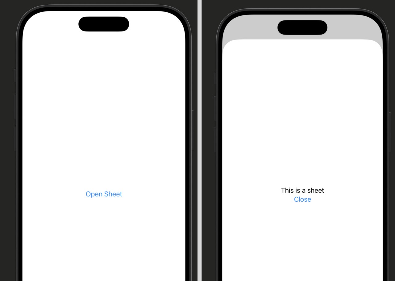
| Line | What it does |
|---|---|
@State private var showSheet = false |
The switch that controls the sheet. True = sheet is visible. False = sheet is hidden. SwiftUI watches this and reacts automatically. |
.sheet(isPresented: $showSheet) |
Attaches the sheet to the view. The binding means SwiftUI can both read (is it showing?) and write (set it back to false when dismissed) this value. |
@Environment(\.dismiss) var dismiss |
Gives the sheet’s content access to the dismiss action. Calling dismiss() sets the parent’s Bool back to false and closes the sheet. |
.interactiveDismissDisabled() modifier on the sheet’s content to prevent accidental dismissal.
Sheet Variations
// Same API as .sheet — just swap the modifier name
.fullScreenCover(isPresented: $showCover) {
    LoginView()
}// When selectedFruit is non-nil, the sheet appears with that fruit's data
@State private var selectedFruit: String? = nil
Button("Show Apple") {
selectedFruit = "Apple"
}
// sheet(item:) takes an optional Identifiable value — show when non-nil
.sheet(item: $selectedFruit) { fruit in
// fruit is the unwrapped value, available directly
FruitDetailView(fruit: fruit)
}.sheet(isPresented: $showSheet) {
FilterView()
// Sheet stops at medium height — user can drag to expand
.presentationDetents([.medium, .large])
}.presentationDetents for a bottom sheet that starts half-height — perfect for filter panels, quick actions, or supplementary content. Users can drag between the sizes you define.| Modifier | What It Does |
|---|---|
| .sheet(isPresented: $bool) { View } | Shows a view modally from the bottom; Bool controls visibility |
| .fullScreenCover(isPresented: $bool) { View } | Same as sheet but covers the full screen; no swipe-to-dismiss |
| .sheet(item: $optionalItem) { item in View } | Sheet bound to optional data — appears when non-nil |
| @Environment(\.dismiss) var dismiss | Dismiss action — call dismiss() to close the sheet from inside |
| .presentationDetents([.medium, .large]) | Half-height sheet that can expand (iOS 16+) |
| .interactiveDismissDisabled() | Prevents swipe-to-dismiss — useful for unsaved data |
.presentationDetents([.medium]) to make it a half-height sheet. Run in the simulator.
Using AI to Go Further
Alerts and confirmation dialogs are the two ways iOS asks the user to confirm an action or choose between options. Think about what happens when you try to delete a photo — the system shows a small popup asking if you’re sure. That’s an alert. When you tap the share button in Safari and see a menu sliding up from the bottom with several choices, that’s a confirmation dialog (sometimes called an action sheet).
The rule of thumb: use an alert for urgent, important messages where you want the user’s full attention — two options maximum, usually “OK” and “Cancel.” Use a confirmationDialog when you have three or more choices or a destructive action that needs a clear presentation.
Both follow the same pattern you saw with sheets: bind them to a Bool, and when the Bool is true, they appear.
import SwiftUI

struct ContentView: View {
    // Bool that controls alert visibility
    @State private var showDeleteAlert = false

    var body: some View {
        Button("Delete Item") {
            // Show the alert when the button is tapped
            showDeleteAlert = true
        }
        // .alert watches the bool and presents when true
        .alert("Delete this item?", isPresented: $showDeleteAlert) {
            // Buttons go in the first trailing closure
            Button("Delete", role: .destructive) {
                // Perform the delete action here
            }
            // .cancel buttons are styled automatically by iOS
            Button("Cancel", role: .cancel) { }
        } message: {
            // Optional supporting text shown below the title
            Text("This cannot be undone.")
        }
    }
}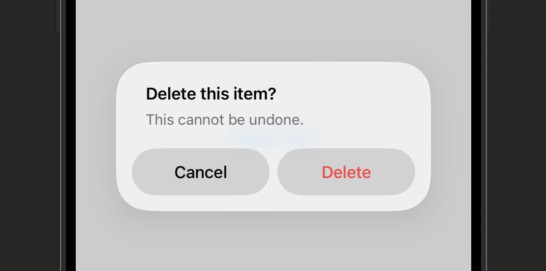
| Line | What it does |
|---|---|
.alert("Title", isPresented: $bool) |
Attaches the alert to the view. The string is the alert’s headline. The Bool binding controls whether it’s showing. |
role: .destructive |
Makes the button appear in red — iOS’s standard way to signal a dangerous action. Always use this on delete or irreversible buttons. |
role: .cancel |
iOS styles this button in bold and positions it at the bottom. It automatically dismisses the alert — you don’t need any action inside. |
message: { Text(...) } |
Optional secondary text shown below the title. Use it to give the user more context about what will happen. |
Alert and Dialog Variations
@State private var showOptions = false

Button("Share") {
    showOptions = true
}
// confirmationDialog slides up from the bottom like an action sheet
.confirmationDialog("Share this item", isPresented: $showOptions) {
    Button("Save to Photos") { }
    Button("Copy Link") { }
    Button("Delete", role: .destructive) { }
    Button("Cancel", role: .cancel) { }
}// Alert appears when errorMessage is non-nil, dismisses when set to nil
@State private var errorMessage: String? = nil
.alert("Error", isPresented: Binding(
get: { errorMessage != nil },
set: { if !$0 { errorMessage = nil } }
)) {
Button("OK", role: .cancel) { }
} message: {
Text(errorMessage ?? "")
}errorMessage to the error text — the alert appears. When dismissed, it sets itself back to nil. The Binding initializer here manually connects the optional to the Bool the alert needs.| Modifier | When to Use |
|---|---|
| .alert(“Title”, isPresented: $bool) | Urgent or important messages — 1 to 2 buttons |
| .confirmationDialog(“Title”, isPresented: $bool) | 3 or more choices, or destructive multi-option actions |
| role: .destructive | Red button styling — signals irreversible actions |
| role: .cancel | Bold styled cancel button — auto-dismisses on tap |
| message: { Text(…) } | Secondary supporting text shown below alert title |
Using AI to Go Further
Tab bar navigation is one of the most recognizable patterns in iOS. If you’ve used Instagram, the App Store, or the Clock app, you’ve used a tab bar. Those icons at the bottom of the screen that let you jump between completely separate sections of an app — that’s TabView.
The key mental model for TabView is that each tab is an independent section. Unlike push navigation where screens are stacked on top of each other, tabs sit side by side. Each tab has its own navigation state — you can be deep in a push stack on one tab and it won’t affect what’s happening in another.
Setting up a basic tab bar takes just a few lines: wrap your views in TabView and give each one a .tabItem modifier that describes its icon and label.
import SwiftUI

struct ContentView: View {
    var body: some View {
        // TabView is the container — every direct child becomes a tab
        TabView {
            // Each view gets a .tabItem that defines its icon and label
            HomeView()
                .tabItem {
                    Label("Home", systemImage: "house.fill")
                }

            SearchView()
                .tabItem {
                    Label("Search", systemImage: "magnifyingglass")
                }

            ProfileView()
                .tabItem {
                    Label("Profile", systemImage: "person.fill")
                }
        }
    }
}

struct HomeView: View {
    var body: some View {
        // Each tab gets its own NavigationStack for independent navigation
        NavigationStack {
            Text("Home Screen")
                .navigationTitle("Home")
        }
    }
}

struct SearchView: View {
    var body: some View {
        NavigationStack {
            Text("Search Screen")
                .navigationTitle("Search")
        }
    }
}

struct ProfileView: View {
    var body: some View {
        NavigationStack {
            Text("Profile Screen")
                .navigationTitle("Profile")
        }
    }
}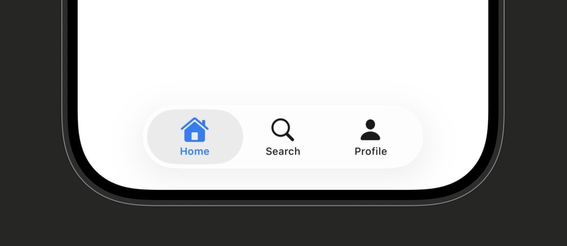
| Line | What it does |
|---|---|
TabView { } |
The container. Every direct child view inside becomes a tab. Tabs appear in the order you write them. |
.tabItem { } |
Required on every tab’s view. Defines what appears in the tab bar for that tab. Only Label, Text, or Image work inside here — custom styled views are not supported. |
Label("Home", systemImage: "house.fill") |
Creates the tab bar item with both a text label and an SF Symbol icon. The system handles layout, sizing, and tint color automatically. |
NavigationStack inside each tab |
Each tab manages its own navigation stack independently. Push a detail view on the Home tab and the Search tab stays exactly where it was. |
.tabItem modifier on one of your tabs. Without it, that tab will appear blank in the bar — no icon, no label. SwiftUI doesn’t warn you, it just shows nothing. Every view inside a TabView needs its own .tabItem.
TabView Customization
// @State variable tracks the currently active tab
@State private var selectedTab = 0

// Pass a binding so the TabView can read and write the selected tab
TabView(selection: $selectedTab) {
    HomeView()
        .tabItem { Label("Home", systemImage: "house") }
        // .tag() assigns an identifier — must match the type of selectedTab
        .tag(0)
    ProfileView()
        .tabItem { Label("Profile", systemImage: "person") }
        .tag(1)
}

// Jump to Profile tab from anywhere in your code
Button("Go to Profile") {
    selectedTab = 1
}MessagesView()
.tabItem {
Label("Messages", systemImage: "envelope")
}
// Shows a red badge with the number — drive it from your data model
.badge(3)TabView {
// tabs here
}
// Apply .tint to the TabView itself to change the selected tab color
.tint(.orange).tint() on the TabView itself to match your app’s brand color. iOS 16+. Use .accentColor() for older target deployments.| Modifier | What It Does |
|---|---|
| .tabItem { Label(“Title”, systemImage: “icon”) } | Required — defines the tab bar icon and label for each tab |
| .tag(value) | Assigns an identifier to a tab for programmatic switching |
| TabView(selection: $selectedTab) | Binds a @State variable to the active tab |
| .badge(count) | Shows a red badge number on the tab icon |
| .tint(.color) | Changes the selected tab’s highlight color |
Using AI to Go Further
Navigation is about moving between screens. Data flow is about what travels with you. These two topics come together here — because understanding how to push to a new screen is only half the picture. The other half is making sure the right data arrives there, and knowing how to send changes back.
There are two directions data travels between screens. Forward is straightforward: you’re going somewhere and you bring what you need with you — just like passing a parameter to a function. Backward is trickier: the detail screen needs to tell the parent screen something changed. That’s where @Binding and @Environment(\.dismiss) come in.
This lesson pulls together what you’ve learned in Stage 4 with the data flow concepts from Stage 2. Let’s look at both directions with a realistic example.
import SwiftUI

struct ContentView: View {
    // @State owns the username — this is the source of truth
    @State private var username = "Alex"

    var body: some View {
        NavigationStack {
            VStack(spacing: 20) {
                Text("Hello, \(username)")
                    .font(.title)
                // Pass a binding so EditView can write back to this @State
                NavigationLink("Edit Profile") {
                    EditView(username: $username)
                }
            }
            .navigationTitle("Home")
        }
    }
}

struct EditView: View {
    // @Binding connects to the parent's @State — changes here update the parent
    @Binding var username: String

    var body: some View {
        VStack {
            // TextField with a binding — the user types and it updates instantly
            TextField("Username", text: $username)
                .textFieldStyle(.roundedBorder)
                .padding()
            Text("Preview: \(username)")
        }
        .navigationTitle("Edit Profile")
        .navigationBarTitleDisplayMode(.inline)
    }
}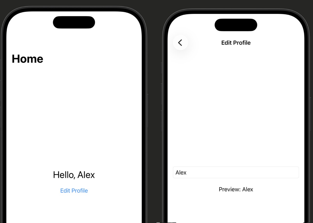
| Line | What it does |
|---|---|
@State private var username = "Alex" |
The parent owns the data. @State is the source of truth — only one place in your code should own each piece of data. |
EditView(username: $username) |
Passing a binding ($username) instead of a plain value. The $ prefix creates a two-way connection — changes in EditView write back to ContentView’s @State. |
@Binding var username: String |
The child receives a binding — not its own copy, but a reference to the parent’s @State. Changes here propagate back immediately. |
TextField("Username", text: $username) |
TextField also takes a binding. As the user types, it writes to $username, which updates both this view and the parent at the same time. |
let username: String) is a copy — changes stay local. A binding (@Binding var username: String) points back to the original — changes are shared.
Data Direction Patterns
// Parent passes a value — the child gets a read-only copy
NavigationLink("View Details") {
    DetailView(item: selectedItem)
}

struct DetailView: View {
    // let = constant, can't be changed — this is display-only data
    let item: Item

    var body: some View {
        Text(item.name)
    }
}let property when the destination only needs to display data, not change it. This is the simplest pattern and the right default — only reach for @Binding when you need changes to travel back.// Parent owns the data with @State
@State private var isEnabled = true
// Pass a binding — the sheet can toggle this value
.sheet(isPresented: $showSettings) {
SettingsSheet(isEnabled: $isEnabled)
}
struct SettingsSheet: View {
@Binding var isEnabled: Bool
var body: some View {
// Toggle writes back to the parent's @State via the binding
Toggle("Enable Feature", isOn: $isEnabled)
.padding()
}
}struct AddItemSheet: View {
@Environment(\.dismiss) var dismiss
var body: some View {
VStack {
Text("Add a new item")
Button("Done") {
// Save your data, then dismiss
dismiss()
}
}
}
}@Environment(\.dismiss) is the right tool. It asks the presentation system to remove this view, regardless of how it was presented.| Pattern | Use When |
|---|---|
| let property in destination | Passing data forward that won’t be edited |
| @Binding in destination + $value at call site | Destination needs to modify the parent’s data |
| @Environment(\.dismiss) + dismiss() | Closing a modal/sheet from inside, no data to return |
| @State in parent + @Binding in child | Parent owns data, child edits it — the canonical pattern |
Using AI to Go Further
Stage 4 Recap: Navigation
You’ve covered all the essential navigation patterns in SwiftUI — and your apps can now have multiple screens that are genuinely connected. That’s a real, meaningful milestone.
- Lesson 4.1 — NavigationStack: The foundation of push/pop navigation. Wrap your content in NavigationStack and use
.navigationTitle,.toolbar, and.toolbarBackgroundto build polished nav bars. - Lesson 4.2 — NavigationLink: The tap target that pushes new views. Use it with plain string labels, custom label closures, or the modern
.navigationDestination(for:)pattern for data-driven navigation. - Lesson 4.3 — Programmatic Navigation:
NavigationPathlets you drive navigation from code — append values to push screens, callremoveLastto go back, and empty the path to return to root without a user tap. - Lesson 4.4 — Sheet and fullScreenCover: Modal presentations that slide up from the bottom. Bind to a Bool or an optional item, and use
@Environment(\.dismiss)to close them from inside. - Lesson 4.5 — Alert and confirmationDialog: Alert for urgent 1–2 button confirmations; confirmationDialog for 3+ choices. Use
role: .destructiveon dangerous actions androle: .cancelfor the escape route. - Lesson 4.6 — TabView: Side-by-side section navigation. Every tab needs a
.tabItem, its ownNavigationStack, and — when you need programmatic switching — a.tag()and selection binding. - Lesson 4.7 — Passing Data Between Screens: Pass data forward with a plain
let; pass it back with@Binding. Use@Environment(\.dismiss)when you just need to close. The parent always owns the data with@State.
Go run one of this stage’s challenges in the simulator if you haven’t already. Tapping between screens, pushing detail views, dismissing sheets — these things have to be felt in a running app to really stick.
Stage 5 is Lists and Data Display — where you’ll learn to take real data and render it efficiently in lists, grids, and scroll views.
Learn SwiftUI Stage 5: Lists and Data Display
Almost every app you’ve ever used is, at its core, a list of something. Contacts, messages, songs, recipes, transactions. This is the stage where that fundamental pattern clicks — and where your apps start feeling like real products.
You’ll need Xcode open with the canvas preview running throughout this stage. There are seven lessons and roughly three hours of material. Every lesson ends with a challenge — don’t skip them. The challenges in this stage all connect to the same running project, so each one builds on the last.
By the end of Stage 5 you’ll understand how to display collections of data using List and ForEach, how to build custom row views, how to organise content with sections and headers, how to add swipe actions and pull-to-refresh, and — crucially — how to decide which display approach to reach for in any given situation.
Every app that shows more than one item of the same kind — a contact list, a task list, a feed — needs a way to display repeating data. In SwiftUI, the primary tool for that job is List. It wraps your content in a scrollable, system-styled table that looks right on every device and handles a lot of the work for you automatically.
You can think of a List like a vending machine shelf. Each slot holds one item of the same shape, arranged from top to bottom, and the user scrolls down to see more. You define what each slot looks like once, and SwiftUI fills in the rest.
In this lesson you’ll start with the simplest possible list — a static one with hardcoded rows — then move on to dynamic lists that read from an array. You’ll also meet the Identifiable protocol, which is how SwiftUI tells your rows apart.
import SwiftUI

struct ContentView: View {
    var body: some View {
        // List wraps its children in a scrollable, system-styled container
        List {
            // Each view inside becomes one row
            Text("Milk")
            Text("Eggs")
            Text("Bread")
            Text("Butter")
        }
    }
}
| Line | What it does |
|---|---|
List { } |
Creates the scrollable container. Everything you put inside becomes a row. |
Text("Milk") |
A single row. SwiftUI wraps each child view in a row automatically — you don’t have to add any row styling yourself. |
| The divider lines | SwiftUI adds separator lines between rows for free. You don’t write any code for them. |
Dynamic Lists from an Array
Hardcoded rows only work when you know every item at build time. For anything data-driven, you pass an array to List and tell it how to display each element. Here’s a grocery list built from a Swift array:
struct ContentView: View {
    // An array of strings to display
    let items = ["Milk", "Eggs", "Bread", "Butter"]

    var body: some View {
        // id: \.self tells SwiftUI to use the string value itself as the unique identifier
        List(items, id: \.self) { item in
            Text(item)
        }
    }
}id: \.self when your items are plain strings or other simple values. SwiftUI uses the value itself as the unique identifier for each row.// Conform your model to Identifiable so List can tell rows apart
struct GroceryItem: Identifiable {
// id is required by Identifiable — must be unique for each item
let id = UUID()
let name: String
let quantity: Int
}
struct ContentView: View {
let items: [GroceryItem] = [
GroceryItem(name: "Milk", quantity: 2),
GroceryItem(name: "Eggs", quantity: 12),
GroceryItem(name: "Bread", quantity: 1)
]
var body: some View {
// No need for id: parameter — List finds it automatically via Identifiable
List(items) { item in
Text("\(item.name) × \(item.quantity)")
}
}
}Identifiable, you skip the id: parameter entirely. List finds the id property on its own. UUID() generates a unique identifier every time it’s called.struct ContentView: View {
let items = ["Milk", "Eggs", "Bread"]
var body: some View {
// Wrap in NavigationStack to get the title bar at the top
NavigationStack {
List(items, id: \.self) { item in
Text(item)
}
// .navigationTitle appears in the navigation bar above the list
.navigationTitle("Groceries")
}
}
}List in a NavigationStack is the standard iOS pattern. The large title collapses as the user scrolls down, just like Apple’s built-in apps.Understanding Identifiable
When SwiftUI displays a dynamic list, it needs a way to tell each row apart — especially when rows are added, removed, or reordered. That’s what Identifiable is for. It’s a protocol (a contract) that says: “my type has an id property, and that id is unique.”
The id can be any type that’s unique — a UUID, an Int, a String. The only rule is that no two items in the list share the same id. UUID() is the safest default because it generates a globally unique value every time.
| Syntax | What It Does |
|---|---|
| List(items) { item in } | Dynamic list from an Identifiable array — no id parameter needed |
| List(items, id: \.self) { item in } | Dynamic list from a plain array using the value itself as id |
| List { Text(“…”) } | Static list with hardcoded rows |
| struct Foo: Identifiable | Marks a type as having a unique id property |
| let id = UUID() | Generates a unique identifier automatically |
| .navigationTitle(“Title”) | Adds a large navigation title above the list |
Identifiable or the id: parameter when building a dynamic list. If Xcode gives you a confusing error about “initializer” or “generic”, check that first — it’s almost always a missing identifier.
Challenge 5.1
Book struct with id, title, and author properties. Make it conform to Identifiable. Build a List view that displays at least five books, showing the title in each row. Wrap the list in a NavigationStack with an appropriate title. You’ll keep expanding this book list throughout the rest of Stage 5.
Using AI to Go Further
In the last lesson you passed an array directly to List and it looped through your data automatically. Under the hood, that’s ForEach doing the work. In this lesson you’ll use it directly, which gives you a lot more flexibility.
Think of ForEach like a cookie cutter. You give it a tray of dough (your array) and a cutter shape (your row view), and it stamps out one view per item. It doesn’t know or care whether the results end up in a list, a stack, or anywhere else.
This matters because ForEach is not a scrollable container — it’s just a view builder that loops. You can drop it inside a List, a VStack, a ScrollView, or anywhere else that accepts multiple views.
struct ContentView: View {
    let fruits = ["Apple", "Banana", "Cherry", "Date"]

    var body: some View {
        List {
            // ForEach loops through the array and produces one view per item
            ForEach(fruits, id: \.self) { fruit in
                // This closure runs once for every element in the array
                Text(fruit)
            }
        }
    }
}
| Line | What it does |
|---|---|
ForEach(fruits, id: \.self) |
Starts a loop over the fruits array. id: \.self uses each string value as its own unique identifier. |
{ fruit in } |
A closure. The constant fruit holds the current element on each pass through the loop. |
Text(fruit) |
The view to create for each element. SwiftUI calls this once per item in the array. |
for loop in Swift. It’s a SwiftUI view that describes a group of views to render. The distinction matters when you’re thinking about performance and layout.
ForEach Inside Different Containers
var body: some View {
    VStack(alignment: .leading) {
        // Views are stacked vertically, no scrolling, no separators
        ForEach(fruits, id: \.self) { fruit in
            Text(fruit)
                .padding(.vertical, 4)
        }
    }
}ForEach inside a VStack when you want to lay out items vertically without the system list styling. Good for cards, tag clouds, or custom layouts where you don’t want the default list chrome.List {
// A static row above the dynamic content
Text("Today's picks")
.font(.headline)
// ForEach generates one row per fruit
ForEach(fruits, id: \.self) { fruit in
Text(fruit)
}
// Another static row below
Text("End of list")
.foregroundStyle(.secondary)
}ForEach explicitly inside List: you can mix dynamic content with static rows, headers, footers, or other fixed views all in the same list.struct Book: Identifiable {
let id = UUID()
let title: String
let author: String
}
List {
// No id: parameter needed — ForEach finds it via Identifiable
ForEach(books) { book in
Text(book.title)
}
}List, if your model conforms to Identifiable you can skip the id: parameter. This is the most common pattern you’ll see in real SwiftUI codebases.List {
// indices gives you 0, 1, 2... — useful when you need the position
ForEach(fruits.indices, id: \.self) { index in
// Access the element using the index
Text("\(index + 1). \(fruits[index])")
}
}.indices when you need the row number alongside the data. Note that this approach can cause issues if items are deleted — use it for read-only lists where items won’t be removed.| Syntax | What It Does |
|---|---|
| ForEach(array, id: \.self) { item in } | Loop over an array of simple values using the value as id |
| ForEach(array) { item in } | Loop over an Identifiable array — no id parameter needed |
| ForEach inside List { } | Generates dynamic rows inside a scrollable list container |
| ForEach inside VStack { } | Generates stacked views without list chrome or scrolling |
| ForEach(array.indices, id: \.self) { i in } | Loop with access to each item’s index position |
Challenge 5.2
List(books) initializer with an explicit List { ForEach(books) { } } pattern. Then add a static row at the top of the list that says “Reading List” in a headline font. Confirm the static row appears above the dynamic rows.
Using AI to Go Further
A plain Text row works fine for a simple list, but most real apps need rows with more structure — a title, a subtitle, maybe an icon or image. In this lesson you’ll learn to build your own row views and organise your code in a way that scales.
Think of a custom row like a business card template. You design the layout once, and then the same card prints out for every contact in your address book, filled with different data each time. The template stays the same; only the content changes.
You’ll also learn why extracting your row into a separate struct is a good habit — even when the row is simple. It keeps your ContentView clean, makes the row reusable, and makes Xcode’s preview faster.
struct Book: Identifiable {
    let id = UUID()
    let title: String
    let author: String
    let genre: String
}

// A standalone struct that renders one book as a row
struct BookRow: View {
    // The row receives its data via a property
    let book: Book

    var body: some View {
        // HStack lays out the icon and text side by side
        HStack {
            // SF Symbol icon — no image file needed
            Image(systemName: "book.fill")
                .foregroundStyle(.blue)
                .frame(width: 32)

            // VStack stacks the title and author vertically
            VStack(alignment: .leading) {
                Text(book.title)
                    .font(.headline)
                Text(book.author)
                    .font(.subheadline)
                    .foregroundStyle(.secondary)
            }
        }
    }
}

struct ContentView: View {
    let books: [Book] = [
        Book(title: "Dune", author: "Frank Herbert", genre: "Sci-Fi"),
        Book(title: "1984", author: "George Orwell", genre: "Dystopia"),
        Book(title: "The Hobbit", author: "J.R.R. Tolkien", genre: "Fantasy")
    ]

    var body: some View {
        NavigationStack {
            List(books) { book in
                // Pass each book into the custom row view
                BookRow(book: book)
            }
            .navigationTitle("Reading List")
        }
    }
}
| Line | What it does |
|---|---|
struct BookRow: View |
A custom view struct dedicated to rendering one book. It’s just a normal SwiftUI view — there’s nothing special about it being used as a row. |
let book: Book |
The row receives its data as a property. The parent view passes in a different Book value for each row. |
HStack { Image ... VStack { ... } } |
The layout: an icon on the left, a vertical stack of title and author text on the right. |
Image(systemName: "book.fill") |
An SF Symbol — Apple’s built-in icon library. No image assets needed. You can browse all symbols in the free SF Symbols app. |
BookRow(book: book) |
Passes the current loop element into the row. SwiftUI creates one BookRow for every item in the array. |
ContentView stays readable, you can preview the row in isolation, and if you need the same row shape elsewhere you already have it.
Row Layout Patterns
struct SettingsRow: View {
    let icon: String
    let title: String
    let color: Color

    var body: some View {
        Label(title, systemImage: icon)
            .foregroundStyle(color)
    }
}
Label is a convenient shorthand for an icon + text pair. The system automatically applies the right spacing and sizing for a list row context.HStack {
VStack(alignment: .leading) {
Text(book.title).font(.headline)
Text(book.author).font(.caption)
}
// Spacer() pushes everything after it to the trailing edge
Spacer()
Text(book.genre)
.font(.caption)
.foregroundStyle(.secondary)
}Spacer() inside an HStack pushes views apart. Place it between your main content and your trailing detail to create the classic left-content / right-detail row layout.HStack(spacing: 12) {
// Rounded square thumbnail using a system image as a placeholder
Image(systemName: "photo")
.resizable()
.scaledToFill()
.frame(width: 56, height: 56)
.clipShape(RoundedRectangle(cornerRadius: 8))
.background(Color.gray.opacity(0.2))
VStack(alignment: .leading, spacing: 2) {
Text(book.title).font(.headline)
Text(book.author).font(.subheadline).foregroundStyle(.secondary)
Text(book.genre).font(.caption).foregroundStyle(.tertiary)
}
}.clipShape(RoundedRectangle(...)) gives the image rounded corners without needing a custom overlay.| Pattern | When to Use It |
|---|---|
| Text only | Simple data where the text is all that matters |
| HStack + icon + VStack | Most common row layout — icon left, title+subtitle right |
| HStack + Spacer() + trailing Text | When you need a value on the far right (price, date, status) |
| HStack + thumbnail + VStack | Media apps where artwork is part of the identity |
| Label(title, systemImage:) | Quick icon + text when you don’t need custom layout |
Challenge 5.3
BookRow struct. Update the row layout to show a book SF Symbol icon on the left, the title in headline font, and the author in subheadline font beneath it. Add a genre label pushed to the trailing edge using Spacer(). Add an #Preview for BookRow with sample data so you can see it in isolation.
Using AI to Go Further
As your lists grow, a flat collection of rows can feel overwhelming. Section is SwiftUI’s way of grouping related rows together under a shared header, just like Contacts groups names alphabetically or Settings groups controls by category.
Think of sections like chapters in a book. Each chapter has a title that tells you what’s coming, and all the related content sits under it. The table of contents gives you the big picture; you drill into whatever chapter you need.
Sections work inside any List. You can have as many as you need, and each one can have its own header, footer, or both.
struct ContentView: View {
    let reading = ["Dune", "1984"]
    let finished = ["The Hobbit", "Ender's Game", "Foundation"]

    var body: some View {
        NavigationStack {
            List {
                // Section groups related rows and adds a header label above them
                Section("Currently Reading") {
                    ForEach(reading, id: \.self) { title in
                        Text(title)
                    }
                }
                // A second Section creates a separate group below
                Section("Finished") {
                    ForEach(finished, id: \.self) { title in
                        Text(title)
                    }
                }
            }
            .navigationTitle("My Books")
        }
    }
}
| Line | What it does |
|---|---|
Section("Currently Reading") { } |
Creates a section with a header string. All views inside the closure become rows in that section. |
The second Section |
Adds another group. SwiftUI renders a visual gap and a new header between sections automatically. |
Section Variations
Section {
    Toggle("Notifications", isOn: $notificationsOn)
    Toggle("Sounds", isOn: $soundsOn)
} header: {
    // Custom header view — can be any view, not just Text
    Text("Alerts")
} footer: {
    // Footer appears below the section in smaller muted text
    Text("Notifications will appear on your lock screen.")
}header: and footer: parameters accept any view — not just a Text string. Footers are great for adding context below a group of settings or form fields.List {
Section("Account") { /* rows */ }
Section("Privacy") { /* rows */ }
}
// .insetGrouped is the default on iOS 16+ — explicitly set for clarity
.listStyle(.insetGrouped).insetGrouped, which gives each section a rounded card appearance with inset margins. Other options include .plain, .grouped, and .sidebar.Section {
ForEach(books) { book in BookRow(book: book) }
} header: {
// Any view works as a header — not just a plain string
HStack {
Image(systemName: "star.fill")
.foregroundStyle(.yellow)
Text("Top Picks")
}
}.textCase(nil) to prevent automatic uppercasing.| Syntax | What It Does |
|---|---|
| Section(“Header”) { } | Creates a section with a plain text header |
| Section { } header: { } footer: { } | Section with custom header and footer views |
| .listStyle(.insetGrouped) | Rounded card sections with inset margins (default on iOS) |
| .listStyle(.plain) | No section card styling — full width separators |
| .listStyle(.grouped) | Full-width sections, older iOS style |
| Text(“header”).textCase(nil) | Prevents automatic uppercasing on section headers |
Challenge 5.4
status property to your Book struct with values like "Reading", "Finished", and "Want to Read". Reorganise your list into three sections — one per status — using Section. Filter the books array using Swift’s .filter() to populate each section with matching books. Add a footer to the “Finished” section showing the count of books completed.
Using AI to Go Further
Swipe-to-delete is one of the most recognisable iOS interactions. Users swipe left on a row and a red delete button appears. Swipe far enough and the row vanishes. SwiftUI makes this surprisingly easy — and gives you the hooks to add your own custom swipe actions too.
Think of swipe actions like the back of a drawer. The front face (the row) is what users always see. Swiping reveals what’s hidden behind it — delete, archive, flag, whatever you put there. The row itself doesn’t change; you’re just exposing tools attached to it.
In this lesson you’ll add delete with .onDelete, then build custom swipe actions using .swipeActions. You’ll also see how EditButton enables a system-style edit mode with selection circles.
struct ContentView: View {
    // @State makes the array mutable so we can remove items
    @State private var books = ["Dune", "1984", "The Hobbit"]

    var body: some View {
        NavigationStack {
            List {
                ForEach(books, id: \.self) { book in
                    Text(book)
                }
                // .onDelete tells ForEach what to do when a row is swiped-to-delete
                .onDelete(perform: deleteBook)
            }
            .navigationTitle("Books")
            // EditButton toggles edit mode — shows selection circles on rows
            .toolbar { EditButton() }
        }
    }

    // This function receives the IndexSet of rows to remove
    func deleteBook(at offsets: IndexSet) {
        // .remove(atOffsets:) removes the elements at the given positions
        books.remove(atOffsets: offsets)
    }
}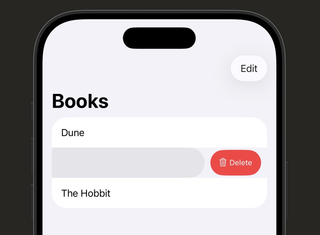
| Line | What it does |
|---|---|
@State private var books |
The array must be @State (mutable and owned by this view) for deletion to work. When the array changes, SwiftUI automatically re-renders the list. |
.onDelete(perform: deleteBook) |
Attaches the delete gesture to the ForEach. When a row is deleted, SwiftUI calls your function with an IndexSet of affected positions. |
IndexSet |
A set of integer index positions. Usually just one position (the row the user deleted), but can be multiple in edit mode. |
books.remove(atOffsets: offsets) |
Removes the elements at those positions from the array. Because books is @State, the view updates immediately. |
EditButton() |
A system button that toggles the list’s edit mode. In edit mode, rows show delete controls and can be reordered. |
Custom Swipe Actions
ForEach(books) { book in
    BookRow(book: book)
        // .swipeActions adds buttons revealed by swiping left (trailing)
        .swipeActions(edge: .trailing) {
            // Each Button inside becomes one swipe action
            Button(role: .destructive) {
                deleteBook(book)
            } label: {
                Label("Delete", systemImage: "trash")
            }
        }
        // .swipeActions on leading edge reveals on swipe right
        .swipeActions(edge: .leading) {
            Button {
                toggleFavourite(book)
            } label: {
                Label("Favourite", systemImage: "star.fill")
            }
            .tint(.yellow)
        }
}role: .destructive automatically colours the button red. Use .tint() to set a custom colour for non-destructive actions.ForEach(books, id: \.self) { book in
Text(book)
}
.onDelete(perform: deleteBook)
// .onMove enables drag handles in edit mode for reordering
.onMove(perform: moveBook)
func moveBook(from source: IndexSet, to destination: Int) {
// .move(fromOffsets:toOffset:) updates the array in place
books.move(fromOffsets: source, toOffset: destination)
}.onMove shows drag handles (three horizontal lines) in edit mode. The user long-presses and drags a row to reorder. Your function updates the underlying array and SwiftUI animates the change.| Syntax | What It Does |
|---|---|
| .onDelete(perform:) | Adds swipe-to-delete to a ForEach — calls your function with an IndexSet |
| books.remove(atOffsets: offsets) | Removes elements from the array at the given index positions |
| .swipeActions(edge: .trailing) | Adds custom buttons revealed by swiping left |
| .swipeActions(edge: .leading) | Adds custom buttons revealed by swiping right |
| Button(role: .destructive) | Automatically styles the button red — use for delete actions |
| .onMove(perform:) | Enables drag-to-reorder in edit mode |
| EditButton() | System button that toggles list edit mode |
let instead of @State for your array. If the array isn’t @State, removing items won’t update the list — you’ll get a crash or no visual change at all. Any list you plan to modify must use @State.
Challenge 5.5
books array from let to @State. Add swipe-to-delete using .onDelete. Then add a leading swipe action that toggles a isFavourite bool on each book, changing the row’s icon to a filled star when true. Add an EditButton to the toolbar and confirm that edit mode shows delete controls.
Using AI to Go Further
Pull-to-refresh is the gesture where a user drags down from the top of a list, sees a loading spinner, and the content updates. You’ve done it a thousand times in Twitter, Mail, and News. In SwiftUI, you add it with a single modifier: .refreshable.
The reason this lesson is short is because .refreshable does almost everything for you: it handles the gesture, shows the spinner, and waits for your work to finish before hiding it again. Your job is just to describe what “refreshing” means for your app.
The one thing to know upfront: .refreshable uses Swift’s async/await syntax. You’ll get a proper deep dive on async/await in Stage 8 (Networking). For now, you just need to know how the pattern looks and what the keywords mean at a surface level.
struct ContentView: View {
    @State private var books = ["Dune", "1984", "The Hobbit"]

    var body: some View {
        NavigationStack {
            List(books, id: \.self) { book in
                Text(book)
            }
            .navigationTitle("Books")
            // .refreshable runs when the user pulls down from the top of the list
            .refreshable {
                // await pauses here and waits for fetchLatestBooks() to finish
                await fetchLatestBooks()
            }
        }
    }

    // async marks a function that can be paused mid-execution
    func fetchLatestBooks() async {
        // Simulate a network delay — in a real app this calls an API
        try? await Task.sleep(for: .seconds(1))
        // Update the array after the fake "network call" completes
        books = ["Dune", "1984", "The Hobbit", "Foundation"]
    }
}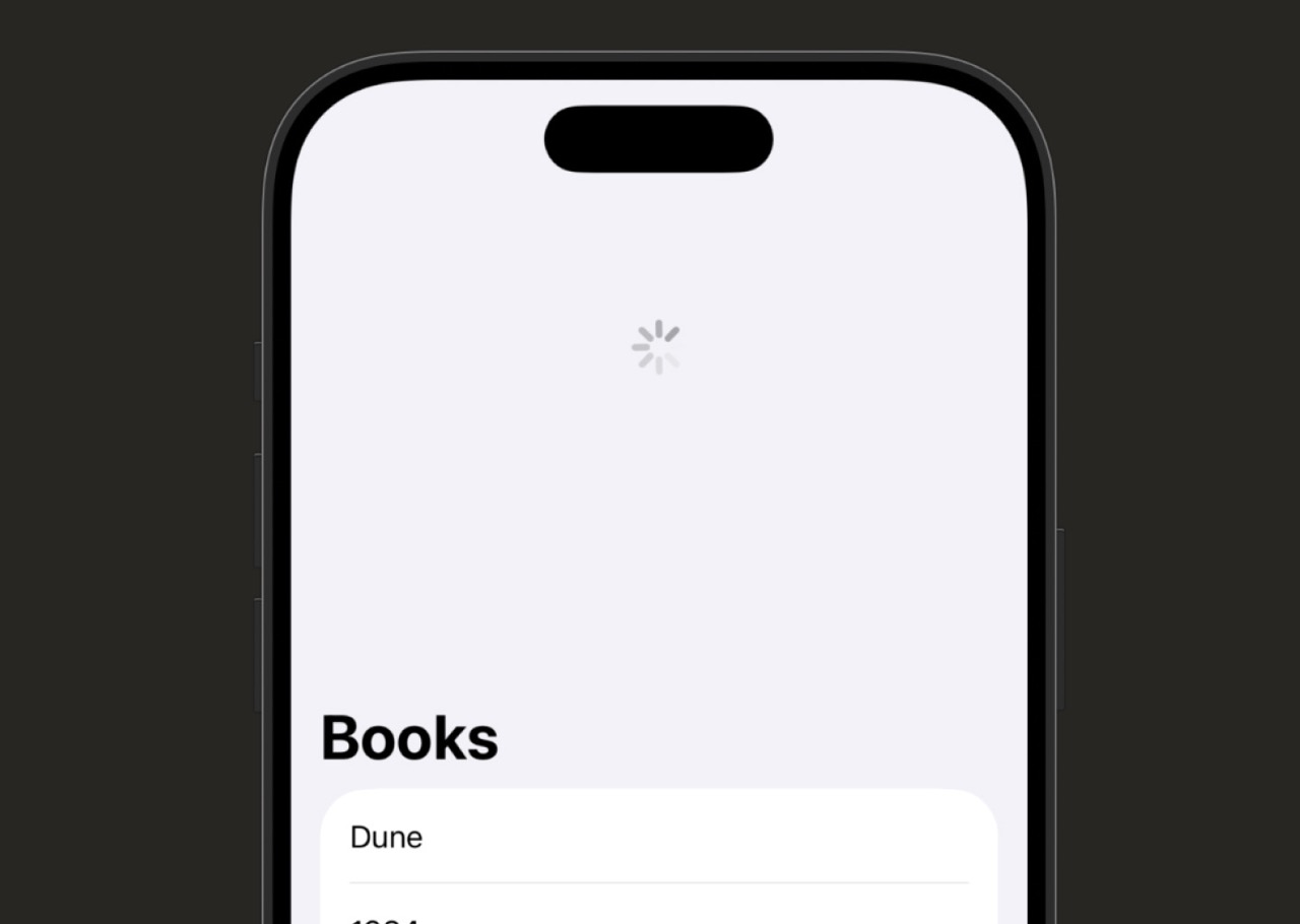
| Line | What it does |
|---|---|
.refreshable { } |
Attaches the pull-to-refresh gesture to the list. The closure runs when the user pulls down. SwiftUI shows a spinner automatically until the closure finishes. |
await fetchLatestBooks() |
await pauses execution here and waits for the async function to complete before continuing. The spinner stays visible the whole time. |
func fetchLatestBooks() async |
The async keyword marks a function that can be paused and resumed. It can contain await calls to other async work. |
Task.sleep(for: .seconds(1)) |
Pauses the async function for 1 second to simulate a network delay. In a real app, you’d call your API here instead. |
async on a function means it can do work in the background, and await means “wait here until that work is done.”
.refreshable {
    // Always update @State properties from the main thread
    await loadData()
}

// @MainActor ensures this function always runs on the main thread
@MainActor
func loadData() async {
    let newBooks = await fetchFromAPI()
    books = newBooks
}@MainActor on a function guarantees this. You’ll use this pattern frequently once you start calling real APIs in Stage 8.| Syntax | What It Does |
|---|---|
| .refreshable { await … } | Attaches pull-to-refresh to a List or ScrollView |
| func name() async | Marks a function as asynchronous — it can be paused |
| await someFunction() | Waits for an async function to complete before continuing |
| try? await Task.sleep(for: .seconds(n)) | Pauses async execution for n seconds — useful for simulating delays |
| @MainActor | Ensures a function runs on the main thread — required for UI updates |
@State from a background thread. If your async function does real network work and updates state from the wrong thread, you’ll see warnings in Xcode. Use @MainActor on your update function to fix it. More on this in Stage 8.
Challenge 5.6
.refreshable to your book list. When the user pulls to refresh, add a new book to the array after a one-second simulated delay using Task.sleep. Run the app in the simulator and confirm the spinner appears for the full second before the new row appears.
Using AI to Go Further
By now you’ve used List, ForEach, and you’ve probably seen ScrollView mentioned. They all involve displaying collections of views, so it’s easy to reach for the wrong one and wonder why something isn’t working. This lesson is entirely about making that decision confidently.
There are no new APIs in this lesson — just clarity. You’ll see what each approach does and doesn’t do, the kinds of bugs that happen when you pick the wrong one, and a simple set of questions to ask yourself when you’re starting a new screen.
Getting this right early saves a lot of debugging time later. Choosing ScrollView + ForEach when you needed List, or vice versa, produces layout headaches that can feel mysterious until you understand the difference.
The Three Tools at a Glance
| Tool | What it is | What it gives you |
|---|---|---|
List |
A scrollable container with built-in system row styling | Separators, swipe actions, edit mode, selection, pull-to-refresh, section headers — all automatic |
ForEach |
A view builder that loops — no container, no scrolling | Nothing except the generated views. Must be placed inside a container (List, VStack, ScrollView, etc.) |
ScrollView |
A scrollable container with no row styling | Scrolling, full layout control. You’re responsible for all spacing, dividers, and interaction. |
When to Use Each One
// List is the right choice when you need any of these:
// - Swipe to delete or custom swipe actions
// - Edit mode with selection or reordering
// - Pull to refresh
// - Section headers with the platform-standard appearance
// - NavigationLink rows that push a detail view
List(contacts) { contact in
    NavigationLink(contact.name, value: contact)
}
.swipeActions { /* ... */ }
.refreshable { await reload() }List. Trying to replicate these behaviours manually in a ScrollView is a lot of unnecessary work.// ScrollView is right when you need:
// - Custom card layouts (no row separators or inset styling)
// - Horizontal scrolling
// - Mixed content types (banners, cards, text, images together)
// - Full control over spacing and visual styling
ScrollView {
VStack(spacing: 16) {
ForEach(recipes) { recipe in
RecipeCard(recipe: recipe)
}
}
.padding()
}ScrollView + ForEach when the design calls for cards, horizontal carousels, or mixed layouts that don’t fit the row/separator pattern of List. You have complete visual control, but you give up all the automatic List features.// ForEach alone (no ScrollView or List wrapper) is right when:
// - You're generating views inside a Form, Group, or HStack
// - The parent container already handles layout and scrolling
// - You need to mix generated and static views in one block
Form {
Section("Tags") {
// ForEach generates Toggle rows inside an existing Form container
ForEach(tags) { tag in
Toggle(tag.name, isOn: $tag.isSelected)
}
}
}Form, a Group, or even another List — ForEach alone is exactly right. Don’t wrap it in another List or ScrollView just because you’re generating multiple views.Common Mistakes and What Goes Wrong
| Mistake | What happens | Fix |
|---|---|---|
Using List when you want full layout control |
Row separators, inset margins, and system styling appear where you don’t want them | Switch to ScrollView + VStack + ForEach |
Using ScrollView + ForEach then adding swipe-to-delete manually |
Lots of code, inconsistent feel, won’t match system behaviour | Use List with .onDelete |
Nesting List inside ScrollView |
Layout breaks, scrolling conflicts, unpredictable heights | Never nest a List inside a ScrollView |
Using ForEach without a scrollable container for long content |
Content overflows off screen with no way to scroll | Wrap in ScrollView or List |
Using ScrollView when you need List selection |
Selection highlighting and edit mode don’t work | Use List(selection:) for selectable lists |
List. If no, use ScrollView + ForEach for the layout control you need.
| Scenario | Best Choice |
|---|---|
| Settings screen with toggles and navigation links | List |
| Social feed with photo cards and custom spacing | ScrollView + VStack + ForEach |
| Horizontal scrolling carousel of items | ScrollView(.horizontal) + HStack + ForEach |
| Task list with swipe-to-complete and delete | List |
| Toggle rows inside a Form section | ForEach inside Form Section (no wrapper needed) |
| Grid of image thumbnails | LazyVGrid (covered in Stage 9) |
| Contact list with A–Z section headers | List with Section per letter |
Challenge 5.7
ScrollView with custom card styling (no list separators). Use ForEach inside a HStack inside a horizontal ScrollView. Notice how different the same data looks when presented through each approach.
Using AI to Go Further
Stage 5 Recap: Lists and Data Display
Seven lessons in and you can now build the data-display layer that sits at the heart of almost every real iOS app. Here’s what you covered:
- Lesson 5.1 — List Basics:
Listcreates a scrollable, system-styled container. Dynamic lists read from arrays, andIdentifiablegives SwiftUI the unique IDs it needs to track each row. - Lesson 5.2 — ForEach:
ForEachis a view builder, not a container. Use it insideList,VStack, orScrollViewto generate multiple views from an array. - Lesson 5.3 — Custom List Rows: Extract row layouts into their own structs — even simple ones. Use
HStack,VStack,Spacer(), and SF Symbols to build any row shape you need. - Lesson 5.4 — Sections and Headers:
Sectiongroups related rows under a shared header. Add footers, customise headers with any view, and use.listStyle()to control the overall appearance. - Lesson 5.5 — Swipe Actions:
.onDeleteon aForEachadds swipe-to-delete..swipeActionslets you build custom leading and trailing swipe buttons. Arrays must be@Statefor modifications to update the UI. - Lesson 5.6 — Pull to Refresh:
.refreshableadds the pull-to-refresh gesture. It requiresasync/await, which you’ll fully explore in Stage 8. For now, the pattern is the important thing. - Lesson 5.7 — List vs ForEach vs ScrollView: Use
Listwhen you need system iOS behaviours. UseScrollView + ForEachfor custom layouts. UseForEachalone when you’re generating views inside an existing container.
If you skipped any of the challenges, go back and do them — they’re all part of the same book list project and each one builds on the last. Running code you wrote yourself is the fastest way to make everything stick.
In Stage 6 you’ll move into Forms and User Input — how to collect text, toggle settings, pick dates, and build the kind of data-entry screens that every app needs.
Learn SwiftUI Stage 6: Forms and User Input
Reading data is one thing — letting users create and change it is what makes an app actually useful. In this stage, you’ll build the skills to accept real input from real people.
You’ll need Xcode open with a new SwiftUI project for this stage. One important note before you begin: most of the controls in this stage work best when tested in the iOS Simulator rather than the canvas preview. The keyboard won’t appear in canvas, so running in the simulator lets you see the full experience. This stage has 7 lessons and takes roughly 2.5 hours — work through them in order, and don’t skip the challenges at the end of each lesson. The challenge builds are where the concepts actually stick.
By the end of Stage 6, you’ll be comfortable working with TextField and SecureField for text input, Toggle, Slider, and Stepper for binary and numeric values, Picker and DatePicker for selections, Form and Section for settings-style layouts, @FocusState for keyboard management, and practical input validation patterns that disable buttons and show inline errors.
Every app that asks for a name, an email address, or a password uses a text field. In SwiftUI, TextField is the view that lets users type free-form text. It looks simple on the surface — a box you can type into — but there’s a lot going on underneath: it’s connected to a piece of state, it responds to the keyboard, and you can configure it in ways that make a real difference to the user experience.
The key thing to understand about TextField is that it’s always bound to a String variable. That binding is a two-way connection: when the user types, the variable updates. When the variable changes in code, the text field updates. That’s the same @State and Binding pattern you’ve already used with buttons and toggles — text input is just another form of the same idea.
SecureField is a close cousin of TextField. It works exactly the same way — same binding, same modifiers — but it hides the characters the user types. You use it for passwords. Once you understand TextField, using SecureField is almost no extra work at all.
import SwiftUI

struct LoginView: View {

    // Store the text the user types into the email field
    @State private var email = ""

    // Store the text the user types into the password field
    @State private var password = ""

    var body: some View {
        VStack(spacing: 16) {

            // TextField takes a placeholder string and a binding to a String variable
            TextField("Email address", text: $email)
                // Style it as a rounded rectangle input box
                .textFieldStyle(.roundedBorder)
                // Tell iOS this is an email address so it shows the right keyboard
                .keyboardType(.emailAddress)
                // Disable autocorrect — no one wants autocorrect on an email
                .autocorrectionDisabled()

            // SecureField hides the typed characters — perfect for passwords
            SecureField("Password", text: $password)
                .textFieldStyle(.roundedBorder)

            // A disabled button that only activates when both fields have content
            Button("Log In") {
                print("Logging in as \(email)")
            }
            .disabled(email.isEmpty || password.isEmpty)
        }
        .padding()
    }
}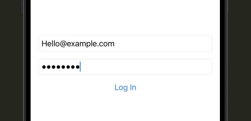
| Line | What it does |
|---|---|
@State private var email = "" |
Declares a State variable that holds whatever the user types. It starts as an empty string. SwiftUI re-renders the view whenever this value changes. |
TextField("Email address", text: $email) |
Creates a text field. The first argument is the placeholder — the greyed-out hint text shown when the field is empty. text: $email creates the two-way binding to your State variable. |
.textFieldStyle(.roundedBorder) |
Applies a rounded rectangle border around the field. Without this the field has no visible border and looks invisible against a white background. |
.keyboardType(.emailAddress) |
Tells iOS to show the email keyboard — which has @, a .com shortcut, and no space bar prominence. The right keyboard type improves user experience significantly. |
.autocorrectionDisabled() |
Prevents iOS from trying to autocorrect the user’s typing. Essential for email addresses, usernames, and any field where autocorrect would cause frustration. |
SecureField("Password", text: $password) |
Identical to TextField in every way except the typed characters are replaced with dots. Uses the same binding pattern. No additional configuration needed for password masking. |
.disabled(email.isEmpty || password.isEmpty) |
Disables the button when either field is empty. isEmpty is a property on String that returns true when the string has no characters. This prevents the user from submitting an incomplete form. |
$ before the variable name in text: $email. Without the dollar sign, you’re passing the current value of the string — not the binding. SwiftUI will show you a compile error, but it’s easy to miss when you’re in flow. The $ is what makes the connection two-way.
TextField Modifiers Worth Knowing
// Email address keyboard — includes @ and .com
TextField("Email", text: $email)
    .keyboardType(.emailAddress)

// Numeric pad — digits only, no letters
TextField("Phone number", text: $phone)
    .keyboardType(.phonePad)

// Number pad with decimal point — good for prices
TextField("Amount", text: $amount)
.keyboardType(.decimalPad).default, .emailAddress, .numberPad, .phonePad, .decimalPad, .URL.// Tells iOS this is an email field — enables AutoFill from Contacts
TextField("Email", text: $email)
.textContentType(.emailAddress)
// Tells iOS this is a new password — triggers strong password suggestion
SecureField("Create password", text: $password)
.textContentType(.newPassword)
// Tells iOS this is an existing password — enables Keychain AutoFill
SecureField("Password", text: $password)
.textContentType(.password)// "Next" on the return key — great for multi-field forms
TextField("First name", text: $firstName)
.submitLabel(.next)
// "Search" on the return key
TextField("Search", text: $query)
.submitLabel(.search)
// "Done" on the return key — signals end of input
TextField("Notes", text: $notes)
.submitLabel(.done).done, .next, .search, .send, .go, .continue, and .join. Pair with .onSubmit to handle the tap.// No autocapitalisation — good for usernames and emails
TextField("Username", text: $username)
.textInputAutocapitalization(.never)
// Capitalise the first letter of each word — good for names
TextField("Full name", text: $name)
.textInputAutocapitalization(.words)
// Capitalise every sentence (the default)
TextField("Bio", text: $bio)
.textInputAutocapitalization(.sentences).never for emails, usernames, passwords, and URLs. Use .words for names and titles. The default .sentences is good for free-text notes and bio fields.| Modifier / Property | What It Does |
|---|---|
| TextField(“placeholder”, text: $var) | Creates a text input bound to a String State variable |
| SecureField(“placeholder”, text: $var) | Same as TextField but hides typed characters with dots |
| .textFieldStyle(.roundedBorder) | Adds a visible rounded rectangle border around the field |
| .keyboardType(.emailAddress) | Shows a keyboard suited to the expected input type |
| .textContentType(.password) | Enables AutoFill from Keychain or Contacts |
| .submitLabel(.next) | Changes the text on the keyboard’s return key |
| .autocorrectionDisabled() | Turns off autocorrect for this field |
| .textInputAutocapitalization(.never) | Controls whether iOS capitalises typed text automatically |
Build a sign-up screen with three fields: first name, email address, and password. Use the appropriate keyboard types and autocapitalisation settings for each. Add a “Create Account” button that is disabled until all three fields contain at least one character. Test in the simulator — type into each field and confirm the button activates only when all three have content. Bonus: add a “Confirm Password” SecureField and update the button logic to also require that the two password fields match.
Using AI to Go Further
Not every piece of user input is text. Sometimes you just want to know if something is on or off. Sometimes you need a number between two limits. SwiftUI has a control for each of these situations: Toggle for booleans, Slider for a value within a range, and Stepper for stepping up and down through a number by a fixed amount.
All three controls follow the same binding pattern you used in Lesson 6.1. Toggle binds to a Bool. Slider and Stepper bind to a numeric type — most commonly a Double. The control reads the current value to know what to display, and it writes back to the variable when the user interacts with it.
Think of these controls as physical dials and switches on a settings panel, but digital. The binding is the wire connecting the dial to the part of your app that actually cares about the value. The control is just a way for the user to change what’s on the other end of that wire.
import SwiftUI

struct SettingsView: View {

    // A boolean — Toggle will flip this between true and false
    @State private var notificationsEnabled = true

    // A Double between 0 and 100 — Slider will set this
    @State private var brightness: Double = 50

    // An Int that Stepper will increment and decrement
    @State private var fontSize = 16

    var body: some View {
        VStack(alignment: .leading, spacing: 24) {

            // Toggle takes a label string and a Bool binding
            Toggle("Enable Notifications", isOn: $notificationsEnabled)

            VStack(alignment: .leading) {
                // Display the current slider value so the user can see it
                Text("Brightness: \(Int(brightness))%")

                // Slider takes a value binding and an in: range
                Slider(value: $brightness, in: 0...100)
            }

            VStack(alignment: .leading) {
                Text("Font Size: \(fontSize)pt")

                // Stepper takes a label, a value binding, and an in: range
                Stepper("Font Size", value: $fontSize, in: 10...32)
            }
        }
        .padding()
    }
}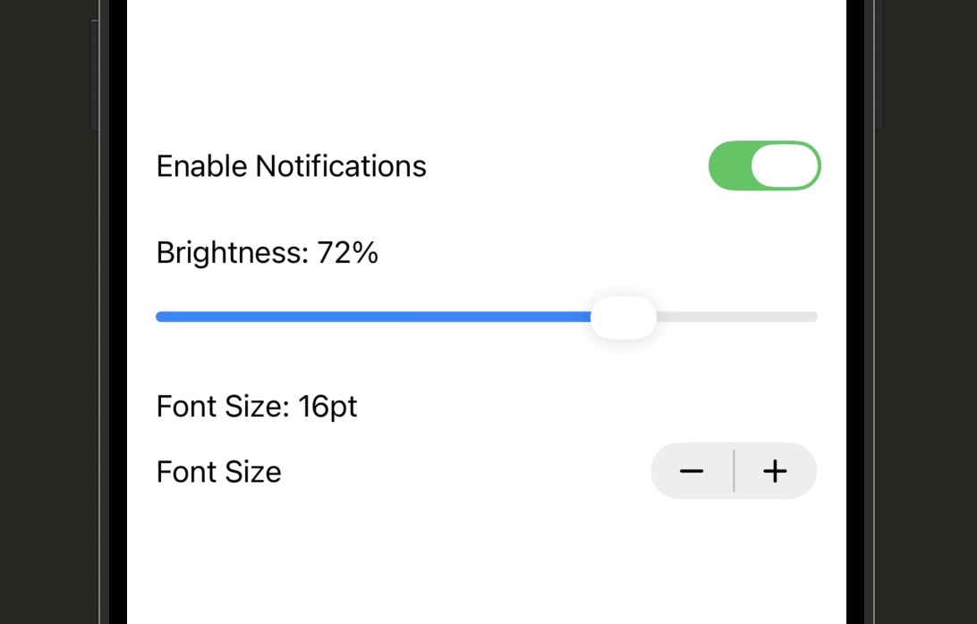
| Line | What it does |
|---|---|
Toggle("Enable Notifications", isOn: $notificationsEnabled) |
Creates an iOS-style switch. The label text appears to the left of the switch. isOn: takes a binding to a Bool — true means the switch is on (blue), false means it’s off (grey). |
Slider(value: $brightness, in: 0...100) |
Creates a horizontal drag handle. value: takes a binding to a Double. in: defines the closed range. As the user drags, the Double updates continuously. |
Int(brightness) |
Converts the Double to an Int before displaying it, so you see “72%” rather than “72.456382943%”. This is a common pattern when displaying a Slider’s value as text. |
Stepper("Font Size", value: $fontSize, in: 10...32) |
Creates a plus/minus control. Each tap increments or decrements by 1 by default. The in: range prevents the value going below 10 or above 32. The label is read by VoiceOver. |
Toggle, Slider, and Stepper. VoiceOver reads these labels aloud to users who are visually impaired. A toggle that says nothing is unusable for these users. The label doesn’t have to be visible in the UI — you can hide it with .labelsHidden() if your design calls for it — but always pass a real string.
Useful Variations
// step: 5 means the value jumps 0, 5, 10, 15... when dragged
Slider(value: $volume, in: 0...100, step: 5)step: makes the slider snap to discrete values. Useful for things like volume where you want 0, 5, 10, 15 rather than every value in between. Works well with integer display since the value always lands on a clean number.// step: 5 means each tap adds or subtracts 5
Stepper("Quantity", value: $quantity, in: 0...100, step: 5)// Button style — looks like a button that activates/deactivates
Toggle("Bold", isOn: $isBold)
.toggleStyle(.button).button toggle style renders as a pill-shaped button that highlights when active. Great for text formatting toolbars or any UI where a row of on/off options makes more sense than a list of switches.// minimumValueLabel and maximumValueLabel show on the slider ends
Slider(value: $rating, in: 1...5, step: 1) {
Text("Rating")
} minimumValueLabel: {
Text("1")
} maximumValueLabel: {
Text("5")
}| Syntax | What It Does |
|---|---|
| Toggle(“Label”, isOn: $bool) | On/off switch bound to a Bool variable |
| Slider(value: $double, in: 0…100) | Draggable control within a range, bound to a Double |
| Slider(value: $val, in: 0…100, step: 10) | Slider that snaps to discrete values at each step |
| Stepper(“Label”, value: $int, in: 0…10) | Plus/minus buttons that step a value within a range |
| Stepper(“Label”, value: $int, in: 0…100, step: 5) | Stepper that increments by 5 on each tap |
| .toggleStyle(.button) | Renders Toggle as a button instead of a switch |
| .labelsHidden() | Hides the visible label while keeping it for accessibility |
Build a simple settings screen with four controls: a Toggle for “Dark Mode”, a Slider for screen brightness (0–100), a Stepper for text size (12–24, step 2), and a Toggle for “Show Badge Count”. Below all the controls, add a Text view that displays a live summary of the current values — for example “Dark Mode: On | Brightness: 65% | Text Size: 16pt”. Test in the simulator and confirm all values update in real time as you interact with the controls.
Using AI to Go Further
Picker lets users choose one option from a list. Think of a “Country” dropdown, a “Sort by” control, or the tab at the top of a screen that switches between “Day”, “Week”, and “Month” views. Picker handles all of these with a single, flexible component that changes its appearance based on the style you choose.
The binding for a Picker is slightly different from what you’ve seen. You bind it to a variable that holds the currently selected value, and you tag each option inside the Picker with the value it represents. When the user picks an option, the binding updates to that tag’s value. It sounds like more pieces to juggle, but the pattern is very consistent once you’ve seen it a couple of times.
Picker works naturally with enums, and that’s usually the best approach. An enum gives you a clearly defined set of options, meaningful names, and you get compiler errors if you add a case and forget to handle it somewhere. You’ll use this pattern constantly in real iOS apps.
import SwiftUI

// Define the options as an enum — String gives us free raw values
enum SortOption: String, CaseIterable, Identifiable {
    case newest = "Newest"
    case oldest = "Oldest"
    case popular = "Most Popular"

    // Identifiable requires an id — using self works for String enums
    var id: String { rawValue }
}

struct SortPickerView: View {

    // Hold the currently selected sort option
    @State private var selectedSort: SortOption = .newest

    var body: some View {
        VStack(spacing: 20) {

            // Picker takes a label, a selection binding, and a content block
            Picker("Sort by", selection: $selectedSort) {
                // Each option is a view tagged with the value it represents
                ForEach(SortOption.allCases) { option in
                    Text(option.rawValue).tag(option)
                }
            }
            // Segmented style shows all options as a horizontal control
            .pickerStyle(.segmented)

            // Display the selected value below so we can see the binding working
            Text("Sorted by: \(selectedSort.rawValue)")
                .foregroundStyle(.secondary)
        }
        .padding()
    }
}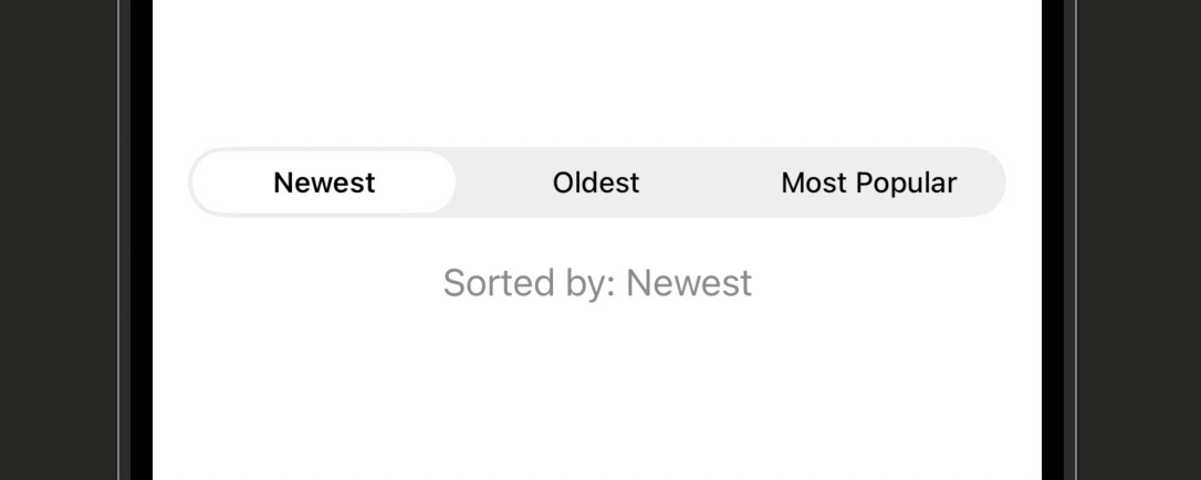
| Line | What it does |
|---|---|
enum SortOption: String, CaseIterable, Identifiable |
Defines the set of options. String gives each case a raw string value. CaseIterable gives you .allCases to loop through all options. Identifiable is required by ForEach. |
var id: String { rawValue } |
Satisfies the Identifiable protocol. For a String enum, using rawValue as the id is the easiest approach since each raw value is already unique. |
Picker("Sort by", selection: $selectedSort) |
Creates the picker. The label "Sort by" is used by VoiceOver. selection: takes the binding to whatever variable holds the chosen value. |
Text(option.rawValue).tag(option) |
Each row in the picker is a view with a .tag(). When the user selects this row, the binding updates to the tagged value. The tag type must match the type of your selection variable. |
.pickerStyle(.segmented) |
Changes the visual style to a segmented control. Other styles are .menu (dropdown), .wheel (scrollable drum), and .inline (list rows). |
.menu style is usually the best default when you have more than 3 options. It shows the current selection with a small disclosure arrow and expands to a popover menu on tap. It takes up minimal space in your UI and handles long option names gracefully.
Picker Styles
Picker("Country", selection: $selectedCountry) {
    ForEach(countries, id: \.self) { country in
        Text(country).tag(country)
    }
}
.pickerStyle(.menu)Form.Picker("View", selection: $selectedView) {
Text("List").tag("list")
Text("Grid").tag("grid")
}
.pickerStyle(.segmented)Picker("Hour", selection: $selectedHour) {
ForEach(0..<24, id: \.self) { hour in
Text("\(hour):00").tag(hour)
}
}
.pickerStyle(.wheel)| Syntax | What It Does |
|---|---|
| Picker(“Label”, selection: $var) { } | Creates a picker bound to a State variable |
| Text(“Option”).tag(value) | Marks a picker row — selection updates to this value when chosen |
| ForEach(MyEnum.allCases) { } | Loops over all enum cases to generate picker rows |
| .pickerStyle(.menu) | Compact dropdown popup — good default for 4+ options |
| .pickerStyle(.segmented) | Horizontal segmented control — best for 2–4 options |
| .pickerStyle(.wheel) | Scrollable drum wheel — good for ordered numeric lists |
| .pickerStyle(.inline) | Renders as List rows — natural inside a Form |
Create a profile setup screen with three pickers: a segmented Picker for “Skill Level” (Beginner, Intermediate, Advanced), a menu Picker for “Preferred Language” (at least 5 programming languages), and a wheel Picker for “Years of Experience” (0–20). Display the current selections in a summary Text below the pickers. Make sure all three pickers use different styles so you can compare how each one looks and behaves in the simulator.
Using AI to Go Further
DatePicker is exactly what it sounds like — a control that lets users pick a date, a time, or both. Booking apps, reminder apps, calendar apps, countdown timers — if your app involves time in any way, you’ll use DatePicker. It handles all the complexity of date and time selection for you, including locale formatting and time zones.
Like all the other input controls you’ve seen, DatePicker uses a binding. This time the binding is to a Date value. Date is a type built into Swift’s Foundation framework that represents a specific point in time. You initialize it with Date() to get the current date and time as a starting value.
You can restrict the range of selectable dates with the in: parameter. This is useful for things like “departure date must be in the future” or “date of birth must be in the past”. You can also control whether the picker shows a date, a time, or both using displayedComponents.
import SwiftUI

struct EventSchedulerView: View {

    // Date() gives us the current date and time as the starting value
    @State private var eventDate = Date()

    // Date.now gives a reference point — used to restrict selectable range
    let dateRange: ClosedRange<Date> = Date.now...Date.now.addingTimeInterval(60 * 60 * 24 * 365)

    var body: some View {
        VStack(alignment: .leading, spacing: 20) {

            // Full date AND time picker — graphical calendar style
            DatePicker(
                "Event Date",
                selection: $eventDate,
                // Only allow dates from now up to one year from today
                in: dateRange,
                // Show both date and time components
                displayedComponents: [.date, .hourAndMinute]
            )
            // Graphical style shows a full calendar and clock
            .datePickerStyle(.graphical)

            // Display the selected date using a formatter
            Text("Selected: \(eventDate.formatted(date: .abbreviated, time: .shortened))")
                .foregroundStyle(.secondary)
        }
        .padding()
    }
}
| Line | What it does |
|---|---|
@State private var eventDate = Date() |
Creates a State variable of type Date. Date() with no arguments returns the current date and time, which is a sensible starting value. |
Date.now.addingTimeInterval(...) |
Creates a date one year from now. addingTimeInterval takes seconds — so 60 × 60 × 24 × 365 = one year’s worth of seconds. This defines the upper bound of selectable dates. |
in: dateRange |
Restricts the picker to only allow dates within the range. Dates outside the range appear greyed out and cannot be selected. You can also use a one-sided range like Date.now... for “any future date”. |
displayedComponents: [.date, .hourAndMinute] |
Controls what parts of a date are shown. .date shows year/month/day. .hourAndMinute shows the time. Use just [.date] if you only need a day, or [.hourAndMinute] for time-only input. |
eventDate.formatted(date: .abbreviated, time: .shortened) |
Formats the Date for display. .abbreviated produces something like “Apr 15, 2025”. .shortened produces “2:30 PM”. This uses Swift’s modern formatted() API which automatically localises the output. |
in: Date.now... (open upper bound) to allow any future date, or in: ...Date.now (open lower bound) to allow any past date. This is perfect for birthdate pickers that should only allow dates before today.
DatePicker Styles and Configurations
// Compact style shows tappable date/time labels that expand on tap
DatePicker("Reminder", selection: $reminderDate)
.datePickerStyle(.compact)// Only show the date — no time picker
DatePicker(
"Birthday",
selection: $birthday,
in: ...Date.now,
displayedComponents: .date
).date to displayedComponents to hide the time selector entirely. The one-sided range ...Date.now ensures the user can only pick a past date — perfect for birthdates.// Only show the time picker — no date
DatePicker(
"Wake up time",
selection: $wakeTime,
displayedComponents: .hourAndMinute
).hourAndMinute to show a time-only picker. The Date value still holds a full timestamp, but the user only interacts with the hour and minute portion. Great for alarm or reminder time settings.| Syntax | What It Does |
|---|---|
| DatePicker(“Label”, selection: $date) | Date and time picker bound to a Date State variable |
| displayedComponents: .date | Shows only the date — hides the time selector |
| displayedComponents: .hourAndMinute | Shows only the time — hides the calendar |
| in: Date.now… | Restricts selection to future dates only |
| in: …Date.now | Restricts selection to past dates only |
| .datePickerStyle(.graphical) | Full inline calendar and clock wheels |
| .datePickerStyle(.compact) | Tappable labels that expand on tap — space-efficient default |
| date.formatted(date: .abbreviated, time: .shortened) | Formats a Date for user-facing display |
Build a trip planner screen with two DatePickers: a departure date (date only, must be in the future) and a departure time (time only). Display the selected departure datetime formatted as a sentence below the pickers — for example “Your trip departs Apr 15 at 9:00 AM”. Bonus: add a third DatePicker for the return date that is restricted to be after the departure date (hint: use the departure date State variable as the lower bound of the return date’s range).
Using AI to Go Further
All the input controls you’ve learned so far — TextField, Toggle, Picker, DatePicker — can be dropped into any view. But when you want to create a proper settings screen or data-entry form in the iOS style, Form is the container to use. It automatically applies the grouped, rounded-rect list styling that iOS settings screens use, and it adapts each control placed inside it to look right in that context.
Form is basically a specialised List that is optimised for input controls. Drop a Toggle inside a Form and it automatically gets a label on the left and a switch on the right — just like the iOS Settings app. Drop a Picker inside and it gets a disclosure chevron and opens as a navigation push. Everything just looks right with almost no extra work.
Section organises a Form into labelled groups. Think of it as a chapter heading for a group of related settings. You give it an optional header and footer, and it draws a visual separator between groups. Any real settings screen you build will use multiple Sections to keep things organised and readable.
import SwiftUI

struct AppSettingsView: View {

    // Input state for all the form fields
    @State private var displayName = ""
    @State private var notificationsEnabled = true
    @State private var soundEnabled = true
    @State private var theme = "System"

    var body: some View {
        // NavigationStack gives the form a title bar
        NavigationStack {
            // Form lays out its children as a grouped settings list
            Form {

                // Section with a header string groups related rows together
                Section("Profile") {
                    // TextField inside Form auto-styles as a labelled row
                    TextField("Display Name", text: $displayName)
                }

                Section("Notifications") {
                    // Toggle inside Form shows label left, switch right
                    Toggle("Push Notifications", isOn: $notificationsEnabled)
                    // Second row inside the same section
                    Toggle("Sound", isOn: $soundEnabled)
                        // Disable Sound if notifications are off
                        .disabled(!notificationsEnabled)
                }

                // Section with a header AND a footer note
                Section {
                    Picker("Theme", selection: $theme) {
                        Text("Light").tag("Light")
                        Text("Dark").tag("Dark")
                        Text("System").tag("System")
                    }
                } header: {
                    Text("Appearance")
                } footer: {
                    // Footer appears below the section as small grey text
                    Text("System follows your device's appearance setting.")
                }
            }
            .navigationTitle("Settings")
        }
    }
}
| Line | What it does |
|---|---|
Form { } |
A container that applies iOS settings-list styling to everything inside it. Controls like TextField, Toggle, and Picker automatically adapt their appearance to fit the Form context. |
Section("Profile") { } |
Groups a set of rows under a section header. The string becomes the header label shown above the group. The visual separator between sections is drawn automatically. |
.disabled(!notificationsEnabled) |
Disables the Sound toggle when notifications are off. The control appears greyed out and does not respond to taps. This kind of conditional disabling is common in settings screens. |
Section { } header: { } footer: { } |
The full Section initialiser with both header and footer. The header appears above the group, the footer appears below in smaller grey text. Both are optional. |
Form works best inside a NavigationStack. Without a navigation container, the Form is functional but lacks the title bar that makes settings screens feel complete. Always wrap your settings views in a NavigationStack and set a .navigationTitle().
Form and Section Patterns
// Use a view builder for a custom styled header
Section {
    Toggle("Location Access", isOn: $locationEnabled)
} header: {
    Label("Privacy", systemImage: "lock.shield")
}Label adds an icon next to the section heading, which can help users quickly scan a long settings screen.Section {
// A destructive button at the bottom of the form
Button("Delete Account", role: .destructive) {
print("Delete tapped")
}
}role: .destructive automatically colours the text red, signalling danger to the user without any extra styling. This matches Apple’s HIG recommendation for destructive actions.// Grouped (default on iPhone) — rounded rectangle sections
Form { }
.formStyle(.grouped)
// Columns (default on iPad/Mac) — two-column layout
Form { }
.formStyle(.columns).columns style displays labels and controls side by side. You rarely need to set this explicitly unless you’re overriding platform defaults.| Syntax | What It Does |
|---|---|
| Form { } | Container that styles children as a grouped settings list |
| Section(“Header”) { } | Groups rows under a labelled section with a string header |
| Section { } header: { } footer: { } | Section with both a header view and a footer view |
| Button(“Label”, role: .destructive) { } | Destructive action row with automatic red text |
| .disabled(condition) | Greys out and disables a control when condition is true |
| .formStyle(.grouped) | Explicit grouped style — the default on iPhone |
Build a settings screen inside a NavigationStack using Form and at least three Sections: an “Account” section with a TextField for display name and a static row showing an email address as Text, a “Notifications” section with three Toggles (Push, Email, SMS), and an “About” section with a Button that prints “Support tapped” and a destructive Button labelled “Sign Out”. Add a .navigationTitle(“Settings”). Bonus: make the Email and SMS toggles disabled when the Push toggle is off, since those notifications depend on push being enabled.
Using AI to Go Further
Here’s a frustration every iOS user has experienced: you tap into a text field, the keyboard appears, and now there’s no obvious way to dismiss it. Or you fill in a field and tap the return key, and nothing happens — focus doesn’t move to the next field. These are keyboard handling problems, and fixing them is what separates a polished app from a rough one.
SwiftUI’s @FocusState property wrapper gives you programmatic control over which field has focus — meaning which field the keyboard is attached to. You can read it to know which field is active, and you can write it to move focus from one field to another or dismiss the keyboard entirely.
Think of focus like a spotlight. Only one field can have the spotlight at a time. @FocusState lets you move that spotlight around in code, rather than waiting for the user to tap each field manually. When no field has focus, the keyboard hides. That’s your keyboard dismissal mechanism.
import SwiftUI

// Define an enum for each focusable field in the form
enum Field: Hashable {
    case firstName, lastName, email
}

struct SignUpFormView: View {

    @State private var firstName = ""
    @State private var lastName  = ""
    @State private var email     = ""

    // @FocusState tracks which field currently has keyboard focus
    @FocusState private var focusedField: Field?

    var body: some View {
        VStack(spacing: 14) {
            TextField("First name", text: $firstName)
                .textFieldStyle(.roundedBorder)
                // Bind this field's focus state to the .firstName case
                .focused($focusedField, equals: .firstName)
                // Return key says "Next" because more fields follow
                .submitLabel(.next)
                // When return is tapped, move focus to lastName
                .onSubmit { focusedField = .lastName }

            TextField("Last name", text: $lastName)
                .textFieldStyle(.roundedBorder)
                .focused($focusedField, equals: .lastName)
                .submitLabel(.next)
                .onSubmit { focusedField = .email }

            TextField("Email", text: $email)
                .textFieldStyle(.roundedBorder)
                .focused($focusedField, equals: .email)
                .keyboardType(.emailAddress)
                // Last field — "Done" dismisses the keyboard
                .submitLabel(.done)
                // Setting focusedField to nil removes focus from all fields = keyboard hides
                .onSubmit { focusedField = nil }

            Button("Continue") {
                // Dismiss keyboard when user taps the button
                focusedField = nil
            }
            .buttonStyle(.borderedProminent)
        }
        .padding()
        // Tap anywhere outside a field to dismiss the keyboard
        .onTapGesture { focusedField = nil }
    }
}
| Line | What it does |
|---|---|
enum Field: Hashable |
An enum identifying each focusable field. Hashable is required by @FocusState. Using an enum means the compiler will warn you if you reference a field that doesn’t exist. |
@FocusState private var focusedField: Field? |
The optional type means it can be nil — no field has focus — or set to a specific Field case. When you set it to nil, all fields lose focus and the keyboard dismisses. |
.focused($focusedField, equals: .firstName) |
Links this TextField to the focusedField state. When focusedField == .firstName, this field has focus. When focus moves away, focusedField updates to the new field’s value. |
.onSubmit { focusedField = .lastName } |
Called when the user taps the return key on this field. Setting focusedField = .lastName moves keyboard focus to the last name field — the “Tab” key equivalent for forms on iOS. |
.onTapGesture { focusedField = nil } |
Adds a tap gesture to the VStack container. Tapping anywhere outside a field sets focusedField to nil, which dismisses the keyboard. This is the “tap to dismiss” behaviour users expect. |
@FocusState only works correctly when tested in the simulator or on a real device. In the Xcode canvas preview, the keyboard doesn’t appear and focus state changes have no visible effect. Always test keyboard behaviour in the simulator for this lesson.
Focus Patterns
// Bool version — useful when there's only one field to track
@FocusState private var isEmailFocused: Bool

TextField("Email", text: $email)
    // No equals: — Bool version just tracks focused/not focused
    .focused($isEmailFocused)

Button("Done") {
    // Setting to false dismisses the keyboard
    isEmailFocused = false
}Bool @FocusState is simpler than the enum approach. The field has focus when the bool is true and loses it when set to false.// Apply onSubmit to the container to handle any field's return key
VStack {
TextField("Username", text: $username)
SecureField("Password", text: $password)
}
// This fires when return is tapped in ANY field inside the VStack
.onSubmit {
login()
}.onSubmit to a container rather than an individual field, it fires when the return key is tapped in any field inside that container. Useful for simple forms where any return key submission should trigger the same action.| Syntax | What It Does |
|---|---|
| @FocusState var focused: Field? | Tracks which field (or none) currently has keyboard focus |
| .focused($focusedField, equals: .fieldName) | Links a TextField to a specific FocusState value |
| .focused($isFocused) — Bool version | Simpler focus tracking for a single field |
| .onSubmit { } | Runs a closure when the user taps the return key |
| focusedField = .nextField | Moves keyboard focus to the next field |
| focusedField = nil | Removes focus from all fields — keyboard dismisses |
| .onTapGesture { focusedField = nil } | Tap-to-dismiss keyboard on any background tap |
Build a login form with a username field, a password field (SecureField), and a “Log In” button. Use @FocusState with an enum to manage focus between the two fields. The username field should have a .submitLabel(.next) that moves focus to the password field on return. The password field should have a .submitLabel(.go) that dismisses the keyboard on return. Tapping anywhere outside the fields should also dismiss the keyboard. Test the complete flow in the simulator.
Using AI to Go Further
Getting input from the user is only half the job. The other half is checking that the input is actually usable before you act on it. If someone tries to sign up with an empty username or a password that’s only two characters long, you need to stop them, tell them what’s wrong, and let them fix it. That’s input validation.
SwiftUI makes basic validation patterns surprisingly clean. The most common approach is computed properties: a property that returns true when the form is valid, and false when it isn’t. You use that property to disable your submit button, so the user literally can’t proceed until the form is valid. This is called disabling the “happy path” — it’s simpler and more reliable than showing an error message after the fact.
For a better user experience, you can also show inline error messages that appear as the user types. This involves another computed property — one that returns an optional string — and a conditional Text view that displays it when it’s not nil. Keep validation logic close to the view for now. When your app grows, you can move it to a separate model.
import SwiftUI

struct RegistrationView: View {

    @State private var username = ""
    @State private var password = ""
    @State private var confirmPassword = ""

    // Returns an error message if the username is invalid, nil if it's fine
    var usernameError: String? {
        if username.isEmpty { return "Username is required" }
        if username.count < 3 { return "Must be at least 3 characters" }
        return nil
    }

    // Returns an error message if the password is invalid, nil if it's fine
    var passwordError: String? {
        if password.count < 8 { return "Must be at least 8 characters" }
        if password != confirmPassword { return "Passwords do not match" }
        return nil
    }

    // The form is only valid when both error properties return nil
    var isFormValid: Bool {
        usernameError == nil && passwordError == nil && !confirmPassword.isEmpty
    }

    var body: some View {
        VStack(alignment: .leading, spacing: 12) {

            TextField("Username", text: $username)
                .textFieldStyle(.roundedBorder)

            // Only show the error message when there is one (non-nil)
            if let error = usernameError, !username.isEmpty {
                Text(error)
                    .foregroundStyle(.red)
                    .font(.caption)
            }

            SecureField("Password", text: $password)
                .textFieldStyle(.roundedBorder)

            SecureField("Confirm Password", text: $confirmPassword)
                .textFieldStyle(.roundedBorder)

            // Show password error only after the confirm field has been touched
            if let error = passwordError, !confirmPassword.isEmpty {
                Text(error)
                    .foregroundStyle(.red)
                    .font(.caption)
            }

            // Button is disabled until the form passes all validation checks
            Button("Create Account") {
                print("Creating account for \(username)")
            }
            .buttonStyle(.borderedProminent)
            .disabled(!isFormValid)
            .frame(maxWidth: .infinity)
        }
        .padding()
    }
}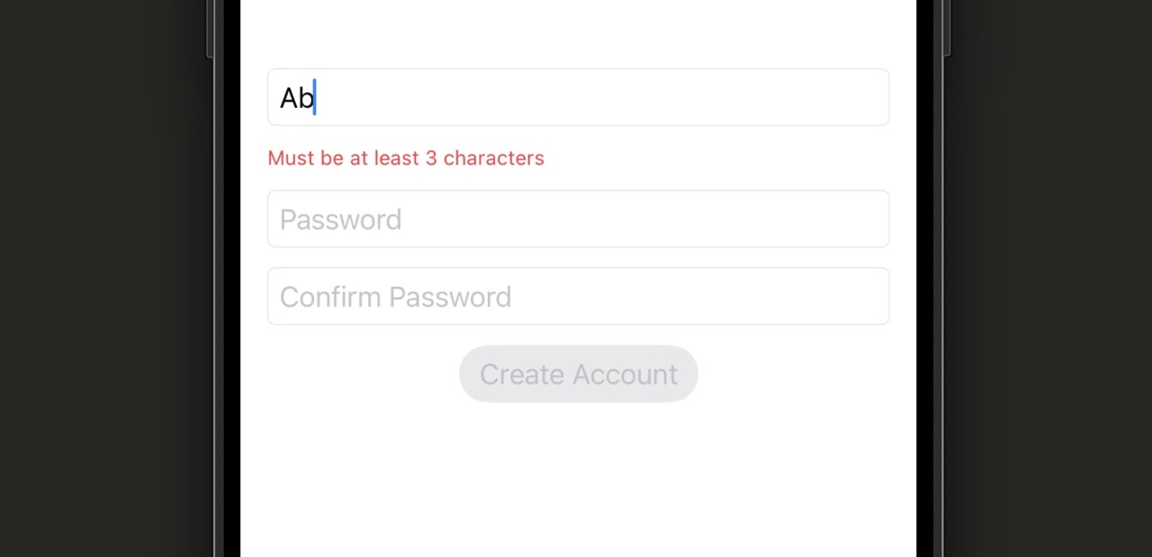
| Line | What it does |
|---|---|
var usernameError: String? { ... } |
A computed property — one that calculates its value on demand. It returns a String describing the problem if validation fails, or nil if the field is valid. SwiftUI re-evaluates this automatically whenever username changes. |
var isFormValid: Bool { ... } |
Another computed property that combines all the individual checks into a single boolean. Using this to drive the .disabled() modifier is cleaner than putting all the logic inline on the button. |
if let error = usernameError, !username.isEmpty |
Unwraps the optional error string. The second condition !username.isEmpty prevents showing an error when the field is completely empty (the user hasn’t tried yet). This is a better UX than showing errors before the user has done anything. |
.foregroundStyle(.red).font(.caption) |
Styles the error message as small red text. .caption is smaller than the default body size, which visually communicates that this is supplementary information rather than the main content. |
.disabled(!isFormValid) |
Disables the button when the form is not valid. This is the key interaction — the user can see the button exists, but cannot tap it until all validation passes. The visual greying-out signals that something needs to be fixed. |
!username.isEmpty guard in the example above is a simple way to implement this. The button being disabled handles the “can’t submit yet” message without any text error needed at that stage.
Validation Patterns
var emailError: String? {
    if email.isEmpty { return "Email is required" }
    // Basic check: must contain @ and at least one dot after it
    if !email.contains("@") || !email.contains(".") {
        return "Enter a valid email address"
    }
    return nil
}contains() catches the most obvious mistakes without requiring a regex. For production apps you might use a more thorough validation or Apple’s dataDetector, but this is sufficient for most beginner projects.TextField("Username", text: $username)
.padding(8)
.// Red border when invalid, default grey when valid or empty
.overlay(
RoundedRectangle(cornerRadius: 8)
.stroke(usernameError != nil && !username.isEmpty
? Color.red
: Color.gray.opacity(0.4),
lineWidth: 1.5)
).overlay to draw a RoundedRectangle over the field, with its stroke colour driven by the validation state.TextField("Bio", text: $bio)
// Watch for changes and trim if over the limit
.onChange(of: bio) { _, newValue in
if newValue.count > 160 {
bio = String(newValue.prefix(160))
}
}
// Show remaining characters like a Twitter-style counter
Text("\(160 - bio.count) characters remaining")
.foregroundStyle(bio.count > 140 ? .red : .secondary)
.font(.caption).onChange(of:) modifier fires whenever the bound value changes. Using prefix(160) to trim the string keeps it at or below the limit. The counter below turns red as you approach the limit — a familiar pattern from Twitter/X and many other apps.if let optional unwrapping feel unfamiliar, check out the Learn Swift series — then come back here.
| Pattern | What It Does |
|---|---|
| var error: String? { } | Computed property that returns an error string or nil |
| var isFormValid: Bool { } | Single boolean combining all validation checks |
| .disabled(!isFormValid) | Disables submit button until all validation passes |
| if let error = fieldError, !field.isEmpty { } | Shows inline error only after the user has typed something |
| .foregroundStyle(.red).font(.caption) | Styles an error message as small red text |
| .onChange(of: field) { _, new in } | Fires whenever the field’s value changes — use for character limits |
| String(value.prefix(160)) | Trims a string to a maximum length |
Build a sign-up form that validates all of the following: username (required, at least 4 characters), email (required, must contain @ and .), password (required, at least 8 characters), and confirm password (must match password). Show inline error messages under each field — but only after the user has started typing in that field. Disable the “Create Account” button until all four fields pass validation. Add a character counter below the username field that shows remaining characters (max 20). Test the complete form in the simulator and verify that the button only activates when all validations pass.
Using AI to Go Further
Stage 6 Recap: Forms and User Input
You’ve covered every essential input control in SwiftUI and learned how to build forms that are polished, keyboard-friendly, and validated. Here’s what you learned in each lesson:
- Lesson 6.1 — TextField and SecureField: Accepting text input with a two-way String binding. Using keyboard types, autocorrect settings, and textContentType to make fields smarter and more user-friendly. SecureField for passwords.
- Lesson 6.2 — Toggle, Slider, and Stepper: The three controls for boolean and numeric input. Toggle binds to Bool, Slider binds to Double within a range, Stepper increments and decrements an integer value.
- Lesson 6.3 — Picker: Choosing from a list of options using an enum and .tag() to connect each row to a value. Three visual styles — .menu, .segmented, and .wheel — each suited to different contexts.
- Lesson 6.4 — DatePicker: Accepting date and time input with range restrictions. Using displayedComponents to show just the date, just the time, or both. Formatting a Date value for display with the .formatted() API.
- Lesson 6.5 — Form and Section: The Form container that automatically styles input controls as a settings-style list. Section organises rows into labelled groups with optional header and footer text.
- Lesson 6.6 — Keyboard Handling and @FocusState: Programmatic focus management using @FocusState and a Field enum. Moving focus between fields with .onSubmit, and dismissing the keyboard by setting focusedField to nil.
- Lesson 6.7 — Input Validation Patterns: Using computed properties to produce optional error strings. Showing inline error messages conditionally, disabling the submit button until all validation passes, and limiting input length with .onChange.
If you skipped any of the challenges, go back and build them — especially the Challenge 6.7 full validated form. That one brings together everything from this stage and the result is something you could drop into a real app.
Up next in Stage 7: Animations and Transitions — you’ll learn how to bring your interface to life with movement, giving users visual feedback that makes your app feel smooth and responsive.
Learn SwiftUI Stage 7: Animations and Transitions
The difference between an app that works and an app that feels great is almost always animation — and in SwiftUI it takes surprisingly little code to get there.
For this stage you’ll need Xcode open with a SwiftUI project. One important heads-up before you start: animations won’t play in the canvas preview — the canvas only shows static states. To actually see your animations move, run the app in the Simulator or on a real device. That’s true for every lesson in this stage, so get the Simulator ready before you begin. There are 6 lessons totalling about 2.5 hours, and each one ends with a challenge that you test in the Simulator.
By the end of Stage 7 you’ll know how to add implicit animations with .animation(), trigger animations explicitly using withAnimation, control timing with curves and springs, animate views appearing and disappearing with .transition(), build hero animations using matchedGeometryEffect, and sequence multi-step animations with PhaseAnimator. That’s the full toolkit most iOS apps use.
Animations in SwiftUI start with a simple idea: describe what your view looks like in two states, and SwiftUI smoothly fills in the in-between frames automatically. The modifier that makes this happen is .animation(), and it’s the easiest entry point into the whole animation system.
Think of it like a light dimmer switch instead of a regular on/off switch. Without animation, views snap instantly between states. With .animation() attached, the change plays out gradually — SwiftUI does all the work of interpolating the values in between.
The key thing to understand is that .animation() watches a specific value for changes. When that value changes, any animatable properties on the view animate to their new state. You’re not manually describing the motion — you’re just saying “when this value changes, animate.”
import SwiftUI

struct ContentView: View {
    // @State toggles between two sizes when the button is tapped
    @State private var isLarge = false

    var body: some View {
        VStack(spacing: 40) {
            Circle()
                // frame changes based on isLarge state
                .frame(width: isLarge ? 200 : 80,
                       height: isLarge ? 200 : 80)
                // foregroundStyle changes between two colors
                .foregroundStyle(isLarge ? Color.red : Color.blue)
                // .animation watches isLarge — any animatable change plays smoothly
                .animation(.easeInOut(duration: 0.4), value: isLarge)

            Button("Tap Me") {
                // flipping the bool triggers the animation
                isLarge.toggle()
            }
        }
    }
}
| Line | What it does |
|---|---|
@State private var isLarge = false |
A boolean that controls whether the circle is big or small. When this flips, SwiftUI re-renders the view. |
.frame(width: isLarge ? 200 : 80, ...) |
The circle’s size is determined by the current value of isLarge. The ternary operator picks one of two sizes. |
.foregroundStyle(isLarge ? .red : .blue) |
Same pattern for color. Both the size and color are “animatable” — SwiftUI knows how to interpolate between them. |
.animation(.easeInOut(duration: 0.4), value: isLarge) |
This is the key line. It tells SwiftUI: “when isLarge changes, animate any animatable changes on this view using an ease-in-out curve over 0.4 seconds.” |
isLarge.toggle() |
Flips the boolean from false to true (or back). That state change triggers the animation. |
.animation(.easeInOut) without a value: argument. That still compiles but it’s deprecated and can cause unexpected animations elsewhere in your view. Always pass value: to be precise about what triggers the animation.
What is Animatable?
Not every property in SwiftUI can be animated. Properties that represent continuous values — size, position, opacity, color, rotation, scale — are animatable because SwiftUI can calculate intermediate values between start and end. A boolean itself isn’t animatable, but the visual properties that depend on it are.
Text("Hello")
    // 1.0 is fully visible, 0.0 is invisible
    .opacity(isVisible ? 1.0 : 0.0)
.animation(.easeOut(duration: 0.3), value: isVisible).animation().Image(systemName: "heart.fill")
.foregroundStyle(.red)
// 1.0 is normal size, 1.5 is 50% larger
.scaleEffect(isLiked ? 1.5 : 1.0)
.animation(.spring(duration: 0.3), value: isLiked)Image(systemName: "chevron.right")
// Rotate 90 degrees when expanded is true
.rotationEffect(.degrees(isExpanded ? 90 : 0))
.animation(.easeInOut(duration: 0.25), value: isExpanded).degrees() takes a Double, and SwiftUI animates the rotation smoothly between values.Rectangle()
.frame(width: 100, height: 100)
// Slide 200 points right when active
.offset(x: isActive ? 200 : 0)
.animation(.easeInOut, value: isActive)| Syntax | What It Does |
|---|---|
| .animation(.easeInOut, value: x) | Slow in, slow out — the most natural-feeling default |
| .animation(.easeIn, value: x) | Starts slow, ends at full speed — good for exits |
| .animation(.easeOut, value: x) | Starts fast, decelerates — good for entrances |
| .animation(.linear, value: x) | Constant speed throughout — mechanical feel |
| .animation(.spring(), value: x) | Bouncy, physical feel — great for interactive elements |
| .animation(.easeInOut(duration: 0.4), value: x) | Same as easeInOut but with an explicit duration in seconds |
| .animation(nil, value: x) | Explicitly disables animation for this value — useful to opt out |
VStack containing five views, all five will animate. Be specific to keep things predictable.
Build a view with a rounded rectangle that starts at 60×60 points with a blue fill. Add a button below it. When the button is tapped, the rectangle should animate to 180×180 points and change its fill to orange using an .easeInOut curve. Test in the Simulator — you should see the rectangle grow and shift color smoothly when you tap. Tap again to shrink it back.
Using AI to Go Further
In Lesson 7.1 you attached .animation() directly to a view. That works well when you want a specific view to animate a specific value. But sometimes you want to animate a state change that affects many views at once — and attaching .animation() to each one is repetitive and fragile.
That’s where withAnimation comes in. Instead of putting the animation instruction on the view, you wrap the state change itself in a withAnimation block. SwiftUI then animates every view that responds to that state change. Think of it like making an announcement to the whole room instead of whispering to each person individually.
This approach gives you more control and is the preferred pattern when a single user action drives changes across multiple views.
import SwiftUI

struct ContentView: View {
    // Two state variables that drive the UI
    @State private var isExpanded = false
    @State private var showDetail = false

    var body: some View {
        VStack(spacing: 24) {
            // This view responds to isExpanded
            RoundedRectangle(cornerRadius: 16)
                .fill(Color.blue)
                .frame(width: isExpanded ? 280 : 100,
                       height: isExpanded ? 160 : 60)

            // This view also responds to isExpanded
            Text(isExpanded ? "Tap to collapse" : "Tap to expand")
                .opacity(showDetail ? 1.0 : 0.4)

            Button("Toggle") {
                // withAnimation wraps the state change — both views animate
                withAnimation(.easeInOut(duration: 0.4)) {
                    isExpanded.toggle()
                    // Multiple state changes inside the block all animate together
                    showDetail = !isExpanded
                }
            }
        }
    }
}| Line | What it does |
|---|---|
withAnimation(.easeInOut(duration: 0.4)) { } |
This is the explicit animation wrapper. Every state change inside the curly braces will cause affected views to animate using the provided animation curve. |
isExpanded.toggle() |
The state change happens inside the block. SwiftUI captures the before and after states and animates the difference. |
showDetail = !isExpanded |
A second state change in the same block. Both changes animate at the same time, in sync, using the same animation. |
The RoundedRectangle and Text |
Neither of these has .animation() attached. They animate purely because withAnimation was used at the call site. That’s the key difference. |
.animation() when you want a single view to always animate a specific value, regardless of where the change comes from. Use withAnimation when you control the moment of the change (usually inside a button or gesture handler) and want all affected views to animate together.
withAnimation Patterns
Button("Animate") {
    // No argument = SwiftUI picks the default animation
    withAnimation {
        isVisible.toggle()
    }
}withAnimation with no argument uses SwiftUI’s default animation, which is a smooth ease-in-out. Good for quick prototyping.Button("Animate") {
withAnimation(.easeOut(duration: 0.3).delay(0.15)) {
// Waits 0.15 seconds before the animation begins
isShowing.toggle()
}
}.delay() onto an animation pushes its start time back. Useful when you want to stagger animations across multiple views.Button("Animate") {
withAnimation(.easeInOut(duration: 0.3).repeatCount(3, autoreverses: true)) {
// Plays 3 times, reversing direction each time
isShaking.toggle()
}
}.repeatCount(3) plays the animation 3 times. autoreverses: true makes it play forward, then backward, then forward again. Classic use: a “wrong password” shake effect.Circle()
.scaleEffect(isPulsing ? 1.3 : 1.0)
.opacity(isPulsing ? 0.4 : 1.0)
.animation(
// .repeatForever loops until isPulsing becomes false
.easeInOut(duration: 0.8).repeatForever(autoreverses: true),
value: isPulsing
)
.onAppear { isPulsing = true }.repeatForever() loops indefinitely. Triggering it in .onAppear is a common pattern for loading indicators, ambient pulsing effects, and attention-drawing animations.| Syntax | What It Does |
|---|---|
| withAnimation { } | Animates all state changes inside the block using the default animation |
| withAnimation(.spring()) { } | Uses a spring animation for all changes in the block |
| .delay(0.2) | Chains onto any animation to delay its start by 0.2 seconds |
| .repeatCount(3, autoreverses: true) | Plays the animation 3 times, reversing direction each time |
| .repeatForever(autoreverses: true) | Loops the animation indefinitely until the view disappears or state resets |
| .speed(2.0) | Chains onto any animation to play it at double speed |
Create a view with two elements: a colored square and a label below it showing “Collapsed” or “Expanded”. When a button is tapped, use withAnimation to simultaneously change the square’s size, its color, and the label text. All three changes should animate together in one smooth motion. Test in the Simulator — you should see all three elements update at the same time when the button is tapped.
Using AI to Go Further
All the animations you’ve written so far used words like .easeInOut and .spring() without much explanation of what they actually mean. This lesson fills that gap.
A curve describes the rate of change over time. Think about how a car moves: it accelerates from a stop, travels at speed, then decelerates before stopping. That’s not a constant speed — it’s a curve. The same idea applies to UI animations. The same distance traveled at a constant speed feels robotic. Ease in, speed up, ease out feels alive.
Springs are different from curves. Instead of following a predetermined mathematical path, a spring animation is physically simulated — the view overshoots its target slightly and bounces back, just like a real spring. That’s why spring-based UIs feel so natural to interact with.
import SwiftUI

struct CurveComparisonView: View {
    @State private var isMoved = false

    var body: some View {
        VStack(spacing: 20) {
            // Each circle uses a different animation curve
            Circle().fill(.blue).frame(width: 50, height: 50)
                .offset(x: isMoved ? 120 : 0)
                .animation(.linear(duration: 0.6), value: isMoved)

            Circle().fill(.green).frame(width: 50, height: 50)
                .offset(x: isMoved ? 120 : 0)
                .animation(.easeInOut(duration: 0.6), value: isMoved)

            // Spring uses response and dampingFraction, not duration
            Circle().fill(.orange).frame(width: 50, height: 50)
                .offset(x: isMoved ? 120 : 0)
                .animation(.spring(response: 0.5, dampingFraction: 0.6), value: isMoved)

            Button("Move Circles") { isMoved.toggle() }
                .padding()
        }
    }
}
| Line | What it does |
|---|---|
.linear(duration: 0.6) |
Constant speed all the way through. Covers the distance evenly. Feels mechanical — you’ll rarely use this for UI motion, but it’s good for things like loading progress bars. |
.easeInOut(duration: 0.6) |
Starts slow, speeds up in the middle, then decelerates. Matches how physical objects actually move. The most natural-feeling curve for most UI transitions. |
.spring(response: 0.5, dampingFraction: 0.6) |
A physics-based animation. response controls how quickly the spring reacts (like stiffness). dampingFraction controls how much it bounces — 1.0 is no bounce, lower values bounce more. |
dampingFraction of 1.0 means no bounce at all — it settles smoothly. Around 0.7–0.8 gives a gentle, Apple-like feel. Around 0.4–0.5 gives a more playful bounce. Below 0.3 can feel excessive and distracting.
Curve and Spring Options
Circle()
    .offset(x: isMoved ? 200 : 0)
    // Accelerates as it moves — good for exits
.animation(.easeIn(duration: 0.4), value: isMoved)Circle()
.offset(x: isMoved ? 200 : 0)
// Decelerates near destination — good for entrances
.animation(.easeOut(duration: 0.4), value: isMoved)Circle()
.scaleEffect(isTapped ? 1.4 : 1.0)
// iOS 17+ simplified spring — just set the duration
.animation(.spring(duration: 0.4, bounce: 0.3), value: isTapped)duration controls the total animation time and bounce controls how much overshoot you get (0.0 to 1.0). This is now the recommended approach for most spring animations.Circle()
.offset(y: isDropped ? 300 : 0)
// stiffness: how quickly it moves. damping: how quickly it settles.
.animation(.interpolatingSpring(stiffness: 120, damping: 10), value: isDropped)| Syntax | What It Does |
|---|---|
| .linear(duration: 0.4) | Constant speed — mechanical feel, good for loaders |
| .easeIn(duration: 0.4) | Accelerates — best for views leaving the screen |
| .easeOut(duration: 0.4) | Decelerates — best for views arriving on screen |
| .easeInOut(duration: 0.4) | Slow → fast → slow — most natural-feeling default |
| .spring(response: 0.5, dampingFraction: 0.7) | Physics-based spring — response is speed, dampingFraction controls bounce |
| .spring(duration: 0.4, bounce: 0.3) | iOS 17+ simplified spring syntax — duration + bounce amount |
| .interpolatingSpring(stiffness: 100, damping: 10) | Full physical spring control via stiffness and damping values |
Build a view with a button that shows a checkmark icon. When the button is tapped, the checkmark should scale up to 1.5× its normal size using a spring animation with a noticeable bounce, then use a second button or a short delay to return it to normal. The goal is to make the checkmark feel satisfying to tap — like a real confirmation moment. Test in the Simulator and adjust the spring’s bounce value until it feels right to you.
Using AI to Go Further
So far, the animations you’ve built have all been about changing properties on a view that’s always present. But what about views that appear or disappear entirely? When you show or hide a view with an if statement, SwiftUI normally just snaps it in or out of existence. Transitions make that snap into a smooth animation.
Think of a transition as the “entrance and exit choreography” for a view. You attach .transition() to a view to describe how it should appear when inserted into the view hierarchy and how it should disappear when removed. The actual animation is still triggered by withAnimation — the transition just defines the choreography.
Transitions only work with views that are conditionally shown using if or if/else. If a view is always present, there’s nothing to transition — it’s already there.
import SwiftUI

struct ContentView: View {
    @State private var showBanner = false

    var body: some View {
        VStack {
            // This view only exists when showBanner is true
            if showBanner {
                Text("Welcome back!")
                    .padding()
                    .background(Color.blue)
                    .foregroundStyle(.white)
                    .cornerRadius(10)
                    // .transition describes how the view enters and exits
                    .transition(.slide)
            }

            Spacer()

            Button("Toggle Banner") {
                // withAnimation is required — .transition alone doesn't animate
                withAnimation(.easeInOut(duration: 0.4)) {
                    showBanner.toggle()
                }
            }
            .padding(.bottom, 32)
        }
    }
}
| Line | What it does |
|---|---|
if showBanner { ... } |
This is what makes the view conditional. When showBanner becomes true, SwiftUI inserts the banner view. When it becomes false, SwiftUI removes it. |
.transition(.slide) |
This tells SwiftUI: “when this view is inserted, slide it in from the leading edge; when it’s removed, slide it out to the leading edge.” This modifier only matters at the moment of insertion or removal. |
withAnimation { showBanner.toggle() } |
This is what actually triggers the transition animation. Without withAnimation, the view would still appear and disappear — just without any animation. The two pieces work together. |
.transition() modifier just declares the animation style — it doesn’t activate anything on its own. You must also wrap the state change in withAnimation, otherwise the view just snaps in and out instantly.
Built-in Transitions
if isShowing {
    Text("Hello")
        // Fades from 0 opacity on insert, to 0 on removal
        .transition(.opacity)
}if isShowing {
Image(systemName: "checkmark.circle.fill")
.font(.system(size: 64))
// Scales from 0 to full size on insert, 0 on removal
.transition(.scale)
}if isShowing {
VStack { /* menu content */ }
// Slides in from the trailing (right) edge
.transition(.move(edge: .trailing))
}.slide — you control which edge the view enters and exits from. Options are .top, .bottom, .leading, and .trailing. Perfect for slide-out menus, drawers, and bottom sheets.if isShowing {
Text("Notification")
// Slides in from the top but fades out when dismissed
.transition(.asymmetric(
insertion: .move(edge: .top),
removal: .opacity
))
}| Syntax | What It Does |
|---|---|
| .transition(.opacity) | Fade in on insert, fade out on removal |
| .transition(.scale) | Grow in from center, shrink out to center |
| .transition(.slide) | Slide in from leading edge, slide out to leading edge |
| .transition(.move(edge: .bottom)) | Enter and exit from a specific edge: .top, .bottom, .leading, .trailing |
| .transition(.scale.combined(with: .opacity)) | Run two transitions at the same time using .combined(with:) |
| .transition(.asymmetric(insertion: .slide, removal: .opacity)) | Different animations for appearing vs disappearing |
Build a notification-style banner that appears at the top of the screen. It should slide down from the top when a button is tapped and slide back up when a dismiss button on the banner itself is tapped. Use .asymmetric to make the entrance different from the exit — for example, slide in from the top but fade out when dismissed. Test in the Simulator and make sure both the appearance and dismissal animate correctly.
Using AI to Go Further
You’ve seen apps where tapping a small thumbnail causes it to expand into a full-screen detail view — and the image itself seems to fly from its original position to fill the screen. That effect is called a hero animation, and in SwiftUI you build it with matchedGeometryEffect.
The idea is that you have two different views — one small (the card in a list) and one large (the expanded detail) — and you want SwiftUI to animate between them as if they’re the same view moving and resizing. matchedGeometryEffect does this by giving both views a shared identifier and a namespace, then SwiftUI interpolates between their frames when one replaces the other.
It requires two things: a @Namespace property to create a shared animation space, and .matchedGeometryEffect(id:in:) applied to both the source and destination views with the same ID.
import SwiftUI

struct ContentView: View {
    // @Namespace creates a shared animation context for matchedGeometryEffect
    @Namespace private var animation
    @State private var isExpanded = false

    var body: some View {
        if isExpanded {
            // Expanded state — a full-width card at the top
            VStack {
                RoundedRectangle(cornerRadius: 24)
                    .fill(Color.blue)
                    .frame(maxWidth: .infinity)
                    .frame(height: 260)
                    // Same id "card" and same namespace — SwiftUI links these two
                    .matchedGeometryEffect(id: "card", in: animation)
                    .onTapGesture {
                        withAnimation(.spring(response: 0.5, dampingFraction: 0.75)) {
                            isExpanded = false
                        }
                    }
                Spacer()
            }
            .padding()
        } else {
            // Collapsed state — a small card in the center
            VStack {
                Spacer()
                RoundedRectangle(cornerRadius: 16)
                    .fill(Color.blue)
                    .frame(width: 160, height: 100)
                    // Same id "card" and same namespace — SwiftUI connects these
                    .matchedGeometryEffect(id: "card", in: animation)
                    .onTapGesture {
                        withAnimation(.spring(response: 0.5, dampingFraction: 0.75)) {
                            isExpanded = true
                        }
                    }
                Spacer()
            }
        }
    }
}
| Line | What it does |
|---|---|
@Namespace private var animation |
Creates a namespace — a shared animation context. Think of it as a channel that connects the two views. Both views must reference this same namespace. |
.matchedGeometryEffect(id: "card", in: animation) |
Applied to both the small and large version with the same ID. When one is removed and the other appears within a withAnimation call, SwiftUI animates the transition between their sizes and positions automatically. |
if isExpanded { ... } else { ... } |
The key structure. Only one of the two views exists at a time. When the state flips, SwiftUI sees that a view with ID “card” is being removed and another with the same ID is being inserted — and it animates the morph between them. |
withAnimation(.spring(...)) |
Just like transitions, matchedGeometryEffect requires withAnimation to produce the animation. Without it, the view still switches — just without the hero effect. |
if/else — not two separate if statements — to ensure only one is present at any moment.
matchedGeometryEffect Patterns
// In the list row — match just the image
Image("photo")
    .resizable()
    .frame(width: 60, height: 60)
    .matchedGeometryEffect(id: "photo-\(item.id)", in: animation)

// In the detail view — same image, full width
Image("photo")
    .resizable()
    .frame(maxWidth: .infinity)
    .frame(height: 300)
.matchedGeometryEffect(id: "photo-\(item.id)", in: animation)@Namespace private var tabNamespace
HStack {
ForEach(tabs, id: \.self) { tab in
VStack {
Text(tab)
if selectedTab == tab {
// The underline moves between tabs using matched geometry
Capsule()
.frame(height: 3)
.matchedGeometryEffect(id: "indicator", in: tabNamespace)
}
}
.onTapGesture {
withAnimation(.spring()) { selectedTab = tab }
}
}
}matchedGeometryEffect makes it slide smoothly from one tab to the next instead of popping between positions.| Syntax | What It Does |
|---|---|
| @Namespace var animation | Creates the shared namespace — required, declared once in the view |
| .matchedGeometryEffect(id: “key”, in: animation) | Links two views with the same string ID and namespace together |
| id: “item-\(item.id)” | Dynamic IDs using string interpolation — use this in lists so each item has a unique match |
| if/else (not two if statements) | Ensures only one view with a given ID exists at a time |
| withAnimation(.spring(…)) | Required to trigger the animated transition between matched views |
Build a simple grid of three colored cards. When you tap a card, it should expand to fill most of the screen — the card itself should animate from its original position and size into the full-screen version using matchedGeometryEffect. Show a close button on the expanded view that returns to the grid. Test in the Simulator — the card should feel like it’s flying from the grid position to full screen and back. Use a spring animation with a subtle bounce.
Using AI to Go Further
Every animation you’ve built so far has had two states: a start and an end. But some animations need to pass through multiple states in sequence — like an icon that bounces up, pauses, then settles down, or a progress indicator that pulses through three distinct steps. That’s what PhaseAnimator is for.
Introduced in iOS 17, PhaseAnimator lets you define an ordered sequence of values — called phases — and SwiftUI animates between them automatically. Think of it like a flipbook: instead of just “page 1 to page 2,” you define pages 1, 2, 3, and 4, and SwiftUI flips through them in order.
KeyframeAnimator goes even further — it gives you precise control over individual animatable properties at specific moments in time, like specifying that the scale should be 1.5 at 0.2 seconds, then 0.8 at 0.4 seconds, then back to 1.0 at 0.6 seconds. It’s the most complex tool in the animation toolkit and you’ll need it less often than the others.
import SwiftUI

struct BounceView: View {
    @State private var trigger = 0

    var body: some View {
        VStack(spacing: 40) {
            // PhaseAnimator takes an array of phases and cycles through them
            PhaseAnimator(
                [0.0, -30.0, 0.0],
                // trigger: when this value changes, restart the phase sequence
                trigger: trigger
            ) { phase in
                Image(systemName: "bell.fill")
                    .font(.system(size: 60))
                    .foregroundStyle(.orange)
                    // phase is the current value — 0.0, -30.0, or 0.0
                    .offset(y: phase)
            } animation: { phase in
                // Different animation curves for each phase transition
                phase == 0.0 ? .spring(response: 0.3, dampingFraction: 0.5) : .easeOut(duration: 0.2)
            }

            Button("Ring Bell") {
                // Incrementing trigger restarts the phase animation from the beginning
                trigger += 1
            }
        }
    }
}
| Line | What it does |
|---|---|
PhaseAnimator([0.0, -30.0, 0.0], trigger: trigger) |
The array defines the phases in order. PhaseAnimator will cycle through these values one by one. trigger restarts the cycle when it changes — incrementing an integer is a clean way to do this. |
{ phase in ... } |
The view content closure. phase is the current value from the array (a Double in this case). You use it to set properties on the view. |
.offset(y: phase) |
The offset is driven directly by the current phase value. Phase 0.0 means no offset. Phase -30.0 means 30 points upward. Phase 0.0 again returns to rest. |
animation: { phase in ... } |
The animation closure lets you specify a different animation curve for each phase transition. When the view is moving to phase -30, it uses .easeOut. When returning to 0, it uses a spring. |
trigger += 1 |
Incrementing the trigger integer restarts the entire phase sequence from the beginning. This is the cleanest way to fire a PhaseAnimator on demand. |
withAnimation calls and DispatchQueue.main.asyncAfter. PhaseAnimator is significantly cleaner, so use it when your deployment target allows.
PhaseAnimator and KeyframeAnimator Patterns
// No trigger = loops automatically and continuously
PhaseAnimator([1.0, 1.2, 1.0]) { phase in
    Circle()
        .fill(.blue)
        .frame(width: 60, height: 60)
        // phase is 1.0, 1.2, 1.0, repeating forever
        .scaleEffect(phase)
} animation: { _ in
    .easeInOut(duration: 0.8)
}trigger parameter, PhaseAnimator loops through the phases continuously from when the view appears. Great for ambient pulsing, loading effects, and attention-drawing animations.enum BouncePhase: CaseIterable {
case rest, up, down
var offset: Double {
switch self {
case .rest: return 0
case .up: return -20
case .down: return 10
}
}
}
// Use the enum's CaseIterable conformance as the phase array
PhaseAnimator(BouncePhase.allCases, trigger: trigger) { phase in
Image(systemName: "star.fill")
.offset(y: phase.offset)
}KeyframeAnimator(initialValue: CGFloat(1.0), trigger: trigger) { scale in
Image(systemName: "checkmark.seal.fill")
.font(.system(size: 60))
.scaleEffect(scale)
} keyframes: { _ in
// Snap immediately to 1.5x scale
LinearKeyframe(1.5, duration: 0.1)
// Spring back down past 1.0 to 0.8 — overshoot
SpringKeyframe(0.8, duration: 0.2)
// Return to normal size with another spring
SpringKeyframe(1.0, duration: 0.25)
}LinearKeyframe, SpringKeyframe, and CubicKeyframe. Use this when PhaseAnimator isn’t precise enough for the effect you need.| Syntax | What It Does |
|---|---|
| PhaseAnimator([…], trigger: t) { phase in } | Cycles through the array of values, restarting when trigger changes |
| PhaseAnimator([…]) { phase in } | Loops through phases continuously without needing a trigger |
| animation: { phase in .easeOut } | Closure that returns a different animation curve per phase |
| KeyframeAnimator(initialValue:, trigger:) | Animate properties along a precise timeline with keyframe values |
| LinearKeyframe(1.5, duration: 0.1) | Reach this value linearly over 0.1 seconds |
| SpringKeyframe(1.0, duration: 0.25) | Spring toward this value over 0.25 seconds |
.animation() and withAnimation for most things. Reach for PhaseAnimator when you need more than two steps. Only use KeyframeAnimator when you need surgical control over individual property values at specific moments in time.
Build a “send message” button that plays a multi-phase animation when tapped. Use PhaseAnimator with at least three phases: the button should compress slightly when tapped, then a paper-plane icon should scale up, and finally everything returns to rest. Define your phases as an enum for readability. Test in the Simulator — tapping the button should feel like a satisfying confirmation of the send action, not just a color change.
Using AI to Go Further
Stage 7 Recap: Animations and Transitions
You’ve just gone from zero animations to a full animation toolkit. Here’s what you covered across the six lessons.
- Lesson 7.1 — Implicit Animations: Attaching
.animation(modifier:value:)to a view makes any animatable property changes play smoothly whenever the specified value changes. Always pass thevalue:parameter. - Lesson 7.2 — Explicit Animations: Wrapping a state change in
withAnimation { }animates every view that responds to that change — no need to attach.animation()to each view individually. - Lesson 7.3 — Curves and Springs: Curves (easeIn, easeOut, easeInOut, linear) describe the rate of change over time. Springs are physics-based and feel more natural for interactive elements. Use
dampingFractionorbounceto control how much the spring overshoots. - Lesson 7.4 — View Transitions:
.transition()animates views appearing and disappearing when they’re wrapped in anifstatement. It requireswithAnimationto actually animate — without it, the view just snaps. - Lesson 7.5 — matchedGeometryEffect: Creates hero animations between two views with the same
idand@Namespace. Useif/elseto ensure only one view with a given ID exists at a time. - Lesson 7.6 — Phase Animators and Keyframes:
PhaseAnimatorlets you sequence animations through multiple values automatically.KeyframeAnimatorgives you precise per-property control at exact moments in time. Both require iOS 17+.
If you skipped any of the challenges, go back and do them — this is the stage where building in the Simulator matters most. You can’t really feel the difference between a spring and an ease-in-out by reading about it. Run the code and feel it.
Up next is Stage 8: Networking and Data — where you’ll learn to fetch real data from the internet, decode JSON, and display it in your SwiftUI views using async/await.
Learn SwiftUI Stage 8: Networking and Data
Every app worth using talks to the internet. This is the stage where your app stops living in isolation and starts connecting to the real world.
You’ll need Xcode open for this stage, and one important note upfront: network requests don’t run in the canvas preview. You’ll need to use the simulator or a real device to see your networking code actually execute. Don’t let that slow you down — just hit the run button. This stage has 6 lessons and takes roughly 3 hours to complete. Each lesson ends with a hands-on challenge using real public APIs, so you’ll be fetching actual data by the end of lesson 8.2.
By the time you finish Stage 8, you’ll understand how the request/response cycle works in iOS, how to fetch data from an API using URLSession with async/await, how to decode JSON responses using Codable, how to model loading and error states so your app behaves gracefully, how to load remote images using AsyncImage, and what you need to know about caching and performance to avoid common pitfalls. This is a big stage — and a very satisfying one.
Before you write a single line of networking code, it helps to have a clear mental model of what’s actually happening when your app talks to the internet. A lot of beginners skip this step and end up confused when things don’t work — not because the code is wrong, but because they didn’t understand what the code was supposed to do.
Think about ordering food at a restaurant. You look at a menu, you tell the waiter what you want, and the waiter goes to the kitchen and comes back with your food. You don’t go into the kitchen yourself. You don’t care how the food is prepared. You just make a request and eventually get a response. That’s networking in a nutshell. Your app is the customer. The server is the kitchen. The API is the menu — a list of things you’re allowed to ask for. And URLSession is your waiter.
The specific format that most modern APIs use to send data back is called JSON. JSON stands for JavaScript Object Notation, but don’t let that name confuse you — it has nothing to do with JavaScript. It’s just a plain-text format for describing structured data. When your app makes a request to an API, the server usually sends back a JSON response — a bunch of text that represents the data you asked for. Your job as an iOS developer is to take that text and turn it into real Swift objects your app can use.
https://api.example.com/posts. The server at that URL receives the request, does whatever it needs to do, and sends back a response. The response has two parts: a status code (a number like 200 for success, or 404 for not found) and a body (usually JSON). Your app then reads the body and does something with the data. That’s the entire cycle — request, response, decode, display.
Key Terms to Know Before Lesson 8.2
https://jsonplaceholder.typicode.com/posts. In networking, a URL is what you hand to URLSession to say “go get me the data at this address.”{"id": 1, "title": "Hello"}. An array of objects looks like [{"id": 1}, {"id": 2}]. Once you’ve seen a few examples, it becomes very readable — it’s basically a dictionary written as text.200 means success. 404 means the resource wasn’t found. 401 means unauthorized. 500 means something went wrong on the server. You’ll use these to decide how to handle a response in your app./posts might return a list of posts. /posts/1 might return a single post with id 1. The base URL stays the same; the path changes.This challenge is a written reflection — no code required. Open your browser and go to https://jsonplaceholder.typicode.com/posts/1. You just made a GET request from your browser. Look at the JSON response that appears.
Now answer these three questions in your own words: (1) What URL did you make a request to? (2) What data did the server send back? (3) If you were building a blog app, what Swift properties would you need to represent this data? Write down your answers before moving to lesson 8.2 — this mental model is the foundation everything else builds on.
Using AI to Go Further
Now that you have the mental model, it’s time to write the code. Fetching data from the internet in modern Swift uses two things together: URLSession (Apple’s built-in networking layer) and async/await (Swift’s way of handling work that takes time to complete). If you haven’t used async/await before, don’t worry — I’ll explain it here in plain English before we use it.
Here’s the core idea behind async/await. Some operations in your app take time — like fetching data from a server. You don’t want your entire app to freeze while it waits for a response. That would make for a terrible user experience. async/await lets you write code that says “start this task, and while you’re waiting for it to finish, let the rest of the app keep running.” The await keyword marks the exact spot where the waiting happens. Think of it like placing a bookmark — your code pauses at that line until the result arrives, then picks up right where it left off.
In SwiftUI, the .task modifier is the cleanest way to kick off an async network call when a view appears. It automatically cancels the task if the view disappears before the data arrives — which is exactly what you want.
import SwiftUI

// A simple model to hold one post from the API
struct Post: Codable, Identifiable {
    let id: Int
    let title: String
    let body: String
}

struct PostListView: View {
    // State variable to hold our fetched posts
    @State private var posts: [Post] = []

    var body: some View {
        List(posts) { post in
            VStack(alignment: .leading, spacing: 4) {
                Text(post.title)
                    .font(.headline)
                Text(post.body)
                    .font(.subheadline)
                    .foregroundStyle(.secondary)
            }
        }
        // .task runs when the view appears and cancels if the view disappears
        .task {
            await fetchPosts()
        }
    }

    // async marks this function as one that can be awaited
    func fetchPosts() async {
        // Build the URL — guard let safely handles a bad URL string
        guard let url = URL(string: "https://jsonplaceholder.typicode.com/posts") else { return }

        // do/catch lets us handle errors without crashing
        do {
            // await here — this line pauses until data and response arrive
            let (data, _) = try await URLSession.shared.data(from: url)

            // Decode the JSON data into an array of Post structs
            let decoded = try JSONDecoder().decode([Post].self, from: data)

            // Update state on the main thread so the UI refreshes
            await MainActor.run {
                posts = decoded
            }
        } catch {
            // Print the error so you can see what went wrong
            print("Fetch error: \(error)")
        }
    }
}
| Line | What it does |
|---|---|
struct Post: Codable, Identifiable |
Defines the data model. Codable lets Swift automatically decode JSON into this struct. Identifiable lets SwiftUI use it in a List without needing an explicit id: parameter. |
@State private var posts: [Post] = [] |
Declares the state that holds the fetched posts. It starts as an empty array. When this updates, SwiftUI automatically re-renders the List. |
.task { await fetchPosts() } |
Triggers the async fetch when the view appears. SwiftUI automatically cancels the task if the view disappears before the work completes. |
func fetchPosts() async |
The async keyword marks this function as one that does asynchronous work. It means callers need to use await when calling it. |
try await URLSession.shared.data(from: url) |
Makes the actual network request. await pauses here until the data arrives. try is needed because this can throw an error if the network is unavailable. |
let (data, _) = ... |
URLSession returns a tuple of (Data, URLResponse). The underscore _ discards the response object — we only need the data for now. |
await MainActor.run { posts = decoded } |
Updates the UI state on the main thread. SwiftUI requires all state updates that affect the UI to happen on the main thread. MainActor.run ensures this. |
posts = decoded directly without MainActor.run, you may see a purple runtime warning in Xcode saying you’re updating state on a background thread. Always route UI state changes through MainActor.run inside async functions, or mark your view model with @MainActor.
Key Patterns for Networking
.task {
    await loadData()
}do {
let (data, _) = try await URLSession.shared.data(from: url)
// use data
} catch {
print("Error: \(error)")
}do/catch means a failed request prints an error instead of crashing your app.guard let url = URL(string: "https://api.example.com/data") else {
print("Invalid URL")
return
}URL(string:) returns an optional because not every string is a valid URL. Using guard let here is the standard pattern — if the URL is invalid, you exit early with a clear message instead of crashing later.await MainActor.run {
self.items = decoded
}MainActor.run moves the assignment back to the main thread. An alternative is to mark your entire class with @MainActor.| Syntax | What It Does |
|---|---|
| func load() async | Declares an asynchronous function that must be called with await |
| await someAsyncFunction() | Calls an async function, pausing execution until it returns |
| try await URLSession.shared.data(from: url) | Makes a network GET request and returns the raw data and response |
| let (data, _) = try await … | Destructures the tuple, keeping data and discarding the response |
| .task { await … } | SwiftUI modifier that runs async work when the view appears |
| await MainActor.run { } | Runs the closure on the main thread, safe for UI updates |
Build a new SwiftUI view called UserListView. Instead of posts, fetch users from https://jsonplaceholder.typicode.com/users. Create a User struct with id, name, and email properties. Display each user’s name and email in a List. Run in the simulator and confirm you see 10 real users appear.
Bonus: add a NavigationStack with a .navigationTitle("Users").
Using AI to Go Further
In lesson 8.2, you saw Codable used on the Post struct, but we didn’t dig into what it actually does. In this lesson, you’ll learn how Codable works, what to do when the JSON property names don’t match your Swift property names, and how to decode nested JSON structures — which is extremely common in real-world APIs.
Codable is a Swift protocol that gives your struct the ability to convert itself to and from external data formats like JSON. When you add Codable to a struct, Swift automatically generates the code needed to encode (convert your struct to JSON) and decode (convert JSON into your struct). You don’t have to write any of that logic yourself — the compiler handles it. That said, there are a few situations where you do need to step in and provide some hints, and those are the ones we’ll cover here.
The most common situation where automatic decoding breaks down is when the JSON property names don’t match your Swift property names. JSON APIs often use snake_case (like user_name) while Swift convention is camelCase (like userName). CodingKeys is how you bridge that gap.
// A JSON response might look like this:
// { "user_name": "Chris", "post_count": 42, "is_verified": true }

struct UserProfile: Codable {
    let userName: String
    let postCount: Int
    let isVerified: Bool

    // CodingKeys maps your Swift names to the JSON field names
    enum CodingKeys: String, CodingKey {
        case userName = "user_name"
        case postCount = "post_count"
        case isVerified = "is_verified"
    }
}

// Nested JSON: { "id": 1, "address": { "city": "Toronto", "zip": "M1M 1M1" } }
struct Address: Codable {
    let city: String
    let zip: String
}

struct Person: Codable, Identifiable {
    let id: Int
    // A nested Codable struct mirrors a nested JSON object automatically
    let address: Address
}

// Decoding is the same regardless of nesting depth
let decoded = try JSONDecoder().decode(Person.self, from: data)
print(decoded.address.city) // "Toronto"| Line | What it does |
|---|---|
struct UserProfile: Codable |
Adding Codable conformance gives this struct the ability to decode from (and encode to) JSON automatically. No extra code required for simple cases. |
enum CodingKeys: String, CodingKey |
A special nested enum that tells Swift how to map between JSON keys and Swift property names. Required only when names don’t match. |
case userName = "user_name" |
The left side is your Swift property name. The right side is the exact string key in the JSON. Swift matches these up during decoding. |
struct Address: Codable |
Any nested struct also needs to be Codable. When the decoder encounters the “address” key in JSON, it recursively decodes it as an Address. |
JSONDecoder().decode(Person.self, from: data) |
Creates a JSONDecoder and tells it to turn raw Data into a Person instance. Person.self is how you pass a type as a parameter in Swift. |
let title: String and the JSON doesn’t include a "title" key, decoding throws an error. The fix is to either make the property optional (let title: String?) or add a CodingKey that maps to the correct JSON key name.
Codable Patterns You’ll Use Constantly
// JSON: { "id": 1, "title": "Hello", "body": "World" }
struct Post: Codable {
    let id: Int
    let title: String
    let body: String
}let decoder = JSONDecoder()
// Automatically converts user_name → userName, post_count → postCount
decoder.keyDecodingStrategy = .convertFromSnakeCase
let decoded = try decoder.decode(UserProfile.self, from: data)struct Article: Codable, Identifiable {
let id: Int
let title: String
// subtitle may not exist in every JSON object
let subtitle: String?
let imageURL: URL?
}nil when the key is missing rather than throwing an error. This is extremely common with real-world APIs that have inconsistent responses.// JSON: { "name": "Chris", "company": { "name": "CodeWithChris" } }
struct Company: Codable {
let name: String
}
struct Developer: Codable {
let name: String
let company: Company
}Codable, the decoder handles the nesting automatically — no extra code required.| Syntax | What It Does |
|---|---|
| struct Model: Codable | Adds encoding and decoding capability to the struct |
| JSONDecoder().decode(T.self, from: data) | Decodes raw Data into type T — throws on failure |
| enum CodingKeys: String, CodingKey | Provides custom mapping between JSON keys and Swift properties |
| decoder.keyDecodingStrategy = .convertFromSnakeCase | Automatically converts snake_case JSON keys to camelCase Swift properties |
| let value: String? | Makes a Codable property optional — decodes to nil if the JSON key is absent |
Fetch the users endpoint: https://jsonplaceholder.typicode.com/users. Each user has a nested address object that contains a city field. Create the necessary Codable structs to decode this nested structure. Display each user’s name and their city in a List. Try to do it without looking back at the lesson — this will solidify the pattern.
Using AI to Go Further
Here’s the reality of every network request: it might be loading, it might have succeeded with data, it might have come back empty, or it might have failed with an error. If you only handle the success case — which a lot of beginners do — your app will look broken in every other situation. Loading states are how you make your app feel like a polished, professional product instead of a rough prototype.
The standard pattern in SwiftUI is to represent these states with a Swift enum. Enums are perfect here because a request can only be in one state at a time — it can’t be both loading and loaded simultaneously. When you model your state as an enum, the compiler helps you handle every case, which prevents whole categories of bugs.
You’ll use a @State variable of your enum type, and then a switch statement in your view to display different UI for each state. This pattern is sometimes called a “view state machine” and it scales well as your app grows.
import SwiftUI

struct Post: Codable, Identifiable {
    let id: Int
    let title: String
}

// An enum that covers every possible state of the network request
enum LoadingState {
    case loading
    case loaded([Post])
    case empty
    case error(String)
}

struct PostsView: View {
    // State starts as loading so we show a spinner immediately
    @State private var state: LoadingState = .loading

    var body: some View {
        // Switch over the state enum to render the right UI
        switch state {
        case .loading:
            ProgressView("Loading...")

        case .loaded(let posts):
            List(posts) { post in
                Text(post.title)
            }

        case .empty:
            ContentUnavailableView("No Posts", systemImage: "tray")

        case .error(let message):
            ContentUnavailableView("Error", systemImage: "exclamationmark.triangle",
                                  description: Text(message))
        }
    }
}| Line | What it does |
|---|---|
enum LoadingState |
Defines all possible states. The loaded case has an associated value — it carries the actual array of posts so you don’t need a separate variable to store them. |
case loaded([Post]) |
An enum case with an associated value. When you set state to .loaded(posts), the data travels with the state change. When you switch on it, you extract the data with let posts. |
@State private var state: LoadingState = .loading |
Starts in the loading state so the spinner appears immediately when the view first renders, before any network request completes. |
switch state { } |
Swift’s switch on an enum is exhaustive — the compiler forces you to handle every case. This means you can’t accidentally forget the error state. |
ContentUnavailableView |
A built-in SwiftUI view (iOS 17+) for showing empty or error states. It follows Apple’s design conventions automatically. |
isLoading: Bool and errorMessage: String? alongside your data array looks simple but creates impossible states — like isLoading = true and posts = [...] at the same time. An enum with cases makes illegal states unrepresentable.
Loading State Patterns
case .loading:
    ProgressView("Fetching data...")
.progressViewStyle(.circular)case .loading:
List(0..<5, id: \.self) { _ in
Text("Placeholder post title")
}
.redacted(reason: .placeholder).redacted(reason: .placeholder) modifier replaces text and images with rounded gray rectangles — creating a skeleton loading effect identical to what you see in the App Store and Apple News.case .error(let message):
VStack(spacing: 16) {
Text(message).foregroundStyle(.secondary)
Button("Try Again") {
Task { await fetchPosts() }
}
.buttonStyle(.borderedProminent)
}Task { await ... } inside a Button’s action to bridge between synchronous Button callbacks and async functions.| Syntax | What It Does |
|---|---|
| enum LoadingState | Defines the set of all possible UI states for a network operation |
| case loaded([Post]) | Enum case with an associated value — the data travels with the state |
| switch state { case .loaded(let posts): } | Exhaustive switch — compiler forces you to handle every case |
| ProgressView(“Loading…”) | Displays a circular spinner with an optional label |
| .redacted(reason: .placeholder) | Replaces content with gray skeleton shapes while loading |
| ContentUnavailableView | System view for empty and error states (iOS 17+) |
| Task { await … } | Creates an async task from a synchronous context (e.g. a Button action) |
Take your PostListView from lesson 8.2 and refactor it to use a LoadingState enum. Your enum should have four cases: loading, loaded([Post]), empty, and error(String). Update the view’s switch statement to show a ProgressView while loading, a List when loaded, and a ContentUnavailableView for empty and error states. To test the error state, temporarily change the URL to something invalid and confirm the error case displays correctly.
Using AI to Go Further
Most apps that display data also display images — profile photos, product thumbnails, article headers. Loading images from a URL used to require third-party libraries, but SwiftUI now has AsyncImage built right in. It handles the network request, the loading state, and the failure case all in one clean view.
The simplest version of AsyncImage takes just a URL and loads the image automatically. But the real power comes from the phase-based API, which gives you explicit control over what to show while the image is loading and what to show if the load fails. This is the version you’ll use in any production app.
One thing to be aware of: AsyncImage doesn’t cache images by default. If the same URL appears multiple times in a List and the user scrolls, the image gets re-fetched each time a cell comes back into view. For simple use cases this is fine. For apps with long image-heavy lists, you’ll want a caching solution — which we cover in lesson 8.6.
import SwiftUI
struct ProfileCard: View {
let imageURL: URL
var body: some View {
// Phase-based API gives us full control over loading, success, and failure
AsyncImage(url: imageURL) { phase in
switch phase {
case .empty:
// Shown while the image is being fetched
ProgressView()
.frame(width: 80, height: 80)
case .success(let image):
// The loaded image — apply modifiers here
image
.resizable()
.scaledToFill()
.frame(width: 80, height: 80)
.clipShape(.circle)
case .failure:
// Shown when the image fails to load
Image(systemName: "person.circle.fill")
.resizable()
.frame(width: 80, height: 80)
.foregroundStyle(.secondary)
@unknown default:
EmptyView()
}
}
}
}| Line | What it does |
|---|---|
AsyncImage(url: imageURL) { phase in } |
The phase-based initializer. phase is an AsyncImagePhase enum value that changes as the image loads. The closure you provide decides what to display for each phase. |
case .empty |
The image hasn’t loaded yet. This is shown immediately while the request is in-flight. A ProgressView or a gray placeholder works well here. |
case .success(let image) |
The image loaded successfully. image is a SwiftUI Image view — apply .resizable(), .scaledToFill(), and any other modifiers here. |
case .failure |
The image failed to load — bad URL, network error, or server error. Show a fallback image or icon here so the UI doesn’t look broken. |
@unknown default |
A future-proofing case. If Apple adds a new phase in a future iOS version, this prevents your switch from breaking. Always include it with EmptyView(). |
.frame() modifier. Without it, they’ll collapse to zero size, which makes the layout jump when the image loads. Match the frame to the size you want the final image to occupy.
AsyncImage Patterns
AsyncImage(url: URL(string: "https://example.com/photo.jpg"))
.frame(width: 100, height: 100)AsyncImage(url: url) { image in
image.resizable().scaledToFit()
} placeholder: {
Color.gray.opacity(0.3)
}
.frame(height: 200)let urlString = "https://picsum.photos/200"
AsyncImage(url: URL(string: urlString)) { phase in
// handle phases
}AsyncImage takes an optional URL?, so you can pass URL(string: urlString) directly without unwrapping it. If the string is invalid, AsyncImage silently shows the failure state.| Syntax | What It Does |
|---|---|
| AsyncImage(url:) | Loads an image from a URL — simplest form, auto placeholder |
| AsyncImage(url:) { phase in } | Phase-based API — handle loading, success, and failure explicitly |
| case .empty | Image is loading — show a spinner or placeholder |
| case .success(let image) | Image loaded — apply resizable, scaledToFill, clipShape, etc. |
| case .failure | Image failed — show a fallback icon or color |
| @unknown default | Future-proofing case — include with EmptyView() |
Create a LazyVGrid that displays a 2-column grid of images from https://picsum.photos/200?random=N where N is a number from 1 to 20. Use the phase-based AsyncImage API to show a ProgressView while each image loads and a gray rectangle on failure. Each cell should be 160×160 points with a slight corner radius.
Using AI to Go Further
You now know how to fetch data and display images. But there’s a layer of practical knowledge that separates apps that feel fast from apps that feel sluggish: understanding what gets cached, what doesn’t, and how to keep your networking off the main thread. This lesson is intentionally conceptual — the goal is awareness, not implementation complexity.
By default, URLSession does some caching automatically. When you make a GET request, the response may be stored in an on-disk cache depending on the HTTP cache headers the server sends back. The next time you make the same request, URLSession might serve the cached version instead of hitting the network again. This is a good thing for JSON data that doesn’t change often. You generally don’t need to configure this — the default behavior is reasonable for most apps.
Images are a different story. AsyncImage does not maintain a persistent image cache between app launches. Each fresh run of your app re-downloads every image it displays. For a simple app showing a handful of images this is fine. For an app with a long, scrolling list of photos, this will feel slow and waste the user’s data. That’s where image caching libraries come in.
import SwiftUI
// URLSession response caching — happens automatically for GET requests
// The URLCache.shared instance manages the on-disk cache
// You can inspect or configure the cache size if needed:
let cache = URLCache.shared
print("Memory capacity: \(cache.memoryCapacity / 1024 / 1024)MB")
print("Disk capacity: \(cache.diskCapacity / 1024 / 1024)MB")
// For most apps, you won't need to touch this. But you can increase it:
URLCache.shared = URLCache(
memoryCapacity: 50_000_000, // 50 MB in memory
diskCapacity: 200_000_000, // 200 MB on disk
directory: nil
)| Concept | What You Need to Know |
|---|---|
URLCache.shared |
The system-managed cache for HTTP responses. Works automatically for most GET requests if the server sets appropriate cache headers. You rarely need to configure it directly. |
| AsyncImage caching | AsyncImage has no persistent image cache. Images are re-downloaded on each app launch and when cells scroll off-screen in a List. Fine for small sets of images, problematic for image-heavy lists. |
| Main thread rule | Network requests must never block the main thread. URLSession with async/await handles this automatically — your fetch happens on a background thread and only touches the main thread when you update state with MainActor.run. |
| Third-party image caching | Kingfisher and Nuke are the two most popular Swift image caching libraries. They handle download, memory caching, disk caching, and smooth scrolling performance automatically. Add via Swift Package Manager. |
AsyncImage is perfectly fine. Don’t add a third-party library before you actually experience a performance problem. Premature optimization creates complexity — ship first, optimize when users tell you it’s slow.
Performance Patterns to Know
// LazyVStack only creates views as they become visible
ScrollView {
LazyVStack {
ForEach(items) { item in
AsyncImage(url: item.imageURL) { phase in
// handle phase
}
}
}
}LazyVStack, SwiftUI only creates the views (and triggers the AsyncImage downloads) for items that are currently on screen. This is critical for performance with long lists of images.// .task cancels automatically when the view disappears
.task {
await fetchData()
}
// Avoid .onAppear with Task{} — this doesn't cancel automatically
// .
onAppear { Task { await fetchData() } } // less preferred.task modifier automatically cancels its work if the view disappears. If you use .onAppear with a manual Task { }, you need to manage cancellation yourself. Prefer .task whenever possible.// 1. In Xcode: File > Add Package Dependencies
// 2. Paste: https://github.com/onevcat/Kingfisher
// 3. Select the Kingfisher library and click Add Package
import Kingfisher
// Then use KFImage exactly like AsyncImage
KFImage(URL(string: "https://example.com/photo.jpg"))
.resizable()
.scaledToFill()
.frame(width: 100, height: 100)
.clipShape(.circle)KFImage is a drop-in replacement for AsyncImage with persistent memory and disk caching built in. Only add this when you actually need it — not every project does.| Concept | Key Takeaway |
|---|---|
| URLCache.shared | Automatic HTTP response cache — works without configuration for most apps |
| AsyncImage caching | No persistent cache — images re-download on each launch |
| Main thread | Network calls happen on background threads automatically with async/await |
| LazyVStack / LazyVGrid | Only instantiates views in the current viewport — critical for long lists |
| .task vs .onAppear | Prefer .task — it handles automatic cancellation when view disappears |
| Kingfisher / Nuke | Third-party libraries with persistent image caching — add only when needed |
Go back through the views you built in lessons 8.2–8.5. Check each one for these three things: (1) Are all state updates using MainActor.run or placed where they’re guaranteed to run on the main thread? (2) Are you using .task instead of .onAppear for async work? (3) If you have image lists, are they inside a LazyVStack or a List (which is lazy by default)? Fix any issues you find.
Using AI to Go Further
Stage 8 Recap: Networking and Data
Your app can now talk to the internet. That’s a genuinely significant capability unlock — and it’s one that the majority of real-world iOS apps depend on. Here’s what you covered in Stage 8:
- Lesson 8.1 — How Networking Works: The request/response cycle in plain English. What an API, a URL, JSON, and a status code are — the mental model before the syntax.
- Lesson 8.2 — URLSession and async/await: Making real network requests with
URLSession.shared.data(from:), the.taskmodifier for triggering async work, and routing state updates throughMainActor.run. - Lesson 8.3 — Decoding JSON with Codable: Using
Codablestructs to turn raw JSON into Swift objects,CodingKeysfor mismatched property names, and nested structs for nested JSON. - Lesson 8.4 — Modelling Loading States: Representing loading, loaded, empty, and error states with an enum — and why this pattern prevents bugs that multiple Bool flags create.
- Lesson 8.5 — AsyncImage: Loading remote images with SwiftUI’s built-in
AsyncImageusing the phase-based API for full control over loading and failure states. - Lesson 8.6 — Caching and Performance: What URLSession caches automatically, why AsyncImage lacks persistent caching, how lazy stacks improve scrolling performance, and when to reach for third-party libraries like Kingfisher.
If you skipped any of the stage challenges, now is a great time to go back. The 8.2, 8.3, and 8.4 challenges use JSONPlaceholder — a free, live API — so you’ll see real data moving through your code. That hands-on experience is what makes this stage stick.
Stage 9 covers Persistence — how to save data locally on the device using UserDefaults, SwiftData, and file storage, so your app remembers state between launches.
Learn SwiftUI Stage 9: Persistence
An app that forgets everything the moment it closes isn’t really useful. Every counter resets to zero, every preference vanishes, every piece of work disappears. This stage fixes that — for good.
You’ll need Xcode open with canvas preview running as you work through these six lessons. Each one builds on the last, so go in order. The whole stage takes around three hours, and every lesson ends with a challenge — the challenges here are especially important because persistence only means something when you actually close the app and reopen it. Don’t skip them.
By the end of Stage 9 you’ll know how to save simple preferences with @AppStorage, write and read custom data files, and model structured data with SwiftData. You’ll also walk away with a clear mental model for choosing the right tool — so you’re never guessing which one to reach for.
Picture a tap counter app. Every time you tap a button, a number goes up. You’ve been tapping all day — you’re at 47. You close the app to check a message. You come back. The counter is at zero.
That’s the problem this stage is about. In SwiftUI, @State variables live entirely in memory. They exist only while the app is running. The moment iOS terminates your app — whether the user force-quits it, the system reclaims memory, or the device restarts — every @State value disappears. It’s as if the app was opened for the very first time.
Persistence means saving data somewhere it will survive that. Instead of existing only in RAM, persisted data is written to the device’s storage — and read back the next time the app launches. Every app you’ve ever used that remembers something about you is using some form of persistence. This lesson gives you the map before Stage 9 hands you the tools.
What happens when the app closes?
When you close an app on iOS, the system doesn’t necessarily terminate it right away — it suspends it in the background. While suspended, the app’s memory is still there. But if iOS needs memory for another app, or if the user force-quits, or if the device restarts, the process is terminated. At that point every variable is gone.
The lesson here is that you can’t rely on suspension to keep data around. If your app stores something the user cares about — a preference, a record, a piece of work — you need to write it to storage explicitly. Reading it back on launch is equally important, and that’s what the property wrappers and APIs in this stage handle for you.
In-memory state vs. persisted data — side by side
| Characteristic | @State (in-memory) | Persisted data |
|---|---|---|
| Survives app termination | No — gone when the process ends | Yes — written to device storage |
| Speed | Instantaneous — just a RAM read | Slightly slower — a disk read on launch |
| Good for | UI state: which tab is selected, whether a sheet is showing | User data: preferences, records, documents |
| Risk if lost | Low — UI resets gracefully | High — user loses work or preferences |
@State for data the user expects to still be there when they reopen the app. The symptom is always the same: users complain that “the app forgot everything.” If a user would be upset by the data disappearing, it should be persisted.
Think of two apps on your phone that rely on persistence. For each one, write a sentence describing what data would be lost if that app used only @State. Then, for each, decide which of the three tools from the tip box above would be the right fit — @AppStorage, files, or SwiftData. There’s no code to write here. The goal is building the mental model before you write a single line.
Using AI to Go Further
@AppStorage is the SwiftUI-native way to read and write UserDefaults — the system’s built-in key-value store for simple app preferences. Think of UserDefaults like a tiny notepad that iOS keeps for your app. You write a value to a key, and it stays there even after the app closes.
The great thing about @AppStorage is how familiar it feels. It works almost exactly like @State — you declare a property, you read it, you write to it, and SwiftUI automatically updates the view whenever the value changes. The difference is that the value is backed by disk storage, not RAM.
You’ll use @AppStorage for things like a dark mode toggle, an onboarding completion flag, the user’s display name, or a saved font size preference. It’s not right for large or structured data — but for simple values, it’s exactly what you want.
import SwiftUI
struct SettingsView: View {
// Reads and writes to UserDefaults under the key "isDarkMode"
@AppStorage("isDarkMode") var isDarkMode: Bool = false
// Reads and writes the user's chosen username
@AppStorage("username") var username: String = ""
var body: some View {
Form {
Section("Appearance") {
// Toggle writes directly to UserDefaults on change
Toggle("Dark Mode", isOn: $isDarkMode)
}
Section("Profile") {
// TextField writes to UserDefaults as the user types
TextField("Your name", text: $username)
}
}
// preferredColorScheme reads isDarkMode to set light or dark mode
.preferredColorScheme(isDarkMode ? .dark : .light)
}
}
| Line | What it does |
|---|---|
@AppStorage("isDarkMode") |
Declares a property backed by UserDefaults. The string "isDarkMode" is the key — the name under which the value is stored and retrieved. |
var isDarkMode: Bool = false |
Declares the type and default value. The default is only used the first time — if a value already exists in UserDefaults for this key, that value is used instead. |
Toggle("Dark Mode", isOn: $isDarkMode) |
Binds the toggle directly to the @AppStorage property. When the user flips it, the value is written to UserDefaults immediately. |
.preferredColorScheme(...) |
Reads isDarkMode to set the color scheme for the view. Because @AppStorage works like @State, the view re-renders automatically whenever the value changes. |
@ symbol before AppStorage marks it as a property wrapper — a Swift feature that adds behavior around a stored value. You’ve already used property wrappers: @State, @Binding, and @Observable are all property wrappers. @AppStorage adds persistence on top of the same reactivity pattern.
Common @AppStorage patterns
// Stored as a Bool — true once onboarding is done
@AppStorage("hasCompletedOnboarding") var hasCompletedOnboarding: Bool = false
// Mark it complete when the user taps "Get Started"
Button("Get Started") {
hasCompletedOnboarding = true
}Bool for any yes/no flag. Reading it back on the next launch lets you skip the onboarding screen for returning users.// Stored as an Int — default font size is 16
@AppStorage("fontSize") var fontSize: Int = 16
Stepper("Font size: \(fontSize)", value: $fontSize, in: 12...24)Bool — just declare the type as Int. Use for any numeric preference that should survive relaunches.// Stored as a String — empty by default
@AppStorage("displayName") var displayName: String = ""
// Shows a personalised greeting if a name has been saved
if !displayName.isEmpty {
Text("Welcome back, \(displayName)!")
}isEmpty to tell whether the user has ever set a name — a clean way to gate personalised content.// Enum must have a RawValue that UserDefaults understands
enum AppTheme: String {
case light, dark, system
}
// Store the raw String value automatically
@AppStorage("theme") var theme: AppTheme = .systemString or Int raw value, @AppStorage can store and retrieve it directly. The raw value is what actually gets written to UserDefaults.@AppStorage is fine. If you’d show it in a list of records, reach for SwiftData instead.
Quick Reference
| Syntax | What It Does |
|---|---|
| @AppStorage(“key”) var x: Bool = false | Persists a Bool to UserDefaults under “key” |
| @AppStorage(“key”) var x: String = “” | Persists a String — empty string is the default |
| @AppStorage(“key”) var x: Int = 0 | Persists an Int — 0 is the default |
| @AppStorage(“key”) var x: Double = 0.0 | Persists a Double |
| $x in a binding | Works exactly like @State — bind directly to controls |
| x = newValue | Writes to UserDefaults immediately; view re-renders |
Build a settings screen with at least three @AppStorage properties: a Bool toggle, a String text field, and an Int stepper. Display the saved values on a separate view so you can see them. Close the app completely in the simulator (Device > Restart, or use the Home button and terminate from the app switcher), reopen it, and verify that all three values are still there. Persistence only counts if it survives a real close-and-reopen.
Using AI to Go Further
Every app on iOS has its own private folder on the device — a space where it can read and write files freely. That folder is called the documents directory, and it’s yours to use. Nothing outside your app can see it, and it persists across launches just like UserDefaults does.
File storage is the right tool when you have data that doesn’t fit neatly into UserDefaults but also doesn’t need the structured querying that SwiftData provides. A notes app that saves each note as a text file. An export feature that writes JSON to a file the user can share. A local cache of data downloaded from an API. These are the use cases file storage was made for.
The two operations you’ll learn here are writing data to a file and reading it back. Both use FileManager to find the right directory, and Swift’s String and Data types to handle the actual content. You’ll also see how Codable — Swift’s built-in encoding protocol — makes saving structured types straightforward.
import Foundation
// Get the URL of the app's documents directory
func documentsDirectory() -> URL {
FileManager.default.urls(for: .documentDirectory, in: .userDomainMask)[0]
}
// Build a URL for a specific file inside that directory
func fileURL(named filename: String) -> URL {
documentsDirectory().appendingPathComponent(filename)
}
// Write a String to a file — overwrites if it already exists
func saveNote(_ text: String) {
let url = fileURL(named: "note.txt")
try? text.write(to: url, atomically: true, encoding: .utf8)
}
// Read the String back — returns nil if the file doesn't exist yet
func loadNote() -> String? {
let url = fileURL(named: "note.txt")
return try? String(contentsOf: url, encoding: .utf8)
}| Line | What it does |
|---|---|
FileManager.default.urls(for: .documentDirectory, in: .userDomainMask)[0] |
Asks the system for the URL of the app’s private documents directory. The [0] takes the first result — there’s always exactly one on iOS. |
.appendingPathComponent(filename) |
Adds a filename to the directory URL — like combining a folder path and a filename into a full file path. |
text.write(to: url, atomically: true, encoding: .utf8) |
Writes the string to disk. atomically: true means it writes to a temporary file first, then renames it — safer than writing directly, because a partial write can’t corrupt the file. |
try? |
Turns a throwing function call into an optional result instead of crashing. If writing or reading fails, you get nil instead of an error being thrown. |
String(contentsOf: url, encoding: .utf8) |
Reads the contents of the file at the given URL and converts it back to a String using UTF-8 encoding. |
Codable is a Swift protocol that lets your custom types convert themselves to and from formats like JSON. If a struct conforms to Codable, you can encode it to Data, write that data to a file, then decode it back into your struct on the next launch. You’ll see this pattern in the modifier cards below.
File storage patterns
// The struct must conform to Codable to be encoded
struct UserProfile: Codable {
var name: String
var score: Int
}
func saveProfile(_ profile: UserProfile) {
// JSONEncoder converts the struct into raw Data
let data = try? JSONEncoder().encode(profile)
// Write the Data bytes to a file named profile.json
try? data?.write(to: fileURL(named: "profile.json"))
}JSONEncoder converts any Codable type into a Data value. Data is just raw bytes — you can write them to any file. The .json extension is a convention that makes the file format obvious.func loadProfile() -> UserProfile? {
// Read the raw Data from the file
guard let data = try? Data(contentsOf: fileURL(named: "profile.json")) else {
return nil
}
// JSONDecoder converts the Data back into a UserProfile
return try? JSONDecoder().decode(UserProfile.self, from: data)
}guard let safely unwraps the optional Data — if the file doesn’t exist yet, the function returns nil instead of crashing. JSONDecoder then turns the bytes back into your struct.func fileExists(named filename: String) -> Bool {
// Returns true only if a file exists at that path
FileManager.default.fileExists(atPath: fileURL(named: filename).path)
}UIFileSharingEnabled key in your app’s Info.plist. By default, everything you write there is invisible to other apps and to the user.
Quick Reference
| Syntax | What It Does |
|---|---|
| FileManager.default.urls(for: .documentDirectory, in: .userDomainMask)[0] | Returns the URL of the app’s documents directory |
| url.appendingPathComponent(“file.txt”) | Creates a full file URL by adding a filename to a directory URL |
| string.write(to: url, atomically: true, encoding: .utf8) | Writes a String to a file safely |
| String(contentsOf: url, encoding: .utf8) | Reads a file and returns its contents as a String |
| JSONEncoder().encode(value) | Encodes a Codable value to Data (JSON bytes) |
| JSONDecoder().decode(Type.self, from: data) | Decodes Data back into a Codable type |
| FileManager.default.fileExists(atPath:) | Returns true if a file exists at the given path |
Build a single-screen note-taking app with a TextEditor and two buttons: Save and Load. When the user taps Save, write the text to a file in the documents directory. When they tap Load, read it back and display it. Then test persistence: type a note, save it, close the app completely in the simulator, reopen it, tap Load, and confirm the note is still there. Extend the challenge by making it load automatically when the view appears using .onAppear.
Using AI to Go Further
When you need to persist a whole collection of structured objects — tasks in a to-do app, journal entries, contacts, saved recipes — file storage starts to feel awkward. You’d be reading and writing an entire array every time anything changed, and querying or filtering would mean loading everything into memory first. That’s where SwiftData comes in.
SwiftData is Apple’s modern framework for structured, relational persistence. You describe your data model using regular Swift classes, add a single macro, and SwiftData handles everything else: creating the database, writing records, reading them back, and keeping your views updated when the data changes. It was introduced in iOS 17 and is the future of persistence in the Apple ecosystem.
Think of SwiftData like a smart filing cabinet. Instead of dumping everything into one file, it stores each record separately in a database — and it knows how to find, sort, and filter them quickly. You describe the shape of the cabinet with your model class, and SwiftData builds and manages it for you.
@Model macro below uses a Swift class — if you want to understand what a class is and how it differs from a struct before continuing, check out the Learn Swift series — then come back here.
import SwiftData
import SwiftUI
// @Model turns this class into a SwiftData model
// Named TaskItem to avoid conflict with Swift's built-in Task type
@Model
class TaskItem {
// Each property becomes a column in the underlying database
var title: String
var isCompleted: Bool
// Date.now sets the creation time automatically
var createdAt: Date
// The initialiser sets up a new TaskItem instance
init(title: String) {
self.title = title
self.isCompleted = false
self.createdAt = .now
}
}
// .modelContainer tells SwiftUI which model types to persist
@main
struct TaskApp: App {
var body: some Scene {
WindowGroup {
ContentView()
}
// Pass TaskItem.self to register the model with the container
.modelContainer(for: TaskItem.self)
}
}| Line | What it does |
|---|---|
@Model |
This is a Swift macro — it generates all the persistence code SwiftData needs automatically. Without it, SwiftData doesn’t know about your class. Add it above any class you want to persist. |
class TaskItem |
SwiftData models must be classes, not structs. This is because SwiftData tracks changes to objects over time — which classes support and structs don’t. The model is named TaskItem rather than Task to avoid a naming conflict with Swift’s built-in concurrency Task type. |
var title: String |
Each stored property becomes a persistent field in the database. SwiftData infers the type from the property declaration. |
.modelContainer(for: TaskItem.self) |
Attaches a model container to the app. The container is the object that manages the actual database file. Every view below this in the hierarchy can access it. |
Key SwiftData concepts
// Add @Model above any class you want SwiftData to persist
@Model
class JournalEntry {
var body: String
var mood: String
var date: Date
init(body: String, mood: String) {
self.body = body
self.mood = mood
self.date = .now
}
}@Model class represents one type of record. Think of it like defining a row in a database table — each property is a column.// Register multiple models in a single container
.modelContainer(for: [TaskItem.self, JournalEntry.self])
// Or use an in-memory store for previews and tests
.modelContainer(for: TaskItem.self, inMemory: true)ModelContainer is the object that manages the on-disk database. Set it up once at the app root using the .modelContainer() modifier. Using inMemory: true is useful for Xcode Previews, because in-memory data doesn’t persist between preview renders.struct SomeView: View {
// @Environment injects the ModelContext provided by .modelContainer
@Environment(\.modelContext) private var modelContext
var body: some View {
Button("Add Task") {
// Insert a new TaskItem object into the context
let task = TaskItem(title: "Buy groceries")
modelContext.insert(task)
}
}
}ModelContext is your write access to the database. Use @Environment(\.modelContext) to access it inside any view. You insert, update, and delete records through it.Quick Reference
| Syntax | What It Does |
|---|---|
| @Model class MyType { } | Marks the class as a SwiftData persistent model |
| .modelContainer(for: MyType.self) | Attaches a database container to the app — do this once at the root |
| .modelContainer(for: MyType.self, inMemory: true) | In-memory container for previews and tests — data is not saved |
| @Environment(\.modelContext) var modelContext | Injects the active write context into a view |
| modelContext.insert(object) | Adds a new model object to the database |
| modelContext.delete(object) | Removes a model object from the database |
Create a new Xcode project and define a @Model class called Note with three properties: title: String, content: String, and createdAt: Date. Add .modelContainer(for: Note.self) to your app entry point. Then add a button that inserts a test note using modelContext.insert. You won’t see the notes in a list yet — that’s Lesson 9.5. For now, just confirm the app compiles and runs without crashing, and that tapping the button doesn’t error. Close and reopen the app to verify it launches cleanly.
Using AI to Go Further
Inserting a record into SwiftData is only half the job. You also need to read those records back and show them in your UI. That’s what the @Query macro does — it fetches model objects from the database and keeps the view in sync as the data changes.
@Query is beautifully simple: you declare a property with it, and SwiftData automatically populates it with the matching records. When you add a new record, delete one, or update one, @Query picks up the change and SwiftUI re-renders the view. You don’t have to do anything extra to keep the UI up to date.
This lesson also covers filtering and sorting — two things you’ll want in almost every real app. You’ll build a complete task manager view by the end, with add and delete support, that persists across launches.
import SwiftData
import SwiftUI
struct TaskListView: View {
// @Query fetches all TaskItem objects from the database
@Query var tasks: [TaskItem]
// modelContext lets us insert and delete records
@Environment(\.modelContext) private var modelContext
var body: some View {
NavigationStack {
List {
// ForEach iterates over every TaskItem returned by @Query
ForEach(tasks) { task in
HStack {
// Show a checkmark if the task is completed
Image(systemName: task.isCompleted ? "checkmark.circle.fill" : "circle")
.foregroundStyle(task.isCompleted ? .green : .gray)
.onTapGesture {
// Toggling the property updates the database automatically
task.isCompleted.toggle()
}
Text(task.title)
}
}
// .onDelete removes items when the user swipes
.onDelete(perform: deleteTasks)
}
.navigationTitle("Tasks")
.toolbar {
Button("Add", systemImage: "plus") {
// Create and insert a new TaskItem into the database
let task = TaskItem(title: "New task")
modelContext.insert(task)
}
}
}
}
// Called by .onDelete with the IndexSet of rows to remove
func deleteTasks(at offsets: IndexSet) {
for index in offsets {
// Delete the TaskItem at each index from the database
modelContext.delete(tasks[index])
}
}
}| Line | What it does |
|---|---|
@Query var tasks: [TaskItem] |
Fetches all TaskItem records from the database and keeps the array up to date. When any task changes, tasks updates and the view re-renders. |
ForEach(tasks) { task in } |
Iterates over the @Query results. SwiftData models are automatically Identifiable, so ForEach knows how to track each row. |
task.isCompleted.toggle() |
Directly mutates a model property. SwiftData detects the change and writes it to the database automatically — you don’t need to call save. |
.onDelete(perform: deleteTasks) |
Enables swipe-to-delete on List rows. When the user swipes, deleteTasks is called with the index of the row to remove. |
modelContext.delete(tasks[index]) |
Removes the TaskItem object at the given index from the database. @Query updates the array automatically after deletion. |
insert or delete on the context, the changes are persisted without any extra step from you. This is very different from Core Data, where you had to call try context.save() manually.
Filtering and sorting with @Query
// Sort tasks alphabetically by title, ascending
@Query(sort: \TaskItem.title) var tasks: [TaskItem]
// Sort by creation date, newest first
@Query(sort: \TaskItem.createdAt, order: .reverse) var tasks: [TaskItem]\TaskItem.propertyName) to sort results by that property. Add order: .reverse for descending order.// Fetch only tasks that are not completed
@Query(filter: #Predicate<TaskItem> { $0.isCompleted == false })
var activeTasks: [TaskItem]
// Fetch tasks whose title contains "groceries"
@Query(filter: #Predicate<TaskItem> { $0.title.contains("groceries") })
var groceryTasks: [TaskItem]#Predicate is a Swift macro that compiles your filter condition down to an efficient database query. The $0 refers to each record being tested — it’s a shorthand for the closure parameter.// Active tasks only, sorted by date (newest first)
@Query(
filter: #Predicate<TaskItem> { $0.isCompleted == false },
sort: \TaskItem.createdAt,
order: .reverse
)
var activeTasks: [TaskItem]filter: and sort: to the same @Query. SwiftData handles the database logic — you get back exactly the records you want, in the order you want them.task.title = "Updated title". SwiftData detects the change via the @Model macro’s observation tracking and saves it automatically.
Quick Reference
| Syntax | What It Does |
|---|---|
| @Query var items: [MyModel] | Fetches all records of MyModel, stays live as data changes |
| @Query(sort: \MyModel.property) var items | Fetches records sorted by a property, ascending by default |
| @Query(sort: …, order: .reverse) var items | Sorts in descending order |
| @Query(filter: #Predicate { $0.x == y }) var items | Fetches only records where the condition is true |
| modelContext.insert(object) | Adds a new model object — automatically saved |
| modelContext.delete(object) | Removes a model object — automatically saved |
| object.property = newValue | Updates a record — automatically saved by SwiftData |
Build a complete task manager that persists across app launches. It should: display tasks in a List using @Query, let the user add new tasks via a TextField and an Add button, support swipe-to-delete, and let the user tap a task to toggle its completed state. Sort tasks by createdAt with newest at the top. Once it works, close the app completely in the simulator, reopen it, and verify all your tasks are still there — including their completed state.
Using AI to Go Further
You now have three persistence tools in your toolkit. The most common source of confusion at this stage isn’t how to use them — you’ve already done that — it’s knowing which one to reach for. Choosing the wrong tool creates problems that are annoying to fix later, so it’s worth taking fifteen minutes to build a solid decision-making framework.
The short version: @AppStorage is for settings, files are for documents and exports, and SwiftData is for collections of structured records. Each tool has a sweet spot, and the overlap between them is smaller than it looks.
This lesson gives you a comparison table, walks through the most common mistakes developers make when choosing, and ends with a set of real-world scenarios you can use to test your own reasoning. There’s no new syntax here — just clarity.
Side-by-side comparison
| Characteristic | @AppStorage | File Storage | SwiftData |
|---|---|---|---|
| Best for | User preferences and simple flags | Documents, exports, raw data files | Collections of structured records |
| Data type | Bool, String, Int, Double, RawRepresentable | String, Data, any Codable type | Any @Model class, including relationships |
| Querying / filtering | No — reads one value at a time | No — you load the whole file | Yes — @Query with predicates and sort |
| SwiftUI reactivity | Yes — view updates like @State | No — you manage loading manually | Yes — @Query keeps views live |
| iOS version required | iOS 14+ | Any version | iOS 17+ |
| Setup required | None — just declare the property | Minimal — helper functions for file URLs | @Model class + .modelContainer at app root |
| Wrong when | You have more than a handful of values, or structured data | You need to query, filter, or sort records | You just need a simple yes/no flag or a small setting |
Common mistakes when choosing
// Don't do this — encoding a whole array into one AppStorage key
@AppStorage("tasks") var tasksJSON: String = "[]"
// Do this instead — SwiftData handles collections properly
@Query var tasks: [TaskItem]@AppStorage key, stop. That’s a strong signal you need SwiftData — or at minimum, file storage.// Inconvenient — you have to load all entries, filter in memory
let entries = loadEntries()
let todayEntries = entries.filter { Calendar.current.isDateInToday($0.date) }
// Cleaner — @Query handles the filter at the database level
@Query(filter: #Predicate<JournalEntry> { ... }) var todayEntries: [JournalEntry]// Overkill — SwiftData for a single Bool
@Model
class AppSettings {
var isDarkMode: Bool = false
}
// Correct — @AppStorage is exactly right for this
@AppStorage("isDarkMode") var isDarkMode: Bool = false@AppStorage is genuinely the right choice for boolean flags and user preferences.@AppStorage. If it’s a file the user might share or export, use file storage. If it’s a list of records the app manages, use SwiftData.
Quick decision guide — real scenarios
| Scenario | Right tool | Why |
|---|---|---|
| Saving whether the user has seen onboarding | @AppStorage | A single Bool flag — exactly what UserDefaults is for |
| Saving 200 journal entries with dates and tags | SwiftData | A collection of structured records you’ll want to filter and sort |
| Exporting a user’s data as a JSON file they can share | File storage | You’re creating a document the user explicitly wants as a file |
| Saving the user’s chosen accent color (a String) | @AppStorage | A single setting — no querying needed |
| A to-do app with hundreds of items, due dates, and categories | SwiftData | Complex structured data with filtering requirements |
| A local cache of a downloaded markdown article | File storage | It’s a document — a single file with no querying needed |
Think about an app idea you have — or look at something you’ve already built in this course. For each piece of data in that app that needs to survive a relaunch, decide which persistence tool you’d use. Write a short note for each decision explaining your reasoning. Then pick one piece of data from that list and implement it using the correct tool. Close and reopen the app to confirm the data actually persists.
Using AI to Go Further
Stage 9 Recap: Persistence
You’ve solved one of the most fundamental problems in app development: making data survive. Every app you build from here forward will use at least one of the tools you learned in this stage — and most will use more than one.
- Lesson 9.1 — Why Persistence Matters:
@Statelives only in memory and is gone when the app terminates. Persistence means writing data to the device so it survives relaunches — and choosing the right tool depends on the type of data you need to save. - Lesson 9.2 — @AppStorage: The SwiftUI-native way to read and write UserDefaults. Perfect for simple preferences — Bool, String, Int, Double, and raw-value enums. Works like
@Statewith automatic view updates. Not for large or structured data. - Lesson 9.3 — Writing and Reading Files: The app’s documents directory lets you save any data as a file. Use
FileManagerto build the URL,String.writeorData.writeto save, andJSONEncoder/JSONDecoderwith Codable types for structured content. - Lesson 9.4 — Intro to SwiftData: The
@Modelmacro turns a Swift class into a persistent model..modelContainersets up the database at the app root.ModelContext— accessed via@Environment— is how you insert and delete records. - Lesson 9.5 — Querying and Displaying SwiftData:
@Queryfetches model objects and keeps views live as data changes. Sort with key paths, filter with#Predicate, and update records by mutating their properties directly — SwiftData saves automatically. - Lesson 9.6 — When to Use What: Use
@AppStoragefor settings, file storage for documents and exports, and SwiftData for collections of structured records. The most common mistake is using@AppStorageto store arrays — that’s a SwiftData job.
If you skipped any of the challenges, go back and do them — persistence is one of those topics where reading is not enough. You’ll only really understand it once you’ve closed the simulator, reopened the app, and watched your data still be there.
Stage 10 is App Architecture — you’ll learn how to organise a growing codebase with patterns like MVVM, how to separate concerns so your views stay clean, and how the persistence tools from this stage fit into a well-structured app.
Learn SwiftUI Stage 10: App Architecture
The bigger an app gets, the more your early decisions either save you or haunt you. This stage is about making the right ones from the start — so your code stays readable, changeable, and something you’re actually proud to look at six months later.
This stage has 6 lessons and takes roughly 3 hours to complete. You’ll need Xcode open with the canvas preview running so you can see your changes take effect in real time. Each lesson ends with a challenge — don’t skip them. Architecture skills only click when you practice restructuring real code, not just reading about patterns.
By the end of Stage 10, you’ll know how to separate your view logic from your business logic, how to hide data access behind the repository pattern, how to use dependency injection to keep your code flexible, how to organise a real project so it scales, and how to apply all of that in a guided refactoring exercise that shows every pattern working together.
When you first start building apps, everything goes in one place. You’ve got a ContentView, and that’s where the action happens. The data lives there. The network calls happen there. The formatting logic, the validation, the UI — all of it, in one file. And honestly, for a small practice app that’s fine. That’s not a problem. That’s just how it starts.
The problem comes when the app grows. Features get added. Bugs get fixed. New requirements arrive. And suddenly that ContentView is 500 lines long and nobody — including you — can confidently change one thing without worrying it breaks something else. This is what developers call the “massive view” problem, and it’s one of the most common traps beginners fall into.
Architecture is the word for intentional decisions about how you structure your code. It’s not about following rules for the sake of rules. It’s about making your app easier to understand, easier to change, and easier to test as it grows. The patterns you’ll learn in this stage aren’t abstract theory — they’re practical tools that solve real problems you’ve probably already started running into.
What a Massive View Looks Like
Here’s an example of what happens when everything ends up in one view. Read through it — not to understand every line, but just to feel the weight of it. This is what we’re trying to avoid.
import SwiftUI
struct ContentView: View {
// Tracks everything — UI state, raw data, and loading flags all jumbled together
@State private var tasks: [String] = []
@State private var isLoading = false
@State private var newTaskText = ""
@State private var errorMessage: String? = nil
@State private var filterText = ""
var body: some View {
NavigationStack {
VStack {
// Input row — UI code
HStack {
TextField("Add task...", text: $newTaskText)
Button("Add") {
// Validation logic buried inside a button action
let trimmed = newTaskText.trimmingCharacters(in: .whitespaces)
guard !trimmed.isEmpty else {
errorMessage = "Task can't be empty."
return
}
guard trimmed.count <= 100 else {
errorMessage = "Task is too long."
return
}
// Data mutation also inside the button action
tasks.append(trimmed)
newTaskText = ""
errorMessage = nil
}
}
// Error display — more UI mixed with logic
if let error = errorMessage {
Text(error)
.foregroundStyle(.red)
}
// Filtering — a data transformation step happening inside the view
List(tasks.filter { filterText.isEmpty || $0.localizedCaseInsensitiveContains(filterText) }, id: \.self) { task in
Text(task)
}
// Network fetch — completely different concern, still in the view
Button("Load from server") {
isLoading = true
Task {
let url = URL(string: "https://api.example.com/tasks")!
let (data, _) = try await URLSession.shared.data(from: url)
let decoded = try JSONDecoder().decode([String].self, from: data)
tasks = decoded
isLoading = false
}
}
if isLoading { ProgressView() }
}
.navigationTitle("Tasks")
}
}
}What Good Architecture Buys You
When you separate concerns properly, each piece of your app does one thing and does it well. That unlocks three concrete benefits.
Readability
A view that only handles UI is easy to scan. A view model that only holds business logic is easy to reason about. When you return to a project after three weeks away, you know exactly where to look for each kind of problem.
Changeability
When your validation logic lives in the view, changing it means understanding the entire view. When it lives in its own type, you change it in one place and nothing else needs to know. Good architecture makes changes local and contained.
Testability
You can’t easily write a test for a ContentView that has 300 lines of mixed logic. But you can absolutely write a test for a small, focused type that validates a task name and returns an error if it’s too long. Separating concerns makes your logic testable without needing a running simulator.
Challenge
Open any app project you’ve built before — from this course or something you built on your own. Look at your largest view file and write down the answers to these three questions:
1. How many different “jobs” is this view doing? List each one (e.g. fetching data, formatting a string, validating input, displaying a list).
2. Which of those jobs feel like they belong in the view, and which feel like they don’t? Trust your instinct.
3. If you had to change the validation rules for one of the forms in this view, how many lines of code would you need to touch — and why?
You don’t need to refactor anything yet. The goal is just to see the problem clearly. By the end of Stage 10 you’ll know exactly how to fix it.
Using AI to Go Further
In lesson 10.1 you saw what happens when everything lives in the view. Now let’s fix it. The first tool is a view model — a separate Swift type that holds your business logic, your data transformations, and any state that isn’t purely about how the UI looks. Your view’s job becomes simple: read from the view model and display what it tells you to display.
Think of it like a restaurant. The view is the dining room — it’s what the customer sees and interacts with. The view model is the kitchen — it does the actual work. Customers don’t walk into the kitchen to cook their own food. They order, and the kitchen handles the rest. The view and the view model communicate through a clean interface, and neither needs to know the details of how the other works.
In SwiftUI, the modern way to build a view model is using the @Observable macro, which was introduced in iOS 17. It makes a class automatically observable — meaning your views will update whenever the view model’s properties change, without any extra wiring required. Let’s see a before and after.
Before: Everything in the View
// All state, validation, and data mutation live inside the view
struct TaskView: View {
@State private var tasks: [String] = []
@State private var newTaskText = ""
@State private var errorMessage: String? = nil
var body: some View {
VStack {
TextField("New task", text: $newTaskText)
Button("Add") {
let trimmed = newTaskText.trimmingCharacters(in: .whitespaces)
guard !trimmed.isEmpty else {
errorMessage = "Task can't be empty."
return
}
tasks.append(trimmed)
newTaskText = ""
}
if let error = errorMessage {
Text(error).foregroundStyle(.red)
}
List(tasks, id: \.self) { Text($0) }
}
}
}After: Business Logic Moved to a View Model
// The @Observable macro makes this class automatically update any views that use its properties
@Observable
class TaskViewModel {
// Published properties — views automatically re-render when these change
var tasks: [String] = []
var errorMessage: String? = nil
// All validation and mutation logic lives here, away from the view
func addTask(_ text: String) {
let trimmed = text.trimmingCharacters(in: .whitespaces)
guard !trimmed.isEmpty else {
errorMessage = "Task can't be empty."
return
}
guard trimmed.count <= 100 else {
errorMessage = "Task is too long."
return
}
tasks.append(trimmed)
errorMessage = nil
}
}
// The view is now lean — it only handles UI
struct TaskView: View {
// @State creates and owns the view model — the view model is injected via @State
@State private var viewModel = TaskViewModel()
@State private var newTaskText = ""
var body: some View {
VStack {
TextField("New task", text: $newTaskText)
Button("Add") {
// The view delegates the work — it doesn't do the work itself
viewModel.addTask(newTaskText)
newTaskText = ""
}
if let error = viewModel.errorMessage {
Text(error).foregroundStyle(.red)
}
List(viewModel.tasks, id: \.self) { Text($0) }
}
}
}| Code | What it does |
|---|---|
@Observable |
A macro that instruments the class so SwiftUI automatically tracks which properties a view reads, and re-renders only when those specific properties change. No extra wiring needed. |
class TaskViewModel |
A class, not a struct — because view models are reference types that multiple views might share. The class lives outside the view file entirely. |
func addTask(_ text: String) |
All the validation and mutation logic is now in a named, testable function. The view calls it; it doesn’t implement it. |
@State private var viewModel = TaskViewModel() |
Creates and owns the view model instance. Using @State here is correct for an @Observable class — SwiftUI manages its lifetime. |
viewModel.addTask(newTaskText) |
The view delegates to the view model. It says “please handle this” — not “let me figure this out myself.” |
@State. The view model holds business state: your data, your errors, your loading flags. The view holds presentation state: what’s visible, what’s expanded, what’s selected.
View Model Patterns
@Observable
class CounterViewModel {
var count = 0
func increment() { count += 1 }
}@Published or ObservableObject. Use @State in the view to own the instance.class CounterViewModel: ObservableObject {
@Published var count = 0
func increment() { count += 1 }
}@Published. In the view, use @StateObject to own it or @ObservedObject to receive it from a parent.@Observable
class PostsViewModel {
var posts: [Post] = []
var isLoading = false
func loadPosts() async {
isLoading = true
posts = await PostService.fetchAll()
isLoading = false
}
}
// In the view — clean and declarative
.task { await viewModel.loadPosts() }@Observable
class TaskViewModel {
var tasks: [String] = []
var filterText = ""
// Data transformation stays out of the view body
var filteredTasks: [String] {
guard !filterText.isEmpty else { return tasks }
return tasks.filter { $0.localizedCaseInsensitiveContains(filterText) }
}
}viewModel.filteredTasks — it doesn’t know how the filtering works.| Syntax | What It Does |
|---|---|
| @Observable class VM {} | Marks a class as observable so SwiftUI views automatically update when its properties change (iOS 17+) |
| @State var vm = VM() | Creates and owns an @Observable view model inside a view |
| @StateObject var vm = VM() | Creates and owns an ObservableObject view model (iOS 13+) |
| @ObservedObject var vm: VM | Receives an ObservableObject from a parent — does not own it |
| var computed: T { … } | Derived value on the view model — auto-recalculated when its inputs change |
Challenge
Take the task view from the beginning of this lesson (or any view you’ve built that has logic mixed into the body) and refactor it. Create a new file called TaskViewModel.swift, mark the class with @Observable, and move the following out of the view: all validation logic, all data mutation functions, and any computed/filtered values. The view should have no guard statements and no direct array manipulation after the refactor. Confirm it still works correctly in the simulator.
Using AI to Go Further
In lesson 10.2 you moved business logic out of the view and into a view model. Now let’s look at the next layer down: where does the data actually come from? Right now, the view model might be making network calls or writing to a database directly. That means the view model is responsible for two different things — applying business rules and fetching data. The repository pattern separates those two concerns.
Think of a repository like a librarian. You ask the librarian for a book, and you get a book. You don’t know whether they went to the shelf, ordered it from another library, or pulled it from a digital archive. You just asked, and you received. That’s exactly what a repository does — it hides the details of where data comes from behind a simple, consistent interface.
In Swift, that interface is a protocol. You define what a repository can do, then write one or more concrete types that implement it. Your view model only ever talks to the protocol — which means you can swap the real implementation for a fake one during testing without changing a single line of view model code.
// Step 1: Define the protocol — this is the contract your view model will depend on
protocol BookRepository {
func fetchBooks() async throws -> [Book]
func save(_ book: Book) async throws
}
// Step 2: Write the real implementation that talks to the network
struct NetworkBookRepository: BookRepository {
func fetchBooks() async throws -> [Book] {
let url = URL(string: "https://api.example.com/books")!
let (data, _) = try await URLSession.shared.data(from: url)
return try JSONDecoder().decode([Book].self, from: data)
}
func save(_ book: Book) async throws {
// POST to the API
}
}
// Step 3: Write a fake implementation for testing and Previews — returns instant, predictable data
struct MockBookRepository: BookRepository {
func fetchBooks() async throws -> [Book] {
[Book(title: "Swift Programming"), Book(title: "Design Patterns")]
}
func save(_ book: Book) async throws {
// Do nothing — this is a fake
}
}
// Step 4: The view model depends on the protocol, not the concrete type
@Observable
class BookViewModel {
var books: [Book] = []
var isLoading = false
// The view model holds a reference to the protocol type — not the concrete type
private let repository: any BookRepository
init(repository: any BookRepository = NetworkBookRepository()) {
self.repository = repository
}
func loadBooks() async {
isLoading = true
do {
books = try await repository.fetchBooks()
} catch {
// Handle error here
}
isLoading = false
}
}| Code | What it does |
|---|---|
protocol BookRepository |
Defines the interface — the contract. Any type that conforms to this must provide fetchBooks() and save(_:). The view model only knows about this protocol, nothing else. |
struct NetworkBookRepository: BookRepository |
The real implementation. This is the type that makes actual network calls. It conforms to BookRepository by providing both required methods. |
struct MockBookRepository: BookRepository |
A fake implementation used in tests and SwiftUI Previews. Returns instant, hardcoded data so your Previews don’t need a network connection to work. |
private let repository: any BookRepository |
The any keyword says “this holds any type that conforms to BookRepository.” The view model doesn’t care which one — it just calls the methods defined in the protocol. |
init(repository: any BookRepository = NetworkBookRepository()) |
The view model accepts a repository at initialization. In production, it defaults to the real one. In tests, you pass in the mock. This is dependency injection — covered in the next lesson. |
MockBookRepository() for Previews. They load instantly, every time, with predictable data.
Repository Pattern Variations
struct LocalBookRepository: BookRepository {
let modelContext: ModelContext
func fetchBooks() async throws -> [Book] {
let descriptor = FetchDescriptor<Book>()
return try modelContext.fetch(descriptor)
}
func save(_ book: Book) async throws {
modelContext.insert(book)
try modelContext.save()
}
}#Preview {
// Inject the mock — no network call, no waiting, predictable data every time
let vm = BookViewModel(repository: MockBookRepository())
BookListView(viewModel: vm)
}struct FailingBookRepository: BookRepository {
func fetchBooks() async throws -> [Book] {
// Simulate a network failure every time
throw URLError(.notConnectedToInternet)
}
func save(_ book: Book) async throws { }
}
// Use this in a Preview to see your error state UI without disabling Wi-Fi
#Preview("Error state") {
BookListView(viewModel: BookViewModel(repository: FailingBookRepository()))
}| Syntax | What It Does |
|---|---|
| protocol Repo { func fetch() async throws -> [T] } | Defines the repository interface — the contract all implementations must satisfy |
| struct RealRepo: Repo { … } | The production implementation — talks to a real data source |
| struct MockRepo: Repo { … } | A test/preview implementation — returns hardcoded data instantly |
| private let repo: any Repo | Stores any type conforming to the protocol — doesn’t care which one |
| init(repo: any Repo = RealRepo()) | Accepts a repo at init — defaults to real in production, swap for testing |
Challenge
Take the TaskViewModel from lesson 10.2. Right now it holds the tasks array directly. Create a TaskRepository protocol with fetchTasks() and addTask(_:) methods. Write a LocalTaskRepository that uses an in-memory array as the backing store, and a MockTaskRepository that returns three hardcoded tasks. Update the view model to depend on any TaskRepository. Confirm the SwiftUI Preview still works using the mock repository.
Using AI to Go Further
You’ve already seen dependency injection in the last lesson — when BookViewModel accepted a repository through its init. But we didn’t name it. Dependency injection just means: instead of creating your dependencies inside a type, you pass them in from outside. “Dependency” is a fancy word for “something your code needs to do its job.”
Why does this matter? Because when a type creates its own dependencies internally, you can’t control or replace them. If BookViewModel creates NetworkBookRepository() inside itself, there’s no way to swap in a mock for testing. But if it accepts the repository through its initializer, you’re in control — you can pass in whatever you want.
There are two main patterns for dependency injection in SwiftUI. Constructor injection works great for a single view or view model. Environment injection works better when a dependency needs to be available deep in a view hierarchy without passing it through every intermediate view.
// CONSTRUCTOR INJECTION — pass the dependency through init
@Observable
class BookViewModel {
private let repository: any BookRepository
// The dependency arrives here — not created here
init(repository: any BookRepository) {
self.repository = repository
}
}
// In production: real dependency
let vm = BookViewModel(repository: NetworkBookRepository())
// In tests or Previews: mock dependency
let vm = BookViewModel(repository: MockBookRepository())
// ─────────────────────────────────────────────────
// ENVIRONMENT INJECTION — available anywhere in the view hierarchy below
// Step 1: Create an EnvironmentKey so SwiftUI knows how to store this dependency
private struct BookRepositoryKey: EnvironmentKey {
static let defaultValue: any BookRepository = NetworkBookRepository()
}
// Step 2: Extend EnvironmentValues to add a named accessor
extension EnvironmentValues {
var bookRepository: any BookRepository {
get { self[BookRepositoryKey.self] }
set { self[BookRepositoryKey.self] = newValue }
}
}
// Step 3: Inject at the app or scene level
@main
struct MyApp: App {
var body: some Scene {
WindowGroup {
ContentView()
// Swap the whole app to use a mock by changing this one line
.environment(\.bookRepository, NetworkBookRepository())
}
}
}
// Step 4: Read it from the environment anywhere below
struct BookListView: View {
@Environment(\.bookRepository) var repository
@State private var viewModel: BookViewModel?
var body: some View {
Text("Book list")
.onAppear {
viewModel = BookViewModel(repository: repository)
}
}
}| Code | What it does |
|---|---|
init(repository: any BookRepository) |
Constructor injection — the dependency arrives at creation time. Simple and explicit. Best for view models and types that don’t need to share a dependency app-wide. |
struct BookRepositoryKey: EnvironmentKey |
Registers a new key in SwiftUI’s environment system. The defaultValue is what views get if nobody has injected a value above them. |
extension EnvironmentValues |
Adds a named property to SwiftUI’s environment so you can write \.bookRepository instead of using the key type directly. |
.environment(\.bookRepository, NetworkBookRepository()) |
Injects the dependency into the environment for all views below this point in the hierarchy. One line changes the whole app’s data source. |
@Environment(\.bookRepository) var repository |
Reads the dependency from the environment. The view doesn’t need to know where it came from or how it got there. |
Dependency Injection Patterns
init(repository: any BookRepository = NetworkBookRepository()) {
self.repository = repository
}BookViewModel(). For testing, pass the mock explicitly. Clean and minimal.@Observable
class AppSettings {
var isDarkMode = false
}
// In the app entry point
ContentView()
.environment(AppSettings())
// In any child view — read it directly
@Environment(AppSettings.self) var settings@Observable objects, SwiftUI lets you inject them by type rather than by key — a simpler approach when the object is the whole dependency (not behind a protocol).#Preview {
BookListView()
// Swap the real repo for the mock — only in this Preview
.environment(\.bookRepository, MockBookRepository())
}| Syntax | What It Does |
|---|---|
| init(dep: any Protocol = RealImpl()) | Constructor injection with a default — use real in production, pass mock for tests |
| struct Key: EnvironmentKey { … } | Registers a new dependency in SwiftUI’s environment system |
| extension EnvironmentValues { var dep } | Adds a named accessor so you can write \.depName in .environment() |
| .environment(\.depName, implementation) | Injects a dependency for all views below in the hierarchy |
| @Environment(\.depName) var dep | Reads a dependency from the environment — works anywhere in the subtree |
| .environment(MyObservable()) | Injects an @Observable object by type — simpler when not behind a protocol |
Challenge
Take the TaskViewModel and TaskRepository from lesson 10.3. If you used a default parameter in the initializer, try switching to environment-based injection instead. Register TaskRepository as an environment value, inject LocalTaskRepository in MyApp, and update your Preview to inject MockTaskRepository via .environment. Verify that the view still loads the correct data in both the Preview and the simulator.
Using AI to Go Further
Architecture patterns are only half the story. The other half is file and folder structure — where everything lives on disk. You can apply perfect MVVM and still end up with a project that’s hard to navigate if all your files are dumped in one folder with no organisation. As soon as a project has more than about 10 files, structure starts to matter.
There are two main schools of thought: group by type (all views in one folder, all view models in another, all models in another), or group by feature (everything related to Books in one folder, everything related to Profile in another). Both work. Feature-based grouping scales better as the app grows — when you’re working on the Books feature, all the relevant files are in one place rather than scattered across three folders.
This lesson is practical. No code patterns to memorise — just concrete decisions you can make right now to keep your projects clean and navigable from the start.
Feature-Based Structure (Recommended)
| Folder / File | What goes here |
|---|---|
App/ |
The app entry point (MyApp.swift), top-level configuration, environment setup, and app-level constants. |
Features/Books/ |
Everything related to the Books feature: BookListView.swift, BookDetailView.swift, BookViewModel.swift, BookRepository.swift. |
Features/Profile/ |
Everything related to the Profile feature: its view, view model, and any feature-specific models. |
Shared/Models/ |
Data models used across multiple features — User.swift, Book.swift. If a model is only used in one feature, it can live in that feature’s folder. |
Shared/Components/ |
Reusable UI components used in more than one feature — custom buttons, cards, loading views, empty state views. |
Shared/Services/ |
App-wide services like NetworkService.swift, AnalyticsService.swift, or AuthService.swift. |
Shared/Extensions/ |
Swift extensions that add utility methods — String+Extensions.swift, Date+Formatting.swift, etc. |
BookRow or ProfileHeader), it deserves its own file.
File Naming Conventions
| File name | What it contains |
|---|---|
BookListView.swift | A SwiftUI view that shows a list of books |
BookDetailView.swift | A SwiftUI view that shows details for a single book |
BookViewModel.swift | The @Observable view model for the Books feature |
BookRepository.swift | The protocol and its implementations for book data access |
Book.swift | The Book model/struct |
BookRow.swift | A reusable row component used inside the list view |
Organisation Guidelines
// ✓ Good — BookViewModel.swift contains only BookViewModel
@Observable
class BookViewModel { ... }
// ✗ Avoid — mixing the view model and repository in one file
@Observable
class BookViewModel { ... }
struct NetworkBookRepository { ... }// BookListView.swift — the main view plus its private sub-views
struct BookListView: View {
var body: some View { List { BookRow() } }
}
// Private — only used inside this file, so it can live here
private struct BookRow: View {
var body: some View { Text("A book") }
}private and only exists to break up a complex view body, it’s fine to keep it in the same file. Only extract to a new file when it’s reused or when the file gets too long.// Book+Identifiable.swift — protocol conformance in its own file
extension Book: Identifiable {
var id: UUID { uuid }
}
// Book+Comparable.swift — another conformance, another file
extension Book: Comparable {
static func < (lhs: Book, rhs: Book) -> Bool {
lhs.title < rhs.title
}
}Type+Protocol.swift naming convention so the purpose is clear from the filename.| Guideline | Why it helps |
|---|---|
| Group by feature, not by type | Everything for a feature is in one place — easier to find, easier to delete a feature entirely |
| One type per file | Xcode’s navigator becomes a useful index of your codebase |
| Name files after what they contain | BookViewModel.swift, BookListView.swift — no ambiguity |
| Keep private subviews in the parent file | Reduces file count without hiding anything important |
| Shared/ for cross-feature code | Clear distinction between feature-specific and reusable code |
| App/ for entry point and config | App-level setup is isolated and easy to find |
Challenge
Open any project you’ve been building across this stage. Create the folder structure described above: App/, Features/ (with a subfolder per feature), Shared/Models/, Shared/Components/. Move your existing files into the correct folders. Rename any files that don’t follow the convention (TypeName.swift for models, TypeNameView.swift for views, TypeNameViewModel.swift for view models). Confirm the project still builds after the reorganisation.
Using AI to Go Further
The best way to understand architecture patterns is to see them applied one by one to the same app — not as isolated examples, but as connected layers that build on each other. In this lesson, you’ll watch a messy single-file app get refactored step by step using every pattern from this stage.
The app is a simple reading tracker. You start with a ContentView that does everything — fetches books from an in-memory store, validates new entries, filters the list, and renders the UI. It works, but it’s a mess. By the end you’ll have a clean, well-structured project that you could confidently hand to another developer.
Follow along by creating the same files in a fresh Xcode project. After each step, run the app in the simulator and confirm it still produces the same visible result. The functionality doesn’t change — only the structure does.
Step 1 — The Starting Point: Everything in One File
Here’s the app before any refactoring. It works, but every concern is tangled together.
// ContentView.swift — the before state. One file doing everything.
import SwiftUI
struct Book: Identifiable {
let id = UUID()
var title: String
var isRead: Bool
}
struct ContentView: View {
@State private var books: [Book] = [
Book(title: "The Swift Programming Language", isRead: true),
Book(title: "Clean Code", isRead: false),
]
@State private var newTitle = ""
@State private var errorMessage: String? = nil
@State private var showUnreadOnly = false
var filteredBooks: [Book] {
showUnreadOnly ? books.filter { !$0.isRead } : books
}
var body: some View {
NavigationStack {
VStack {
Toggle("Show unread only", isOn: $showUnreadOnly)
.padding()
HStack {
TextField("Book title", text: $newTitle)
Button("Add") {
let trimmed = newTitle.trimmingCharacters(in: .whitespaces)
guard !trimmed.isEmpty else {
errorMessage = "Title can't be empty."
return
}
books.append(Book(title: trimmed, isRead: false))
newTitle = ""
errorMessage = nil
}
}
.padding(.horizontal)
if let error = errorMessage {
Text(error).foregroundStyle(.red)
}
List(filteredBooks) { book in
Text(book.title)
}
}
.navigationTitle("Reading Tracker")
}
}
}Step 2 — Extract the Model
First, move the Book struct into its own file. This is the simplest change, but it’s a good habit from the start — models don’t belong in view files.
// Book.swift — create this file in Shared/Models/
import Foundation
struct Book: Identifiable {
let id = UUID()
var title: String
var isRead: Bool
}Step 3 — Add the Repository
Next, create the BookRepository protocol and two implementations. This separates data access from the view and makes it swappable.
// BookRepository.swift — create this in Features/Books/
import Foundation
// The protocol defines the interface — the view model will only ever talk to this
protocol BookRepository {
func fetchBooks() -> [Book]
mutating func addBook(title: String)
}
// The real implementation — stores data in memory for now
struct InMemoryBookRepository: BookRepository {
private var books: [Book] = [
Book(title: "The Swift Programming Language", isRead: true),
Book(title: "Clean Code", isRead: false),
]
func fetchBooks() -> [Book] { books }
mutating func addBook(title: String) {
books.append(Book(title: title, isRead: false))
}
}
// The mock — returns fast, predictable data for Previews
struct MockBookRepository: BookRepository {
func fetchBooks() -> [Book] {
[Book(title: "Preview Book One", isRead: true),
Book(title: "Preview Book Two", isRead: false)]
}
mutating func addBook(title: String) { }
}Step 4 — Add the View Model and Clean Up the View
Finally, create the view model to hold the business logic, and strip the view down to just UI. This is the biggest change — but look at how clean ContentView becomes.
// BookViewModel.swift — create this in Features/Books/
import Foundation
@Observable
class BookViewModel {
var books: [Book] = []
var showUnreadOnly = false
var errorMessage: String? = nil
// The filtered list is a derived value — the view just reads this property
var filteredBooks: [Book] {
showUnreadOnly ? books.filter { !$0.isRead } : books
}
private var repository: any BookRepository
init(repository: any BookRepository = InMemoryBookRepository()) {
self.repository = repository
// Load initial data from the repository when the view model is created
books = repository.fetchBooks()
}
// All validation and mutation lives here — the view just calls this function
func addBook(title: String) {
let trimmed = title.trimmingCharacters(in: .whitespaces)
guard !trimmed.isEmpty else {
errorMessage = "Title can't be empty."
return
}
repository.addBook(title: trimmed)
books = repository.fetchBooks()
errorMessage = nil
}
}
// ContentView.swift — after the refactor. Pure UI. No logic, no validation, no data access.
struct ContentView: View {
@State private var viewModel = BookViewModel()
@State private var newTitle = ""
var body: some View {
NavigationStack {
VStack {
Toggle("Show unread only", isOn: $viewModel.showUnreadOnly)
.padding()
HStack {
TextField("Book title", text: $newTitle)
Button("Add") {
viewModel.addBook(title: newTitle)
newTitle = ""
}
}
.padding(.horizontal)
if let error = viewModel.errorMessage {
Text(error).foregroundStyle(.red)
}
List(viewModel.filteredBooks) { book in
Text(book.title)
}
}
.navigationTitle("Reading Tracker")
}
}
}
// Preview uses the mock — no dependency on real data
#Preview {
ContentView()
.// Inject the mock repository so the Preview is fast and predictable
}
Challenge
Extend the refactored reading tracker with one new feature: the ability to mark a book as read. The before state: you’d add this logic directly into the view’s button action. The after state: add a markAsRead(book: Book) method to BookViewModel and a corresponding markAsRead(_:) method to the BookRepository protocol. Wire it up in the view using a swipe action on the list row. The view should contain no logic — just viewModel.markAsRead(book: book).
Using AI to Go Further
Stage 10 Recap: App Architecture
You’ve made it through the most conceptually dense stage in the entire curriculum. These patterns take time to internalise — that’s normal. What matters is that you now have a vocabulary and a toolkit for making deliberate decisions about where your code lives.
- Lesson 10.1 — Why Architecture Matters: The “massive view” problem is real, and it’s caused by mixing UI, business logic, and data access in a single type. Architecture is what keeps code readable, changeable, and testable as it grows.
- Lesson 10.2 — Separating View and Business Logic: The
@Observableview model holds your data, your validation, and your mutations. The view’s only job is to read from the view model and display what it sees. - Lesson 10.3 — The Repository Pattern: Repositories hide data access behind a protocol, so your view model doesn’t care whether data comes from the network, a local store, or a mock. Swap implementations without touching business logic.
- Lesson 10.4 — Dependency Injection: Pass dependencies in rather than creating them inside. Constructor injection is simple and explicit. Environment injection works when many views across a hierarchy need the same dependency.
- Lesson 10.5 — Organising a Real Project: Group files by feature, not by type. One type per file. Name files after what they contain. Keep shared code in a Shared/ folder. These small decisions compound over time.
- Lesson 10.6 — The Refactor Exercise: All four patterns applied to the same app, step by step. The UI never changed — only the structure did. That’s what good architecture buys you.
If you skipped the challenges, go back and do them. The refactoring exercises in this stage are where the patterns actually click — reading about them is one thing, restructuring your own code is another entirely.
Up next is Stage 11: Polish and Real-World Skills — where you’ll learn how to make your apps feel truly finished with accessibility, animations, error handling, and the details that separate a good app from a great one.
Learn SwiftUI Stage 11: Polish and Real-World Skills
Anyone can build an app that works. This stage is about building one that feels like it belongs on the App Store.
You’ll work through 8 lessons across roughly 3 hours. Most lessons run great in Xcode’s canvas preview, but a few — VoiceOver and haptics especially — are best tested on a real iPhone. Keep that in mind before you reach those sections. As always, don’t skip the challenges at the end of each lesson. That’s where the concepts actually stick.
By the time you finish Stage 11 you’ll know how to use SF Symbols effectively, extract reusable custom components, support dark mode and Dynamic Type, add VoiceOver labels and haptic feedback, configure an app icon and launch screen, and wire up a real preferences system with @AppStorage. These are the details that separate a practice project from something you’d actually submit.
Every SwiftUI app needs icons. You could design your own, license a pack, or spend hours fiddling with SVGs — but Apple already solved this problem for you. SF Symbols is a library of over 6,000 icons built directly into iOS, and every single one is free to use in your apps.
The icons aren’t just images. They’re vector-based and scale cleanly at any size, they automatically adapt to the user’s preferred text size, and they support multiple rendering modes that let you add color and depth without any extra work. They also integrate naturally with Label, Button, and navigation components so everything lines up pixel-perfectly.
The most important tool for working with SF Symbols is the free SF Symbols app from Apple. Download it from developer.apple.com. You’ll use it to browse symbols, preview rendering modes, and copy the exact symbol name you need. Think of it as your icon search engine — open it alongside Xcode whenever you’re building UI.
import SwiftUI
struct SymbolDemoView: View {
var body: some View {
VStack(spacing: 24) {
// Basic symbol — the simplest form
Image(systemName: "star.fill")
.font(.largeTitle)
// Hierarchical rendering — foreground and secondary layers get different opacities
Image(systemName: "cloud.sun.rain.fill")
.font(.largeTitle)
.symbolRenderingMode(.hierarchical)
.foregroundStyle(.blue)
// Palette rendering — assign specific colors to each symbol layer
Image(systemName: "cloud.sun.fill")
.font(.largeTitle)
.symbolRenderingMode(.palette)
.foregroundStyle(.yellow, .blue)
// Multicolor rendering — uses Apple's preset per-symbol color scheme
Image(systemName: "heart.fill")
.font(.largeTitle)
.symbolRenderingMode(.multicolor)
// Symbol with a specific weight — matches a font weight
Image(systemName: "bolt.fill")
.font(.system(size: 40, weight: .ultraLight))
// Variable symbol — value from 0.0 to 1.0 controls fill level
Image(systemName: "speaker.wave.3.fill", variableValue: 0.4)
.font(.largeTitle)
.foregroundStyle(.green)
}
}
}
| Line | What it does |
|---|---|
Image(systemName:) |
Loads a symbol from the SF Symbols library by name. The name must match exactly — copy it from the SF Symbols app to avoid typos. |
.font(.largeTitle) |
Controls symbol size using text size values. This is the preferred approach because it lets the symbol scale with Dynamic Type automatically. |
.symbolRenderingMode(.hierarchical) |
Renders layered symbols with a single foreground color at varying opacities. Good for adding subtle depth without specifying multiple colors. |
.symbolRenderingMode(.palette) |
Assigns specific colors to each layer of the symbol. Pass colors in the same order as the symbol’s layers — foreground first. |
.symbolRenderingMode(.multicolor) |
Uses Apple’s predefined color scheme for that symbol. Not every symbol supports multicolor — check the SF Symbols app first. |
variableValue: 0.4 |
For variable symbols, sets how much of the symbol is “filled in.” A value of 0.0 is empty, 1.0 is full. Great for volume sliders, signal strength, battery levels. |
heart.fill vs heart.filled — will silently show a blank view.
Rendering Modes and Variants
Image(systemName: "star.fill")
.symbolRenderingMode(.monochrome)
.foregroundStyle(.orange)Image(systemName: "bell")
.symbolVariant(.fill)
Image(systemName: "bell")
.symbolVariant(.slash)bell.fill and bell.slash as separate names, you can use the base name and apply a variant modifier. Useful when you’re toggling states programmatically.Label("Favorites", systemImage: "heart.fill")
.font(.headline)
.foregroundStyle(.pink)Label view pairs a symbol with text automatically. SwiftUI adapts its layout based on context — in a toolbar it might show only the icon, in a list row it shows both. This is the right component for tab bars, menus, and toolbars.Label("Download", systemImage: "arrow.down.circle.fill")
.imageScale(.large).imageScale() controls how large the icon is relative to the text. Options are .small, .medium, and .large. This is different from .font() — it’s relative scaling rather than an absolute size.| Syntax | What It Does |
|---|---|
| Image(systemName: “name”) | Load a symbol from SF Symbols by name |
| .symbolRenderingMode(.hierarchical) | Single color at multiple opacities per layer |
| .symbolRenderingMode(.palette) | Specific color per layer — pass colors to foregroundStyle |
| .symbolRenderingMode(.multicolor) | Apple’s preset coloring for that symbol |
| .symbolVariant(.fill) | Apply a named variant (fill, slash, circle, square, etc.) |
| variableValue: 0.0…1.0 | Control fill level of variable symbols |
| .imageScale(.large) | Scale symbol relative to adjacent text |
| Label(“Text”, systemImage: “name”) | Symbol and text as a paired, context-aware component |
Text buttons or navigation titles with Label components using appropriate SF Symbols. Then pick one symbol and try all four rendering modes to see which looks best in your app’s color scheme.
Using AI to Go Further
If you’ve caught yourself copying and pasting the same block of SwiftUI code into multiple places, that’s the signal to extract it into a reusable component. A reusable view is just a struct that conforms to View — the same thing you’ve been building all along — but designed to be flexible enough to drop in anywhere.
Think of it like making a LEGO brick. The brick itself doesn’t know where it will end up in the final model. It just knows what shape it is and what color it is. You configure those details when you snap it into place. That’s exactly how a parameterized SwiftUI component works: you define the structure once, then pass in the specific values when you use it.
Getting this right is one of the things that separates beginners from developers who can build and maintain real projects. When a design changes, you update one component and every screen that uses it updates automatically. You’ll feel this pay off immediately in your own projects.
import SwiftUI
// A reusable stat card — used anywhere you want a labeled number
struct StatCard: View {
// Properties make the component configurable at call sites
let title: String
let value: String
let icon: String
var accentColor: Color = .blue
var body: some View {
VStack(alignment: .leading, spacing: 8) {
// Icon row using the injected symbol name and color
Label(title, systemImage: icon)
.font(.caption)
.foregroundStyle(accentColor)
// The main value, displayed prominently
Text(value)
.font(.title2.bold())
.foregroundStyle(.primary)
}
.padding()
.background(.regularMaterial)
.clipShape(RoundedRectangle(cornerRadius: 12))
}
}
// Using the component — different data, same visual structure
struct DashboardView: View {
var body: some View {
HStack {
StatCard(title: "Steps", value: "8,421", icon: "figure.walk", accentColor: .green)
StatCard(title: "Calories", value: "542", icon: "flame.fill", accentColor: .orange)
StatCard(title: "Sleep", value: "7h 20m", icon: "moon.fill", accentColor: .indigo)
}
.padding()
}
}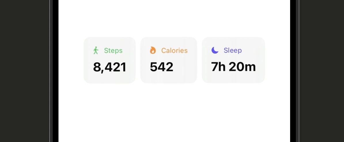
| Line | What it does |
|---|---|
struct StatCard: View |
Declares a new SwiftUI view. This is the same pattern you’ve used since Stage 1 — the difference is that this view is designed to be reused, not used just once. |
let title: String |
A required property. Whoever creates a StatCard must pass a title. Swift enforces this at compile time. |
var accentColor: Color = .blue |
An optional property with a default value. If you don’t pass an accentColor, it falls back to blue. This keeps call sites clean when the default works fine. |
.background(.regularMaterial) |
Uses a material background — a frosted-glass effect that adapts automatically to light and dark mode. No extra work needed. |
StatCard(title: "Steps", ...) |
Creates an instance of the component and passes in the specific values for this card. The component handles the rest. |
Component Patterns
struct CardContainer<Content: View>: View {
// @ViewBuilder lets callers pass any SwiftUI view as content
let content: Content
init(@ViewBuilder content: () -> Content) {
self.content = content()
}
var body: some View {
content
.padding()
.background(.regularMaterial)
.clipShape(RoundedRectangle(cornerRadius: 12))
}
}
// Usage — any view goes inside the braces
CardContainer {
Text("Anything can go here")
}@ViewBuilder is what SwiftUI uses internally for all its own containers like VStack and HStack. Applying it to your own components gives callers the same flexibility — they can pass in any view content using the familiar trailing closure syntax.// Right-click any view in your code or canvas
// Choose "Extract Subview" from the menu
// Xcode creates the new struct and wires it up automatically
// Before: inline code in a larger view
Text("Hello")
.font(.title)
.padding()
.background(.blue)
.foregroundStyle(.white)
.clipShape(Capsule())
// After extraction: a named, reusable component
GreetingBadge()struct PrimaryButtonStyle: ViewModifier {
func body(content: Content) -> some View {
content
.font(.headline)
.foregroundStyle(.white)
.padding(.horizontal, 24)
.padding(.vertical, 12)
.background(.blue)
.clipShape(Capsule())
}
}
// Convenience extension so you can call it like any built-in modifier
extension View {
func primaryButton() -> some View {
modifier(PrimaryButtonStyle())
}
}
// Usage — reads like a native modifier
Button("Get Started") { }
.primaryButton()ViewModifier bundles them into a single reusable modifier. Adding a convenience extension on View lets you call it with dot syntax, just like SwiftUI’s built-in modifiers.| Syntax | What It Does |
|---|---|
| struct MyView: View { } | Define a reusable component |
| let property: Type | Required property — must be passed at the call site |
| var property: Type = default | Optional property with fallback value |
| @ViewBuilder content: () -> Content | Accept any SwiftUI view as injected content |
| struct S: ViewModifier { func body(content:) } | Bundle modifier chains into a reusable modifier |
| extension View { func myMod() } | Add dot-syntax convenience access to a custom modifier |
Using AI to Go Further
Dark mode isn’t optional anymore. A large portion of iOS users keep their device in dark mode permanently, and your app needs to look good in both. The good news is that SwiftUI does most of the heavy lifting for you — if you use semantic colors and system materials, you get dark mode for free.
Semantic colors are colors defined by their role rather than their specific shade. .primary is the main text color — it’s near-black in light mode and near-white in dark mode. .secondary is a softer version of that. .background flips between white and near-black. When you use these, the system handles the switching automatically.
Where you run into trouble is when you hardcode specific colors — like setting a background to Color.white or text to Color.black. Those don’t adapt. In dark mode, white text on a white background becomes invisible. This lesson shows you how to avoid that.
import SwiftUI
struct ColorSchemeExampleView: View {
// Read the current color scheme from the environment
@Environment(\.colorScheme) var colorScheme
var body: some View {
VStack(spacing: 20) {
// Semantic colors — these adapt automatically
Text("Primary text")
.foregroundStyle(.primary)
// Tinted background that adapts — do this, not Color.white
RoundedRectangle(cornerRadius: 12)
.fill(Color(.systemBackground))
.frame(height: 60)
// Use colorScheme to branch on light vs dark when necessary
Text(colorScheme == .dark ? "Dark Mode" : "Light Mode")
.foregroundStyle(.secondary)
// Custom color from the asset catalog — defined once, adapts automatically
Text("Branded text")
.foregroundStyle(Color("AppBlue"))
}
.padding()
.background(Color(.systemGroupedBackground))
}
}| Line | What it does |
|---|---|
@Environment(\.colorScheme) |
Reads the active color scheme (.light or .dark) from the SwiftUI environment. The value updates automatically when the user switches modes. |
.foregroundStyle(.primary) |
Uses the semantic primary color, which is near-black in light mode and near-white in dark mode. Always prefer this over Color.black. |
Color(.systemBackground) |
Accesses a UIKit semantic color via its string name. systemBackground is white in light mode and near-black in dark mode. A reliable choice for card backgrounds. |
colorScheme == .dark ? ... : ... |
Branches explicitly on the current color scheme. Use this sparingly — only when you need different content or behavior, not just different colors. |
Color("AppBlue") |
Loads a named color from the asset catalog. In Xcode’s asset catalog you define both a light and a dark variant for the same name. SwiftUI picks the right one automatically. |
Color.white or Color.black for backgrounds and text. These are fixed colors and don’t adapt. Use Color(.systemBackground) and .primary instead.
Color Tools and Techniques
// In Xcode: Assets.xcassets → + → Color Set
// Set the Appearances dropdown to "Any, Dark"
// Define the light color in the "Any" slot and dark in the "Dark" slot
// Name it "BrandAccent"
// Then use it anywhere in SwiftUI
Text("Hello")
.foregroundStyle(Color("BrandAccent"))// Force dark mode on a specific view for testing
MyView()
.preferredColorScheme(.dark)
// Lock the app to light mode regardless of system setting
WindowGroup {
ContentView()
.preferredColorScheme(.light)
}// Show both light and dark mode in the preview canvas
struct MyView_Previews: PreviewProvider {
static var previews: some View {
Group {
MyView()
.preferredColorScheme(.light)
MyView()
.preferredColorScheme(.dark)
}
}
}| Syntax | What It Does |
|---|---|
| @Environment(\.colorScheme) var colorScheme | Read the active color scheme from the environment |
| .foregroundStyle(.primary) | Semantic text color — adapts automatically |
| Color(.systemBackground) | Semantic background — white in light, near-black in dark |
| Color(.systemGroupedBackground) | Slightly different semantic background for grouped sections |
| Color(“NamedColor”) | Load a named color set from the asset catalog |
| .preferredColorScheme(.dark) | Force dark mode on a view or the app root |
| .background(.regularMaterial) | Frosted-glass material that adapts automatically |
Color.white, Color.black, or hex color values in your views. Replace each one with a semantic color or an asset catalog color set. Then add both light and dark previews to your main view to verify everything looks correct.
Using AI to Go Further
Dynamic Type is the iOS feature that lets users choose their preferred font size in Settings. Some people bump it up because their eyes need the extra help. Others shrink it to fit more content on screen. Your app is expected to respect this preference — and when you use SwiftUI’s text styles correctly, it does so automatically.
The trap that beginners fall into is hardcoding font sizes with something like .font(.system(size: 16)). That number is fixed. It never changes regardless of what the user has set. Use semantic text styles like .font(.body) or .font(.headline) instead, and the system handles the scaling for you.
When you need a custom size for a non-text element — like an icon, a circle, or a spacing value — @ScaledMetric is the tool for the job. It works like a property that automatically scales up or down in proportion to the user’s text size setting. This is how you make every dimension in your UI feel intentional and accessible.
import SwiftUI
struct AccessibleRowView: View {
// @ScaledMetric scales this value proportionally with Dynamic Type
@ScaledMetric var avatarSize: CGFloat = 48
var body: some View {
HStack(alignment: .top, spacing: 12) {
// Size driven by @ScaledMetric — grows with the user's text preference
Circle()
.fill(.blue)
.frame(width: avatarSize, height: avatarSize)
VStack(alignment: .leading, spacing: 4) {
// Semantic text style — scales automatically, no hardcoded size
Text("Jane Doe")
.font(.headline)
// Secondary line — a smaller semantic style
Text("Joined 2023")
.font(.subheadline)
.foregroundStyle(.secondary)
}
Spacer()
}
.padding()
}
}
| Line | What it does |
|---|---|
@ScaledMetric var avatarSize: CGFloat = 48 |
Declares a property whose value scales with the user’s Dynamic Type setting. At default text size, avatarSize is 48. At the largest accessibility size, it could be 80 or more. |
.font(.headline) |
A semantic text style. SwiftUI knows the appropriate font size and weight for each style and scales them with Dynamic Type automatically. |
.font(.subheadline) |
A slightly smaller semantic style, appropriate for supporting information like dates, subtitles, and secondary labels. |
HStack(alignment: .top) |
Aligns the avatar and text to the top of the row. At large text sizes the text may wrap to multiple lines — top alignment keeps the layout from looking misaligned. |
Dynamic Type Modifiers
// Text will shrink up to 50% of its original size before truncating
Text("Long navigation title that might not fit")
.font(.headline)
.minimumScaleFactor(0.5)
.lineLimit(1)// Scale the icon size in proportion to headline text specifically
@ScaledMetric(relativeTo: .headline) var iconSize: CGFloat = 20
Image(systemName: "star.fill")
.frame(width: iconSize, height: iconSize)relativeTo: parameter ties the scaling behavior to a specific text style. If your icon appears next to headline text, scaling it relative to .headline keeps the proportions consistent at all text sizes.// Xcode menu: Xcode → Open Developer Tool → Accessibility Inspector
// Or press: Cmd + Shift + A in Xcode
//
// The Audit tab scans your app for accessibility issues automatically
// The Inspection tab lets you tap elements to read their accessibility info
// The Settings tab lets you simulate Dynamic Type sizes without leaving Xcode| Syntax | What It Does |
|---|---|
| .font(.headline) | Semantic text style — scales with Dynamic Type |
| .font(.body) | Default body text style — the baseline semantic size |
| .font(.caption) | Small secondary text — for labels, timestamps, hints |
| @ScaledMetric var size: CGFloat = 48 | Scale a custom measurement proportionally with text size |
| @ScaledMetric(relativeTo: .headline) | Scale relative to a specific text style |
| .minimumScaleFactor(0.5) | Allow text to shrink up to the given fraction before truncating |
| .dynamicTypeSize(.large … .accessibility3) | Limit the range of Dynamic Type sizes a view responds to |
.font(.system(size:)) call with the appropriate semantic text style. Then find at least one hardcoded CGFloat size for a non-text element and convert it to a @ScaledMetric property. Preview the result at both the default and largest accessibility text sizes.
Using AI to Go Further
VoiceOver is Apple’s screen reader for blind and low-vision users. When it’s enabled, users navigate by swiping and tapping, and the system reads aloud everything on screen. SwiftUI does a reasonable job of providing default VoiceOver support — a Button with a text label gets announced automatically, for example. But the defaults have limits, and a few minutes of intentional work makes your app genuinely usable for everyone.
The most common problem is image-only buttons. A trash icon button with no label text is invisible to VoiceOver unless you add an accessibility label. VoiceOver will just say “image” — which tells the user nothing. The same applies to decorative images that shouldn’t be read at all — they need to be explicitly hidden from VoiceOver so they don’t interrupt the reading flow.
Testing on a real device with VoiceOver enabled is the only way to know how your app actually feels. Enable it in Settings, or triple-click the side button if you’ve set up the accessibility shortcut. You’ll immediately discover whether your app makes sense in audio form.
import SwiftUI
struct AccessibleCardView: View {
var body: some View {
VStack(alignment: .leading, spacing: 12) {
// Decorative image — hidden from VoiceOver so it doesn't read "image"
Image(systemName: "photo")
.accessibilityHidden(true)
// Label that VoiceOver will read as the accessible name
Text("Article title")
.font(.headline)
.accessibilityLabel("Article: SwiftUI Animations")
// Hint read after the label — describes what happens when activated
Button("Read") { }
.accessibilityLabel("Read article")
.accessibilityHint("Opens the full article in a new screen")
// Value — useful for progress, sliders, or counts
ProgressView(value: 0.6)
.accessibilityLabel("Reading progress")
.accessibilityValue("60 percent")
// Combine multiple elements into one VoiceOver-readable group
HStack {
Image(systemName: "heart.fill").accessibilityHidden(true)
Text("128 likes")
}
.accessibilityElement(children: .combine)
}
.padding()
}
}| Line | What it does |
|---|---|
.accessibilityHidden(true) |
Hides an element from VoiceOver completely. Use this for decorative images, dividers, or visual elements that don’t add meaning when read aloud. |
.accessibilityLabel("...") |
The name VoiceOver reads for this element. For icon buttons, this is the most important modifier — without it, VoiceOver has nothing useful to say. |
.accessibilityHint("...") |
Additional context read after the label. Describes what happens when the element is activated. Keep it brief — it’s supplementary, not the primary description. |
.accessibilityValue("...") |
Communicates the current value of an element — especially useful for progress indicators, sliders, and counters. |
.accessibilityElement(children: .combine) |
Merges all child elements into a single VoiceOver-readable unit. Instead of reading each child separately, VoiceOver reads the group as one item. |
.accessibilityLabel. This is the most common VoiceOver failure in beginner apps. A trash button, a share button, a close button — if it has no visible text, add an explicit label.
VoiceOver Modifiers
// Mark a view as a header so VoiceOver users can navigate by headings
Text("Today's Tasks")
.font(.title2)
.accessibilityAddTraits(.isHeader)
// Mark an image as a button since it has a tap gesture
Image(systemName: "star")
.onTapGesture { /* favorite */ }
.accessibilityAddTraits(.isButton)
.accessibilityLabel("Add to favorites")Image gets announced as a static image — VoiceOver users won’t know it’s interactive. Add .isButton so they hear “Add to favorites, button.”// Replace a complex layout with a single clean VoiceOver description
HStack {
Circle().fill(.green).frame(width: 10, height: 10)
Text("Active")
Text("·")
Text("2 min ago")
}
.accessibilityElement(children: .ignore)
.accessibilityLabel("Status: Active, 2 minutes ago").ignore strategy discards all children and uses your custom label instead.// Users can say any of these names to activate this button with Voice Control
Button("Save") { }
.accessibilityLabel("Save document")
.accessibilityInputLabels(["Save", "Save document", "Save file"])| Syntax | What It Does |
|---|---|
| .accessibilityLabel(“name”) | The name VoiceOver reads for this element |
| .accessibilityHint(“hint”) | Additional context read after the label |
| .accessibilityValue(“value”) | Current value of a control (slider, progress, counter) |
| .accessibilityHidden(true) | Hide decorative elements from VoiceOver |
| .accessibilityElement(children: .combine) | Merge children into one readable unit |
| .accessibilityElement(children: .ignore) | Replace children with a custom label |
| .accessibilityAddTraits(.isHeader) | Mark as a navigation header |
| .accessibilityAddTraits(.isButton) | Mark as interactive/tappable |
Using AI to Go Further
Haptic feedback is the subtle vibration that tells your hand something happened. When you delete a message and feel that light tap, when a toggle snaps into place, when a payment goes through and the phone pulses — that’s haptics. Done well, it makes an app feel physical and responsive. Done badly — too often, too intense, for the wrong actions — it just becomes annoying.
iOS provides two main classes for haptic feedback. UIImpactFeedbackGenerator produces impact-style taps — good for button presses, completing an action, or acknowledging a gesture. UINotificationFeedbackGenerator produces notification-style feedback — three distinct patterns for success, warning, and error outcomes.
Haptics only work on a real device. The simulator ignores them silently. Make a habit of testing haptic-enabled features on a physical iPhone before shipping — what sounds right in code doesn’t always feel right in your hand.
import SwiftUI
struct HapticDemoView: View {
var body: some View {
VStack(spacing: 20) {
// Light impact — subtle confirmation, like toggling a switch
Button("Light Tap") {
UIImpactFeedbackGenerator(style: .light).impactOccurred()
}
// Medium impact — general button press or selection
Button("Medium Tap") {
UIImpactFeedbackGenerator(style: .medium).impactOccurred()
}
// Heavy impact — significant action, like deleting an item
Button("Heavy Tap") {
UIImpactFeedbackGenerator(style: .heavy).impactOccurred()
}
// Success — task completed, payment confirmed, save successful
Button("Success") {
UINotificationFeedbackGenerator().notificationOccurred(.success)
}
// Warning — something needs attention, but not an error
Button("Warning") {
UINotificationFeedbackGenerator().notificationOccurred(.warning)
}
// Error — action failed, validation error, network failure
Button("Error") {
UINotificationFeedbackGenerator().notificationOccurred(.error)
}
}
.padding()
}
}
| Line | What it does |
|---|---|
UIImpactFeedbackGenerator(style:) |
Creates a generator for impact-style haptics. The style parameter determines the intensity. You don’t need to store the generator — create it, fire it, and let it go. |
.impactOccurred() |
Triggers the haptic immediately. Call this at the exact moment the impact should be felt — on button press, on drop, on snap. |
UINotificationFeedbackGenerator() |
Creates a generator for notification-style haptics. These have a distinct three-beat pattern that iOS users recognize for specific outcomes. |
.notificationOccurred(.success) |
Triggers the success haptic pattern. Use this when something went right — a form submitted, a file saved, a transaction completed. |
.notificationOccurred(.error) |
Triggers the error haptic pattern. Use this for failures — a network error, a validation rejection, a failed payment. It’s distinct and communicates “something went wrong.” |
Haptic Patterns
@State private var isSaved = false
Button("Save") {
isSaved = true
}
// Trigger haptic when isSaved changes to true
.sensoryFeedback(.success, trigger: isSaved).sensoryFeedback() as a native SwiftUI modifier. Instead of calling UIKit classes directly, you attach the modifier to a view and it fires when the trigger value changes. Cleaner and more SwiftUI-idiomatic for new projects targeting iOS 17+.let generator = UIImpactFeedbackGenerator(style: .medium)
// Prepare before the action — reduces taptic engine warm-up delay
generator.prepare()
// Then fire when the moment arrives
generator.impactOccurred().prepare() on a generator before firing reduces the latency from a cold start. For actions where timing matters — like a game tap target or an animation that needs a synchronized feel — prepare the generator as soon as the user starts the interaction.// Fire as the user scrolls through picker options
UISelectionFeedbackGenerator().selectionChanged()| Syntax | What It Does |
|---|---|
| UIImpactFeedbackGenerator(style: .light) | Light impact — subtle tap for minor actions |
| UIImpactFeedbackGenerator(style: .medium) | Medium impact — standard button press |
| UIImpactFeedbackGenerator(style: .heavy) | Heavy impact — significant or destructive action |
| .notificationOccurred(.success) | Success pattern — task completed |
| .notificationOccurred(.warning) | Warning pattern — needs attention |
| .notificationOccurred(.error) | Error pattern — something failed |
| UISelectionFeedbackGenerator().selectionChanged() | Subtle tick for selection changes |
| .sensoryFeedback(.success, trigger: value) | SwiftUI-native haptics (iOS 17+) |
Using AI to Go Further
Your app icon is the first thing anyone sees. It appears on the home screen, in the App Store listing, in search results, and in Settings. A polished icon signals that you took the whole experience seriously. A placeholder icon — the default gray grid — signals the opposite. This lesson is about making sure your app never looks unfinished.
The launch screen is what appears between tapping your app icon and your first view loading. iOS shows it automatically. Without any configuration, it defaults to a black or white screen. A properly configured launch screen either mirrors your app’s first view closely (so the transition feels seamless) or shows a branded splash that sets the right visual tone from the first frame.
There are two approaches to launch screens: the Info.plist approach and the LaunchScreen storyboard approach. Both work — the Info.plist version is simpler and sufficient for most apps. The storyboard approach gives you more visual control. We’ll cover both.
// App Icon setup — done in the asset catalog, not in code
// 1. In Xcode: Assets.xcassets → AppIcon
// 2. Drag a 1024x1024 PNG into the slot
// 3. Xcode generates all required sizes automatically (iOS 14+)
// Dark and tinted icon variants (iOS 18+)
// In the AppIcon asset, switch Appearances to "Any, Dark, Tinted"
// Provide a separate icon image for each variant
// Launch screen via Info.plist — simplest approach
// In Info.plist, add UILaunchScreen key
// Set UIColorName to a named color from your asset catalog
// Set UIImageName to an image asset to show centered on the screen
// Changing the launch screen in code is NOT possible —
// it must be configured in the asset catalog or Info.plist
| Step | What it does |
|---|---|
Assets.xcassets → AppIcon |
The asset catalog slot for your app’s icon. iOS 14 and later only requires the 1024×1024 master image — Xcode generates all other sizes from it. |
| 1024×1024 PNG requirement | Your source image must be exactly 1024×1024 pixels with no alpha channel (transparency). A transparent background will cause App Store rejection. |
| Dark icon variant (iOS 18+) | Users can opt into a dark home screen. Providing a dark variant of your icon ensures your app looks polished in that context — not just a darkened version of the original. |
| UILaunchScreen in Info.plist | The simplest launch screen configuration. You can set a background color and a centered image without creating a storyboard. |
| LaunchScreen.storyboard | The storyboard approach gives you full visual control over the launch screen layout. Still not SwiftUI — it’s a special UIKit view that exists outside your app’s SwiftUI scene. |
App Icon and Launch Screen Patterns
/* In Info.plist — add these keys under UILaunchScreen */
/* UIColorName — a color set defined in your asset catalog */
"UIColorName": "LaunchBackground"
/* UIImageName — an image asset to show centered */
"UIImageName": "LaunchLogo"
/* UIImageRespectsSafeAreaInsets — keeps image away from notch/dynamic island */
"UIImageRespectsSafeAreaInsets": trueUILaunchScreen dictionary to your Info.plist. Define your background color as a color set in the asset catalog and your logo as an image asset. This is the fastest path to a branded launch screen without a storyboard.// 1. File → New → File → Launch Screen (Storyboard)
// 2. Name it LaunchScreen.storyboard
// 3. In the canvas, set your background color and add image views
// 4. In project settings → General → App Icons and Launch Image
// set Launch Screen File to LaunchScreen
// Important: use Auto Layout constraints, not fixed frames
// The launch screen must work on all iPhone screen sizes// Switch the app icon programmatically — user triggers this in settings
if UIApplication.shared.supportsAlternateIcons {
UIApplication.shared.setAlternateIconName("DarkIcon") { error in
if let error {
print("Icon switch failed: \(error)")
}
}
}
// To restore the default icon, pass nil
UIApplication.shared.setAlternateIconName(nil) { /* ... */ }| Topic | Key Detail |
|---|---|
| App icon source size | 1024×1024 PNG, no alpha channel |
| Icon slot location | Assets.xcassets → AppIcon |
| Dark icon variant | Requires iOS 18+, set Appearances to Any/Dark/Tinted |
| Simple launch screen | UILaunchScreen dictionary in Info.plist |
| Advanced launch screen | LaunchScreen.storyboard with Auto Layout |
| Alternate icons | Declared in Info.plist, switched via UIApplication.setAlternateIconName |
| Common rejection cause | Transparent icon or wrong pixel dimensions |
Using AI to Go Further
User preferences are the settings that should survive the app being closed and reopened. Dark mode preference, notification opt-in status, a chosen display name, whether the user has completed onboarding — these need to persist. In Stage 9 you learned that @AppStorage writes values to UserDefaults automatically. This lesson puts that knowledge to work in a real preferences screen.
The key insight with @AppStorage is that it behaves exactly like @State from SwiftUI’s perspective. When the value changes, the view re-renders. When the app relaunches, the stored value is read back automatically. You get persistent state with almost no extra code compared to regular in-memory state.
This lesson builds a complete preferences screen that stores three real settings: a theme override, a notification opt-in toggle, and a display name. These are exactly the kinds of user preferences you’ll need in any real app.
import SwiftUI
struct PreferencesView: View {
// @AppStorage reads from and writes to UserDefaults automatically
@AppStorage("userDisplayName") private var displayName = ""
// Bool preference — persists across launches
@AppStorage("notificationsEnabled") private var notificationsEnabled = false
// String preference used to drive preferredColorScheme
@AppStorage("themePreference") private var themePreference = "system"
var body: some View {
Form {
Section("Profile") {
// TextField bound directly to the @AppStorage property
TextField("Display name", text: $displayName)
}
Section("Notifications") {
// Toggle reads and writes the persisted Bool directly
Toggle("Enable notifications", isOn: $notificationsEnabled)
}
Section("Appearance") {
// Picker lets user choose from three theme options
Picker("Theme", selection: $themePreference) {
Text("System").tag("system")
Text("Light").tag("light")
Text("Dark").tag("dark")
}
.pickerStyle(.segmented)
}
}
.navigationTitle("Preferences")
// Apply the user's theme choice to the whole view
.preferredColorScheme(colorSchemeFor(themePreference))
}
// Helper — converts the stored string to a SwiftUI ColorScheme optional
private func colorSchemeFor(_ preference: String) -> ColorScheme? {
switch preference {
case "light": return .light
case "dark": return .dark
default: return nil // nil = follow system
}
}
}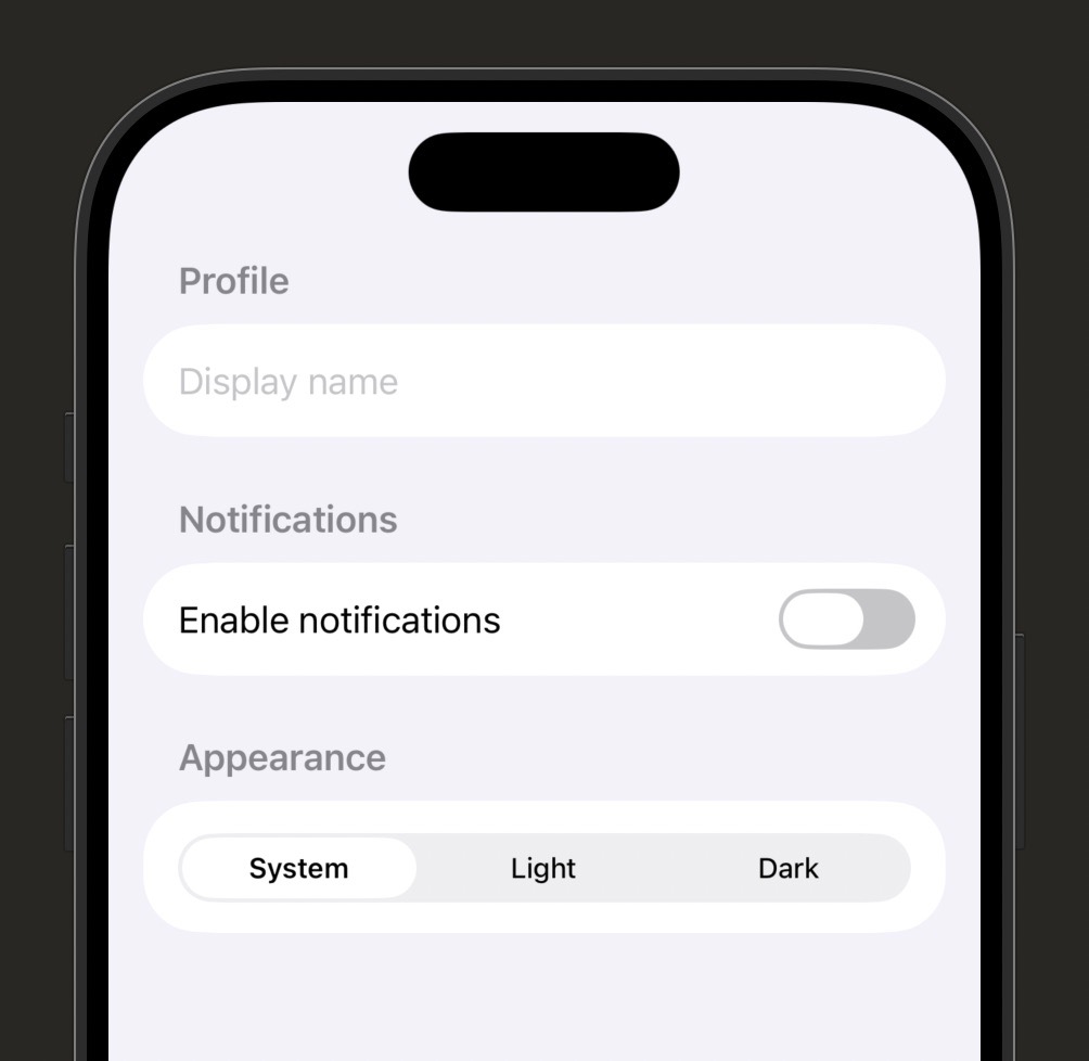
| Line | What it does |
|---|---|
@AppStorage("key") var value = default |
Declares a persistent property. The string key is how the value is stored in UserDefaults. The default value is only used the very first time — after that, the stored value takes over. |
TextField("...", text: $displayName) |
Binds a text field directly to an @AppStorage property using the $ binding syntax, exactly like @State. Every keystroke is persisted immediately. |
Toggle("...", isOn: $notificationsEnabled) |
Binds a toggle to the persisted Bool. When the user flips the switch, the new value is written to UserDefaults and the view re-renders. |
Picker(..., selection: $themePreference) |
Binds a picker to the stored string. When the user selects a segment, the string updates and the helper function converts it to a ColorScheme. |
colorSchemeFor(_:) |
A private helper function that converts the stored string (“system”, “light”, “dark”) to the ColorScheme? that .preferredColorScheme() expects. Returning nil means follow the system. |
"com.yourapp.notificationsEnabled" instead of short generic names like "notifications". Short names risk collisions with other frameworks or future settings. The key is just a string — make it unambiguous.
@AppStorage Patterns
// In PreferencesView
@AppStorage("notificationsEnabled") private var notificationsEnabled = false
// In ProfileView — same key, always reads the same stored value
@AppStorage("notificationsEnabled") private var notificationsEnabled = false// Share preferences between an app and its widget extension
@AppStorage("widgetEnabled", store: UserDefaults(
suiteName: "group.com.yourapp.shared"
))
private var widgetEnabled = falsestruct RootView: View {
// False by default — first launch always shows onboarding
@AppStorage("hasCompletedOnboarding") private var hasCompletedOnboarding = false
var body: some View {
if hasCompletedOnboarding {
MainTabView()
} else {
// Onboarding sets this flag to true when the user finishes
OnboardingView(onComplete: { hasCompletedOnboarding = true })
}
}
}| Syntax | What It Does |
|---|---|
| @AppStorage(“key”) var value = default | Persist a value in UserDefaults, read/write like @State |
| $value (binding) | Pass to controls like Toggle, TextField, Picker for two-way binding |
| Same key in multiple views | Shared state — all views with the same key stay in sync |
| store: UserDefaults(suiteName:) | Use an App Group shared store for widgets or extensions |
| Supported types | Bool, Int, Double, String, URL, Data |
| Default value | Used only on first launch — replaced by stored value on every subsequent launch |
@AppStorage. Then apply the theme preference to your app’s root view and verify it persists when you stop and relaunch the app in the simulator.
Using AI to Go Further
Stage 11 Recap: Polish and Real-World Skills
You’ve now covered everything that separates a working app from one that feels genuinely finished. These eight lessons aren’t extras — they’re the details that App Store reviewers notice, that users feel without knowing why, and that distinguish a beginner’s project from a real product.
- Lesson 11.1 — SF Symbols: Use Apple’s built-in icon library with rendering modes, variants, and variable values — and never hardcode icon names by guessing.
- Lesson 11.2 — Custom Components: Extract repeated UI into parameterized structs and custom modifiers so your codebase scales without copy-paste sprawl.
- Lesson 11.3 — Dark Mode: Use semantic colors and asset catalog color sets so your app adapts automatically — no extra code per mode needed.
- Lesson 11.4 — Dynamic Type and Accessibility: Replace hardcoded font sizes with semantic text styles and use
@ScaledMetricfor custom dimensions so your layout works at every text size. - Lesson 11.5 — VoiceOver: Add accessibility labels, hints, and values to every interactive element — especially icon-only buttons — so screen reader users can navigate your app meaningfully.
- Lesson 11.6 — Haptics: Use
UIImpactFeedbackGeneratorandUINotificationFeedbackGeneratorsparingly and intentionally to make interactions feel physical and responsive. - Lesson 11.7 — App Icons and Launch Screens: Provide a 1024×1024 icon with no transparency, configure a launch screen via Info.plist or storyboard, and avoid the common rejection mistakes.
- Lesson 11.8 — User Preferences: Build a real preferences system using
@AppStoragefor settings that persist across launches — including theme choice, notification opt-in, and onboarding state.
If you skipped any challenges, go back and complete them now. The gap between understanding code and being able to apply it closes fastest when you build something of your own immediately after each lesson.
Stage 12 is the final stage: Shipping. You’ll learn how to prepare your app for App Store submission — TestFlight, App Store Connect, metadata, screenshots, review guidelines, and what to do after you launch.
Learn SwiftUI Stage 12: Shipping
Building the app is the part most tutorials teach. Shipping it is the part that turns a hobby project into something real — and this stage covers every step between “my app works on my phone” and “my app is live on the App Store.”
This stage is different from the others. It’s mostly process, not code. You’ll be working inside Xcode’s Organizer, App Store Connect, and TestFlight rather than writing Swift. One important thing to know upfront: submitting to the App Store requires an Apple Developer Program membership, which costs $99/year. If you don’t have one yet, you can follow along with everything up to the actual submission step and join when you’re ready to ship. This stage has 7 lessons covering roughly 3 hours of material. Each lesson ends with a concrete action item — something you can actually do right now, not just think about.
By the end of Stage 12, you’ll understand code signing and provisioning profiles (the part everyone finds confusing at first), how to set up a beta test with TestFlight, how to fill out your App Store Connect listing, how to write screenshots and keywords that actually convert, what the App Review process looks like and what to do when things go wrong, how to read crash reports and basic analytics, and how to maintain your app after it’s live. This is the last stage of Learn SwiftUI — and the one that makes everything before it feel worth it.
Before your app can run on a real device or be submitted to the App Store, Apple needs to verify that it came from a trusted developer. That verification system is called code signing, and provisioning profiles are the files that make it work. If you’ve ever seen an error like “No signing certificate found” or “Provisioning profile doesn’t include the selected device” — this lesson explains exactly what went wrong and how to fix it.
The good news is that Xcode handles most of this automatically. The bad news is that when something goes wrong, the error messages are cryptic and the fix isn’t obvious. This lesson will demystify the whole system so that when you hit an error (and you will), you know what you’re looking at and what to do about it.
Think of code signing like a notary stamp. Apple is the notary, your Developer ID certificate is the stamp, and the provisioning profile is the document that says which devices your app is allowed to run on. When everything matches up, Xcode stamps your app and Apple trusts it. When something is missing or expired, the whole thing breaks down.
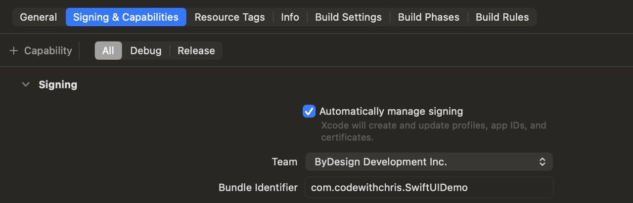
The Two Types of Certificates
You’ll encounter two kinds of certificates in your developer account. Development certificates let you run your app on your own devices during testing. Distribution certificates are required for submitting to the App Store or distributing via TestFlight to external testers. Xcode can create both automatically — you typically don’t need to manage them manually.
Common Code Signing Errors and Fixes
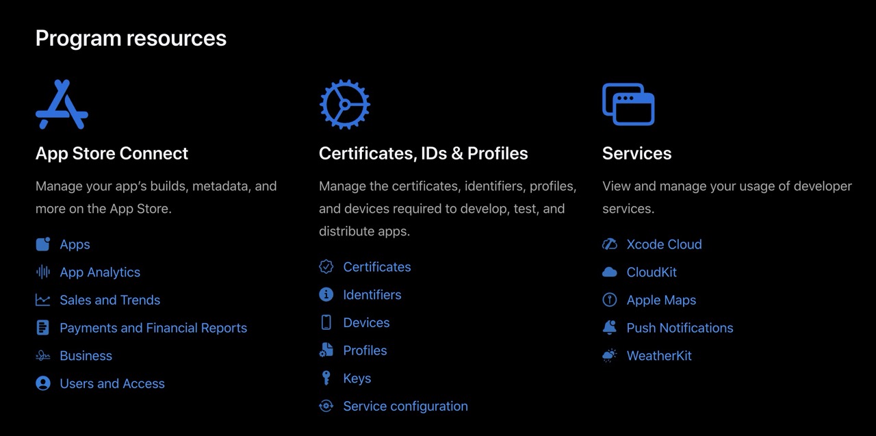
Your Bundle ID
Your Bundle ID is a unique string that identifies your app across all of Apple’s systems. The standard format is reverse domain notation: com.yourname.appname. Once you submit your app to the App Store, the Bundle ID is permanent — you can never change it. Choose it carefully before submitting. If you’re just testing, anything works. But for your real app, use something you own.
Open Xcode → Settings → Accounts. Add your Apple ID if it isn’t listed. Then open your project, select your target, go to Signing & Capabilities, enable “Automatically manage signing”, and select your team. Build to your simulator and verify there are no signing errors. If you’re submitting a real app, also connect your iPhone and confirm it runs on device.
Using AI to Go Further
TestFlight is Apple’s official beta testing platform. It lets you share your app with real users before it goes live on the App Store — and those users can install it on their real iPhones without the app being publicly released. This is invaluable. Real users find bugs that you and your simulator never will. They tap in unexpected places, use the app in unexpected ways, and surface crashes you didn’t know existed.
TestFlight is free and built into App Store Connect. You upload a build, invite testers, and they get an email with a link to install the TestFlight app and your beta. It’s significantly simpler than it sounds, and you should use it for every app — even if your “beta testers” are just your friends and family.
There are two tiers of testers: internal and external. Internal testers are people in your Apple Developer account — team members. External testers are anyone else — up to 10,000 people via email invitation. External testing requires a brief Apple review first, which usually takes about a day.
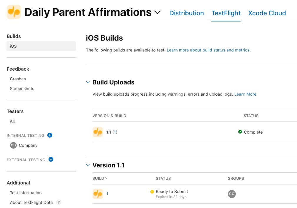
How to Upload a Build
Reading Crash Reports from TestFlight
When your app crashes for a tester, TestFlight captures a crash report and sends it to App Store Connect. You can view these under TestFlight → your build → Crashes. Crash reports show you the exact line of code that caused the crash, which is far more useful than a tester saying “it just stopped working.” Check crash reports regularly during your beta period.
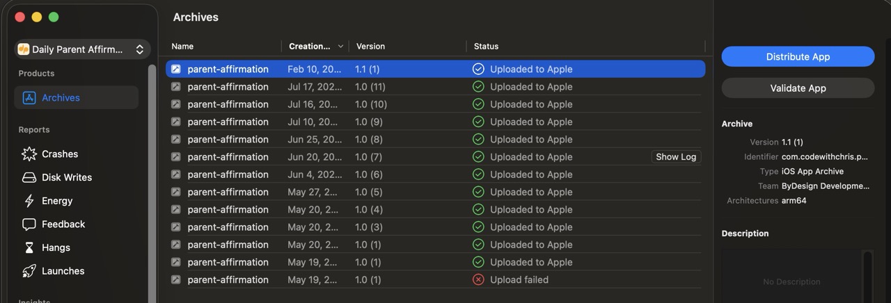
Select “Any iOS Device” in Xcode, then choose Product → Archive. Validate the archive, then distribute it to App Store Connect. Once the build appears in TestFlight, invite yourself as an internal tester and install it on your iPhone through the TestFlight app. Confirm it launches and runs correctly on your real device.
Using AI to Go Further
App Store Connect is Apple’s web portal for managing your apps, viewing analytics, and submitting to the App Store. Before you can upload a build, you need to create an app record here — a kind of container that holds all your app’s metadata, builds, and review history. This lesson walks through every field you’ll need to fill in.
The first time you open App Store Connect it can feel overwhelming. There are dozens of fields and settings, and it’s not always obvious which ones matter and which ones you can ignore. The goal of this lesson is to cut through that noise and tell you exactly what you need to fill in and why.
A few things are permanent once you submit: your Bundle ID, your primary language, and your app’s primary category. Everything else — your name, description, screenshots, pricing — can be changed in a later update. Don’t let the fear of making the wrong choice stop you from moving forward.
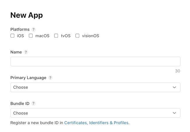
Creating Your App Record
Fields You Must Complete Before Submitting
| Field | What to know |
|---|---|
Privacy Policy URL |
Required for all apps. Even if you collect no data, you need a privacy policy. Use a free generator like app-privacy-policy-generator.firebaseapp.com and host it anywhere (Notion, GitHub, your own site). |
Age Rating |
Answer the questionnaire honestly. Most simple apps rate as 4+. If your app has any user-generated content, even basic profile pictures, you’ll rate higher. |
Category |
Choose the most accurate primary category. A secondary category is optional but can help visibility. Categories affect where your app appears in Browse — not just search. |
Copyright |
Your name or company name plus the year. Example: “2025 Jane Smith”. Not a legal requirement to register separately — just type it in. |
Support URL |
A URL where users can get help. This can be a contact page, a simple FAQ, or even a GitHub page. It must be a real, accessible URL. |
Log in to App Store Connect at appstoreconnect.apple.com. Click My Apps → the “+” button → New App. Fill in the platform, name, primary language, Bundle ID, and SKU. Then navigate to App Information and fill in the category, age rating, and your privacy policy URL. Don’t worry about screenshots or description yet — that’s Lesson 12.4.
Using AI to Go Further
Your app’s listing is your sales page. It’s the first thing a potential user sees before they decide whether to download your app. Most developers treat it as an afterthought — they take quick screenshots in the simulator, write a few sentences, and move on. That’s a mistake. Your listing is where downloads are won or lost.
App Store Optimization (ASO) is the practice of improving your listing so more people find your app and more of them download it when they do. You don’t need to be an expert — but understanding a few basics will make a real difference, especially for your first app when you don’t have reviews or word-of-mouth working for you yet.
This lesson covers the three elements of your listing that matter most: your screenshots, your description, and your keyword field. Each one affects a different part of the funnel — keywords affect whether people find you, screenshots affect whether they click, and your description affects whether they download.
Screenshots That Convert
Writing Your Description
Your description has two parts: the first three lines (visible without tapping “more”) and the rest. Put your strongest, clearest statement of what the app does in those first three lines. Most users never read further. After that, you can go into more detail about features, but keep the language user-focused rather than technical.
Keywords Field
The keyword field gives you 100 characters to add search terms — words that aren’t in your app name or subtitle already. Don’t repeat your app name. Don’t add spaces after commas — Apple ignores them and you’re wasting characters. Think about what your target user would search for when looking for an app like yours.
Take screenshots of your app at 6.5″ and 5.5″ using the Xcode simulator. Add a short text overlay to at least your first screenshot using Canva or a similar tool. Write a description that leads with your app’s strongest benefit in the first three lines. Fill in your keyword field using 100 characters of relevant search terms with no spaces after commas. Upload everything to App Store Connect.
Using AI to Go Further
Once you’ve filled in your metadata, uploaded your screenshots, and attached a build, you click “Submit for Review” — and then you wait. Apple’s App Review team manually examines your app to make sure it follows their guidelines. For most straightforward apps, review takes 24–48 hours. It can be faster. It can also be longer for complex apps or during busy periods like the holidays.
Getting rejected is more common than most people expect. About 40% of first submissions get rejected. That’s not a reflection of your work — it’s just how the process works. Rejections are fixable. Apple tells you exactly what the problem is, you fix it, and you resubmit. The average total time from first submission to App Store approval is about one week when you factor in potential rejections.
Understanding why rejections happen is the best way to avoid them. The vast majority of rejections fall into a small number of categories, and most of them are preventable if you know what to look for before you submit.
Common Rejection Reasons
What To Do When You’re Rejected
Apple sends a rejection message through the Resolution Center in App Store Connect. Read it carefully — they usually specify the exact guideline and what the reviewer observed. Reply to ask for clarification if needed. Once you’ve fixed the issue, go to your submission, address the rejection in the Resolution Center notes, and resubmit. You don’t need to start over from scratch.
Before you click “Submit for Review”, go through this checklist: test your app on a real device with no prior data (delete and reinstall), test with no internet connection, verify all permissions have clear purpose strings in Info.plist, create a demo account if your app requires login and add those credentials to the App Review Notes, and read through your App Store listing once more to verify everything is accurate.
Using AI to Go Further
Your app is live. Real people are using it. Some of them are experiencing crashes you’ve never seen before, on device configurations you’ve never tested, doing things you never expected. Without crash reporting, those users quietly uninstall your app and leave a one-star review. With crash reporting, you get an exact stack trace pointing to the line of code that failed.
Analytics tell you how people actually use your app — which screens they visit, which features they use, and where they drop off. This data is how you make decisions about what to build next. Don’t fly blind. Even basic analytics data is enormously valuable for prioritizing your next update.
This lesson covers two things: reading crash reports from Xcode’s built-in Organizer, and setting up Firebase Crashlytics as a third-party crash reporter that gives you more real-time data. You don’t need both — Crashlytics is more powerful, but the built-in Organizer reports are free and require no setup.
Reading Crash Reports in Xcode Organizer
Firebase Crashlytics Setup
Firebase Crashlytics gives you real-time crash reports — you see crashes within minutes of them happening, rather than waiting for Apple to batch and deliver them. It also shows you what the user was doing just before the crash, which is invaluable for reproducing the issue.
Basic Analytics with Firebase
Firebase Analytics is free and gives you user counts, session lengths, screen views, and retention data without you writing any custom tracking code. For your first app, the default events Firebase tracks automatically are usually enough to answer your most important questions: how many people are using the app, and are they coming back?
Open Xcode → Window → Organizer → Crashes. If your app has been live for any time, check whether any crash groups appear. If you see crashes, click into the most frequent one and read the stack trace. Try to identify which file and function are involved. Even if you can’t immediately fix it, reading real crash reports is a skill worth practicing now.
Using AI to Go Further
Shipping version 1.0 is not the end — it’s the beginning of a different kind of work. The post-launch phase is where you respond to users, fix bugs you couldn’t have anticipated, and decide what to build next. Most beginner developers underestimate how much of app development happens after launch.
The good news is that this phase is more predictable than building version 1.0. You have real data, real users giving you real feedback, and a clear app to iterate on rather than building from nothing. Many developers find post-launch work more satisfying than the initial build because the feedback loop is so much shorter.
This lesson covers the practical rhythm of maintaining a live app: when and how to update, how to handle App Store reviews, how to communicate with users, and how to decide what belongs in your next release versus what can wait.
The Update Cycle
Responding to App Store Reviews
You can respond to user reviews directly in App Store Connect. Responding to negative reviews — especially quickly — dramatically improves the chance that users update their rating. A response that acknowledges the problem and tells the user what you fixed is more effective than any amount of marketing. Keep responses short, specific, and genuine. Users can tell the difference between a form response and a real one.
Keeping Up with iOS Updates
Apple releases a major iOS version every fall. When a new iOS version ships, you should: test your app on the new version as soon as the betas are available, update to the latest Xcode SDK before Apple stops accepting apps built with older SDKs (usually in the spring following the release), and look at WWDC session videos for new SwiftUI APIs that might enhance your app. Apple publishes the submission deadline each year — don’t miss it or your app will be removed from sale.
Write down the three most important things you’d include in version 1.0.1 of your app — based on what you know about its current state. At least one should be a bug fix or polish improvement, not a new feature. Set a target date for having it submitted. Having a plan for your first update before you’ve even launched is a sign that you’re thinking about this like a developer, not just a one-time builder.
Using AI to Go Further
Stage 12 Recap: Shipping
Stage 12 took you through the complete journey from a working app on your Mac to a live app on the App Store — and everything that comes after. Here’s what you covered.
- Lesson 12.1 — Code Signing: Provisioning profiles and certificates are Apple’s trust system. Enable automatic signing, keep your Team selected, and Xcode handles the rest. Know how to diagnose the most common errors when they occur.
- Lesson 12.2 — TestFlight: Archive in Xcode, upload to App Store Connect, and invite testers. Always beta test on real devices before submitting — real users find bugs that simulators and developers miss entirely.
- Lesson 12.3 — App Store Connect: Your app record holds all your metadata. The Bundle ID is permanent. Fill in your privacy policy, age rating, category, and privacy nutrition labels before you submit.
- Lesson 12.4 — Screenshots and ASO: Your first screenshot and your first three lines of description do most of the conversion work. Use keyword field characters efficiently. Show the app’s best moment, not its setup screens.
- Lesson 12.5 — The Review Process: Rejection is common and fixable. Test thoroughly on device, provide demo credentials if your app requires login, and read the rejection message carefully before resubmitting.
- Lesson 12.6 — Crash Reporting and Analytics: Xcode Organizer gives you symbolicated crash reports automatically. Firebase Crashlytics gives you real-time data. Track crash-free users, daily active users, and Day 1 retention above all else.
- Lesson 12.7 — Post-Launch: Respond to reviews, ship patches quickly, and plan minor updates every 4–8 weeks. Stay ahead of iOS version requirements. The post-launch phase is where you build a real relationship with your users.
You’ve completed 12 stages of Learn SwiftUI. That’s not a small thing. Most people who say they want to build an iOS app never finish one. You just built one and shipped it — or you’re days away from doing so. That’s a real accomplishment, and you should feel genuinely proud of it.
You’ve Shipped. Here’s What’s Next.
Shipping your first app isn’t the end of the journey — it’s the beginning of a longer and more interesting one. Your first app taught you how to build and ship. Your second app will teach you what your first one couldn’t: how to build something people actually want, how to grow it, and how to make it sustainable. Most successful indie developers have 3–5 apps before they find their breakthrough. The developers who eventually succeed are the ones who keep going.
The natural next step from here depends on where you want to go. If you want to go deeper into SwiftUI — widgets, watchOS, macOS, or visionOS — each platform uses the same SwiftUI fundamentals you’ve built and adds its own patterns on top. If you’re interested in native AI features, Apple’s Core ML and the new on-device model APIs are genuinely exciting and approachable with your current foundation. If you want to build your second app with better architecture, diving deeper into Swift Concurrency, the Observation framework, and testing will pay dividends immediately. Or you might simply want to take everything you learned from shipping your first app and apply it more deliberately to a better idea. That’s often the most valuable next step of all.
If you want structured courses, a community of fellow developers going through the same journey, and someone in your corner as you figure out what comes next, CWC+ is where that happens. Whatever you build next — keep building. The skills you’ve developed over these 12 stages are real, they compound, and they get better with every app you ship.