

Written by Iñaki Narciso
Written for Swift 5.7 using Xcode 14.2
SwiftUI Slider Example and Tutorial
Written by Iñaki Narciso on 24 March 2023 Written for Swift 5.7 using Xcode 14.2
This tutorial aims to recreate the UISlider Tutorial and Example (Updated for 2018) in SwiftUI using Slider.
A SwiftUI Slider is a control where you can select a value from a bounded linear range of values. Its UIKit counterpart would be the UISlider.
Prerequisites
To follow this tutorial, you’ll need to have a Mac with Xcode installed. Don’t have a Mac computer? Check out your options using Windows.
Step 1: Creating the Xcode Project
Begin by creating the Xcode project, and choosing App from the iOS template tab.
Configure the project by making sure the interface selected is SwiftUI.
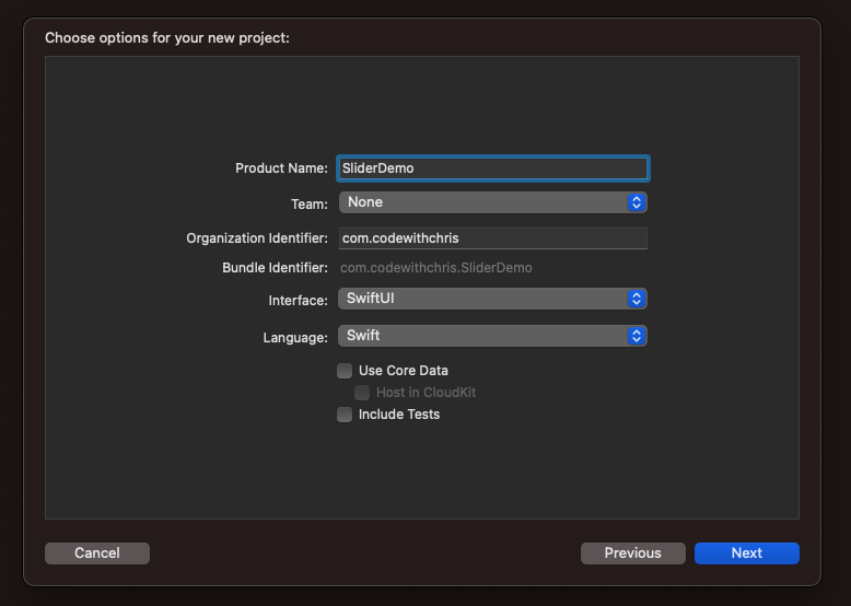
Click on Next and choose a folder where you would save your project.
Step 2: Adding the Slider to the View
Before we add a Slider to our new SwiftUI project, let’s first review the parameters a Slider needs to be added into a SwiftUI view hierarchy: the value binding and the in range parameters.
According to the documentation, the value: accepts a floating-point binding where you can use a @State property with a Double value.
The in: accepts closed-range floating point numbers as the parameter. You can use the range operator ... to indicate a range, and two Double values as the lower and upper bound of the range. ie: The expression 1...5 is a closed bound range that starts with a lower bound 1, and ends with the upper bound 5, having the numbers (1, 2, 3, 4, and 5) in range.
Slider(
    value: Binding<BinaryFloatingPoint>,
    in: ClosedRange<BinaryFloatingPoint>
)
Let’s start with the binding we’ll provide as an argument for the value: parameter. In Xcode, open ContentView.swift:
import SwiftUI

struct ContentView: View {
    @State private var sliderValue: Double = .zero

    var body: some View {
		...
    }
}
Then we’ll use the sliderValue‘s binding property by using the $ symbol. The $ tells the SwiftUI compiler that you’ll use the state property indicated (sliderValue) on a two-way binding. ie. $sliderValue will provide Binding<Double>, whereas simply referencing sliderValue will provide a Double.
The two-way binding works as follows:
- The
Sliderreads the value fromsliderValue. Any changes to thesliderValuewill also update theSlidervalue. This is calledmodel to viewbinding because any changes to the model value will drive a change to the view. - Interacting with the
Sliderwill write thesliderValue. This is called theview to modelbinding because any changes to the view made from user interaction will drive a change to the model.
To further understand how this two-way binding works, let’s use $sliderValue as the value: parameter of the Slider.
import SwiftUI

struct ContentView: View {
    @State private var sliderValue: Double = .zero

    var body: some View {
        VStack {
            Slider(
                value: $sliderValue,
                in: 1...5
            )
        }
        .padding()
    }
}
The in: range parameter tells the Slider what the range of values can be selected. In the example above, we’re interested to show a Slider that can choose a value in between the range of 1 to 5.
Test the Slider on the Preview or run the app using a Simulator. You should see a Slider on the view hierarchy similar to the photo below.

The slider has values ranging from 1 to 5, but we can’t see that since we don’t have a view that’ll show the current value of the Slider. Let’s add it next.
Step 3: Showing the Slider Value
Since we’re using $sliderValue as the binding for the Slider, we can also use it to show the current value of the Slider on a Text.
import SwiftUI

struct ContentView: View {
    @State private var sliderValue: Double = .zero

    var body: some View {
        VStack {
            Slider(
                value: $sliderValue,
                in: 1...5
            )
            // %.2f means to render the Double in two-decimal places
            Text("\(sliderValue, specifier: "%.2f")")
        }
        .padding()
    }
}
Moving the Slider with user interaction should drive the value for sliderValue.
| Moving it Left | Moving it right |
|---|---|
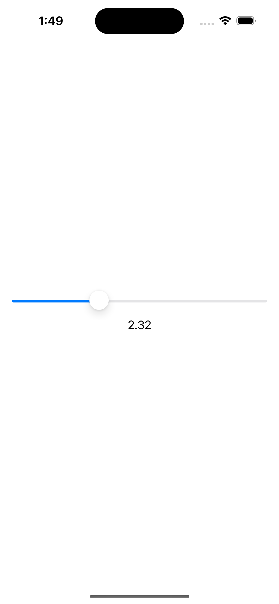 |  |
When you want the Slider to have a fixed set of real-number values, and you don’t want it to drive fractional values, then you can make use of the step: parameter.
Step 4: Adding a Step
The step: parameter accepts an Int to indicate incremental steps along the path of the Slider. ie. We have a Slider that has a range from 0 to 50, and you want the slider’s increments to be 5:
import SwiftUI

struct ContentView: View {
    @State private var sliderValue: Double = .zero

    var body: some View {
        VStack {
            Slider(
                value: $sliderValue,
                in: 0...50,
                step: 5
            )
            Text("\(sliderValue, specifier: "%.2f")")
        }
        .padding()
    }
}
| Step by 5 (at 15) | Step by 5 (at 50) |
|---|---|
 | 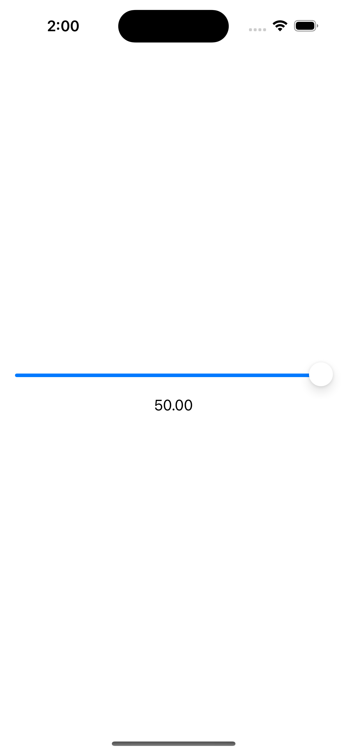 |
Step 5: Configuring the Slider
Now that we have a functional Slider, the next thing we can try out is to configure the Sliderby changing its colours and adding the min and max labels.
Let’s start by adding another @State property that’ll drive the colour change when the user interacts with the Slider.
import SwiftUI

struct ContentView: View {
    @State private var sliderValue: Double = .zero
    // Add this:
    @State private var isEditing = false

    var body: some View {
		...
    }
}
Then we’ll use that property to drive colour changes when the Slider is being edited by the user.
import SwiftUI

struct ContentView: View {
    @State private var sliderValue: Double = .zero
    @State private var isEditing = false

    var body: some View {
        VStack {
            Slider(
                value: $sliderValue,
                in: 0...50,
                step: 5,
                onEditingChanged: { editing in
                    isEditing = editing
                }
            )
            Text("\(sliderValue, specifier: "%.2f")")
                .foregroundColor(isEditing ? .red : .blue)
        }
        .padding()
    }
}
| Text Foreground Blue when not Editing | Text Foreground Red when Editing |
|---|---|
 |  |
We can also add a title label, and min and max labels. The title label doesn’t show up in the UI but it does help when you use the Slider with iOS VoiceOver accessibility feature.
You can do it by following how the documentation does it:
import SwiftUI

struct ContentView: View {
    @State private var sliderValue: Double = .zero
    @State private var isEditing = false

    var body: some View {
        VStack {
            Slider(
                value: $sliderValue,
                in: 0...50,
                step: 5
            ) {
                Text("Values from 0 to 50")
            } minimumValueLabel: {
                Text("0")
            } maximumValueLabel: {
                Text("50")
            } onEditingChanged: { editing in
                isEditing = editing
            }
            Text("\(sliderValue, specifier: "%.2f")")
                .foregroundColor(isEditing ? .red : .blue)
        }
        .padding()
    }
}
Or by using Xcode’s auto-completion feature:
import SwiftUI

struct ContentView: View {
    @State private var sliderValue: Double = .zero
    @State private var isEditing = false

    var body: some View {
        VStack {
            Slider(
                value: $sliderValue,
                in: 0...50,
                step: 5,
                onEditingChanged: { editing in
                    isEditing = editing
                },
                minimumValueLabel: Text("0"),
                maximumValueLabel: Text("0"),
                label: {
                    Text("Values from 0 to 50")
                }
            )
            Text("\(sliderValue, specifier: "%.2f")")
                .foregroundColor(isEditing ? .red : .blue)
        }
        .padding()
    }
}
Both code examples above are essentially the same, only that they differ slightly in syntax.
Test the Slider on the Preview or run the app on a Simulator.

Conclusion
Creating a Slider is easier in SwiftUI. It involves less code and setup compared to doing it in UIKit with UISlider view. I hope that by following this tutorial, you get to understand how to use the Slider on your SwiftUI projects!
That’s all for now! Cheers!